This is the weekend edition of TheMarioBlog and will be updated as needed. The next blog post is June 2.

Let the historians tell you volumes about the institution that The Wall Street Journal has been, perhaps the most influential business newspaper in the world. It's the daily of reference for financial news. It's the brand that has so much credibility and authority encapsulated into its very soul that if the WSJ reports it, then we stop and pay attention. It's the newspaper that many famous Hollywood stars have been seen reading over breakfast in movies both black and white and color.
It's also perhaps the golden crown in Mr. Rupert Murdoch's media empire, a prize he sought and got.
It's all those things and more.
For me, personally, The Wall Street Journal was the project of a lifetime. It was not just another newspaper to redesign. It was, in a way, a reminder of all that is possible in this wonderful country of ours. It was a reporter who reminded me of this.
Soon after I completed the redesign of The Wall Street Journal, introducing color and a faster, more energized way of getting through the daily package, the reporter put two and two together, so to speak:
“Hey, Mario, you came to this country as a young boy, escaping from Cuba, a communist country. Today you have managed to redesign the ultimate capitalistic tool, The Wall Street Journal.”
While I had not given that a thought, it was, indeed, true.
“It's what the American dream is all about,” I responded. “It's the country where nothing is impossible.”
Although, I confess now, at times, many of the changes that we were proposing, seemed impossible to push through.
Suddenly: an invitation for me to work with the WSJ
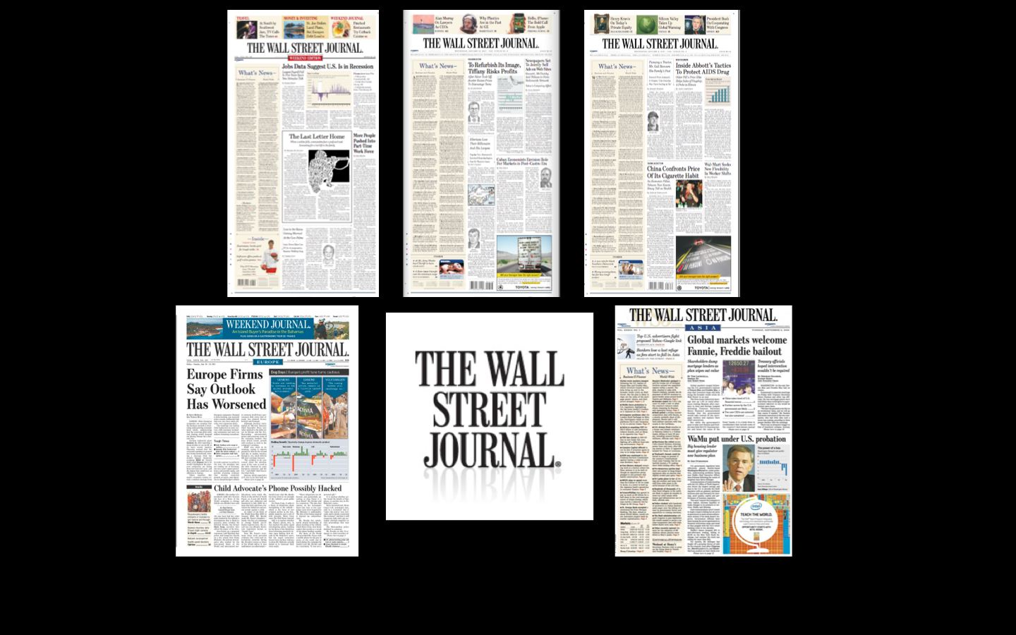
My involvement with The Wall Street Journal began in 1999 when then publisher Karen House invited me to collaborate with her team to introduce color to the The Wall Street Journal Europe and The Wall Street Journal Asia, a process that culminated in 2000.
In 2001, I worked with the WSJ’s team in New York for the introduction of color in the American edition of the newspaper.
Then, in 2003, Karen asked me to be the chief architect when The Wall Street Journal Europe and Asia converted from broadsheet to tabloid, culminating in October 2004.
Think that was easy? Think again. I soon realized that it would be an easier task if we left the word “tabloid” out of the equation. Tabloid is a dirty word if you are a serious, credible and classic Wall Street Journal editor. While “tabloid” may refer to a smaller newspaper format, to some in the industry still carries the stigma of a lesser quality newspaper.
Raju Narisetti, who became editor of the Wall Street Journal Europe as part of that change, reminds me that they ended up calling it a “compact format” in the relaunch campaign, pioneering the print/online WSJE as an always available product for European business audiences, well before it was fashionable for newspapers to think of a seamless print/online offering to readers, a strategy later embraced by WSJ in the US.
Here is the press release that was published in conjunction with the conversin:
http://www.businesswire.com/news/home/20050508005015/en/Wall-Street-Journal-Strengthens-International-Editions-Repositions#.U4d76JRdWD0
The European readers seemed to be wise and accepted the changes with high levels of satisfaction, except for one angry American in Brussels who wrote me directly with this message:
“If I wanted to read USA Today I would move back to Columbus,” he wrote.
Never mind that USA Today is NOT and has never been printed in a tabloid format, and that you could get it in Brussels, or anywhere else in Europe.
Soon after the format change in Europe, we proceeded to Hong Kong to do the same for The Wall Street Journal Asia. Again, with no problems and wide acceptance.
By then the next step was to begin further changes with the American Wall Street Journal.
Lessons I learned from my work with the WSJ team
My next involvement was a 14-month effort in which we worked closely with a team under the direction of James Pensiero, Vice President for Operations, with Marcus Brauchli, then Deputy Managing Editor, and David Pybas, Art Director. The task: to refresh the style, and to change the format to a narrower page.
The lessons
I was well aware that I had entered a real journalistic institution the first time I met with publisher House, and then editor Paul Steiger. History is everywhere, not just on the printed pages in those bound volumes that sit in the newspaper's morgue.
I was ready to tackle the project(s) with The Wall Street Journal and I knew that it would be a high learning curve. I had no idea it would be as astronomically high as it was.
If I had to list the lessons I learned along the way:
The perfection of the craft—I have never seen copy editors with sharper pencils and arguments. At The Wall Street Journal I observed, perfection is not just a goal, it is a requirement.
I learned that the use of the precise word in a headline made a difference for how the story would be perceived. And that repeating words in headlines, summaries and lead paragraphs reduced the number of possibilities to add information and to keep the reader engaged.
Storytelling techniques—I would venture to say that The Wall Street Journal had an almost clear monopoly on the business of story forms, or genres, from page to page. Editors and reporters assigned names to such stories, an A-head (that would be a sort of invisible, quirky story that always appears on Page One, with a “hood” over the headline). The subjects have nothing to do with the news of the day, and could be as “irrelevant” as the trend to install urinals in the bathrooms of American homes, or about the charm of wicker chairs.
Navigation–If there is a newspaper that was visionary in the area of navigation, it is The Wall Street Journal, where, as I understand it, an editor 8 decades ago decided that WSJ readers were busy people and that there should be a full summary of the news on Page One. To me, that was the first navigation scrolling device ever created. It still works today. Why it has been relegated to Page 2 in some print editions, I can't understand, except that the editors may be right in thinking that digitally connected WSJ readers are not counting on that navigational device as much today in their printed newspaper.
Attention to detail—if you have a chance to take a look at the Styleguide of The Wall Street Journal, do so. It is a journalism textbook, crafted to perfection. AT the WSJ I knew, no detail would be left out of the overall planning. Headlines, summaries, text, photo captions, photos, graphics, illustrations and the name of everything was given the utmost attention.
The next 125 years
So, as The Wall Street Journal folks get ready to blow those 125 candles, I say Happy Birthday to one of the world's greatest newspapers. I am forever thankful to have been even a small part of this history. The printed Wall Street Journal I pick up has evolved and changed since our last 2007 involvement, as it should. It is still one heck of a document to hold in your hands, or to read on a digital device.
It's a daily reminder of what good journalism is about and why so many people paid for the WSJ's online edition from day one.
One thing is for sure, the next 125 years will be tougher for The Wall Street Journal, as well as for every other media group.
Perfection of the craft and attention to detail have never been more important, except that today, to succeed, these must be carried across various platforms.
Of related interest:
WSJ on the web
http://blogs.wsj.com/wsj125/2014/05/27/wsj-on-the-web/
The Wall Street Journal – compact
https://garciamedia.com/blog/the_wall_street_journal_compact
The Wall Street Journal: an iconic front page element gets skinnier
https://garciamedia.com/blog/pthe_wall_street_journal_an_iconic_front_page_element_gets_skinner_but_why_
World Cup graphic: a call from Adonis Durado
Interesting mail and project from that most award winning and talented designer, Adonis Durado, creative director for Times of Oman and Shabiba, of Oman.
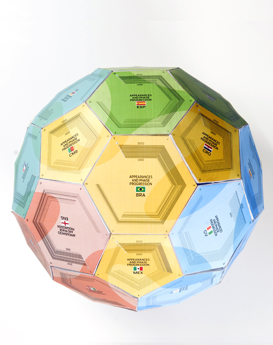
“My team is currently working on a special project for the World Cup. I reckon that this is an opportunity to engage the readers and celebrate what print as a medium can still do in this digital era. I look forward to hearing from people that I should communicate with and who will be interested on this? “
Time is of the essence, Adonis reminds us, since the World Cup is just around the corner, June 12-July 13.
Details of the project
Let me share you an exciting project that the Times of Oman has cooked up for the World Cup. We have created a graphic supplement where readers will have the opportunity to construct a life-size collectible football model. The entire supplement will be full of information and statistics about the 32 national teams. The extent of our research and database building took us months to gather.
For more information, contact Adonis Durado directly: adonisdurado@gmail.com
