It feels good to be back
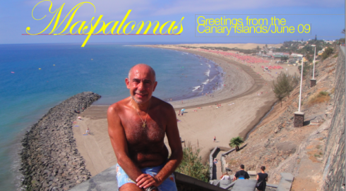
All it takes is a week for me to recharge the tired batteries and return energized. For one week, I was lying in the sun in Maspalomas, that beautiful strip of an island near Las Palmas, the Canary Islands, home to my maternal ancestors.
This year, I decided that I would totally disconnect. Well, make that, ALMOST totally disconnect. Some parts of my ritual remained intact, such as the morning run—-except that here, I ran on the edge of the beach, watching the big waves come at me, forcing me to do quick jumps and detours when the water threatened to cover my feet (I don’t want my new Asics to go swimming). The part that was abandoned was the daily posting of the blog, which, although it may not show it all the time, requires a good one hour to produce each day, minimum.
Instead, I spent that one hour soaking lots of sun and chatting with friends.
The computer was left behind in my hotel room each day, and the iPhone (I confess) I could not part with, so I took it along, but only turned to it if it rang with a call (nobody truly called), and for my music which is all there.
What did I miss?
Did I miss the blog? Honestly, I am not a person who truly misses anything while on the road (call me an ingrate). People often ask me: don’t you miss your pillow at home when you travel?
“No, not really,” I say. “I never encountered a pillow that I could not hold on to like a teddy bear and turn right to sleep on it.”
And, don’t you miss your bed?
“No, not at all, as I have not slept in the same bed for more than a week in decades, so what is to miss?”
In my view, you approach the next destination or project with gusto, and don’t let the memory of what you left behind keep you from enjoying where you are. I am a man of the present more than of the past, and I do live for the next 72 hours, which is as futuristic as I am going to get.
Plus, the world is sort of my neighborhood after 27 years of heavy travel. I know for a fact that I am better known to the pharmacist at the Frankfurt Airport pharmacy than at the Walgreen’s in my Temple Terrace neighborhood. Nothing to be proud of, just the facts. Hotel bellhops and guest relations people and Lufthansa flight crews know me by name, which makes the whole idea of “missing something or someone” not so realistic.
Yes, I miss my children, and, ESPECIALLY, my grandkids. After 10 days on the road, I must come back to see them!
Blog topics in the tropics?
If, however, I had been writing a blog during my one week holiday, these would have been some of the entries:
How to make it more graphic: The crash of Air France AF 447 from Rio to Paris received daily, full coverage on every newspaper I put my hands on during the holiday. It was interesting to see that, while graphics of the event were well used by such Spanish dailies as El Pais and, especially, El Mundo, there was still a heavier reliance on narratives to tell the story of how this Airbus 330 disappeared into the dark waters of the Atlantic Ocean. One day, both El Pais and El Mundo described as one of the possible causes of the crash the sensors that detect the plane’s speed. I took one look at the infographic in Germany’s Bild Zeitung and there it was, a small, but powerful, graphic indicating where these sensors are located right on the side of the nose of the aircraft. The very visual Bild goes direct to the heart of the information—-visually speaking!
Broadsheets and the beach don’t mix: Have you ever tried to read a newspaper with a broadsheet format while sitting at the beach? Well, Maspalomas tends to be windy. Not stormy, just plain, breezy windy. It is quite difficult to hold the huge pages of Bild Zeitung together. I found myself folding the paper into quarterfolds, to be able to get through it. Alas, the best format for the beach—-or for anywhere—-is Spain’s ABC, in an A4 format.
The popularity of the iPhone: Yes, the new model of the popular and, for me, indispensable, iPhone, will be out this week, and it will allow us to make videos, among other enhancements. One of my daily routines at the beach was to count how many of the people taking the sun actually carried an iPhone. The unscientific results: many, from all nationalities. The magic of the iPhone, which could provide the music, the entertainment, the camera—-not to mention that iPhones here were paraded around as status symbols. As it should be.
Spanish newspapers and surprise content: This one is NOT at all a suprise to me, as I studied Spanish literature extensively during my doctorate at the University of Miami , and I know how many of Spain’s greatest writers first introduced us to their work through daily newspapers. In a way, Spanish editors today continue to surprise us with great writers, and with extensive coverage of literature and the arts, not just for their weekend products, but DAILY. As I read El Pais, especially, each day, I found myself staying with the newspaper much longer than my usual time with an average daily newspaper elsewhere. NO, I was not reading reaffirmation news that I already knew. I found myself reading a variety of articles that nobody but El Pais carried. Ironic as it may sound, perhaps the newspaper of the future (I hate that phrase) is nothing more than a reflection of the newspaper of the past. Surprises abound when the content is not necessarily a rehash of the news we already know quite well. Yes, of course, El Pais will do daily follow ups of the crash of Air France, or the elections in Iran, but the real juicy mangos in the fruit bowl are that story about the new Garcia Marquez biography (an analysis more than a review), or the indepth interview with Guillermo Del Toro and his fascination with vampires. This is what we ultimately come back to the newspaper for. Makes us wonder about the new definition of NEWS for the printed daily.
I realized then that we still rely on the narrative too much when a simple graphic can do the job better.
About the disconnect….
Disconnecting is healthy and I recommend it for about a week.
And, if I must confess my weaknesses, twice on Thursday of last week I was tempted to do a blog posting, but my better sense prevailed.
And, if I confess one more thing, I had promised me not to do any TweetsByDesign during the week, but the Tweet is more difficult to abandon than the blog.
Yes, I Tweeted twice during the holiday, rushing in to do my quickie 140-character entry, as if the whole world was pointing a finger shouting: Got you!
It is good to be back, and fully connected, at least till the week of July 4th when the entire Garcia clan spends a week at another beach on the other side of the Atlantic, luscious Longboat Key, near Sarasota, Florida. Until then, there are blogs and TweetsByDesign waiting to be done!
TheMarioBlog: celebrating one year
Reed Reibstein, the Yale University student whom we are proud to have as our summer intern, sends us this thoughtful message as we celebrate the first year of TheMarioBlog:
I am writing to congratulate you on one year of TheMarioBlog! I have to be honest: I do not know of any blog, definitely no graphic design or journalism blog, that is updated as frequently yet consistently has such lengthy and interesting posts. I check your blog first thing when I get up every morning and have never missed a post—and I am sure that there are many others who have the same morning ritual. I consider myself privileged to have been a small part of your posts over the last year.
As you requested online, I thought I would take this opportunity to mention some aspects of TheMarioBlog that I really love and would like to see more of and a couple of features that you might be able to be enhance.
The things he likes about the blog
My favorite posts are, without question, those that give the inside scoop on your redesigns and design developments and your personal opinions about new work in the industry. I enjoy reading about your recent newspaper and magazine projects, especially those in which you provide lots of details. I especially like when you spread the information out over several days, e.g. one day on the overall design, the next on the type, the next on the color palette, etc. One thing that I particularly appreciate is your reluctance to be overly critical or make negative assumptions about redesigns that you find uninspiring. I and your other readers thank you for striving to keep the conversation constructive and professional.
The other features I look for are your short interviews and links to online stories. I like that you interview a wide range of people, but keep the discussion short and focused. And those lists of links: Even though some people may get their journalism news from dedicated sites and blogs, I typically do not, so I enjoy when you post links to five or ten interesting articles from around the Web.
Some useful tips to follow
I very much appreciate that you provide a “takeaway” for each and every blog post to make it easier for your readers. But I find that I usually go to the home page and click right through to the blog post of the day without reading the takeaway first. Do you think it would be helpful to copy the takeaway at the beginning of each blog post, too?
You often use small graphics as headers for the most important items in your blog posts, which I love because they make your blog feel much more vibrant than if you only used the basic formatting of the Web. I have to say, though, that at the size I see these graphics on my screen, the Didot that you use can be rather hard to read. (For example, in the text “Here are links to your favorite postings of the last 12 months” from the current blog post, the hairlines are so light that they almost disappear.) Might you consider switching to another typeface that would be easier to read? I was thinking that Whitney might be a terrific fit—it looks great as the Tweets by Design background on your Twitter page, and it would be nice to see something by Hoefler & Frere-Jones since you work with them so often. Also, I noticed that some of the header graphics end up with a red wavy line under words that are not in your spell check’s dictionary. I do not know which program you make the graphics in, but you may be able to turn off the “Correct for spelling while I type” feature in the options menu, which I think would make everything look nicer.
Congratulations again on a fantastic year of blogging. I can’t wait to see what you have in store for your readers in the next twelve months!
Follow the Marios

Two Marios. Two Views.
Follow Mario Jr. and his blog about media analysis, web design and assorted topics related to the current state of our industry.
http://garciainteractive.com/
Visit Mario Sr. daily here, or through TweetsByDesign (www.twitter.com/tweetsbydesign)
:
To read TheRodrigoFino blog, in Spanish, go:
https://garciamedia.com/latinamerica/blog/
TheMarioBlog posting # 281