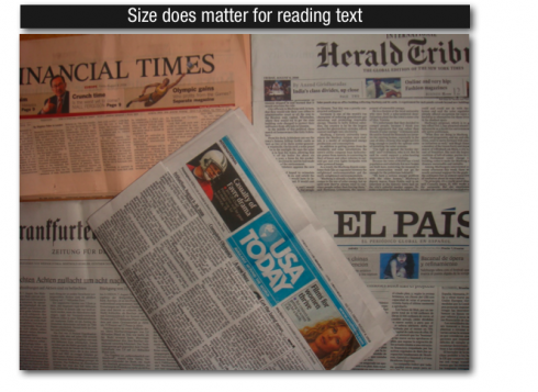
Following my posting concerning the size of text type displayed in the Financial Times, I reviewed a series of inquiries from around the world asking for suggestions for fonts that are especially good for text, as well as for the best size.
On the subject of font selection for text: Currently many good choices exist in terms of fonts. I particularly like Poynter in all its weights as an extraordinarily functional and easy to read text type font. It is also attractive and blends well with other accessory fonts around it. For size, however, I feel that anything under 9 points is too small, and I would even venture to say that in a modern newspaper, text type should be a minimum of 9.5, and better if it is 10 points.
I have prepared a short video to make my explanation of body type use in the Financial Times, Frankfurter Allegemeine, USA Today, El Pais and the Herald Tribune easier to follow. Your comments are welcome.


Ron Reason reports that the Andrew Skwish exhibit at his gallery in Chicago, Friday, Aug 8, was a major success. He has sent some photos of the event that follow here.
A video clip is also ready for viewing.

Video link to the Andrew Skwish exhibit:
http://www.youtube.com/watch?v=H-Iqb89ndMk