This is the weekend edition of TheMarioBlog and will be updated as needed. The next blog post is Monday, November 6 when I will be reporting from Dubai, United Arab Emirates
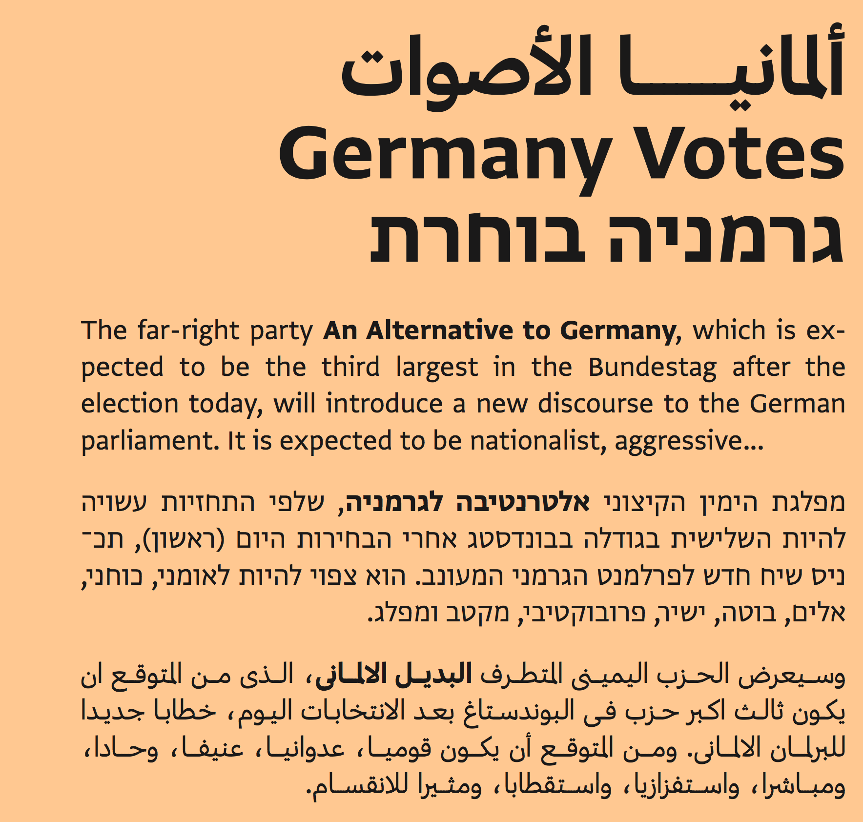
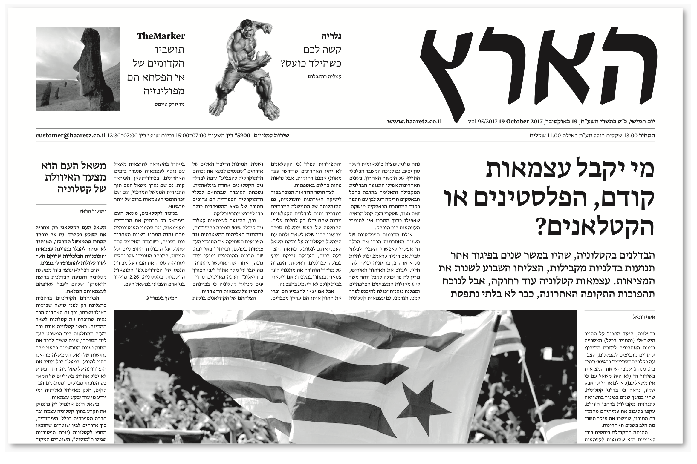
My only encounter with a publication in Hebrew happened more than two decades ago, when I had the privilege of consulting with the Israeli newspaper Haaretz.
At the time, considering a change of font was a challenging proposition.
That’s why I was so happy to hear from Dutch type designer Peter Bilak, of Typotheque.
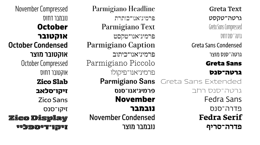
Peter informs me that after a decade of working with Arabic type, now Typotheque’s designers have turned their attention to another Semitic writing script, Hebrew, and they have come up with 21 fonts.
” The aim of this seven-year project was not to create a particular style or a typeface family, but rather a complete Hebrew type program: rigorous, high-contrast typefaces for continuous text, low-contrast fonts for identities and branding, and display typefaces for expressive typography,” he said.
Peter’s involvement with Hebrew alphabets was the ultimate challenge as, as he admits, he does not read nor speak Hebrew. Yet, he thinks there are benefits when an “outsider” approaches a project of this magnitude:
I am a firm believer that it is possible, and in fact many great advances in type design and typography have been made by people who were outsiders or even illiterate, since the skills required to speak a language are quite different from the skills required to work with its visual aspect. Of course, an outsider has to work harder to learn a script’s history, traditions and conventions, mapping out its expressive potential. I knew that in the process of exploring Hebrew type I would make silly mistakes that would never even occur to a native designer, that coming to understand the historical models, references and writing tools would be a long journey, but having already designed Cyrillic, Greek, Armenian, Inuktitut and Arabic typefaces, I was willing to take on this challenge.
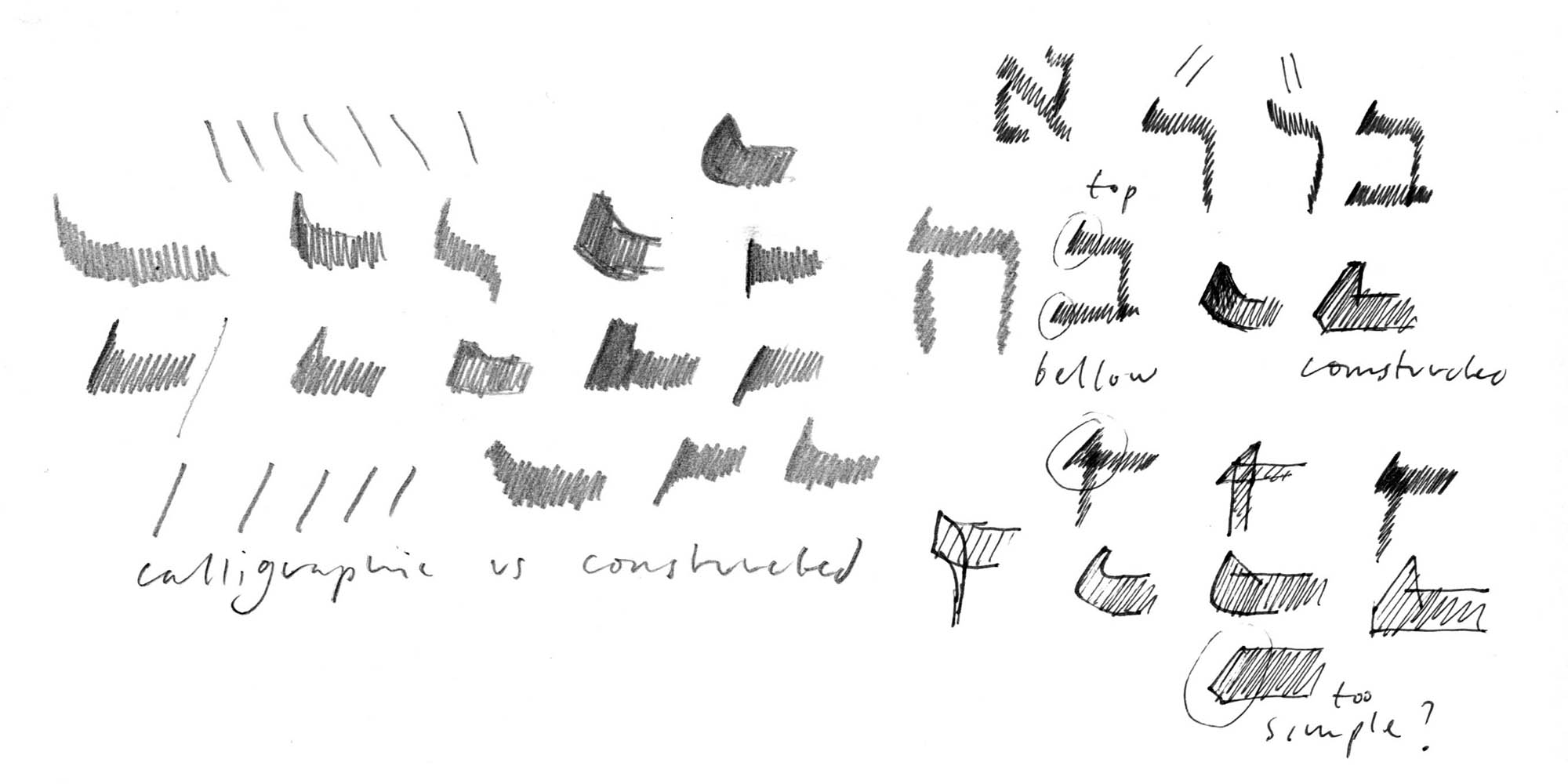
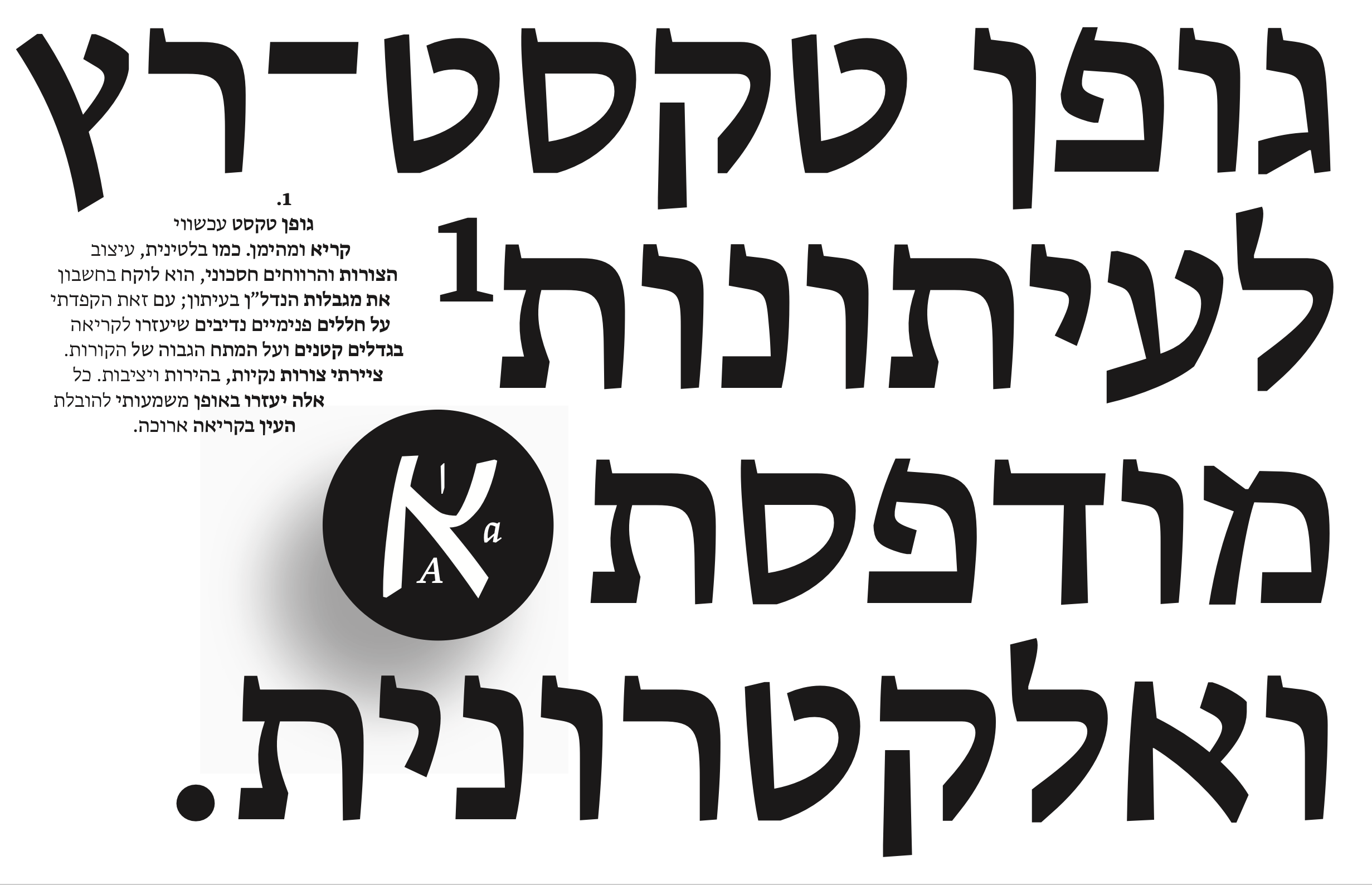
A challenge that Peter welcomed with gusto and that he apparently met with much enthusiasm. Here we see Peter’s early sketches for his Hebrew font creations.
Interview: four questions for type designer Peter Bilak
1. What was the main challenge in designing an alphabet for a language which you do not speak or read?A native speaker has always an advantage when designing a typeface — s/he know the letters intimately, and has a feeling for forms, their cultural and aesthetic connotations. An outsider can slowly acquire similar skills, but it takes time to train one’s eyes to local conventions. That’s why I find it most important to allow plenty of times for projects when one ventures into an unfamiliar writing script. It is certain that one will make mistakes, plenty of mistakes, just as one learns a new language. Personally, only after working with Hebrew for about five years, I could not only draw forms, but have an understanding of their meanings, what different shapes and styles refer to. I need to add that I received also help and advice of excellent local designers, most notably Michal Sahar, who gave Fedra and Greta its authentic voice in Hebrew.
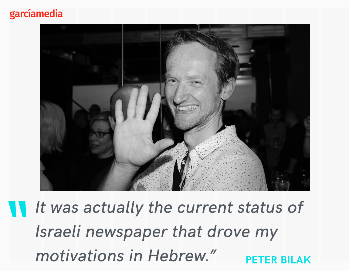
2. In your view, what is the current status of typographic use in Israeli publications, primarily newspapers?It was actually the current status of Israeli newspaper that drove my motivations in Hebrew. Most of the newspapers in Israel use the same font, Frank Rühl, designed in 1910 by Rafael Frank. It is a dated art-nouveau inspired typeface, but somehow seen as a model of a legibility typeface, and it dominates publications in the country. I haven’t yet seen a situation like this. If you look at most magazines and newspapers, 90% of them use of one these three fonts Frank Rühl 1910, David, 1954, and Hadassah, 1958. Which is very much unlike Western typography which is dominated by typefaces by contemporary designers. This is why I started with Greta Text, which is a popular newspaper typeface and already available in Latin, Cyrillic, Greek and Arabic.
3. Do you see your new Israeli fonts as advancing and modernizing how type is used in Hebrew language publications everywhere?They are certainly paying attention to trends, but as described above, they are constrained by traditions, and contemporary typefaces are not widely accepted. The question is whether suitable replacements of those three popular fonts simply don’t exist, or the the market is more conservative than elsewhere.
4. What is the reaction so far?
We’ve just launched the fonts at an event in Tel Aviv, where some 300 people attended the presentation, which was surprising even to most devoted type aficionados. We had a couple of orders by now, but it will take time before the fonts are to be seen in the wild and before they can make any impact.
Take a look at the Hebrew front collection
Typotheque has just announced the release of a substantial collection of Hebrew fonts.
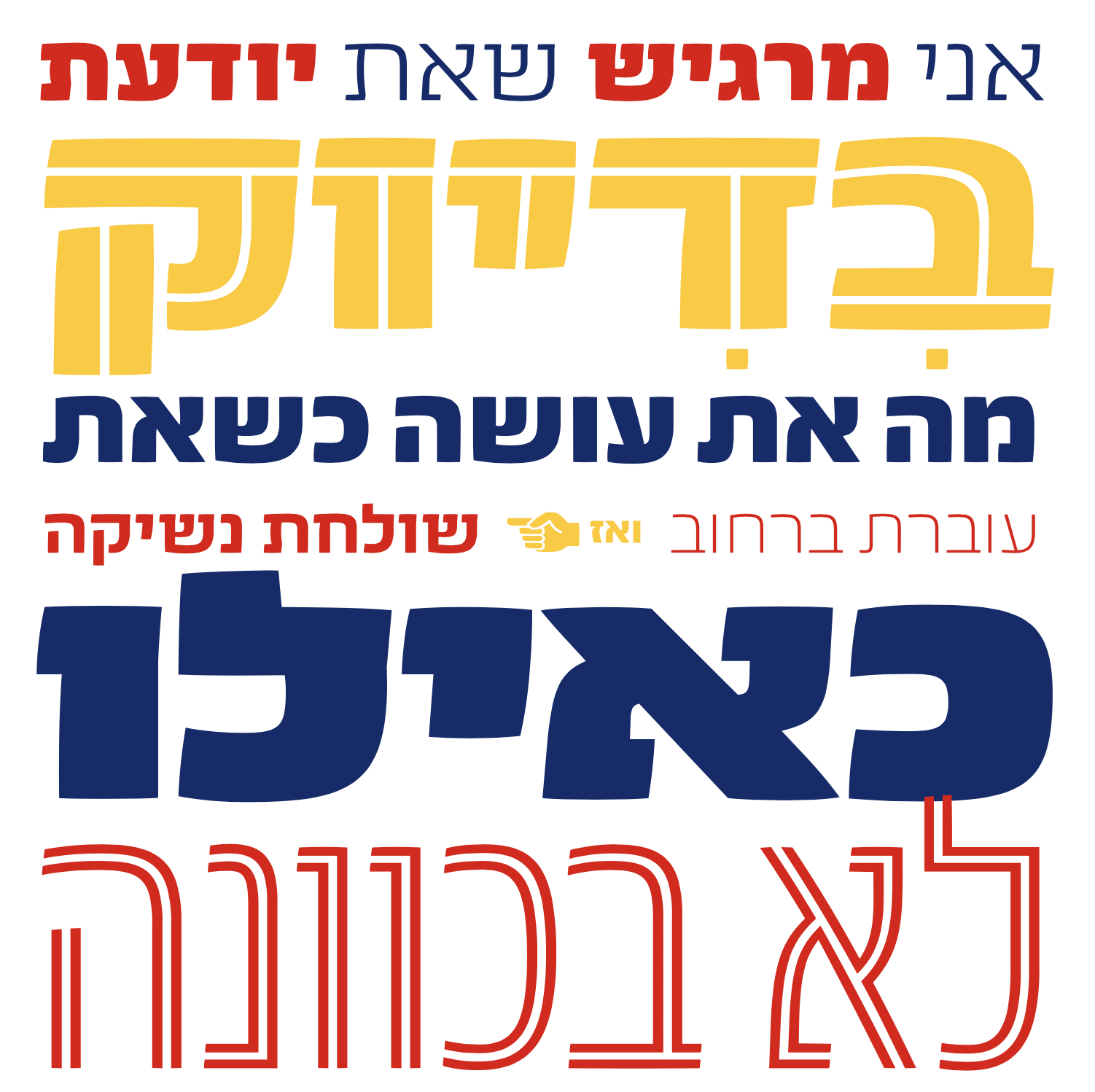
Here we see the fonts in use
Greta Sans Hebrew
Greta Text Hebrew
Greta Text Hebrew
November Hebrew
Zico Display Hebrew
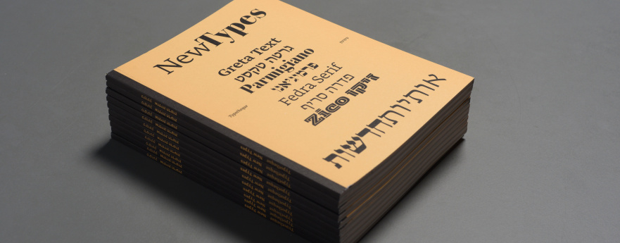
Get the new Typotheque book of Hebrew and Arabic fonts
Typotheque has published a new typeface specimen (No. 15) especially for this occasion, presenting Typotheque’s entire collection of Hebrew (and Arabic and Latin) fonts. Get your copy online for the price of €5.
http://www.typotheque.com
http://TPTQ-Arabic.com
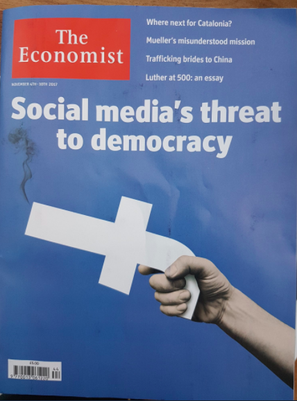
A Cover We Like
The Economist surprises again!
Fifty years of New York Magazine
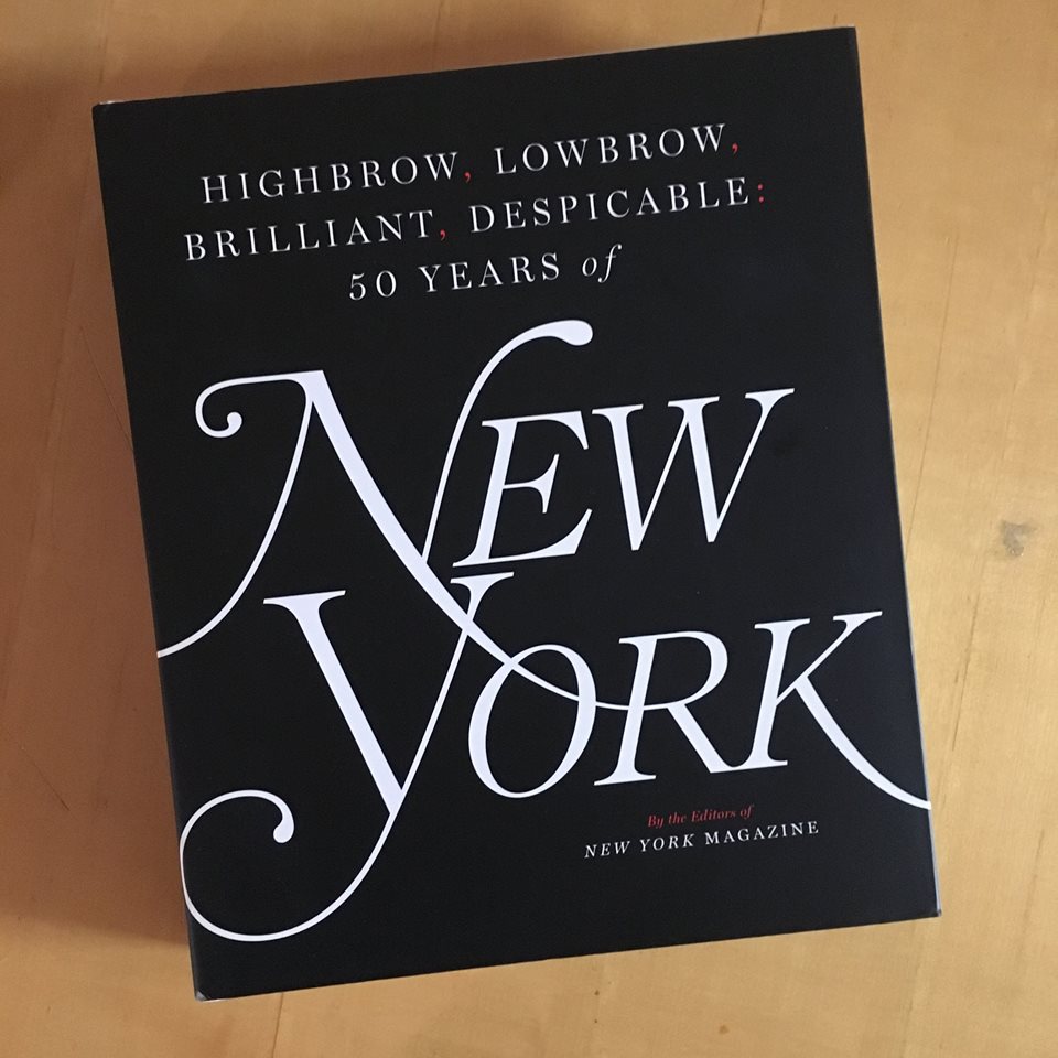
Thanks to my friend and legendary designer Bob Newman for calling attention to this new book celebrating New York magazine’s 50th anniversary . It’s 400+ oversize pages packed with photos, vintage covers, graphics, illustration, and , writes Bob, “some nifty stories, all of it beautifully designed and packaged by design director Tom Alberty and his team.”.
You can get the book here: https://www.amazon.com/dp/B071CTJYFT/ref=dp-kindle-redirect?_encoding=UTF8&btkr=1
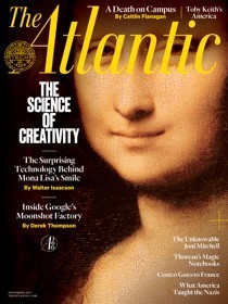
And The Atlantic turns 160

The Atlantic is one of the few magazines that I still enjoy reading in its print edition, delivered monthly to my mailbox in New York City. I do subscribe to The Atlantic’s digital newsletter, and that is where I got the image of the cake you see here. The image was accompanied by this text:
The Atlantic turns 160 years old today—and yes, there really are 160 candles on that cake. See an album of photos from the year the magazine launched here, and check out all the celebrations we’ve planned here. (Katie Martin / Emily Jan / The Atlantic)
Read more about this milestone: https://www.theatlantic.com/entertainment/archive/2017/11/on-turning-160/544604/
Mario’s Speaking Engagements
Nov. 16-19, WAN IFRA Latin America, Buenos Aires, Argentina
April 18-19, 2018-–Newscamp ,Augsburg, Germany.
June 3-6, 2018—The Seminar, San Antonio, Texas.
Our digital transformation workshops
If you would like to find out more about our workshops for digital transformation, email me: mario@garciamedia.com
I will be happy to answer your questions and provide more information. Our workshops are offered in both English and Spanish.