![]()
The premise of this Digital Design Challenge was simple: how can we present ideas that will make distribution and presentation of news via mobile devices more effective. It all began with a conference at Columbia University’s Graduate School of Journalism Oct. 17-18, 2016, where a group of designers and pundits (I was one of the pundits) presented the state of the media today and how new ideas could move us forward. Roger Black coordinated and moderated the program.
The who is who of the conference
The designers:
Jeffrey Zeldman, Publisher, A List Apart
Mike Swartz, Designer, engineer and partner, Upstatement.com
Kat Downs Mulder, The Washington Post —Graphics director
Jared Cocken, Fitocracy
Lucie Lacava, Lucie Lacava Design
Industry experts (pundits):
Megan Chan, director of digital operations, The Washington Post
Susan Mango Curtis, professor at Northwestern University's Medill School of Journalism
Mario Garcia, CEO/Garcia Media, Senior Adviser on News Design/Adjunct Professor, Columbia University/School of Journalism
John Temple, managing editor, Investigative Reporting Program, UC's Berkeley's School of Journalism
Chrys Wu, developer advocate, The New York Times
Seven takeaways
I have again participated in the conference and these are the seven takeaways that I have emerged from the program with:
1. It’s all about the article page—Many of the presentations placed great emphasis on the importance of article pages that are easy to navigate and that invite us to engage with other articles beyond the one we came to read. What makes for a good article page? How can local media conversation be invigorated?
2. Virtual reality as the ultimate immersive storytelling. Also, VR as an amazingly powerful tool for presenting advertising. The next big thing for news organizations, more Virtual Reality, esp. with infographics. “It will be huge when it comes to cars.” (Cocken)
3. Intelligent video with context.Video becoming more sophisticated, it's happening. “Video is powerful, adds transparency”.
4. Branding: your brand is one of your biggest assets. Newspaper brands are strong, capitalize on them to promote your new product offerings. “ “Find typography that brands your publication as authoritative.” (Zeldman)
5. Briefing and curation moving center stage.
Give me an idea what I should read today. And if such briefings can appear near article we are reading, more power to them.
6. The two tempos: lean forward, lean back have made cameos in all presentations. Emphasize two reading modes: quick version (lean forward), longer read (lean back).
7. Simple does it. Simplicity has never been
more essential. Think ease of user experience. “We need to create design systems that are first and foremost readable, and brandeable”. (Zeldman)
The design solutions
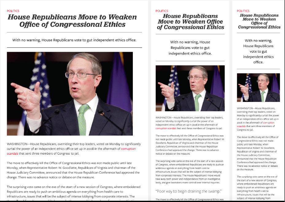
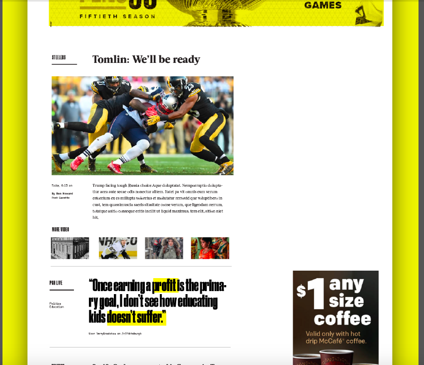
Jeffrey Zeldman, Publisher, A List Apart
“Design alone can't save real news. Design must make content readable, or it's useless.”
I was quite impressed with the way Zeldman focused his design solution entirely on article pages and how to make them easy to access and much easier to navigate. His mandate: “Keep people reading and make it affordable.”
He created the templates you see below, emphasizing simplicity, a logical flow of elements, and quite adaptable to all screens.
Kat Downs Mulder, The Washington Post –Graphics director
“A big-brand news site [should be] aware that people have a lot more to do in their lives than read the news”.
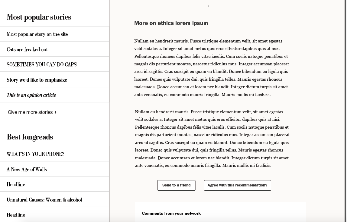
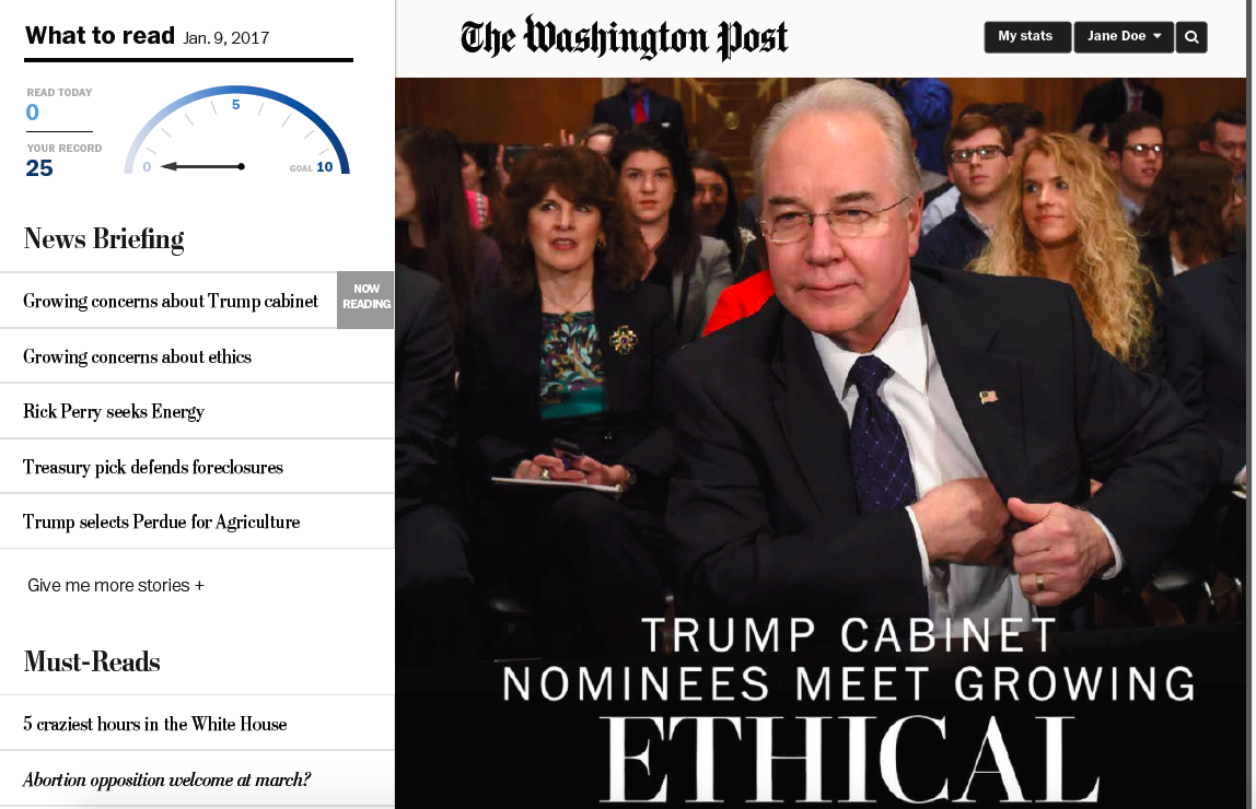
Kat shared a prototype for a big-brand news site finding innovative ways to engage readers in the era of the journalism of interruptions:
“A news publication might think a bit more like Fitbit. That is, it should make you feel like it’s working for you. A reader should say, ‘I’m reading everything I need to know.’”
Kat’s digital design challenge solution also relied heavily on the article page. She presented a multi-paned prototype. See below: the screen includes an article to the right , with a narrower pane on the left as a sort of briefing or navigator of stories.
One interesting feature of Kat’s prototype: it allows readers to have total control of what they read and to keep track of what they are reading. Just like Fitbit encourages extra steps, and rewards the user, Kat’s project offers an accumulation of points that give the reader a sense of accomplishment, if you will. In the midst of the journalism of everywhereness and tons of interruptions, readers may realize that they have had more time than they thought to read content of interest.
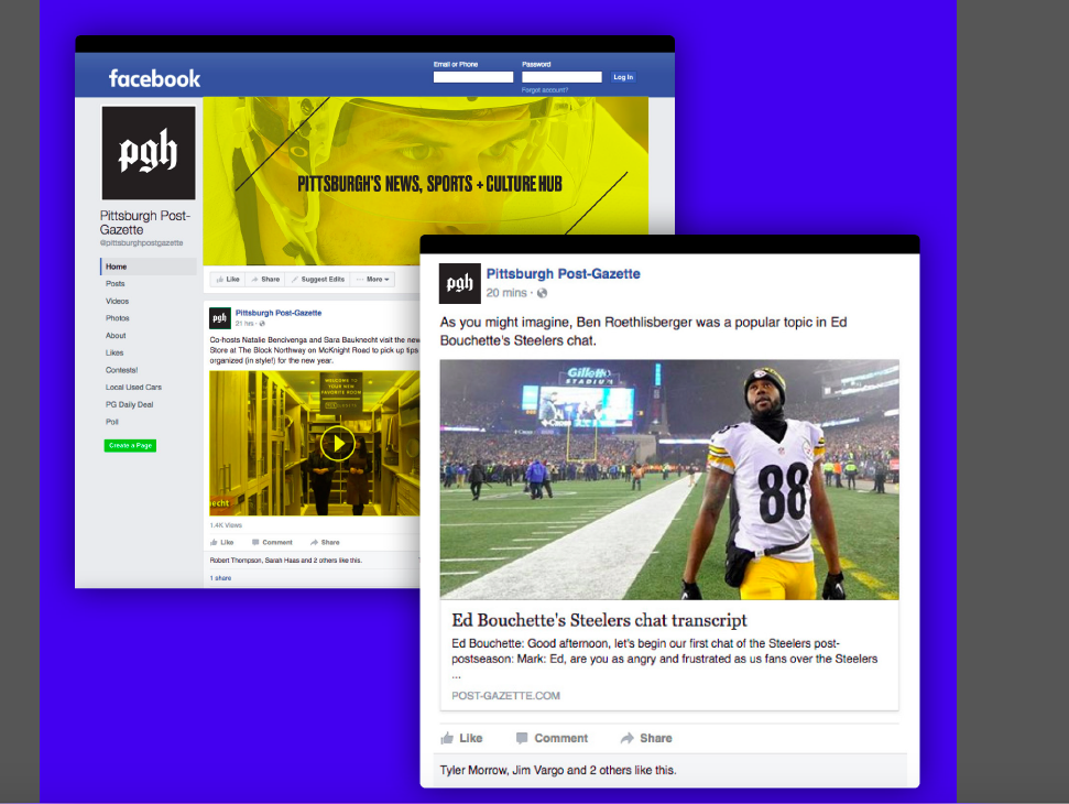
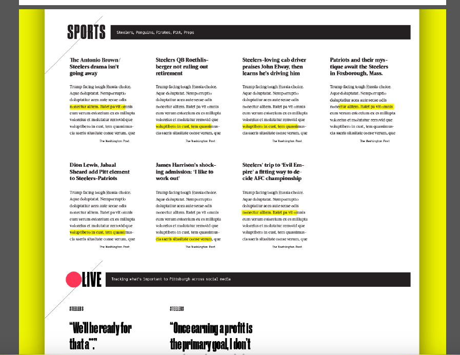
Mike Swartz, Designer, engineer and partner, Upstatement.com
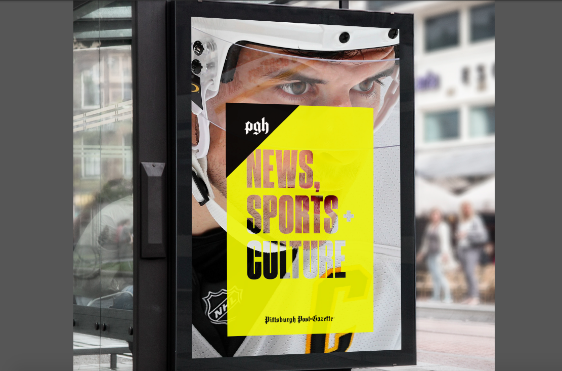
“There’s a potential for an operation like the [Pittsburg Post Gazette] to rebrand itself as more of an “informational operating system” for its city. With different types of products that are focused and useful and not necessarily bundled into a traditional news format, we can create more enjoyable experiences and more useful products readers will love.”
Mike set out to prove that it is not just very big publications who can experiment. Smaller publications (such as his original hometown paper, the Pittsburgh Post-Gazette) with fewer resources than such giants as The New York Times or The Wall Street Journal, can also do things that are innovative and interesting.
“When I was thinking about what I love about newspapers
and news orgs in a local context, I kept thinking
of them as information operating systems. The city
runs on these platforms of news, entertainment and
utility, and newspapers have access and expertise that
no one else can match. So how can we focus on this
and realize the full potential of a news organization in
a local market?”
Take a look at Mike’s prototype below: one strong brand across various platforms; clean, distinctive design that invites the reader. Robust typography and plenty of white space.
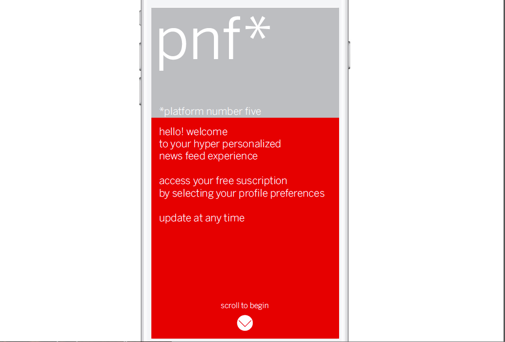
Lucie Lacava, Lacava Design
“Some of the best online design we see today is in magazines . We need to do more of that with news, while allowing users to make choices about what they want to read and even the ads they wish to sample.”
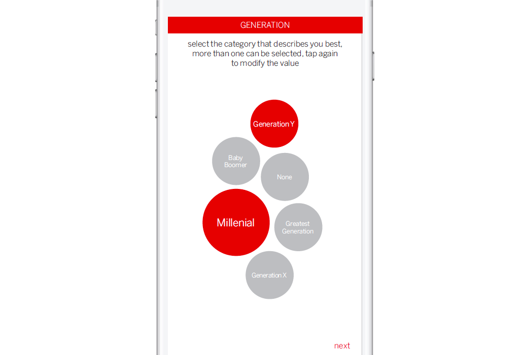
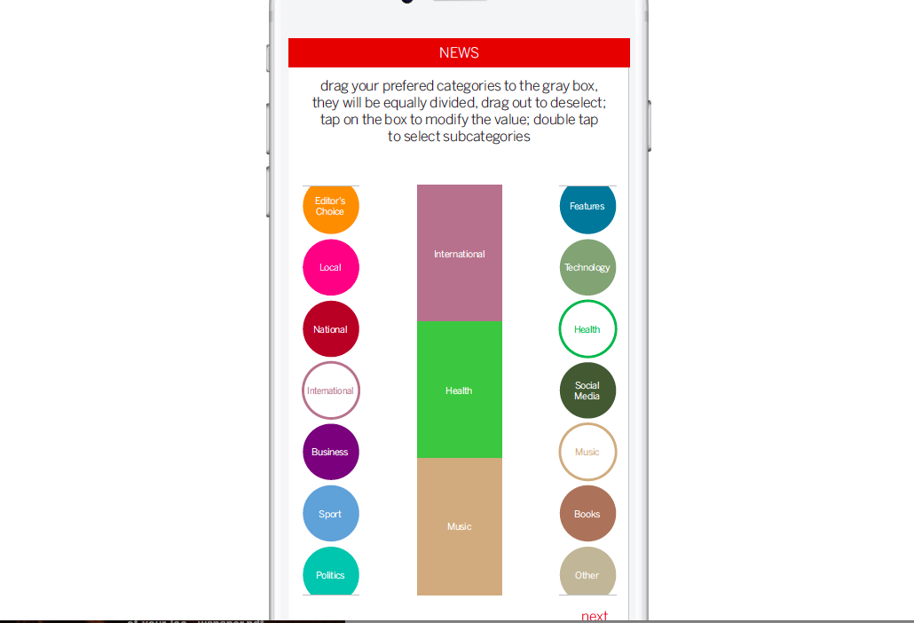
Lucie’s project emphasized advertising and monetization. More importantly, customization. Her project was all about creating a free digital news publication designed to reach all demographics and generating a high engagement level.
She imagined a hyper-personalized news feed designed to empower the user, put him in control of his content and advertising choices.
Jared Cocken, brand and product designer for hire and co-founder of STYLSH.co
““The problem is not the technology, but the people using it.”
Jared project sees Video and Virtual Reality as the next big way s to get into immersive storytelling. He adds that any size publication could produce “video or VR driven stories that enrich a user’s understanding of the world around them.”
“That moment when your story connects with the people, it's very magical.”
Of related interest
Digital newspaper design challenge: a report from Poynter, part 1
https://medium.com/@zeldman/digital-newspaper-design-challenge-a-report-from-poynter-part-1-eeca5b9c6fc6#.wkkqj5kzt
New CNN Media Newsletter
The latest media organization to start sending email newsletters is CNN. It's Reliable Sources, the weekly Sunday program, hosted by Brian Stelter.
Brian now sends this newsletter with the latest with media news. You can subscribe to the nightly newsletter here: http://cnn.us11.list-manage1.com/subscribe?u=47c9040f6ff957a59bd88396e&id=e95cdc16a9