Picture The Poynter Institute in 1986. St. Petersburg. My friend and colleague Dr. Roy Peter Clark ran the writing program. I ran design. By the architecture of the place — and by the habits of the entire industry — we were supposed to be opponents. Our seminars were built that way. Words vs. Pictures. We even staged debates, and the audience of editors sat there enjoying the fight, because the fight confirmed what they already lived: writers on one floor, the art department down the hall, and a copy desk in between trying to keep the peace.
Because both Roy and I have an element of the theatrical at our core, we would go on stage in front of an audience of writers and designers playing our roles. Roy represented the gray and serious Perry Mason, a TV character of the 60s; I would echo the tutti frutti spirit of Carmen Miranda, the colorful Brazilian bombshell. Perry was all about the words; Carmen was, well, about anything crazy. The message was clear: the writers in the newsroom do the serious stuff, the designers decorate.
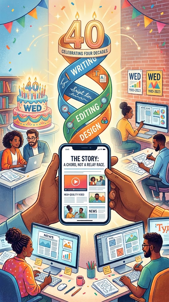
The WED concept would bring the two groups to the middle. WED stands for Writing/Editing/Design, the marriage of words and visual images. That union has never been more important than today. So, here is a celebration to the 40th birthday of WED.
At the stage, it was all laughs. The conversation that mattered didn’t happen on stage. It happened afterward, the two of us comparing notes and arriving at something slightly heretical: the reader does not experience a story in departments.
Nobody has ever picked up a page, a screen, a phone, and thought, the writing here is excellent, a shame about the layout.They think: I understand this, or I don’t. I stayed, or I left.
That decision took minutes to be made in the 1980s. Today, we decide to scroll or to swipe in a matter of seconds.
So we stopped staging the fight and started teaching the fusion. We called it WED — Writing, Editing, Design. Three letters, one act.
What WED actually means
Let me be precise, because forty years of repetition can hollow out a term.
WED is not “design makes the writing look nice.” It is not the writer writing for three weeks and then handing the art director twenty minutes to decorate it. It is not a workflow diagram.
WED is the conviction that writing, editing, and design are three hands on the same instrument, and that they must touch it at the same time. The idea for a story, its structure, its visual form, and the way a reader will move through it — these are decided together, at the beginning, or they are not really decided at all. They are just inherited.
In 1986 that meant a writer, an editor, and a designer in a room before a single word existed. It meant the designer asking what is this story actually about and the writer having to answer in one sentence. It meant the editor protecting the reader from both of them.
For the generation that has never seen a newsroom
Most of the people who need WED today will never work in one. You are a creator with a phone. You are a brand’s content team of one. You are a journalist, a marketer, a teacher, a founder explaining something complicated to strangers who owe you nothing.
You are the writer. You are the editor. You are the designer. All three roles have collapsed into a single person, and that person is you.
That is why today, in my role as consultant, when I walked into a newsroom and I am told that I will meet the “multimedia” team at a certain time, I already know that this is not a newsroom that applies the WED Concept. In today’s mobile first environment everyone is a multimedia editor.
This is WED’s strangest turn of fortune. The philosophy was invented to break down walls between specialists. Now it survives as the operating system for people who have no walls at all — and who therefore have no excuse.
So the three questions arrive before you make anything:
What am I saying? One sentence. If you cannot say it, you cannot design it, and no amount of motion graphics will rescue you.
What is the shortest true way to say it? Shortest and true. Either one alone is a failure.
What does the reader see first? Because they will see something first, whether you chose it or not.
Why WED matters more now than in 1986
We are dealing with the most visual and most impatient audience in the history of human communication. That is not a complaint; it is a design brief.
The reader in 1986 held a newspaper and had, by any honest measure, a leisurely relationship with it. Today’s reader holds a scroll that never ends, and the competition for the next second is infinite. A concept must land fast — which means words and visuals must arrive together, doing different jobs in the same instant. Not the image illustrating the text. Not the text captioning the image. Both carrying meaning the other cannot carry.
The screen has shrunk to the palm and forgives nothing. On mobile, a story that isn’t structured visually simply isn’t read. The small screen has become the most demanding editor any of us has ever worked for.
And “visual” no longer means photographs. It means video. It means audio — the return of the human voice as a storytelling instrument. It means motion, sequence, sound design, silence. The palette expanded while our habits stayed exactly where they were.
Because here is the part that should trouble us on an anniversary: the synergy of the disciplines is obvious, but the practitioners still live in separate worlds. Separate tools, separate channels, separate deadlines, separate vocabularies, separate pride. Forty years on, the silos didn’t disappear. They just got better software.
The new expertise
What the moment demands is the WED expert — and I want to be careful about what I mean by that.
Not a generalist who does three things adequately. Adequate is not a strategy. I mean someone who thinks in writing, editing, and design simultaneously, the way a composer thinks in melody and harmony and rhythm at once, never in sequence. Someone for whom “how will this look” and “what does this say” are not two questions but one.
The goal has never changed: a seamless experience for the person on the other end. Seamless is the whole word. Seams are where the reader falls through.
Roy and I named this thing in 1986 with no idea it would outlive the medium it was built for. But that is the tell, isn’t it—the ideas that survive are the ones that were never really about the technology. They were about the reader.
Forty years, and I still believe —and practice–what we believed in that room in St. Petersburg:
Good storytelling has never been a relay race. It is a chord.
Of related interest
Our AI workshop
Our AI workshop
Consulting with Heart
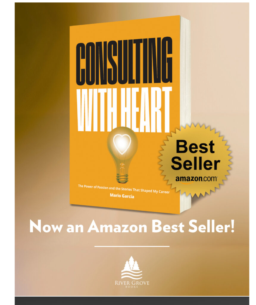
Consulting with Heart — my 17th book—is here! Ready to order. Thanks for making it already the #1 Hot New Release for Media & Communications Books at Amazon.com. Also available from Apple, Barnes & Noble, Target, Torchlight.
Written from my more than 200 diaries. Fueled by people I have met along the way in my journey through 122 countries, this book isn’t just about strategy. It is about my five-decade journey, 750+ projects and my role as an interpreter of dreams for my clients.
amazon.com/dp/1966629958; Apple Books – ebook
Workshop deals with the two big revolutions facing editors
For me, it is imperative that editors approach content creation thinking in terms of mobile first.
Mobile first involves the type of transformation where all content is prepared thinking from small to large platform. Thinking small platform does not mean that the reporter conceptualizing a story for mobile consumption should not think BIG. So, plan from small to large, but think big in terms of the story content and the visual assets that go with it.
While mobile first is still elusive to so many newsrooms around the planet, here we are, in 2024, faced with an even bigger challenge not just knocking at our doors, but already IN: Artificial Intelligence.
Transformation and a change of mentality to face these challenges is the first step. Training and education to tackle them with a sense of focus and direction is essential.
That’s where our Garcia Media workshops come in
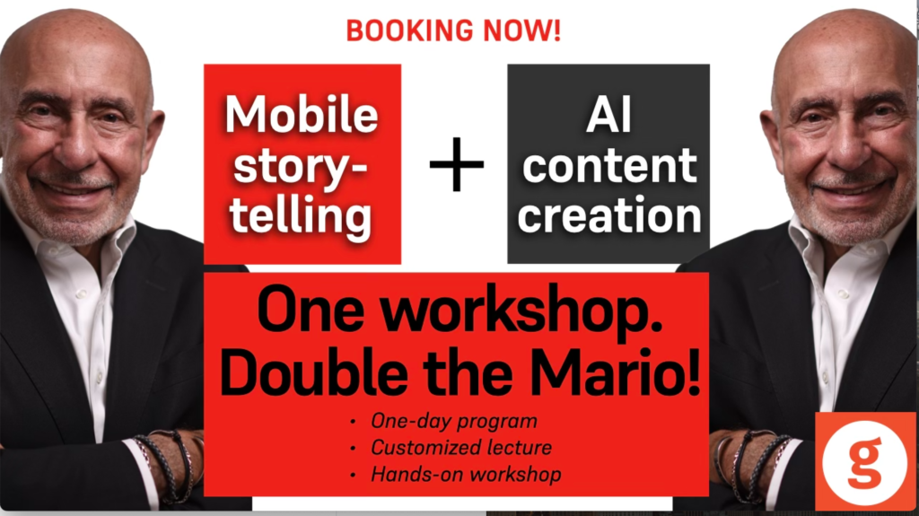
Our Garcia Media Mobile Storytelling workshops introduce your editorial team to the way we write, edit and design for mobile platforms. This one-day program includes a presentation and a hands-on workshop. We’ve added a new segment about AI for content creation.
Mobile first involves the type of transformation where all content is prepared thinking from small to large platform. Thinking small platform does not mean that the reporter conceptualizing a story for mobile consumption should not think BIG. So, plan from small to large, but think big in terms of the story content and the visual assets that go with it.
While mobile first is still elusive to so many newsrooms around the planet, here we are, in 2024, faced with an even bigger challenge not just knocking at our doors, but already IN: Artificial Intelligence.
Transformation and a change of mentality to face these challenges is the first step. Training and education to tackle them with a sense of focus and direction is essential.
That’s where our Garcia Media workshops come in!
Our Garcia Media Mobile Storytelling workshops introduce your editorial team to the way we write, edit and design for mobile platforms. This one-day program includes a presentation and a hands-on workshop. We’ve added a new segment about AI for content creation.
Newsrooms around the planet have gone mobile-first after a Garcia Media workshop!
Our Garcia Media Mobile Storytelling workshops are proven to introduce your editorial team to the way we write, edit and design for mobile platforms. It is a one-day program that involves a presentation (where I summarize my Columbia University class content), and follow it with a hands on workshop.
For details, to customize, and to book: mario@garciamedia.com
How we use AI
Honored to be mentioned here:
https://www.newsroomrobots.com/p/how-10-news-industry-leaders-use
Order my AI book here:
https://thaneandprose.com/…/preorder-ai-what-to-expect…
Blog post # 4025