Update #2: Monday, Oct. 4, 09:52 Bogota
TAKEAWAY: It is the morning after El Tiempo launched its new concept and design. Some like it, some don’t, as it is always the case. And, of course, how can a new design be launched without a couple of readers saying it looks like USA Today—-even in Colombia, where that newspaper is not distributed. This and more in today’s blog post, which will be updated throughout Monday as more reactions pour in. ALSO: The Commonwealth Games open in Delhi, and we show you some pages of the opening night ceremony
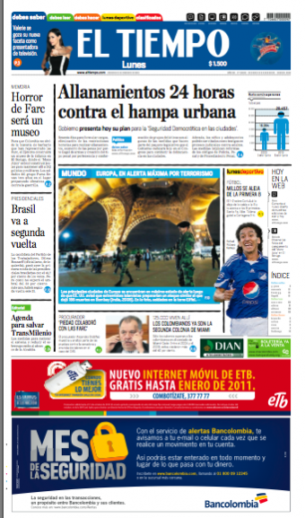
Front page of today’s El Tiempo, second day of the new concept
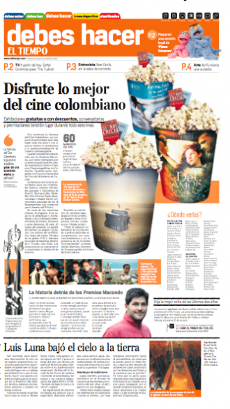
Opening of Debes Hacer (What you must do) section today Monday
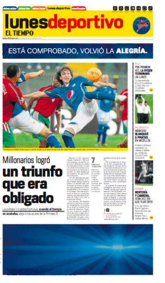
Opening of Lunes Deportivo (Sports Monday) in today’s El Tiempo
The morning after
So it is now Monday morning, and El Tiempo’s new look and concept have been in the hands of readers across Colombia for 24 hours.
Typical of what happens when a change like this is made, reactions fall on both sides of the aisle.
There are many who like it, consider it modern, easier to read and “love the colors”.
Then there are the others, who do not feel the change is a good one, and who claim that, although the design may have changed for the better, El Tiempo has not really made any inroads in improving its content or coverage of specific areas.
The “it’s-like-USA Today” syndrome strikes again——and again!
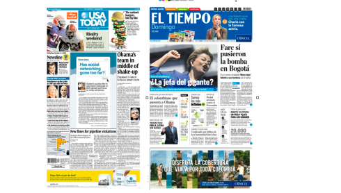
Front page of El Tiempo and front page of USA Today: Similar? Really? Well, both logos are blue, period

Marilyn Monroe, Madonna and Lady Gaga: similar only in their blonde ambitions
And, of course, as we hear right after every redesign anywhere in the world, there is the one person who writes:
‘You have turned my newspaper into USA Today”.
Incredible how the look of that colorful American newspaper that was founded in 1982 can still remain sealed in the minds of so many readers, and it is forever used as a point of comparison when it comes to discussing the redesign of another newspaper. I have lived through that comparison in dozens of projects across six continents.
It is possible that USA Today, indeed, represents the ultimate iconic image of what a colorful newspaper is all about, recognized as such globally.
But, the best reaction to a newspaper looking like USA Today, in my experience ,is the one from a Wall Street Journal reader who wrote, right after we introduced color to the venerable financial daily in 2001:
“If I want to read USA Today, I buy USA Today. I don’t need color in my Wall Street Journal”.
As we all know, color remained in the Wall Street Journal to this day——and if one looks at today’s WSJ in the USA, it is even more colorful in the Murdoch era than it was when we first introduced that touch of “champagne” as wallpaper for the “What’s News” section on page one—-a daring and questionable move at the time.
First day reactions are just that: an immediate response to the change before our eyes, just like when the interior decorator moves the piano from the living room corner to directly under the window on the other side. It is not quite the same at first, then we think it was our own idea to move the piano there.
And when color was introduced to the Wall Street Journal Europe, a woman reader wrote:
“I am no longer living in Ohio, I don’t need USA Today here in France”.
Indeed, a passion for one’s newspaper and fear of any changes is what colors the opinions right after a redesign is launched.
Comparisons will always be made, and we hear them in popular culture as well. Take for example, those blonde goddesses, past and present: Marilyn Monroe, Madonna, Lady Gaga. We often read chronicles or see photo galleries of the three of them, for comparative purposes. Yet, these are three totally different artists—-and women—- united only through their blond ambitions.
It is exactly the same with USA Today which has become the icon engraved in our collective minds to respond to what readers might persist as a “color assault” on their hometown newspaper.
What is a designer to do?
My first rule about reactions: don’t over react.
Wait 30 days to see how many of the first day’s complaints remain strong after a month of daily production. Then tackle those issues which persist as negative.
Change does not come easy to us. Readers will first find fault with the fact that the horoscope is no longer on that back page (we did not move it in El Tiempo), or that the advice columnist has left one section to appear in another (fortunately, Latin American newspapers have never thrived on Dear Abby type columns, so this was not a worry).
But, indeed, as we reorganized the entire newspaper for El Tiempo’s new concept, many department “headers” disappeared, the most noticeable of which is Financial news (Economia), which blends with the rest of Debes Saber (What You Must Know).
A few readers called early Sunday to report that they could not find their financial news. Obviously, editors immediately raise red flags (should they be BLUE flags as this is the Debes Saber section?), and we are discussing that. Other readers, however, claim that they had no trouble distinguishing economic news from the rest of the offerings in the blue section. It is too early to tell.
One special note of appreciation
This was a well worded note from María Carolina Sánchez Blanco, chief of corporate relations for Microsoft Colombia, who wrote:
I can’t wait one more minute. I have read the paper cover to cover. Everything is beautiful, but, beyond beauty, I see it as imaginative, innovative and with journalistic weight.
Upon finishing reading the paper, I felt like one does when turning off the TV, as if I had watched a great movie with many chapters.All of this to tell you that I felt envious, the good type of envy. How I wish I had been part of all these changes and innovations. If there is one thing that can change to continue telling stories, it is journalism itself. Wishing you much success in the months ahead, and keep those stories coming
Assorted reactions from Tweeter
I translate here a series of Tweets we gathered in the first two hours of the new El Tiempo out in the streets
lorenamafi Lorena Machado F.
I see too much color and not so much good content
5 minutes ago
jbedoyalima Jineth Bedoya Lima
Good morning, what did you all think of the new El Tiempo and eltiempo.com?
6 minutes ago
paolitaduq Paola Duque
The transformation of the new El Tiempo is more practical 🙂
13 minutes ago
tatikavila Tatiana
I love the new El Tiempo concept: easy to read, cool 7 minutes ago
Quinternatte Hugo Quintero
El Tiempo has finally recognized its own evolution; adopting the blue that identifies it: The Conservative Party. It now represents the right
19 minutes ago
AlejaRod Alejandra Rodriguez
Indeed! “Very good” the new design of El Tiempo, but it continues to have spelling and grammar errors cc @bacteriaopina
19 minutes ago
alejobaena Alejandro Baena
I don’t like the design of El Tiempo at all!
29 minutes ago
AlisCNN Krupskaia Alís
El Tiempo #Colombia changes and it looks very good http://bit.ly/9EazQW
29 minutes ago
Ginitastar Gina Romero
I like the new face of El Tiempo; fresher, more friendly visually
45 minutes ago
zootwitte Sr. Zootelo
I have read El Tiempo redesigned, or was that USA Today?
5 minutes ago
jjorgegiraldo JORGE GIRALDO
They should have never published this new El Tiempo design, why continue to print on paper, hurt the environment, just do digital
49 minutes ago
PabloCHenao pchenao
@norbeyquevedo El Tiempo, instead of worrying about design, should take a look at its content!
50 minutes ago
DiegoBaez Diego Báez .
To tell the truth, I really like the new front page of El Tiempo, printed; now I wait to see the online version. Congratulations!
3 minutes ago
jhendez Javier E. Héndez
There is something I can’t figure out about this new look for El Tiempo: too sparse?…. #miopinion #eltiempo
58 minutes ago
GabO_Orange Gabriel Naranjo
I love the new format of El Tiempo, very dynamic
1 hour ago
JuanFGiraldo Juan F Giraldo
I like the new format of El Tiempo. It appears that it faces the challenges faced by the printed press in the 21st century
hour ago
drheberth Heberth Cataño
Did not like at all the new look of El Tiempo 🙁
1 hour ago
ALopezCatering diego andres lopez
@ ZuluagaCamila
I like very much new look of El Tiempo. It is very good, modern, friendly, easier to read. Bravo.
1 hour ago
fonsecamonica Monica Fonseca
I am buying El Tiempo in its new design; it enters a new phase; good work
1 hour ago
aurita79 Aura Garcia
So sorry to see so much color, hope Semana magazine does not the same, lose its seriousness
1 hour ago
PabloRodriguezB PabloRodriguezBlanco
New design for El Tiempo; for the first time in its history El Tiempo gets ahead of El Espectador: http://www.citytv.com.co/videos/274296
2 hours ago
gamba952 Fernando Gamba
@eltiempocom
All innovations are good, welcome to this new version of El Tiempo
2 hours ago
rociofrancom Rocio Franco Moreno
@ SairBuitrago
This new design of El Tiempo is relaxing to read, nice with blue color and format.
Changes for eltiempo.com as well
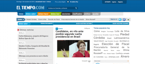
Today www.eltiempo.com also introduced a new design to go with the changes created for the print edition.
We see here how the color coding of the sections carries through to the online edition.
Go here to find out more details of how the new eltiempo.com benefits the user:
http://www.eltiempo.com/ayuda/
To read our other posts about El Tiempo’s new concept
El Tiempo launches new concept today
https://www.garciamedia.com/blog/articles/el_tiempo_launches_new_concept_today
El Tiempo :selling the concept to editors, readers, advertisers
https://www.garciamedia.com/blog/articles/el_tiempo_selling_the_concept_to_editors_readers_advertisers
El Tiempo at 100: a fresh proposition journalistically, visually, digitally
https://www.garciamedia.com/blog/articles/el_tiempo_at_100_a_fresh_proposition_journalistically_visually_digitally
In India: Commonwealth Games 2010 open
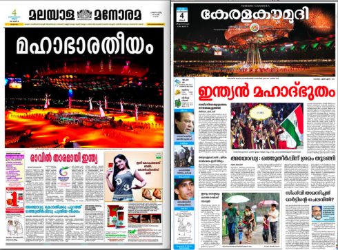
Pages from Malayala Manorama, published in Kerala
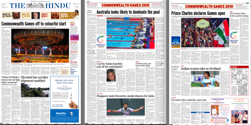
Pages from The Hindu, one of the national English-language dailies of India
We show you here assorted pages from two of our newspaper clients in India as they covered the start of the Commonwealth Games 2010 in Delhi.
Malayala Manorama, published in Kerala, displays large color images to present the opening night ceremony. Inside pages devote ample space to the Games, which have been marked by controversy the past few weeks for what some participating countries described as “poor preparations” especially in the athletes’ village. But, alas, the games have opened. We will show you more pages of Indian newspapers as we receive them.
The Hindu, one of the premiere English-language dailies in India, is published in Chennai, but has editions throughout most major Indian cities. Here is how the newspaper covered the opening of the Commonwealth Games 2010, with smaller images accompanied by text.