TAKEAWAY: This is our weekend edition of TheMarioBlog and, after a busy week in Hong Kong, we catch our breath in Europe before proceeding home to the US. We bring up some subjects of interest this week, plus some recommended weekend reading. And Reed Reibstein’s pick of six must-download type related apps stays on.
Update #3: Saturday, Aug. 27, Luxembourg, 11:07
Bild gives us the biggest-size newspaper in the world
Today’s edition of the German newspaper Bild surprises us again. At a time when newspapers get smaller, and the iPad screen reduces it all to a tiny 10-screen, Saturday’s Bild breaks the mold with gigantic pages, actually posters, in a special edition celebrating the 100 Biggest German Stars of all Time.
Bigger is better, is Bild’s credo, and we see it all the time in here as Frank Deville presents us the Bild pop ups regularly in this blog, but today Frank chimes in with this very special edition, where each page doubles the size of the original Bild pages, and, pages are not stitched so that each page becomes its own poster, including for advertising.
Among those stars mentioned: Marlene Dietrich, Heidi Klum, Romy Schneider, Diane Kruger, Boris Becker, Stefi Graf, Ty Sweiger and Katarina Witt .


Here is front page of Saturday’s Bild, twice the size of the regular broadsheet daily—modeled by Rosi
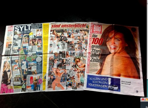
Here we place the gigantic poster-like Bild next to a regular broadsheet format and a tabloid size newspaper
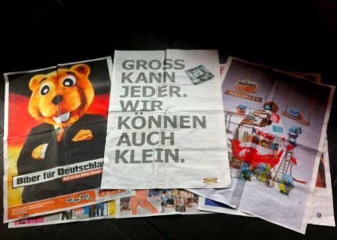
Even the advertisers joined in the poster excitement of Saturday’s Bild. The middle ad, for Ikea furniture, reads: Everybody can be big, but we can be small too
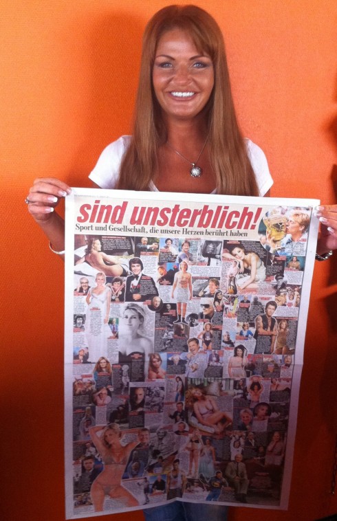
Here is the full page with images of the 100 most memorable German stars of all times-modeled by Rosi.
Steve Jobs: design leadership genius
I have never had the privilege to meet Steve Jobs
personally, although we have at least twice been in the same city, or even around the same auditorium, during the past 20 years. But my admiration for the man is immense, and not likely to diminish now that he has announced his retirement as CEO and genius in charge at Apple—-the company he has made perhaps the most successful ever in the history of corporations.
Two things always caught my attention about Steve Jobs: first, the fact that he never went out to test his products, that he had the courage and conviction to be so sure that what he was creating was exactly what the consumers wanted, that it was not necessary to go thru the sagas and discomforts of testing. God knows how many of Apple’s amazing creations would have been derailed by a focus group of well intentioned participants simply not able to fantasize; Jobs fantasized for all of us, with good results, not in an arrogant “what do they know” mode, but more in an invitation to experiment with what HE knew was right; second, the genius that he exhibited in the design of the products he created and brought to market. If good design is all about the two “s” words “sophistication and simplicity”, then Apple’s catalog of products is the design textbook that everyone needs to consult before sketching her next project whether it is a bottle of wine, a chair or, indeed, the cover of a magazine.
With Jobs we have seen the rare occasion when design and leadership can be uttered in the same sentence.
For those who are worried about Jobs’ absence perhaps indicating the decline of Apple, I say nonsense. In his resignation statement to the Apple Board of Directors, Jobs himself made this clear when he said that he believes “Apple’s brightest and most innovative days are ahead of it. And I look forward to watching and contributing to its success in a new role.”
I have learned that when good design becomes the foundation, the legacy stays. The Steve Jobs’ legacy in the design of Apple’s products is so formidably strong that we are not likely to see it change. It is, like all good design foundations, unshakeable. Future Apple designers will build upon it, as will those trying desperately to compete with Apple products, from the iPhone to the iPad.. Not only did Jobs designed the products that we have made part of our daily rituals, but he would bring the same level of beauty, sophistication and functionality to everything Apple—-including the design of those glass staircases that we see in so many Apple stores.
Everyday I admire the simple, sophisticated design of my iPhone, my MacBookAir, my iPad. Beyond admiring, I study how functionality and aesthetics can marry and stay married.
We owe it to Steve Jobs to have provided us with such lasting union. We will miss Mr. Jobs and I personally wish him much luck as he confronts his health issues.
With Jobs we got the combination of genius, design leadership and the ability to experiment and to fantasize. There is no better recipe for pushing our projects forward.
Behind all of that must be the one ingredient that is essential to all of the above: passion.
The legacy, the lessons, the heights to which he took DESIGN in capital letters, those are going to stay with us for generations.
Of related interest: Steve Jobs
Steve Jobs’ 313 patents
http://tech.fortune.cnn.com/2011/08/25/steve-jobs-313-patents/
First paragraph:
One way to take a measure of Steve Jobs’ legacy at Apple (AAPL) is to search for his patents in the database maintained by U.S. Patent and Trademark Office. Click here to get started.
If you look for patents assigned to either Apple Computer or Apple Inc., you’ll get a total of 11,112 titles.
How Steve Jobs has changed (but not saved) journalism
http://www.poynter.org/latest-news/media-lab/mobile-media/144051/how-steve-jobs-has-changed-but-not-saved-journalism/
First paragraph:
Steve Jobs resigned Wednesday as CEO of Apple Inc., but his legacy will be felt in the news industry for years to come.
In the past five years, Jobs’ Apple has simultaneously disrupted, transformed and aided the news industry.
Steve Jobs and the Economics of Elitism
http://www.nytimes.com/2010/01/31/weekinreview/31lohr.html
First paragraph:
The more, the better. That’s the fashionable recipe for nurturing new ideas these days. It emphasizes a kind of Internet-era egalitarianism that celebrates the “wisdom of the crowd” and “open innovation.” Assemble all the contributions in the digital suggestion box, we’re told in books and academic research, and the result will be collective intelligence.
Bild and Steve Jobs’ resignation story
Today, Bild Zeitung carries a piece on the contributions of Steve Jobs, complete with German/English versions of his letter of resignation to the Apple Board of Directors.
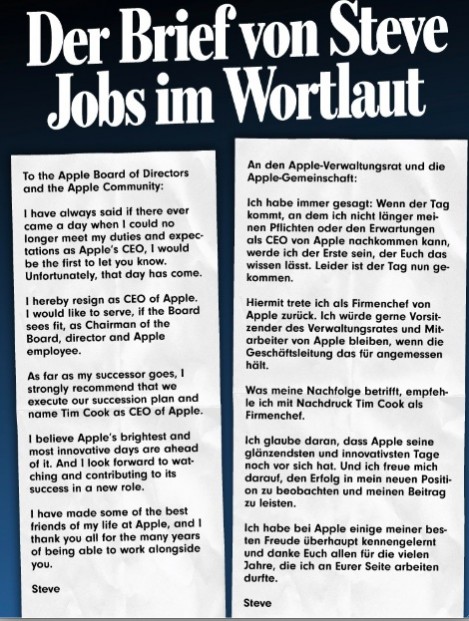
Bild runs Steve Jobs’ resignation letter to the Apple Board of Directors in both English and German
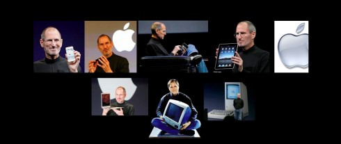
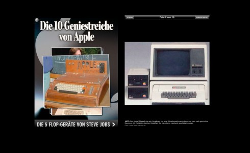
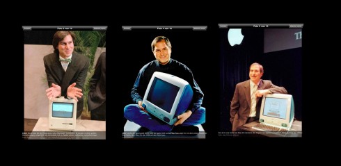
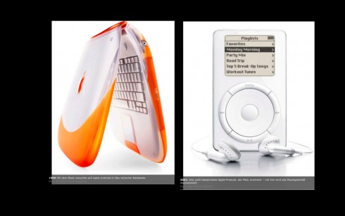
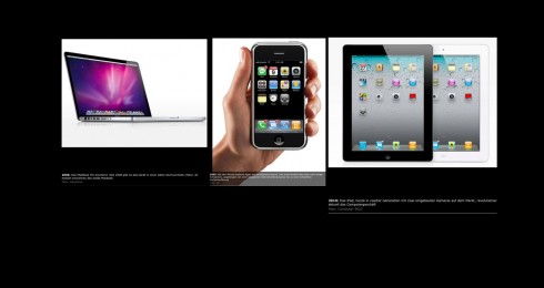
In addition, as you see here, an illustrated list of Steve Jobs’ 10 Most Genius Creations for Apple.
Weekend readings
And the iPad wore white…..
Indeed, an iPad very present at a wedding.
Summary: Case in point. A woman named “Renee” did not want to miss the wedding of her friend, Jamie Wilborn, to Jonathan Alberico in Denver. But Renee couldn’t make the big event. She attended anyway, via an iPad. The iPad, however, was not placed on some seat or discreet location out of the way. It was in the actual wedding.
A Bridal Party App for the iDos
http://www.cnbc.com/id/44275292
Newspapers to thrive in Latin America
Although this report is in Spanish, as published by Argentina’s La Nacion, the information is interesting and useful: According to a recent study by Price WaterHouse Coopers (PwC), circulation of dailies in Latin America is expected to grow during the next five years, generating more than US$7.5 billion in revenues.
This, at a time when US and European newspapers continue to suffer from dropping circulation. The growth will be led by newspapers in Argentina and Brazil.
For an English summary: http://www.portada-online.com/article.aspx?aid=6633
TheMarioBlog post #842
Six Must-Download iPad Apps for Typography Fans
TAKEAWAY: A look at six typographic iPad apps by Reed Reibstein for the Society of Publication Designers. ALSO: Post cards and memories
“Six Essential iPad Apps for Type Lovers”
In his second blog post for the Society of Publication Designers website, our Garcia Media art director and project manager Reed Reibstein takes a look at six iPad apps for those of us who love fonts. His post is reproduced below:
The language of magazine design is type. Publication designers have to know a loop from an ear, a ligature from a swash, and Erik van Blokland from Mark van Bronkhorst. Aside from being a spectacular device for news apps (as Mike Burgess, Joe Zeff, Jochem Wijnands, and Michel Elings described at last month’s “Indie App Night”), the iPad boasts a number of truly useful tools for letterform education and inspiration. Here’s a typographic twist on our ongoing series of essential iPad apps.
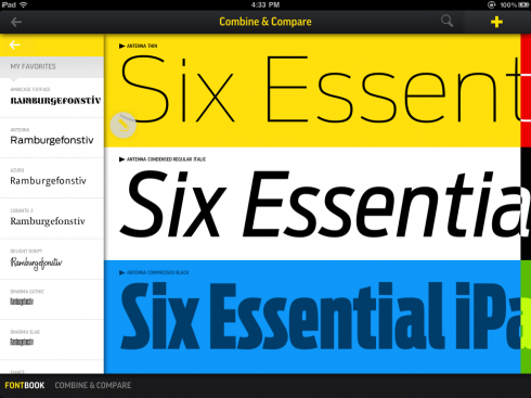
Above: Comparing typefaces in FontBook
FontBook
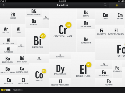
The successor to the familiar yellow and black compendium, the FontBook app has already been described on the SPD website. But it’s so good that it deserves another mention. The app’s minimal design focuses the user on its mind-boggling 620,000 typeface specimens instead of a flashy interface. Upon entering one of the systems used to categorize the type families—alphabetical, typographic class, year, type foundry, and designer—you encounter tiles cleverly sized to reflect the relative size of each group. You might notice a few of your favorite foundries missing, such as Hoefler & Frere-Jones, Village, and Commercial Type. But the advantage of a digital platform is that the database can be updated, and the editors may add more foundries in the future.
FontBook’s type specimens are the true stars, however. The app presents each family through a series of cards, showing everything from an overview of the family’s variants to the full glyph set. Other family members, such as a condensed width or a sans-serif version, are listed on the left, along with the designer’s other typefaces and, sometimes, similar typefaces. One might be concerned that the iPad’s 1024 x 768 screen would not show type near text sizes accurately, but the 18 pt. samples are surprisingly good, especially for faces with limited contrast.
FontBook also allows you to set your own samples. You can see any typeface big, crisp, and in a number of different color schemes – perfect for mocking up a new logotype on the fly. Most designers these days head to the MyFonts, Veer, or FontShop websites to see what a certain typeface looks like or browse typographic styles. Plan on visiting them less often with the intuitive, feature-packed, and fun new FontBook on your iPad. ($5.99)
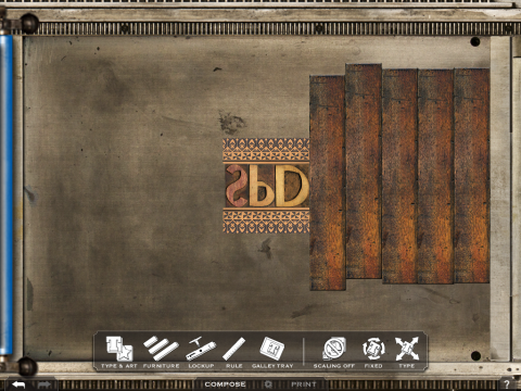
LetterMpress
When you’ve spent all day amid mathematically precise digital typefaces, sometimes you want to get your hands dirty with hand-set type. If you don’t have a Vandercook press in your basement, LetterMpress is the next best thing. John Bonadies and Jeff Adams painstakingly scanned, photographed, and animated all the deliciously imperfect parts that go into letterpress, supported by an enthusiastic Kickstarter campaign. Just like the real thing, you use furniture and quoins to lock up your letters from one of twenty wood fonts before printing. (Luckily for those of us who never mastered this art, the app is much more forgiving.) Submit your best imitation of Power Platon to the LetterMpress Flickr group, which is already full of some spectacular designs. ($5.99)
Type Specimen by Suitcase Type Foundry
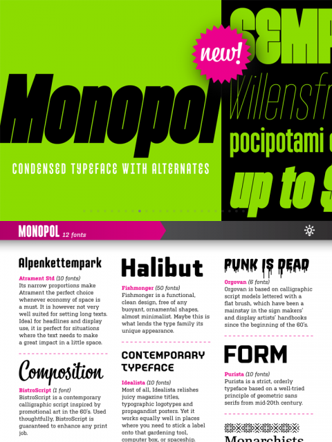
Amid the thousands of type families in FontBook are twenty-three by Tomas Brousil. Lest they be lost in the shuffle, his Suitcase Type Foundry has its own showcase. This attractively designed app serves up specimens of angular Fishmonger, versatile superfamily Tabacand Tabac Sans, and Brousil’s newest, Monopol, a compressed family poised for impactful headlines. The app’s most interesting feature is “Combine,” in which you can mix and match Suitcase typefaces in simplified magazine layouts. If you come up with any killer combinations, please share them in the comments below; we’re partial to Kulturista headlines with RePublic text. (Free)
Typography Insight
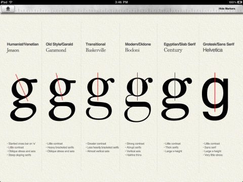
Typography Insight is a classroom in an app. Even the biggest type geek will learn something new from Parsons masters student Dongyoon Park‘s eight exercises. The terminology and historical typefaces sections are good to have at hand should you need to identify the enclosed space of an “e” or classify a serif face. In the “Compare” category, examining letters up close yields surprises—can you name the differences between a Bodoni and Didot “r”? We could see this app being valuable for typography classes and professional studios alike. ($1.99)
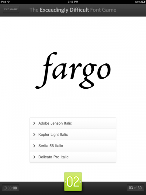
The Font Game HD
Switching from the classroom to the arcade, Font Game HD is the iPad version of the popular iPhone app from I Love Typography. In addition to the classic game, in which players identify twenty type specimens as quickly as possible, the revised app features three further attractions: a reverse version of the classic, terminology identification, and a typographic take on Concentration. Watch out—it’s highly addictive. (We’re not sure whether we should flaunt or deny our first place scores in two of the twelve games.) Though the Font Game may seem less educational, it may just show you the perfect typeface for your next project, especially when you set it to be “Exceedingly Difficult.” ($3.99)
Elementar Font System
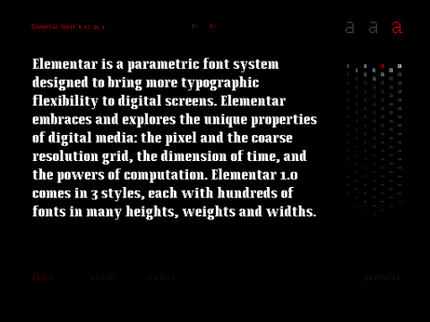
Elementar is an app and a type family. A strange concept, but Typotheque, its creator, does push the envelope for letterform experimentation. (The foundry’s other app, Dance Writer, choreographs dancers to spell out messages.) Elementar the app is an interface for Elementar the type family, which is made of 420 individual fonts by Gustavo Ferreira. Instead of adapting a typeface’s curves to the pixel grid, Ferreira took the opposite approach, designing pixel fonts for each possible height, weight, and width. Sliding your finger along the screen to control the parameters, it is astounding to think that each variant is a unique font ready for use on the web. (Free)
Thanks to FontBook editors Juergen Siebert, Yves Peters, and Stephen Coles for their assistance.
Of special interest today
The 9/11 Memorial: Past, Present and Future , is a look at the World Trade Center site—including the original development of the Twin Towers, the attacks that brought them down and the process behind the construction of the memorial and the accompanying museum. With more than 400 still photographs and hours of video clips. It will be free to the public between September 1 and September 12, and can be purchased for $9.95 thereafter.And it will be available exclusively on the Apple iPad.
Memorial App to be iPad Exclusive
http://www.observer.com/2011/08/911-memorial-app-to-be-ipad-exclusive/
Interesting perspective on going iPad only for this publication.
http://daringfireball.net/linked/2011/08/24/911-ebook
Post cards: remember them?
Well, I saw a man totally concentrated on the writing of a post card from Hong Kong to someone far away. He seemed so into his post card writing that I approached him, to congratulate him for doing so.
It is not everyday that you see someone writing a post card anymore. I used to send many of them myself, but rarely do I stop to buy one and to send it. Emails do it for me, and for many others. I also don’t receive them at all.
Yet, as I engaged in conversation with this stranger, we both agreed that post cards reflect a time when things moved slowly. And, as he put it: “It is so nice to let one’s thoughts flow through the pen.”
Indeed.