TAKEAWAY: It is a new iPad app for Newsweek and it may represent what magazine apps will be like in 2012: moderation rules, reading mode is king, photos shine and, well, you will find one bell and one whistle, not a dozen.


Newsweek has introduced its new iPad app with the current edition of the newsmagazine. We have taken a look.
It is friendly. It is visually familiar if you subscribe to the print edition—-which has undergone major changes since Tina Brown took over as editor a little over a year ago. Just as the print edition thrives on the contrast of black, gray and red against ample white, the screen follows the same route.
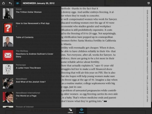
In terms of navigation, there are two choices using Adobe’s paradigm: a vertical nav bar drops down on the left hand side of the screen to guide you to your next destination within the magazine, or you can browse by touching the upper right hand side of the screen where a browser icon appears. That one offers what looks like a clothes line in the middle of the screen Tap the screen to bring up navigation tools, which work well. There is scrolling, and there is swiping (scroll to read within an article, swipe to switch to the next piece).
Grids fluctuate from full screen single columns, but with good interline spacing, to two column pages to variations based on a four-column grid.
I like the typography—Titling Gothic and Acta—and how it picks up where the new design of the print edition has made great improvements since the last redesign: good use of type to highlight quotes.
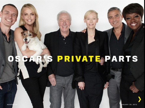
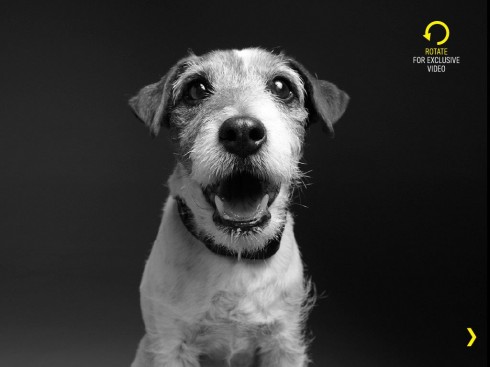
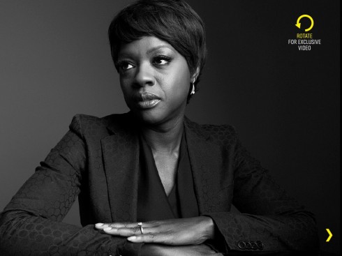
In this first issue of the new iPad, the highlight—the bells and whistles, but nicely done—appear for the magazine’s annual Oscar roundtable, where editors interview a select group of actors nominated for the Oscar. This is always a fun read. I had read it in the print edition of the magazine earlier today while flying towards Oslo, and now have experienced the iPad version: videos, audio and surprises abound here.
I must admit that this is the only part of the magazine that differentiated from the printed edition, but it is well done.
I also admit that my finger found itself tapping into static images for interactivity more than once, but I understand that, as I have said often, creating news iPad apps is an evolutionary process. This is a great start for Newsweek and I look forward to seeing it regularly.
?
Ironically, if Newsweek had tried to come out with an iPad app for its magazine a year ago, it probably would have done more to keep the finger busy. It seems like ages ago that magazines, specifically, thought they had to come out of the gate with tons of special effects. Everything, it seems, had to move, pop up or make a sound. Now, we know that it does not have to be. We just have to plan content flow, and finger activities, in a moderate but consistent manner.
Newsweek’s new iPad app did not quite achieve that balance, but it more than made up for it with how it handled the Oscars roundtable. My suggestion: plan three levels of “finger activities” for each edition—-the simple pop up, the middle range pop up, and the lead pop up.
Let the designers, those twins in their bow ties, the Brothers Mueller, tell you all about their new creation: