TAKEAWAY: We may subconsciously bring elements of digital design and functionality when we design our print products. Color, navigation, graphics and symbology begin to take a new role in print because of our digital experiences.
Recently, why doing a project track for our internal team, I managed to get four of our existing rethink projects together side by side, since these are the titles that will launch a new look before July 1. I normally do these project tracks to alert everyone on the Garcia Media team about our progress, so that all are informed and on the same page.
The moment I looked at the four front pages of these newspapers in four different countries and continents, one thing was obvious: color use.
Not that color has not appeared in most of our projects since day one, but what got y attention was the variety of hues in the color palettes of these projects, as well as the choices, especially for logos, an area in which little, if any, color experimentation every took place, but that seems to be a very organic and fertile ground in which to take color to the next level now.
And because my observation about color was spontaneous and fun, I sent the image of the four projects side by side to my good friend, colleague and design and color expert, Dr. Pegie Stark Adam, with whom I have collaborated on a variety of projects, including the Poynter EyeTrack series for print and online, the past 25 years.
Pegie brings a unique perspective to color and design because she is also a fine artists with a rich collection of paintings to her credit, at least one of which I am proud to be the owner of and to display in my home.
I sent the pdf of the images to Pegie, but did not mention my reaction to the color.
A few hours later I got her mail and her informed response, which I share with you:
“What I am noticing in the world around me is that color palettes are becoming more vivid and now I see why – the introduction of the tablet. I see how beautiful and rich colors can be on my iPad. It’s almost like painting rather than printing on newsprint which always creates color intensity problems. “
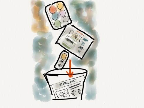
The digital influence
Pegie is right. Indeed, we consciously or subconsciously design for print with a sort of digital sense behind what we put on the pages. Not just for color, mind you, but also and especially for navigation, the use of icons and symbology, the display of graphics.
Only this past week, while showing first set of designs to a group of clients in the United States, a member of the group commented:
“That front page looks very much like something you would see in a tablet.”
Until he said it, I had not observed that, in fact, this newspaper front page could easily appear in a tablet edition and call your finger to action on the screen of that iPad.
There is nothing wrong with that, as long as we are well aware that a printed newspaper edition is NOT a tablet, or online edition. But there is benefit, and I become more aware of that each day, if we take certain functional design strategies and apply them as much as possible across the various platforms in which a title presents its information. Not just in extending brand recognition, but functionality.
This is an interesting area to continue to observe and to experiment with. Perhaps those cognitive psychologists who study how users engage with various platforms in today’s media environment will tackle the subject and offer us some insights.
Meanwhile, however, I am fascinated by Pegie’s comments that when we design for the tablet, for example, we are sort of painting on a canvas, as opposed to placing—or hanging—elements on a page, which is the case when we design for print.
Even more fascinating is how art (in its most pure sense), design, marketing, psychology and technology mix in this process.
Of related interest:
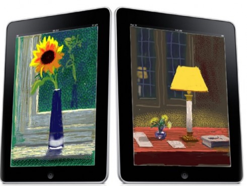
The work of David Hockney on the iPad
Pegie tells me that she is studying the David Hockney iPad paintings. Hockney, considered one of the most influential contemporary British artists, has taken to the iPad as his new canvas. See him in action here:
And here is story about David Hockney art on iPad:
http://www.bbc.co.uk/news/technology-11666162
The iPad Design Lab: Storytelling in the Age of the Tablet
Video walkthrough of the iPad prototype of iPad Design Lab