Update #3 Monday, April 11, 17:28 Tampa, Florida
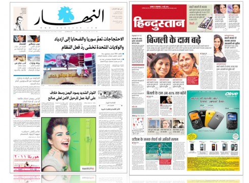
TAKEAWAY: We will be covering this unusual day when two of the projects we at Garcia Media have been working with launch on the same day. Be on the lookout for case study updates for Lebanon’s An Nahar as well as India’s Hindustan.
This blog will be periodically updated between now and Tuesday
These two projects have been going through the pipeline for about six months.
IN both cases we had to work with a non-Roman alphabet.
In both cases the newspapers involved in the rethinking are institutions in their environments, with a rich historuy, great readership and a position of leadership.
In both cases the management wanted to take the products further, not just in terms of design, but going for entire rethinking of content and how it is presented.
In both cases, the brand (logo) were worked with, maintaining the familiar but advancing to freshen them up and give them a more contemporary look and feel.
An Nahar: Lebanon’s leading newspaper
Ask anyone in the Arabic world, and he will tell you that An Nahar (which means The Day) is, without a doubt, one of the most distinguished and respected Arabic-language newspapers in the world. So I was greatly honored when its publisher Nayla Tueni called me in what was supposed to be a short visit “to take a look at the design ideas we haven and plan to implement”.
Indeed, I did that, but found out that there was so much more that could be done with this giant of a newspaper. Why go half way when one could go all the way, take a look at content and its flow, consider the possibility of new topics covered daily through supplements.
Nayla and her team accepted my suggestion and decided to put aside the minor redesign done in house and to tackle this as An Nahar project of greater magnitude.
For Nayla, this was a project that was as important on the personal as well as the professional level.
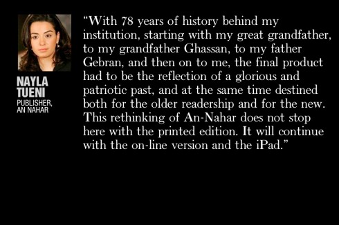
“
Whenever my late father Gebran Tuéni wanted a change for An-Nahar, he always resorted to the experts in the field.
It was only very natural then that I call on to the experts to handle the project of the revamping of An-Nahar.
When I got in touch with Mario Garcia, I was very hopeful but skeptical at the same time. We had little time ahead of us and I only wanted the best.
Mario’s answer was that he “believed in miracles” but that the project would still take some time.
Here we are today at the end of a few months of hard and continuous labor.
The maquette is born. The challenge was big. It still is,” she said in the hours before the Tuesday launch of the new An Nahar.
The process began with a review of An Nahar’s typography.
A new font created uniquely for An Nahar
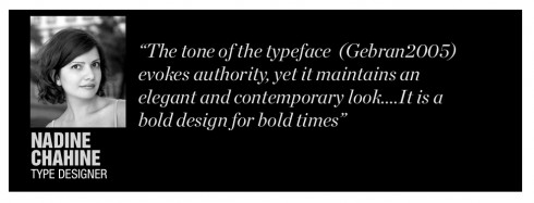
Enter Nadine Chahine, of Linotype, based in Germany. Nadine is one of the busiest and most talented Arab font designers in the world today. We had the pleasure of doing some work with Nadine when redesigning Al Shabiba in Oman, where she retouched the logo. I contacted Nadine and she was happy to join our team.
Immediately, Nadine, who is originally from Lebanon, told me “Oh, Mario, I grew up reading An Nahar. It is an institution. My dad even writes for An Nahar from time to time. A great newspaper. It should have a font created just for them.”
Why not?
The next step was to convince Nayla and her management team that a special font and the costs involved were justified. But this was not difficult to do, and Nayla came on board , asking Nadine and her LInotype colleagues to go to work on what became Gebran 2005,in honor of Gebran Ghassan Tueni , a third-generation journalist, who was editor and publisher of An Nahar until his assassination by a car bomb December 15, 2005. The memory of Gebran is everywhere around the building of An Nahar, and with every person working there, especially with his daughter Nayla, now in charge of taking An Nahar to its next chapter in the life of the Lebanese people.
“Oh mountain, no wind can shake you” – this is the Lebanese saying that inspired Nadine as she created the Gebran2005™ typeface.
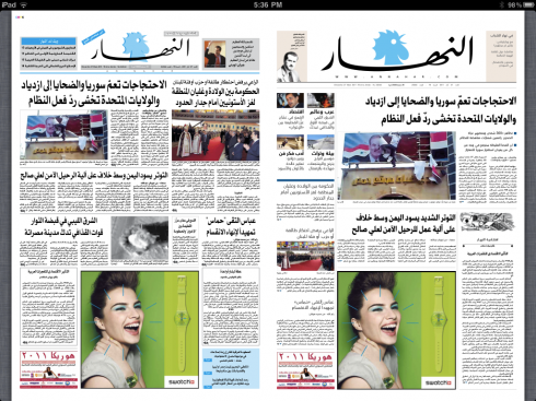
The new front page
My first impressions of An Nahar were that photos ran too small and usually all the same size, a point that we had to emphasize in all workshops. In addition, a tendency for very long texts to run on inside pages without any breaks or other secondary readings to help the reader.
And An Nahar had no effective navigational system, so one was introduced on the left hand side of the page.
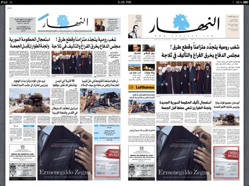
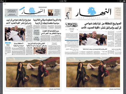
The following simulations show the work of art director Ziad Kassis, working closely with us, and approaching many of the front pages that appeared but using the new styles. Notice that these front page simulations are done matching the exact advertising configurations of the original front page, including when the ad covers 50% of the front page.
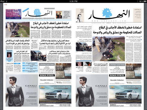
A series of other prototype pages for An Nahar follow
_jpeg_thumb.jpg)
This is a Page 2 prototype: creating hierarchy not just for photos, but also for headlines, incorporating graphic elements to break up the long masses of text
jpeg_thumb.jpg)
A sample business page: introducing more graphic elements for storytelling
This is an example of the design we created to allow the editors to use quick reads, numbers and destination elements as part of storytelling throughout the newspaper
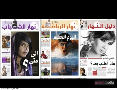
The rethinking of An Nahar introduces lifestyle topics daily through new supplements as the ones seen above
Marketing concept for the new An Nahar
The marketing campaign for An Nahar’s new concept has been extensive. We show you here three aspects of it. Here is how Candice Saghbini, director of An Nahar’s public relations, describes the campaign:
The ink concept is based on a famous quote from Gebran: “ Our promise remains one and the same, and that is to continue to work to maintain freedom, support democracy, reclaim our sovereignty and the right to make our own decisions, safeguard our independence, and promote Lebanon’s role in the world until the very last drop of ink in our hearts, and the very last drop of blood in our pens… Proclaiming freedom every morning with the rooster’s crow”.
Here is how the marketing campaign was mapped out, according to Candice:
In the week preceding the event we started our campaign on TVs, radios, print and web banners, announcing the “free distribution” of An-Nahar on April 12. For that day we are doubling the quantity of printing, as we are aiming to reach a maximum number of the Lebanese people in all the different regions. We also printed T-shirts for our regular salesmen which will stand in the big cities, major roundabouts, universities, crowded streets… to distribute the new Nahar. We organized 2 campaigns: 1 to announce the “free distribution” initiative which was also kind of a teasing campaign (it will end tonight) and the main campaign will be launched tomorrow with main slogan ““A new An-Nahar for every free person. We used the following communication tools for our campaign: unipoles, rooftops, LEDs, scrollers, print (magazines and Newspapers), TV corporate spot, radio spot.
Hindustan case study follows
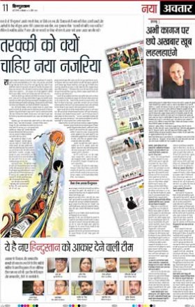
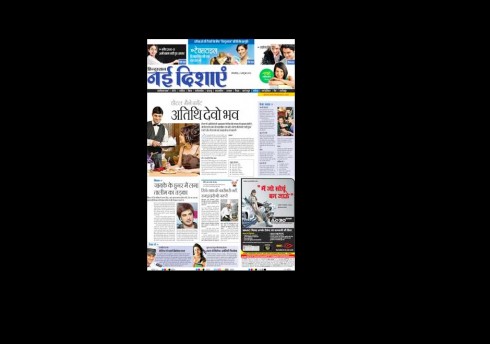
This is the page that appeared in Monday’s editions of the Hindustan announcing the changes
One of our first steps in the rethinking/redesigning of Hindustan was to address the issue of the newspaper’s logo.
Immediately, we knew that we would refer the existing logo to Jim Parkinson
in California. Parkinson did several drawings until we came up with one that was generally liked. Then, the next exercise was to try that logo in various ways, from black, to red, to one with a reverse block behind it, letters in white.
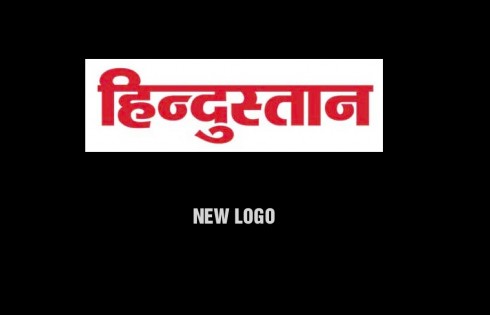
Finalized logo created by Jim Parkinson
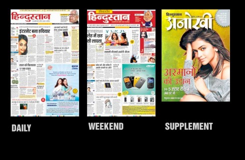
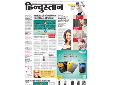
Front page style for the daily, weekend edition, and opener of Women’s supplement
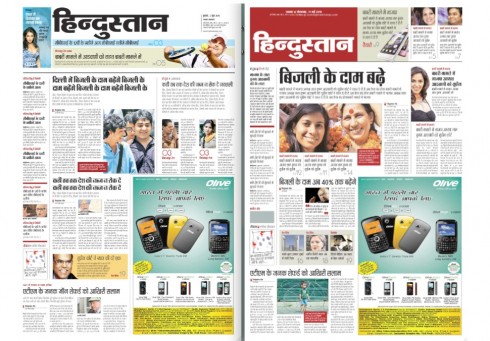
Additional supplement front page
Note: The pages above were sent to me by Anup Gupta, Hindustan Group Creative Director; he and I worked directly with Hindustan art director, Anita Singh and her team. Hindustan editor supervising the redesign/rethink process: Shashi Shekhar
To be continued through Tuesday: stay tuned for frequent updates