
I once heard a newspaper designer refer to typography as the “elephant in the room”.
Very present. Protagonistic. Sort of make it or break it for a design.
And, although I don’t see typography as an elephant at all, I understand what that art director was trying to say.
Whether one is designing a newspaper, magazine or an online edition, typography represents about 80% of what readers see on a page.
One must use typography as a design element. I sketch lines of type by hand to sort of paint with letters on the canvas of the page or screen. It immediately gives me a sense of how the presence of characters will affect everything else I do on the page.
With display type (sizes over 14 in my book) we have the ability to break up a page: horizontal lines, vertical groupings. In a sense, type becomes architecture.
With text units we create texture on a page: areas of gray broken up by sudden outbursts of bold (as in a quote or highlight).
Even the captions under photos, when crisp, bold and in a contrasting weight to the rest of the text, allow us to bring a visual touch to the page.
Type dances on the page, which is why I think of type as a gazelle—-always swift, capable of running at high speeds and jumping high.
Just like a good font and its impact on a page.
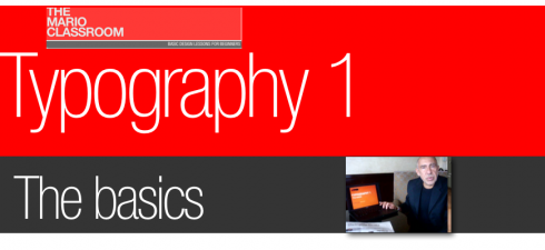
Today’s video: The Basics
I remind my readers that I am not a videographer, but I am learning as I go.
It is a high learning curve, but I am willing to be a good student.
This time, my colleague Dr. Pegie Stark Adam was around to film this three-minute video about typography. Thanks, Pegie.
My hope is that beginners in classrooms around the globe will be able to take this simple lesson and either refresh their knowledge about type basics, or learn why the structure of each letter is important when making type choices. Let me know if you have questions.
This is, indeed, a classroom setting, and even if I cannot see you raising your hand in the back of the room, I can react to your questions as posted here or by email: mario@garcia-media.com.
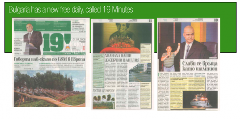
A new free daily newspaper in Bulgaria
It is called 19 Minutes and it is the first free daily published in Sofia:
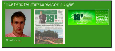
Alexander Krastev is a fourth year student in the faculty of journalism and mass communication, SU “St. Climent Ohridski”, in Sofia, Bulgaria. Here he answers my questions about this new daily that just premiered in the Bulgarian capital. Alexander also manages what he describes as “the biggest blog for non-commercial book reviews in Bulgaria.”
–
1. What media house produces this new free paper 19 Minutes?
The new paper is produced by Slava Media Group (‘Slava’ is the Bulgarian word for ‘Fame’). They also publish the lifestyle Slava Magazine which is positioned in the low-cost magazine segment on Bulgarian market.
2. What is the circulation?
It is believed the initial circulation was 100 000 but it will probably rise. In fact in today’s issue they had their first ad from outer advertiser – a mobile phone selling company. So I see more advertisers really soon.
3. Are there other free papers in Sofia?
This is the first informativon newspaper in Bulgaria. There are some ad-newspapers and of course the infoguides for the culture-lovers.
<![]()
www.AlexanderKrastev.blogspot.com
www.BigTandem.wordpress.com
www.Azcheta.blogspot.com
![]()
In flight, making my way to Brisbane, Australia, a 25-hour flying journey with intermediate stops in Frankfurt and Singapore. Indeed, it is good to break up a trip like this, hit the ground, reconnect with people, take a warm shower, enjoy the pampering and delicacies of the Lufthansa F Class Lounge—nothing like it in this planet—and recharge the batteries for the next leg of the trip.
TheMarioBlog posting #85