This blog post will be updated regularly during the weekend of April 1-3
Update 2: Saturday, April 2, Hong Kong, 09:52

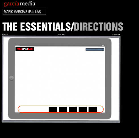
TAKEAWAY: Perhaps the most important element of creating a news iPad app is the careful planning of “directions”—-how the user can get from Point A to Point Z with other points in between in as painless a manner as possible. This is what today’s iPad Lab is all about
Without a doubt, one of the most important initial steps when developing a news iPad app is to design the “directions” that will tell users easily how to go from one part of the app to the next. Unlike the linear nature of a printed newspaper or magazine, where we can flip easily thru the pages, in tablet reading, each screen represents its own unit, and we may not necessarily know what comes next or what we have left behind, or skipped over.
It is because of this that directions are extremely important. The impatient reader, especially all those digital natives that become a larger segment of our audience, wants to move at the touch of the screen. Let’s say I am now in the middle of a cultural section article, which I have finished or decide to abandon to read top news, I should be able to, without hesitation, tap the right area of the screen to get there.
We as designers have an obligation to provide that direction in a visual and tactile manner, effortlessly for the user. Nothing can be more frustrating for an app user that a finger that taps into limbo. Tap, tap, and the third tap with no results you have a frustrated user, lost in the midst of your app.
This Lab today addresses directions and shows samples of those who do it well.
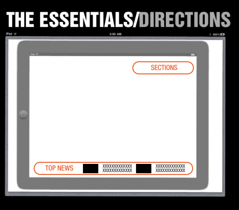
Sections, top news directions (above)
At its most basic, the screen will show you how to access all sections of your newspaper and magazine, and, in the case of newspapers, how to get to the Top News section at anytime during your journey thru the app.
Where you place the directions is less important than getting them designed and built into the screen. They may pop from the top bar or from the bottom; right or left. Users get familiarized with directions and expect to find them in the same place all the time.
The Daily: top navigation bar

The Daily excels in allowing for easy directions, allowing the user to return to any of the established sections by simply looking at the bar across the top of the screen.
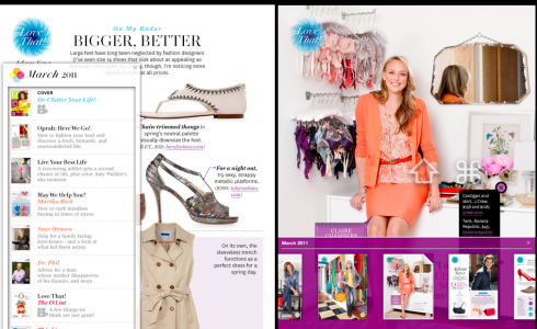
Oprah Mag app
Here is a magazine that wants to make sure you are never lost in the midst of its rich content: the Oprah magazine app offers the drop down navigator (left), as well as a carrousel of the page by page content.
The Daily prototype nav
In his prototype for The Daily, creative director for News Corp, Alfredo Triviño, utilized a drop down photo nav that offers very visual directions to what he conceived for one of the app newspaper’s early versions.
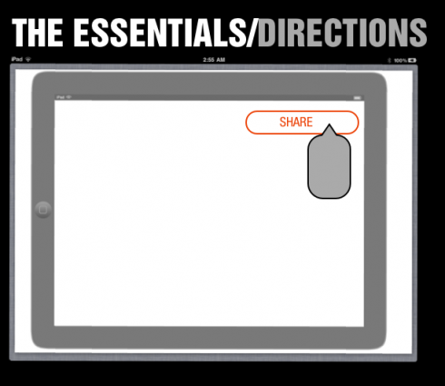
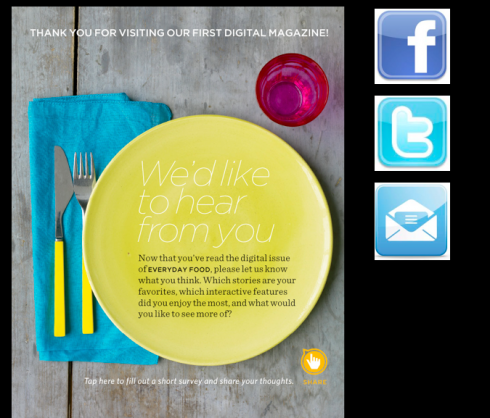
Users want to share
One of the most popular features of apps is offering the ability for the user to share the information with others, either thru email, Facebook, Twitter, or to save for future reference. It is important to make the share direction easy to find. Notice the Martha Stewart Living mag app, where almost every article allows for sharing.
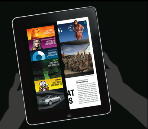
Multi media directions
We all enjoy knowing what photo galleries, videos or other multimedia offerings are in today’s app. Display those, preferably in carrousel style, so that I can see miniatures of the photos I may wish to see more of.
Users absolutely enjoy photo galleries and videos, with more preference for the photos than the videos. No surprise here.
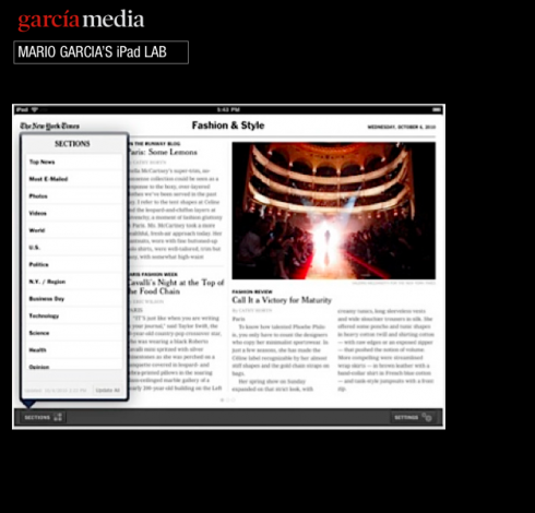

At The New York Times
The Times app allows user to access the sections pop up window anytime. Easy to use. Easy to find. Basic but essentially functional.
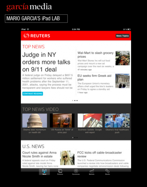
The Reuters app
The sandwich approach to easy to follow directions, with three layers: Top News, Top News Video, Top US News. Slide to the right and find the story you wish to read.
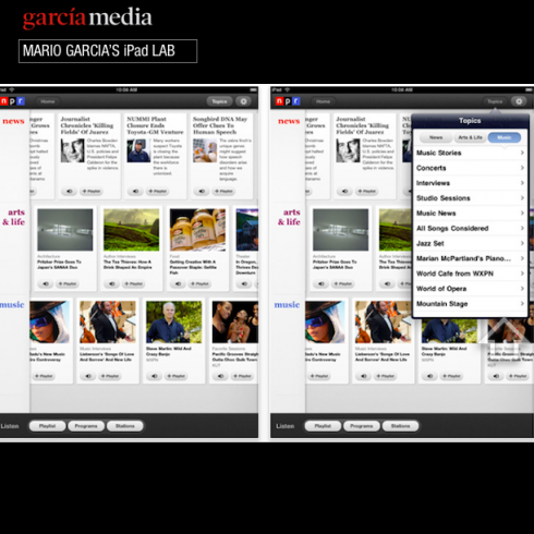
NPR Radio app
One of my favorites, master of simplicity in directions, the NPR (National Public Radio) app excels in its ability to have included all of its great content into three major baskets of information: news, arts & life, music. As simple as that: three choices, carrousel navigator, slide to the right, click and go, and always a pop up window when you call it to guide you to other areas of the app. Many newspaper apps can learn from the simplicity that NPR shows here.
Skip and hop exercise
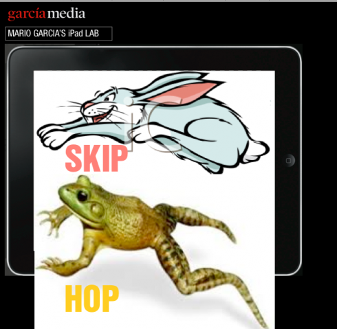
Whenever we have developed enough directions into an app prototype, I work with the team on what I refer to as “skip and hop” exercise. Put copies of each screen on the wall, and have different members of the team navigate thru, skipping and hopping from here to there, to see how it all flows, or if it does flow. Inevitably, there is a destination someone wishes to skip or hop to that does not include easy directions on that particular screen. This, I believe, is s a very essential and necessary exercise for all news app developers.
Of interest today
-How The Daily Is Doing So Far*: 500k Downloads, 75k Users
http://blogs.forbes.com/jeffbercovici/2011/03/30/how-the-daily-is-doing-so-far-500k-downloads-75k-users/
– Even ‘Daily’ Fans Don’t Want To Pay For iPad Newspaper
http://www.mediapost.com/publications/?fa=Articles.showArticle&art_aid=147733?d=125245
– USA: The Tulsa World Will Try A Paywall (Again)
http://paidcontent.org/article/419-the-tulsa-world-will-put-up-a-paywall/
– USA: New York Times’ Paywall Could Benefit AOL
http://seekingalpha.com/article/261210-new-york-times-paywall-could-benefit-aol?source=feed
– USA: New York Times metering system – Expensive tip jar?
http://www.knightdigitalmediacenter.org/leadership_blog/comments/20110326_new_york_times_metering_system_-_expensive_tip_jar/
– UK: News Corp’s UK Newspapers Benefiting from New Digital Products
http://www.smartmoney.com/news/ON/?story=ON-20110329-000232
– UK: New role for James Murdoch
http://www.inpublishing.co.uk/news/articles/new_role_for_james_murdoch.aspx
– UK: Isle of Man Examiner goes tabloid after 131 years
http://www.pressgazette.co.uk/story.asp?sectioncode=1&storycode=46901&c=1
– USA: The paidContent 50: The Most Successful Digital Media Companies In The U.S.
http://paidcontent.org/list/the-most-successful-digital-companies/
– USA: Mobile tops newspapers’ 2011 wish lists
http://www.newsandtech.com/news/article_3fe443aa-5a2f-11e0-8663-001cc4c002e0.html
TheMarioBlog post #743