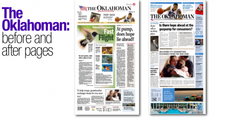
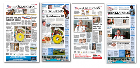
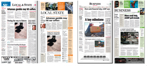
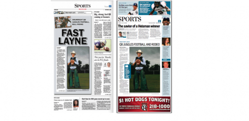
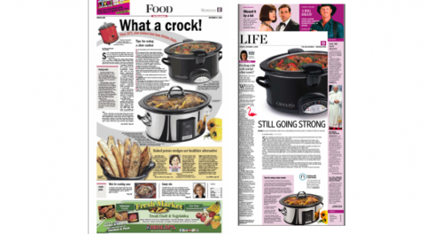
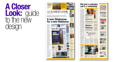
All of the above images represent before and after version of the pages done during practice workshops leading to the launch of The Oklahoman today.
My message to the readers of The Oklahoman
Here is the text that appeared in a specially-produced supplement about the launch of the new project, titled A Closer Look:
For a newspaper with the rich tradition of The Oklahoman, today marks a vibrant new chapter in its history. At a time that many describe as the “most challenging ever” for the printed media—-and some even dare go as far as to discuss the demise of newspapers as a medium—-The Oklahoman, instead, takes a bold step forward, rethinking itself to become a product that fits into today’s multimedia, multiplatform world of news, while retaining those elements that have made it Oklahoma’s newspaper of record, and one with a reputation for serious, responsible, ethical journalism of the best kind.
For me personally, and for our Garcia Media team, headed here by lead designer Kelly Frankeny, it has been an honor and a pleasure to work with the inside team of The Oklahoman as we rethought every aspect of the newspaper—-from the path of how a breaking story travels across the various platforms to how photographs, headlines and story structures are presented.
First and foremost for us in every discussion: how to make your trajectory through the nwspaper easier and more enjoyable.
We know that you are part of an audience that is forever hungry for information, but lacking time to acquire it. We know that many of you have access to online news, as well as news from a variety of sources including the traditional radio and television, and the newer medium of mobile telephones and other digital media.
However, we know that many of you still come to your morning newspaper with that first cup of coffee. We know that you like to clip that special story to send to someone, or to save for later. We also know how you enjoy the entertainment that The Oklahoman provides, not to mention service information, and, of course, features and opinion pieces that help you as you make decisions that affect all aspects of your life.
So what is new?
We don’t call this process that we have just concluded a “redesign”. Redesigns bring about the image of mere cosmetic changes.
Instead, we have “rethought” your newspaper. The Oklahoman you see in front of you today presents the following:
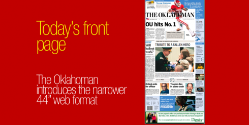
1. A new format: your page is narrower and longer. It is a more compact, easier to carry, easier to read newspaper. It is the trend worldwide for newspapers to become smaller. WE have not even seen the end of this trend. In the future, perhaps the newspapers will be even smaller than what you see today. Worldwide, newspapers such as The Times of London, and even the European and Asian editions of The Wall Street Journal have gone compact. In a world where computers, cameras and telephones get forever smaller, the newspaper of the future will also be more compact. Already such US newspapers as The Wall Street Journal, USA Today, and the Kansas City Star, among others, have changed to narrower webs.
2. A new navigational system: starting on page one, you can survey what the daily offerings are, then decide what you wish to read first, second and third; you can also decide what you would like to read a later time of the day. The reader is king. Our navigational system puts you in the driver’s seat.
3. A new typographic style: Two fonts have been incorporated into the design: Chronicle and Retina, that make the newspaper easier to read (especially for readers 50 and older). Typographically, we offer more contrast throughout, which, in turn, turns into a more visually pleasing journey through the newspaper.
These are the important, more noticeable changes. But there is much more. You will discover the new features of The Oklahoman as you become acquainted with the new format and style.
We hope you like it. It has all been done with you in mind.
The Oklahoman now joins the ranks of great newspapers worldwide that have rethought themselves to serve the readers of the 24/7 multiplatform media world.
![]()
For complete information about The Oklahoman relaunch, as presented by the editors in today’s edition turn to:
http:www.newsok.com
And if you wish to read about the THREE dailies that launched new looks during the weekend, The Chicago Tribune, the Hartford Courant, and The Oklahoman go here for Sara Quinn’s interviews with editors from those dailies:
http://www.poynter.org/column.asp?id=47&aid=151319

Quick Reference Guide to the design of The Oklahoman
Typography:
Text—Quiosco Three
Headlines: a combination of Retina Display Condensed Bold and Chronicle Display Condensed
Page Architecture:
Page grid follows a basic six-column format. The width of the page is 60.9 picas, and each column is 9.3 picas
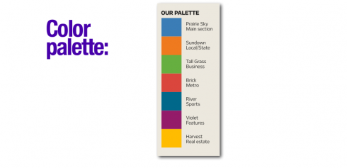
Color palette:
The Oklahoman’s color palette is coded according to sections, as seen in the graphic shown here.
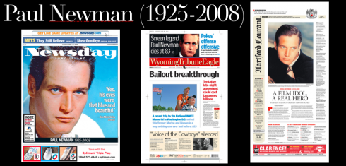
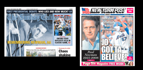
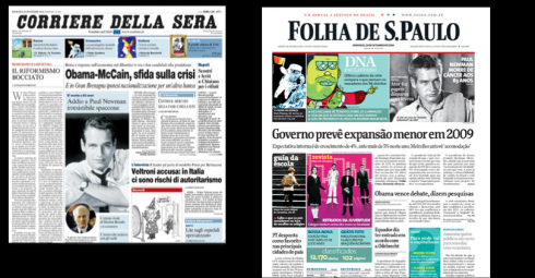
How the front pages say “adios” to Paul Newman
Some selected front pages from today’s editions, honoring Paul Newman, the legendary actor who lost his battle with cancer at 83.
![]()
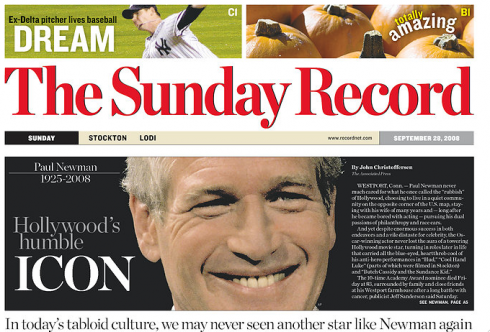
In Oklahoma, doing a post mortem of today’s first edition of The Oklahoman, making corrections, discussing strategy and preparing for the second edition of the newspaper with the new look.
TheMarioBlog posting #105