My diary entries contain travelogues, agendas, and occasionally, the graffiti of design myths. I always write these myths in red, to make sure I do not forget them. I must have more than 150 that I have listed during more than 30 years of traveling, but there are 10 that have become the “Super Myths,” those that transcend nationalities, ethnicity, or language. I offer them as a checklist to see how many of them are part of your own myth repertoire:
1. Don’t run headlines next to each other.
“Bumping headlines” should be ranked as the No. 1 design myth, especially in the United States. I am certain that more time is spent in newsrooms everywhere designing pages that avoid headlines coming together than actually writing better headlines.
As a veteran of hundreds of focus groups that were shown pages with headlines that sometimes bumped, I have yet to hear a reader anywhere echo the complaint about “bumping headlines.”
Of course, I am not an advocate of bumped headlines. However, I am suggesting that we should not spend unnecessary time and effort avoiding what seems to affect no one but the editor and his old journalism school professor.
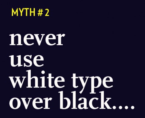
2. Readers don’t like reversed out type.
Well, many editors don’t. And I am sure that readers would probably find it unusual and hard to read if an entire article were set in white type against a black or color background. However, a few lines of a quote or a highlight set against a dark background will not affect legibility as long as the type size is larger than normal and the interline spacing is adequate.
3. Color must be introduced slowly.
Life is in color. Attempts at a slow introduction of color in a newspaper that may have been entirely black and white for years are quite exaggerated. In this regard, one must respect the editors’ knowledge of their own communities and their readers’ ability to assimilate change.
However, my own experience has been that color is almost always extremely well received, and that readers in most communities no longer attach the label of “less serious” to newspapers that print in color. Specifically with 25- to 35-year-old readers, color is an expectation more than an abomination.
What is important, and this must be emphasized, is that color use be appropriate for the newspaper and its community.
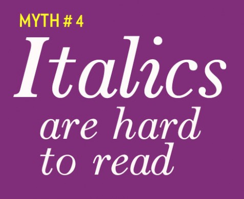
4. Italics are difficult to read.
I have heard this more than 500 times, from South America to South Africa, and in Malaysia, too! Every editor seems to have a built-in catalog of anecdotes to illustrate why italics should never be used. They are supposed to be “feminine”; therefore, why use them in the macho sports section? They are “strange” to the reader and imply soft news, as opposed to hard news, so relegate them to the gardening page. And, last, italics slow down the reading, so avoid them in text.
The truth? Italics are unisex. A feature in sports can wear italics well, but so can that souffle story in the food section. The soft-versus-hard implication is an American phenomenon, I must admit. A banner headline in a strong italic font played large will be able to do the job as well as a Roman headline. Size and boldness and the distinction of the type used are more significant than whether the type is italic.
Contrast italics with Roman type, or bolder or lighter type nearby, and they make that souffle rise on the page. Add them as a secondary line under a classic Roman face, and there is music on the page. Give the name on the byline an italic touch, and somehow the visual rhythm of the text may be altered for the better.
TOMORROW: The rest of the myths
La Tribune update: Friday, Oct. 31.
Valerie Decamp, La Tribune’s general manager, writes us that ” the public finds the new La Tribune formula very new, very dynamic. We hit record last Monday by selling 25 000 copies versus 12 000 on average …Last time we did better was September 2001.”
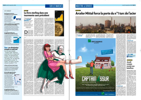
Notice the belt ad for car running through the middle of this inside page
Eric Beziat, art director, emerged from all the heavy work of the past two days to report : “Mario, this is exciting, and we have been running out of copies of the newspaper each day since it came out. People are calling to tell us how much they like it. Fresh and new, but with the same serious type of financial journalism they have come to expect.”
Meanwhile, Karyn Bauer, the American secretary to Olivier Royant, editor of Paris Match, puts it differently: “Mario, love the new La Tribune. It is The Wall Street Journal with a 30 Rock flavor.”
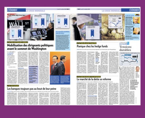
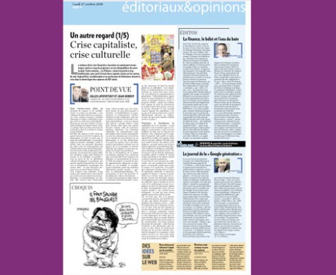
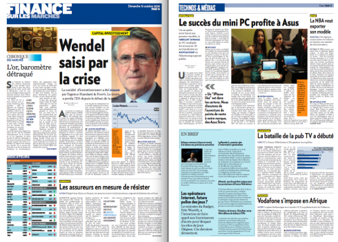
Here are the last group of pages I have received from Eric, the Tuesday and Wednesday front pages, along with inside news pages and editorial/opinion page.
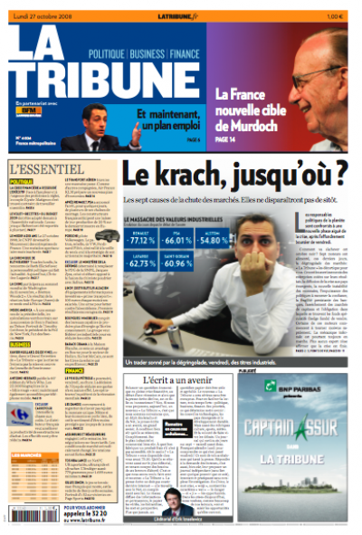
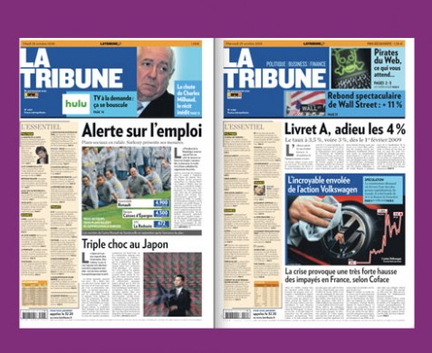
Here is the front page of La Tribune for Monday, Oct. 27th, first day of the new formula, in Berliner format, with a new navigator on Page One.
Other pages to be shown here as they become available.
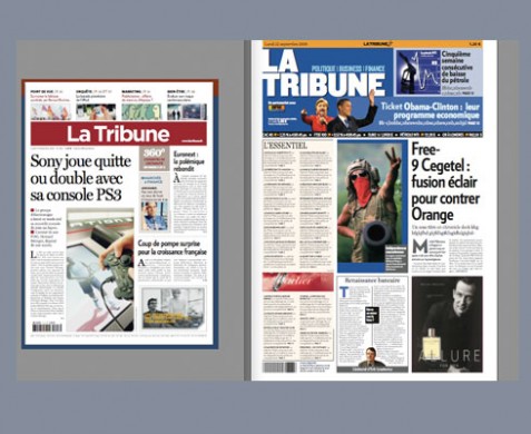
The old and the new La Tribune front page
Updated October 28, 2008—more updates to come throughout the day today
Serious does not mean boring
I remember my first meeting with La Tribune’s director, Valerie Decamp: it was a lunch at a plush, but quite busy, Paris restaurant. The tall and talkative Valerie, whose newspaper trajectory had brought her to La Tribune from the free newspaper, Metro, knew exactly what she wanted, and how she wanted.
“I want you to make La Tribune very lively, colorful, full of energy, and full of news, analysis, and topics that the readers have not seen elsewhere, that is what I want,” Valerie told me two minutes after we met.
Knowing what the management wants is, indeed, the first step in what you know will be a successful project: a manager who is focused, knows direction, target audiences, and has no preconceived ideas that a “financial daily” has to be boring.
Valerie talks fast, and she wanted the project to move fast.
Fast it was. We began around May, launch of the new-formula La Tribune is Monday, Oct. 27.
Enter the new art director: Eric Beziat
One of Valerie’s most effective moves was to hire Eric Beziat as art director. Together, Eric and I met frequently, both in person and in cyberspace, to create the look that you see here.
Every successful design needs an editor who contributes ideas, and who is sure of what he wants: we found this in La Tribune’s new editor, Erik Izraelewicz,
Highlights:
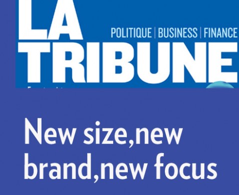
Larger format: At a time when so many newspapers go smaller, La Tribune’s strategy was to go to the Berliner format, from a standard tabloid. I am an advocate of compact, of course, but in this case, the idea is to allow for each of the sections to stand out. “We want to make a dramatic change that is visible to our audience,” Valerie told me as we discussed the larger format.
New branding: Gone is the old La Tribune logo, in the Bordeaux color with white letters. In is a logo with a blue background, but “attached” visually to a navigator to the best “surprise” stories of the day.
New typography: The type combination now involves Verlag in its various weights, but with an emphasis on boldness rarely seen in traditional finance/economics dailies. Chronicle, an elegant serif font, is used as a secondary font, to bring elegance and contrast to each page.
Color palette: We tested orange before we went for blue, but it was decided that it would be good to have blue as the daily color, and orange for Le Journal de Weekend.
Efficient navigation: Perhaps the most reader-friendly element of this rethinking of La Tribune is the Page One navigator, called L’Essentiel, and that is what it is. Borrowed from the highly successful and efficient What’s News from The Wall Street Journal, it summarizes in a few lines, the top stories that are MUST READ for each day.
Advertising innovation: The new La Tribune will experiment with ad positioning. Already many of these ads have been sold ahead of time, including “silent ad” on Page One navigator, plus interesting display of various strategies as shown here.
Personally, I am extremely happy and pleased with this new formula for La Tribune. Readers will appreciate the fact that this new La Tribune offers something for everyone. Those readers who want to read La Tribune in two or three seatings during the day, will have a great navigator to guide them; the ones who would like to sit down and read more in-depth, will have excellent content to analyze. Visually, the new La Tribune offers more graphics to help readers understand complex stories. For a generation of Google surfers, the ones who want everything now, this new formula of La Tribune has it all—-the newspaper for the Internet generation, but with the seriousness, depth and reliable content that they have come to expect from a brand like La Tribune.
Everybody wins.
Offering advertisers different options
Inside pages: rhythm and labels that say “click” for topics
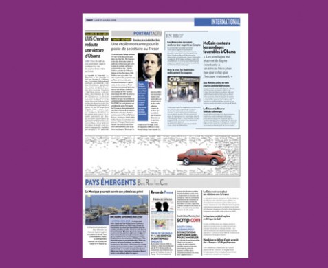
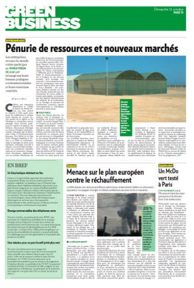
A page about the business and environment
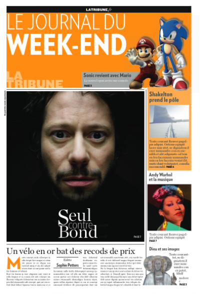
Le Journal de Weekend: more magazine approach
![]()
For the video of La Tribune’s advertising of its new formula: ?
http://fr.youtube.com/watch?v=_bB1VTrXuLc
For Mario’s “editorial” on today’s first issue of the new La Tribune (in French):
http://www.latribune.fr/entreprises/communication/publicite—medias/20081026trib000302948/le-journal-de-la-google-generation.html
Getting ahead of the news
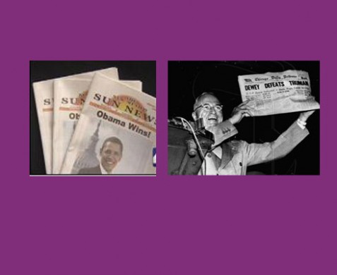
The New Mexico Sun News is an alternative newspaper that comes out bi-monthly. Since their next edition would be after the U.S. Election, the editors decided to make a guess, proclaiming the candidate they support, Sen. Barack Obama, the winner. In this case, print is, indeed, eternal, as the 10000 copies of the edition were snapped quickly by collectors. The Sun is not the first newspaper to get ahead of the news. In 1948, the Chicago Daily Tribune proclaimed Thomas Dewey the winner over HarryTruman. The front page is one of the most eternal ones ever published!
http://www.editorsweblog.org/newspaper/2008/10/france_la_tribune_to_relaunch_next_week.phphttp://www.editorsweblog.org/
![]()
Spending the day in Frankfurt, Germany, catching up with a variety of projects before leaving tomorrow for the Canary Islands for a few days of rest and good runs in Maspalomas.
TheMarioBlog posting #132