It can be controversial, and I usually get asked that question at least twice a week somewhere in the world:
How effective is it to lower the newspaper’s nameplate to put something at the very top?
My response is always similar: very effective. The moment you put a promo, a photo, a story or even a variety of elements above the nameplate, those items will command great attention. It is the editor’s way of saying:
Look at this. It is special
Most frequently asked questions on the topic:
Can a serious newspaper still lower its nameplate and be considered serious by readers?
Of course, the placement of the nameplate has nothing to do with how readers perceive a newspaper; more to do with editors who perpetuate these myths.
Can a newspaper have something ABOVE the nameplate one day, and then NOT do it the following day?
Indeed, and, in fact, I think that the element of surprise is always good. When a daily that ordinarily keeps the nameplate at the top, lowers it to include an item in that “penthouse” position, then I get the signal that this is important and deserves attention. Some newspapers only do the penthouse position for something extremely different or surprising, or to promote a once a year special, as in Back to School, High School Football Preview, etc.
How far down can one go before the nameplate disappears?
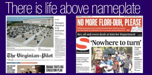
I think the newspaper’s nameplate has to appear above the fold, and much higher than that. So, if you are dealing with inches, for example, I would say, a drop of more than 5 inches will probably bury the nameplate too much. However, we see an example here of the Virginian Pilot, where the drop is bigger than that, and still works.
The Pilot’s editors place a huge photo and story above the nameplate, but the page remains harmonious, and, without a doubt, one with much visual impact.
A little bit of history:
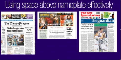
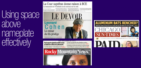
During the 1950s and 1960s, it was customary for a newspaper front page to have two or three stories ABOVE the nameplate. Editors in afternoon dailies, like the now defunctThe Miami News, for example, would use that horizontal strip to highlight a columnist, or a late breaking story. It was a signal to the reader: buy me, buy me, read me, read me. During the redesign golden years of the 1980s, nothing would come before the top of the page and the nameplate. Indeed, most promo boxes found a happy home UNDER the nameplate.
Today we see both, as it should be. And it is no problem to have your promos over the nameplate one day, and under the next.
I believe that editors have to be more flexible, offer more visual surprises, and NOT be handcuffed by their own rules of “always doing the same to avoid reader confusion.”
Readers are not confused easily. They are smart. They like serendipity.
I say to those strict editors: Let loose. Live a little. Enjoy the ability to do something different today. The readers will appreciate it.
Following is an interview with me published in the PANPA official conference newspaper, September 10, 2008. The subject: designing online editions.
Ties that bind: websites and papers
By Kerrie Armstrong
PANPA conference newspaper
September 10, 2008
Broadbeach, Queensland, Australia
As the media world rushes to embrace the online platform it pays to have the best home page possible for your newspaper.
Dr Mario Garcia, CEO and founder of Garcia Media, has over 30 years of experience in design and has redesigned over 550 newspapers around the world including The Wall Street Journal, The Wall Street Journal Europe and The Philadelphia Inquirer.
He is therefore the man to go to when searching for the most effective home page.
There are three things to consider when it comes to making a website home page, Dr Garcia said.
“First you have to think about information architecture. When you are translating the content of a newspaper you have to present it so people can find their way through.”
Dr Garcia said the online environment is often unfamiliar territory for readers and the website needs to make them feel more comfortable.
“Readers are familiar with the newspaper so the website needs to clearly reflect the newspaper.”
The second thing needed is a good sense of navigation to help readers move through the content and finally there is the look and feel of the website.
“A website needs to be first cousins with a newspaper – not brother and sister but first cousins. You need to see something of the newspaper in the website. They need to share some DNA.”
But getting a website together does not always come easily and translating a newspaper into the online format does present some unique challenges.
“You’re working with two different media. In print the eye moves down in a diagonal line.
“In the online medium the eye moves across the page from left to right and so the design needs to accommodate this.”
The size of the available space is also a design consideration, Dr Garcia said.
“In online you are working with a much smaller canvas as opposed to the larger one in print and usually there is only one story for the eye to focus on whereas in a newspaper there are many.”
Advertising also plays a dominant role in the online environment and, in print, content and advertising are able to blend more easily.
“Online you might have an ad for a supermarket flashing right next to the story but in a newspaper the ads are here at the bottom and the editorial content is at the top.
“People are used to seeing content and advertising mixed.”
And as for the perfect newspaper home page, there are three main things that need to happen.
First, it needs to be updated as regularly as stories are available.
“There is no mathematical formula, it just needs to be updated as regularly as possible,” Dr Garcia said.
Second, there needs to be a hierarchy of stories and pictures to guide the reader through the page and finally it needs to be functional.
“A website is not pretty. It does not need to be pretty, it needs to be functional. If you look at Yahoo and Google they are not pretty but people who know how to use them know where to go.”
![]()
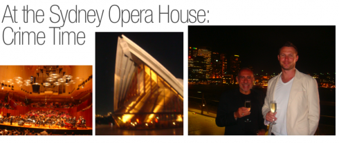
A night at the Sydney Opera House
Everyone goes by the iconic Sydney Opera House, camera in hand, posing in front of it to record the moment. Going in for a function is a totally different experience.
My Aussie friend, James Nihill, invited me to a performance at the Opera House last night, and it was great to enter the building and enjoy a function titled Crime Time, with Frank Strobel as conductor of the Sydney Symphonic Orchestra, and the funny TV personality Clive James as presenter. The premise? The music of the movies, with emphasis on films where crime played a key role. So we were treated to “ten suites” of such memorable films as Alfred Hitchcock’s Rebecca, to Oliver Stone’s JFK, to Rear Window, Dial M for Murder, and, the final piece, the themes from James Bond’s 007. For an encore, The Godfather’s theme.
The Sydney Opera House is located right on the breathtaking Sydney Harbour. It was made a UNESCO World Heritage Site on June 28, 2007.Designed by the Danish architect Jørn Utzon, the Sydney Opera House is one of the world’s most distinctive 20th century buildings, and one of the most famous performing arts venues in the world. It was among the 20 selected finalists in the 2007 New Seven Wonders of the World project.
Today: flying towards Singapore and Europe.
TheMarioBlog posting # 90