


NOTE: The pages of the SN shown here include a Saturday, which is usually a day the newspaper is more text-heavy, with commentary and analysis on page one. I now have updated today with the Monday front page, newsier, more standard front page.
A fine tuning more than a redesign
Call it a soft redesign, and it involved subtle changes as opposed to major rehaul of the newspaper. From the start, publisher/CEO Max Tasch indicated that he was happy with his newspaper, but wanted to spruce it up a bit, and maybe make some content changes.
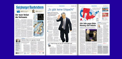
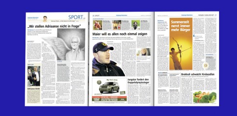
The format is Berliner, with a daily local supplement in half size—-an ideal format for a newspaper, easy to carry and easy to read. See illustrations here.
In our “soft redesign” we kept the Frutiger font for the 100,000 circulation daily published in that one most beautiful of Austrian cities: Salzburg.
Working with Garcia Media senior art director, Jan Kny, we tested other fonts, but finally decided to stay with Frutiger: “It was good, sound and looked perfect, so why change it?<” Jan said. “Frutiger is always a classic font.” One important change, however, was the change of text font. “We changed the body text to a stronger one, and increased its size as well, “ Jan said. “We abandoned Scala, in 8.5 points for Scotch Text 10 pt., much more legible and easier for older readers.”
Other important changes here:
– Systematic use of white space
– Much better hierarchy of stories
– More visual storytelling – Illustrations, info graphics.
– Better Navigation (now with section opening pages
and promos in page headers)
– Visual briefs
– Allowing double-page layouts
– Color code: All elements that connect with the internet appear in red color
Content changes
– More space for backgrounds, analysis and comments
instead of news
– More pages for the local supplement
– More prominent culture section for a highly cultural city—-home of Mozart
– More space for letters to the editor
– A new, more fixed page structure
![]()
http://www.salzburg.com/nwas/index.php
![]()
In Miami till tomorrow, enjoying Mama’s Cuban cooking. On the menu: an old artisanal Cuban delicacy—-sweet grapefruit in syrup with cinnamon. Yes, caloric, but also delicious, and quite tedious to make. One wonders if these old Cuban recipes will stand the test of generations. For now, it is something to enjoy with Cuban crackers on the side (or cream cheese).
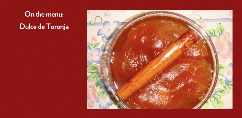
The recipe for Dulce de Toronjas:
http://www.wikihow.com/Make-Dulce-De-Toronjas
TheMarioBlog posting #111