TAKEAWAY: Today we review several pages from the Süddeutsche Zeitung’s new look: a classic textbook example of German precision on every page, without many visual surprises.
Our blog yesterday commented on the relaunch of German’s daily, Süddeutsche Zeitung in its first redesign since 1989. The most major change that readers have seen involves the typographic fonts used.
I now have had an opportunity to take a look at an entire edition of the new Süddeutsche Zeitung, courtesy of twp of the newspaper’s editors: Wolfgang Krach, deputy chief editor, and Carsten Matthäus, managing editor. Gentlemen, I am grateful to both of you for taking the time on the second day of a relaunch, to send us these pdfs.
In fact, Wolfgang has sent me these comments which he feels summarize what he and the team attempted to do:
·
„Süddeutsche Zeitung is more beautiful, modern, clearly arranged and better readable now.“
·
„Our ambition was to preserve the variety of Süddeutsche with regards to content and visual appearance but nevertheless to arrange a more consistent and elegant look.“
·
„We have changed the typography and modernized the layout but preserved the character and identity of the paper which is defined by outstanding journalism.“
My review of the new SZ
Overall, the new Süddeutsche Zeitung is elegant, classy, and a textbook example of newspaper design students on how to apply the rules o spacing, white space, typographic mixing and the rest of what newspaper design books describe in 20 chapters or more.
What the Süddeutsche Zeitung new design does not have is a lot of excitement.
In fact, it is somehow decaffeinated.
My review of the July 10 edition of Süddeutsche Zeitung
Some comments upon reviewing the pages:
Let’s hear it for German precision: Thee is something to be said for German precision, and its newspapers all show it starting with the six column grid, the way those thin vertical lines separate the columns, and the internal spacing, as clean and consistent as can be. In that sense, all students of newspaper design should get copies o the Süddeutsche Zeitung and study it. This design gets a 10 for consistency and craftmanship.
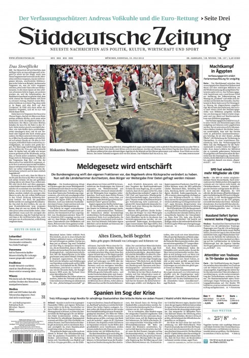
The front page : Good story count, a nice balance of longer narratives, middle size stories and briefs. An elegant navigator bottom let, but missing some small images. We connect faster when we see small, even iconic photos. Here is where I am tempted to add something visual. I can live with the rest.
Here is how front page would look if the navigator included images
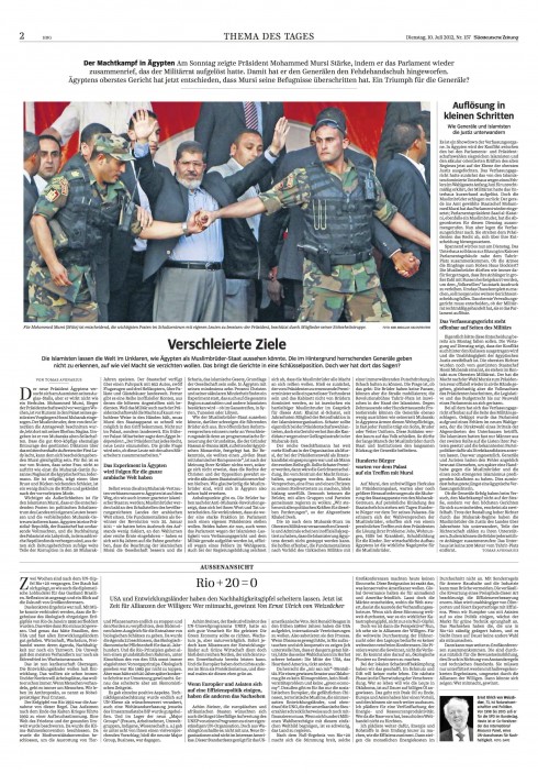
Page 2: Theme of the Day—the reader enters immediately in what the editors consider to be the top story of the day. The centered headlines and summaries give this page a sense o gravitas. It is all about gravitas in this design. If this was music, it is more of a waltz, with the violins as protagonists. However, nice, clean and structured to a perfect T.
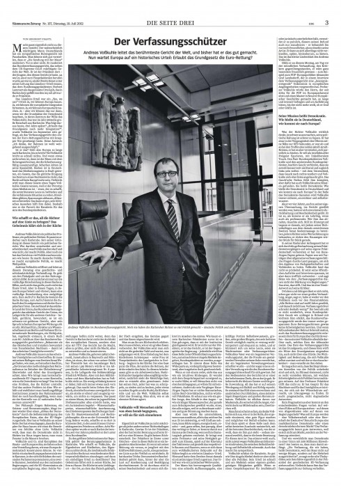
Page 3: The long read of the day, and also one of the biggest photos. Elegant and the assumption that everyone will lean back with this one. In my view, perhaps many of the readers will wait to read this NOT in the morning with the first coffee, but late in the day, o in the evening. Good journalism prevails. Time is the enemy.
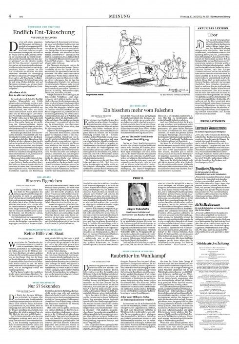
The opinion page: Elegant. Clean. Circa 1950. Implies authority, seriousness and suggests that you enter the library and settle for a good read.
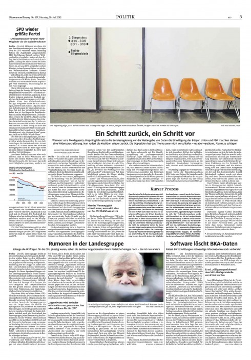
Politics: Perhaps the most abundantly visual, with two photos and one graphic, but with text as still the dominant element.
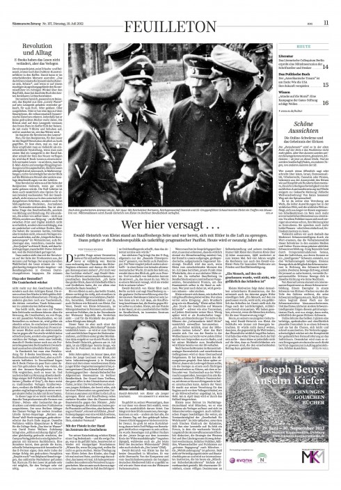
Feuilleton The entrance into the feature section, in this edition, is black and white, a salute to newspapers of another era. Clean. Elegant. Formatted to the max.
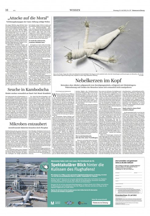
Wissen: Interesting image in this page about Knowledge. The surprise of the day.
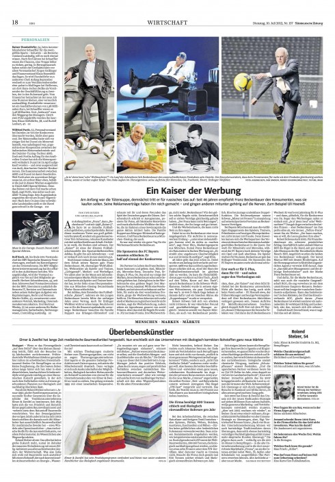
Economy: Here a combo o photos: what a surprise to find the most inviting photo treatment on a business page, usually the least photographic in most newspapers. The SZ never stops surprising.
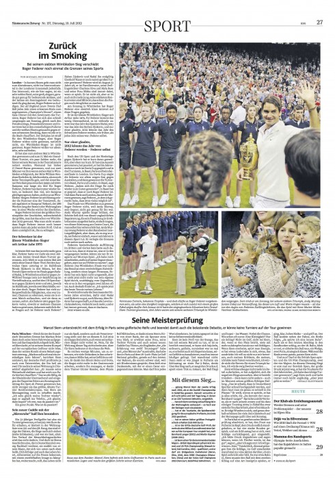
Sport: Good use o photos o the tennis stony. No change of rhythm here as the waltz continues.
In conclusion…
This is a 32-page edition. Again, it is page after page of what seems to be two or three templates that are repeated.
Kurt Kister, Süddeutsche Zeitung chief editor, has said: “The content should be new every day, but not the package.“
For readers who like the very familiar , the SZ is the paper to follow.
The content is good enough to compensate for the lack of visual excitement. The visual surprises here will have to come from the selection of photos and the introduction of more graphics.
We hope the photo editor realizes the responsibility that rests on his/her shoulders. It is almost one lonely photo per page. It must sing on key, tap dance and seduce. Not an easy job. If that one photo four columns across the top of most pages is not exciting, that page is dead on arrival.
Wiaiting for the evolution
Like all redesigns, this one will evolve with time. We are hoping that this new SZ takes a detour into that village inhabited by visual surprises.
In newspaper design, few things are more dramatically exciting than the mixing of a very systematized, elegant and classy newspaper that adds a touch of visual excitement for a given page when the reader least expects it.
All the editors of Suddeustche Zeitung have to do is take a look in their own backyard to find the model: Die Zeit and the Sunday Sonntagszeitung Frankfurter Allgemeine.
Ironically, it is the Germans who do this mixing best.
But enough of the Monday morning quarterback review here. Perhaps Wolfgang Krach, SZ deputy chief editor, has it right when he writes me that:
·
„This is a layout reform for readers – and not for journalistic gurus.“
Amen.
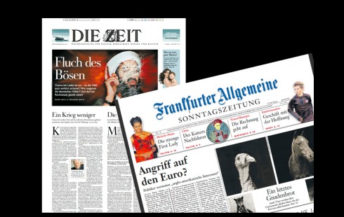
Two German newspapers that excel in combining the best of the classic and elegant models with visual surprises galore: Die Zeit and Sonntagzeitung Fraankfurter Allegemeine
Here is the July 10 complete edition of the SZ
Take a look and flip through the pages of an entire 32-page edition of the Suddeutsche Zeitung for July 10:
The SZ’s art director is Christian Tönsmann and his deputy is Stefan Dimitrov.
The iPad Design Lab: Storytelling in the Age of the Tablet
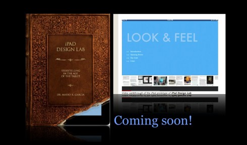
Video walkthrough of the iPad prototype of iPad Design Lab