This is the weekend edition of TheMarioBlog and will be updated as needed. The next blog post is Monday, July 1
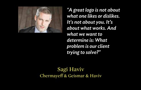
TAKEAWAY: One of the highlights of speaking at the HOW Design Live 2013 conference in San Francisco last week, was to sit in a most informative presentation by Sagi Haviv, a partner and designer at Chermayeff & Geismar & Haviv, a graphic design firm known for its expertise in corporate identity, brand development and logo design.
While Sagi, whose presentation was well organized, thoroughly illustrated and entertaining, offered designers in the audience a vast supply of tips on what makes his work successful, I also walked away with some great insights into the consultant-designer/client relationship.
These five points I found to be totally in agreement with my own experience.
It does not matter if you are designing a logo or rethinking an entire newspaper or magazine, there are key moments in the consultant/client exchange that determine, to a large degree, the success of the project.
Here are five themes mentioned by Sagi that resonated with me:
1. Democracy does not work so well for designing a logo!
I have said it often, and I thought it was perhaps the Latin in me! One cannot complete a project successfully with a totally democratic approach, as in presenting a concept to a room full of managers and then taking a vote on how many vote for blue on the logo as opposed to red.
I have sat through too many of these “democratic design elections” to despise them as totally ineffective.
The most successful projects are those in which the concept is presented to all, but the major decision rests with a small core of key players.
Sagi seemed to agree.
2. Sometimes it is tough to sell “simple” in a logo concept
Sagi used the case study of a logo for a conservation group, where the client insisted on overloading the logo with images of trees, a monkey, humans, the works. Eventually, Sagi was able to convince them that a simple more abstract concept would do it better.
What designer has not gone into a closet to scream privately when faced with an editor or publisher who insists on some visual atrocity simply because “he likes it”.
But, as Sagi suggested: Don’t give up. Use whatever powers you have to show the publisher than a simple solution may be the best.
I have to say that usually common sense and simplicity win—-but not always.
Have you heard the publisher who favors a certain color for the logo “because it’s my wife’s preferred color”? And, how about the mascot of the old bear in the nameplate?
The same may be true when we, as designers, refuse to give up on an idea of ours that is not the best for a particular project. Sagi said it best:
A great logo is not about what one likes or dislikes. It’s not about you. It’s about what works. And what we want to determine is: What problem is our client trying to solve?
3. How many ideas do you bring to a pitch?
“Sometimes it’s only one model shown, but normally more than one shown during a pitch,” Sagi answered.
It’s exactly what I would say.
The one model pitch is appropriate when one has received a thorough briefing and is almost certain that this one model is the way to go. I usually advise my teams at Garcia Media that is better to present a robust, well thought out concept, than to do light versions of three.
However, sometimes the client is seeking suggestions, as he is not sure what the outcome should be.
We at Garcia Media normally present a minimum of two concepts and more often three.
4. Don’t be afraid to push the envelope
![]()
Before and after for the Harvard University Press logo
How true. On the back of my mind I always think: if we were hired here it is because they would like to see what is not there now. What can the consultant bring that represents a totally different thinking? How can we benefit from the consultant’s more global exposure? And, in a sense, to the objectivity that someone not associated with the existing project, can bring to the table?
Sagi referred to the specific work he and his firm did with the Harvard University Press, a prestigious publishing house with the legacy of a logo somewhat visually tied to that of Harvard University. Respecting the legacy, and being sensitive to traditions, is important, but offering new ways of approaching the same concept are also part of what clients want to see.
Sagi showed the most modern and progressive, and eventually it was chosen.
5. What to do when client refuses to accept concept?
We have all been here. You have presented three models, including your very favorite one that, in your heart, you know represents all that this client should adapt to advance the product further.
But, nothing satisfies the client (the memories of 11 prototypes for Germany’s Die Zeit, come to mind).
Sagi urges the designer to continue, to move forward and to seek different directions.
Valid advice. My own tips to our team: don’t become obsessively in love with your own ideas, not to the detriment of the success of the project.
Be ready to abandon ideas that the client refuses, and to show something different. Often, starting anew is the answer (less frustrating and time consuming).
The good news: eventually one idea catches the attention and the approval of those in charge.
Getting there may not be easy, and two extra glasses of champagne or Tio Pepe may be in order, but the victory may be even sweeter.
Of related interest:
40 Years/40 Lessons: The Pitch
https://www.garciamedia.com/blog/articles/40_years_40_lessons_14_the_pitch
Sagi Haviv: How to design a logo
http://www.businessweek.com/articles/2012-04-12/how-to-design-a-logo-sagi-haviv
How we did it: Pure Design case study of Die Zeit
https://garciamedia.com/blog/articles/how_we_did_it_pure_design_case_study_of_die_zeit
He did fun sketches of sessions at the HOW Design Live 2013 conference
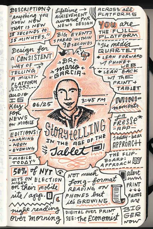
Gerren Lamson really had some fun while attending the HOW Design Live 2013 conference, it seems.
He made great notes on his sketchpads during presentations he attended, capturing the image of the speaker along with the main points of the presentation, including my own.
Take a look at those sketches here. Good job, Gerren. You made me look much younger in that sketch!
Here’s the original blog post:
https://creativemarket.com/blog/2013/06/27/how-live-2013-stickers-sign-ups-sketchnotes