TAKEAWAY: This is the first of a 3-part series devoted to a subject that has many art directors, editors and info graphic artists talking: why did so few infographic entries win at the SND 34 contest? Today: What’s behind the fact that only 17 entries were awarded prizes for infographics this year?

Miguel Gomez/Gulf News-Dubai
Disclaimer: My reason for writing this blog is to engage the industry in an intelligent conversation, so that the current SND leaders can review this discussion and perhaps look for ways to improve how infographics are judged in the future. I have the greatest respect for SND and what it does, and I have been a member since its inception. I have not been a recent judge in the contest and I do not personally enter any categories in the contest, but I feel that it is a worthwhile and monumentally important part of how we honor the good work of our peers, while learning much in the process. I am proud of my SND awards of the past three decades and I cherish them.
Art directors “intrigued and perplexed” by outcome of SND 34 infographics contest
Apparently this was not the year of the infographics at the SND 34 Awards competition, which concluded recently. Not that I had noticed it myself, perhaps because I was not following the SND contest proceedings very closely, I must admit.
However, I have heard from several art directors in three continents who wonder quite loudly why only 17 awards went to infographics this year, even though 2012 was the year of the Olympics and the US Presidential Elections, which brought about an unusually large number of entries dealing with info graphics.
To hear some of these art directors tell it: “we are intrigued, somewhat perplexed and wondering why some of our entries did WIN but for page design, or best inside news page, yet those pages were dominated by infographics that did not win as such”.
Contests, as we know, are always a mystery. Heck, we have just watched the 85th Oscars and not two people agree on whether the best picture was Argo, or Lincoln, or perhaps Life of Pi?
I know from experience as a judge in dozens of publication design contests that only those who are involved as judges are aware of what went on during deliberations, so I have tried to reach as many of the SND 34 judges as possible in the course of preparing what will be a 3-part series of blogs.
One thing is for sure: info graphics have never been more important, especially now that we can do storytelling across the media quartet.
Maybe the bar is much higher today

I am also sure, and many of the judges agree, that in 2013 info graphics have come such a long way, that the Gold of 20 years ago is now the expected, the ordinary (good news!).
Alberto Cairo, one of the most recognized infographic artists of his generation, who presently teaches at the University of Miami, has similar thoughts:
I checked the SND awards database and was surprised to see so few awards to infographics. I am not really sure what happened but it is true that the last two or three years have shown an increasing pace of innovation and great work both in print and online infographics and visualizations. And not just in the US. Brazil is becoming an infographics and data visualization powerhouse, and we’re still seeing fantastic stuff produced in Peru, Argentina, central Europe, etc. The fact that most of that will not be showcased in the SND book is a shame, regardless of what the reasons are. The SND awards book should show the design community where to go next, not where we have been so far.
A question of economics?
Is it possible that because newspapers are going through one of their harshest economic period ever, this, too, is affecting the output of quality infographics?
While this may be true for the United States and parts of Europe, it is not so for many other countries, and the SND contest is global in scope.
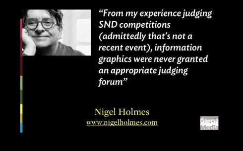
I asked Nigel Holmes, one of the most respected infographics experts and formerly of TIME Magazine, about his thoughts. I must clarify that Nigel has not been involved with this year’s SND judging. Nigel, too, believes that economics could be involved here:
Could the answer about the paucity of infographics here be simple economics? I don’t know how many infographics entries there were this year, but might it be that the people responsible for sending in entries were watching their budgets, and perhaps elected to send their work to be judged at Malofiej instead? Malofiej is part of SND ,of course (it’s run by the Spanish chapter), but it’s still the only competition that I know of that’s devoted solely to information graphics, judged solely by information graphics practitioners, and which produces a beautiful book each year that’s filled with information graphics. From my experience judging SND competitions (admittedly that’s not a recent event), information graphics were never granted an appropriate judging forum; after all, they are not, or should not be, simply something that you glance at, say “wow, that looks good,” and then almost immediately, by necessity of time, move on to the next piece.
Nigel echoes a thought mentioned by some of the judges of this year’s SND contest with whom I exchanged mails: the important role of reporting when judging infographics:
I’m not criticizing SND’s judging process here, just saying that because information graphics are made of pictures and words they need reading and studying, like texts, in ways that many other categories in the SND show do not. That’s why I think the Malofiej model is better for judging information graphics (where my own participation as a judge has been both recent and more often). Time is taken to read, study, discuss, argue, reject, but then to look again if an impassioned plea is heard in a particular piece’s defense. And that is how it should be.
Smaller newshole for graphics?
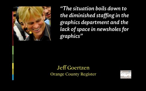
Another highly respected infographics artist who has offered his expertise to countless newspapers and magazines globally, Jeff Goertzen, now at the Orange County Register, also feels that economics and the current financial crisis for newspapers play a role:
In last year’s SND competition two thirds of the informational graphics awards went to non-U.S. newspapers. Of the awards that went to U.S. publications, most went to NY Times and National Geographic. One of the most dismal performances I had witnessed with the U.S. contingency.
The situation boils down to the diminished staffing in the graphics department and the lack of space in newsholes for graphics. The study I conducted a little over year ago with the 50 top newspapers in the country showed that in 2000, the average staff consisted of 9 artists. In 2011, that number went down to about 3. And 9 newspapers had eliminated their graphics departments altogether. As one managing editor recently told me, “Unfortunately, graphics has become a luxury that we just don’t have a staff for.”
Chiqui Esteban, an editorial designer for The Boston Globe, also feels that the current financial stress that newspapers suffer has something to do with what is happening to infographics:
(In some cases) talents are running to some other places outside journalism and outside print. Integrated departments now have to focus in two different products with almost the same people? It’s hard to know what has been the cause, what work has been sent (to the contest) and in which categories.
Steve Dorsey, of the Detroit Media Partnership, and a former SND President, believes that newsrooms feeling the economic pinch may be evaluating their investment in infographic expertise:
I also think we’re now seeing the effect of many newsrooms reducing their commitment and investment into information graphics departments through staffing reductions (especially in the U.S.); as well as news organizations and/or individual information graphics specialists shifting their attention and energies away from print and into interactive and digital efforts. Many of the winners of SND’s Digital competition just this past weekend are certainly evidence of that.
SND & Infographics: a little historical perspective
In the process of researching this blog I have contacted a variety of sources, many of them “veterans” of SND. Through the years, I have heard my share of SND contest stories. Of course, as someone who travels across six continents and visits sometimes two or three newsrooms in one week, I also have witnessed the highs and lows of post SND competitions, the happiness and pride of the winners, the disappointment of the ones whose work was not recognized. I have always listened, without offering opinions.
I have also been an SND judge, so I have a sense of the hard work and even more difficult task of making decisions when the work presented is all so excellent and deserving. I especially admire the work of SND contest director, Prof. Marshall Matlock, my friend and former colleague in the faculty of the S.I. Newhouse School of Public Communications, Syracuse University.
As a judge for SND I learned much from the exchanges with fellow judges, not to mention the number of tear sheets that I picked up from the floor after they were tossed as non winners. I used them in my classes and presentations because they still represented great examples. I am convinced that a lot of the non winners are true winners in the quality they display. A contest is all about making choices, and all of us judges did it passionately.
I have heard that there have been instances of even fist fights between two judges (that’s passion, regardless of the outcome of the situation!).
The infographics category has always been a difficult one to deal with, but some of its problems begin in the newsroom itself: there are the infographics people who think designers do not understand them, or vice versa. In a sense, quite similar to a more prevailing and talked about war: the “word people” versus the “visual people”.
Today, with info graphics appearing not just in print, but also across digital platforms, the process becomes even more cumbersome.
In fact, many of the sources I have contacted while writing this blog reveal that some of the infographics in the digital competition are superior to those entered for print. It may be so, but these are two distinct categories, although perhaps it is time to consider a blurring of the dividing line, and encouraging a category that allows for multi platform entries of the same story, to be judged as a unit, not separately. (To be discussed in Wednesday’s installment)
A look at the numbers
Stephen Komives is the executive director of SND, and he has been gracious to share some numbers of interest with us about the contest.
Some highlights:
In the past four SND contests, infographics represented the following percentages:
34th edition: 17 winners (727 overall) – graphics represent 2.3% of all winners
33rd edition: 53 winners (717 overall) – 7%
32nd edition: 56 winners (833 overall) – 7%
31st edition: 82 winners (1101 overall) – 7%
The last highest percentage of infographic winners, 9%, took place in the 27th edition, with 106 winners
However, the 17 winners (2.3% out of 727 entries) for the SND 34 edition are the second lowest number to date.
The lowest number of info graphic winners ever was in the 21st edition, with 16 winners and 1.7% of the 931 entries.
According to Stephen Komives:
It is clear that individual infographics and portfolios were judged harshly this year when placed in historic context.
Comments from the judges
To get some first hand references as to what happens during a typical judging of the SND infographics category, I have corresponded via email with a variety of sources, and here are some highlights of their views. I have tried to separate their reactions according to themes:
Was the judging too harsh this year?
Not necessarily, say the majority of those with whom I corresponded. However, if one goes by the mathematics of the process for the SND contest overall, 10000 great entries become 700+ winners. It is not easy to win, period.
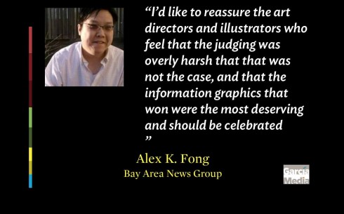
One of the judges, Alex K. Fong, Deputy Design Director
Bay Area News Group (San Jose Mercury News, Contra Costa Times, Oakland Tribune), reminded us of this:
I’d like to reassure the art directors and illustrators who feel that the judging was overly harsh that that was not the case, and that the information graphics that won were the most deserving and should be celebrated
The judges also tell me that there was usually general agreement among the group of judges about winners and losers.
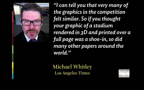
Michael Whitley, of The Los Angeles Times, had this to say:
I can tell you when we mailed in our package of Los Angeles Times entries I thought we had some winning graphics work. But in the end result we won zero awards. And having seen the work and watched the result, I understand why. Our work fell a little short of the work that won awards. It would be easier to say otherwise and that we should have been honored. It is much harder to say “we can and must bet even better”. Awards are not given just for effort or just because there are a certain number of entries. In fact none of the publications the judges were from won a graphics awards. When was the last time that happened? I believe that tells you we applied a standard evenly across all entries.
What constitutes a winning infographic today?
The majority of those with whom I discussed the topic tell me that it is, indeed, more difficult to win an award today than it was even five years ago.
The overall quality of infographics has evolved and improved, so just being good or even excellent may not do the trick: **one must be innovative, inventive, and perhaps advance the field of info graphics to the next level.
This does not mean that the entries of today are worse, quite the opposite, in fact, say the judges, one of whom said that the quality has improved to the point where what once stood out was matched by many other publications:
What was state of the art even two or three years ago was matched by many in 2013. And that can create a decline in awards, because it is more difficult to stand out. If there are 50 pieces that feel equally done, it harms the chance for any to win an award.
In my own view, the award winning graphics, the best of the best (we will show the winners in the third installment of this series Thursday, Feb. 28), must fulfill the traditional criteria of accuracy, legibility, visual impact, but, in addition:
—An innovative manner of presenting the information, with emphasis on depth reporting, enhancing a story via visuals, not repeating story content.
—Emphasis on simplicity, clarity and elegance, and not a public display of technical savvy.
—A strategy for how the graphic will be carried across platforms
—An element in its use of technology, design and/or storytelling that sets it apart and advances the craft of info graphics
One thing that winning info graphics will not do will be to overdesign or to decorate. Judges told me that there were a number of graphics that took up a full page of space but maybe had 1/3 page worth of information. They were posters, essentially, and when you evaluated them on their content fell short quite a bit.
(I must add that this is not limited to info graphics. For years, I have criticized what I describe as the “avocado page” where a giant illustration fills a page, poster style, only to offer minimal information.)
Technique versus aesthetics versus accuracy
So the infographics artist has discovered a new software and can’t get enough of it in his work.
For a period of time, technology rules his/her thinking and actions. Then one of his graphics made its way into the contest. Trouble ahead. The same applies to trying to create a full page poster of a graphic that may not fit the requirement.
The judges told me that there were a lot of graphics that seemed to be more focused on coming up with an atypical data visualization technique at the expense of producing meaningful information. What is worse, they often overly complicated the graphic many times when that wasn’t necessarily the best thing to best display the content. The information in the graphic did not require the bells and whistles that it was granted.
A judge who did not wish to be identified said:
From a journalism standpoint that’s absolutely the wrong thing to do but it seems to be an area we are increasingly heading toward. We actually especially gravitated toward simple and effective graphics because they stood out amongst a lot of overly complicated and ineffective graphics.
While on the subject of forcing the graphic where it may not belong, here is a comment from judge Alex K. Fong:
There were many graphics that felt ram-rodded into becoming the lead visual for a page. Editors should value and play infographics for the information they provide at the scale they deserve in the way that best serves readers, and not because infographics are a convenient decoration for a page.
Are too many of the entries showing the same thing?
Michael Whitley ,Assistant Managing Editor for design and graphics at The Los Angeles Times, is one judge who thinks so:
I can tell you that very many of the graphics in the competition felt similar. So if you thought your graphic of a stadium rendered in 3D and printed over a full page was a shoe-in, so did many other papers around the world. In the final weighing it was often hard to tell some of the graphics apart. Nothing about the drawing distinguished them and the information felt, at times, light. This was the case over and over. Graphics that plotted data on a circular axis could have been an entire category. I’m sure it felt original when it was done. But it looked and felt derivative on the tables, and made understanding the data in many cases very difficult.
What were the trends in info graphics for 2013?
Alex K. Fong is a judge who spotted a few trends during the judging and shared them with us, for which we are thankful:
There were many entries on the table that had first breathed life as an interactive graphic. Some successfully made the leap into print. Others did not hold up in a static medium.
There were many graphics that felt ramrodded into becoming the lead visual for a page. Editors should value and play infographics for the information they provide at the scale they deserve in the way that best serves readers, and not because infographics are a convenient decoration for a page.
There were very few non-epic graphics. Size does not equate to greatness, and I am saddened to see so few small-scale graphics entered in the competition.
Many entries were actually the same infographics entered in multiple categories, which reduced the pool for potential winners.
Gulf News winning graphic: “Close to perfection”
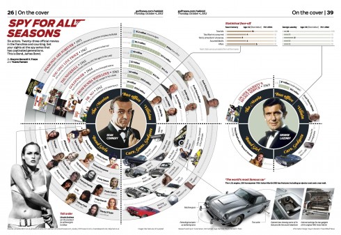
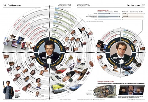
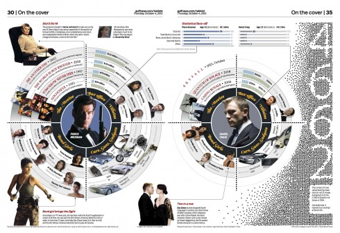
Gulf News’ Gold winning infographic story celebrating 50 years of James Bond
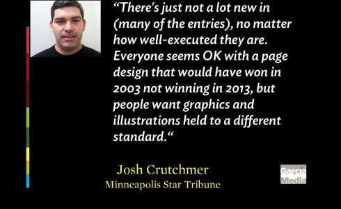
Meanwhile, Josh Crutchmer, News Design Director, Minneapolis Star Tribune, who was an SND34 judge in the news team, had these observations about trends:
As a news judge, the trend I saw was that really great, high-end or innovative graphics are just flat-out scarce, but when they do surface, the work is incredible and the vast majority of judges agree and award accordingly. The first silver medal we gave out for news page design was to a two-page election spread from the Las Vegas Sun that featured incredible hand-drawn illustrations of Mitt Romney and Barack Obama. The second silver medal we gave out was to a business spread from the Omaha World-Herald that featured literally a built-by-hand Warren Buffett.
Josh had this to say about the Gulf News’ Gold winning entry:
The lone gold medal we gave out was to the Gulf News for one of the most intricate graphics we had ever seen, and it was for a news feature on the movie Skyfall and the history of James Bond movies. We all agreed it was the best single entry that crossed our tables on the news team, and any time we would consider another entry for gold, we generally agreed that the planning, reporting and execution the Gulf News put into its graphic was so close to perfection that it continually separated itself from everything else we saw.
One of Josh’s statements may summarize the feeling of many about the state of infographics judging today, and one with which I totally agree:
There’s just not a lot new in (many of the entries), no matter how well-executed they are. Everyone seems OK with a page design that would have won in 2003 not winning in 2013, but people want graphics and illustrations held to a different standard, but the purpose of the competition is to evolve and push people to get better, and I don’t think you get there without continually demanding better.
Evolution. Demanding more. That’s what everyone needs to concentrate on, those sending entries to SND for evaluation, and the judges judging them.
It should start perhaps with SND drafting a list of criteria for what constitutes the Best of the Best Infographic.
Coming tomorrow:

The solutions? What suggestions should we consider together to improve the judging of this infographic category for SND35?
Related links:
The awards database that is the subject of this entire discussion:
http://www.snd.org/2013/02/snd34-database-is-alive/
SND 34 info graphics category winners:
http://office.snd.org/competitions/contest34.lasso
SND 34: Digital infographics contest
http://www.snd.org/2013/02/snd34-best-of-digital-design-in-depth-recap-and-unofficial-medal-count/
The SND-e (SND’s Spanish chapter) Malofiej infographics competition is next month:
http://www.malofiej21.com/
For information from Stephen Komives, SND executive director:
skomives@snd.org
Nigel Holmes
http://nigelholmes.com
Jeff Goertzen
http://www.jeffgoertzen.com
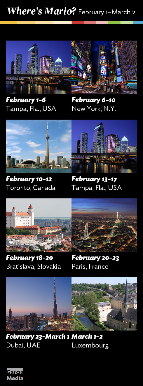
Where’s Mario until March 2, 2013?
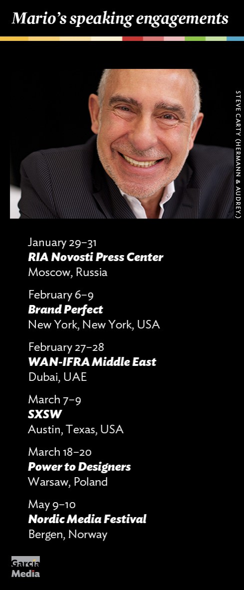
Mario’s upcoming speaking engagements
Take advantage of our iPad Design/Ad Lab workshops

Do you want to take your brand to the next level by creating a tablet edition? Garcia Media can help. We now offer one- to two-day iPad Design Lab workshops on demand to jumpstart your presence on this exciting new platform. We also offer iPad Ad Lab workshops to develop engaging advertising models for your app. Contact us for more information.

Purchase the book on the iBookstore
iPad Design Lab has been given the QED Seal
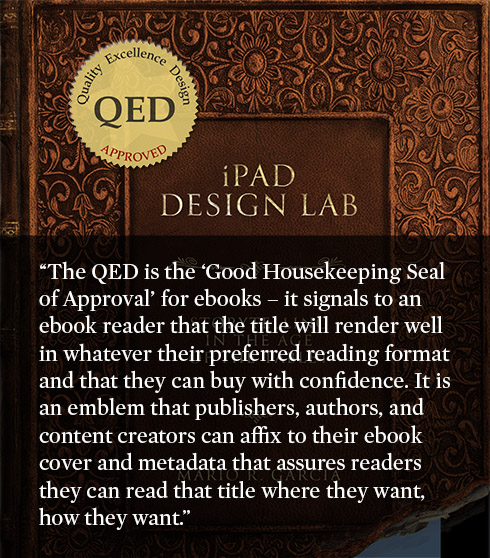
The QED (Quality–Excellence–Design) Seal is bestowed by the judges of the Publishing Innovation Awards after “a thorough, professional 13-point design review with an eye towards readability across multiple devices and in multiple formats.”
Learn more about the QED Seal here.
The EPUB version of book is HERE:
Now available: The EPUB version of  iPad Design Lab: Storytelling in the Age of the Tablet, ready for download via Amazon.com for Kindle:
http://tinyurl.com/8u99txw
Here is how you can get iPad Design Lab book:
The original version of the book is the multitouch textbook version available on the iBookstore for iPad (iOS 5.0 and up):
https://itunes.apple.com/book/ipad-design-lab/id565672822
This version includes video walkthroughs, audio introductions to each chapter, swipeable slideshows, a glossary and a sophisticated look and feel.
Apple only sells multitouch textbooks in certain countries at this time, unfortunately. Copies are available in at least the following countries: Australia, Austria, Belgium, Canada, Finland, France, Germany, Great Britain, Greece, Italy, Latvia, Luxembourg, The Netherlands, Poland, Portugal, Romania, Slovakia, Spain, and the United States.
For those in other countries and without an iPad, we have made the book available in a basic edition for other platforms. This basic edition includes the full text of the original, along with the images and captions, but lacks the other features such as audio and video. It is available on the following platforms in many countries:
Amazon Kindle:
http://amzn.to/SlPzjZ
Google Books:
http://bit.ly/TYKcew
Take a video tour of iPad Design Lab
“iPad Design Lab” trailer on Vimeo.
Read the Society of Publication Designers’ review of The iPad Design Lab here:
http://www.spd.org/2012/10/must-read-ipad-design-lab.php

Keep up with Mario Garcia Jr.. via Garcia Interactive: helping transform online news since 1995.
www.garciainteractive.com