Miguel Gomez/Gulf News-Dubai
Update #!: Thursday, Feb. 28, Dubai, 21;20
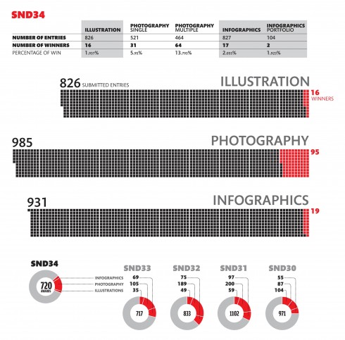
TAKEAWAY: This is the third and last in a series devoted to a subject that has many art directors, editors and info graphic artists talking: why did so few infographic entries win at the SND 34 competition? Today: One fabulous winning entry, and one that, although beautiful, failed to meet the most basic criteria: storytelling.
In our blog the Tuesday and Wednesday, we began a discussion about the SND 34 contest and particularly the infographics category, with several art directors and designers worldwide stating that they did not think enough good entries were awarded prizes, and asking for clarification in how infographics are evaluated.
I must say that I am quite satisfied with the constructive conversation that these blog posts have generated, especially across the social media. That has been the aim of these efforts, and I hope that, as the series concludes today, the dialog on this important subject will continue, leading to reforms and improvements on how SND approaches judging the infographics category (or categories) for its competition starting with SND 35.
National Geographic’s winning entry
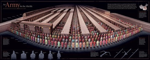
SND 34 winner: Terracotta mega graphic by Juan Velasco for National Geographic magazine
Title: An Army for the Afterlife. The Splendor of Qin Shi Huang Di’s Terra-cotta Army.
SND 34: Award of Excellence
Authors: Juan Velasco (Research, design, text and art direction), Pure Rendering GmbH (a German CGI company doing architectural and product renderings, animation and matte painting),
Publication: It was published in the June 2012 issue of National Geographic magazine for all 37 local-language editions worldwide, making the cover of the magazine in several editions.
What constitutes a winning infographic?
Perhaps this one by Juan Velasco, Art Director, National Geographic magazine, represents the best of the best: aesthetically a monumental example that is suitable for framing (although that is not what we normally would do with an infographic), rich in storytelling, layered with all types of mini stories that go beyond the big story, to reveal important details both visually and journalistically.
A graphic such as this one, titled Terracotta raises the bar, and that is probably what the judges experienced at SND 34 when faced when this piece. After looking at it, reading the texts and admiring all that this graphic does, many other entries, excellent as they may have been, paled considerably.
In Juan Velasco’s own words about his winning graphic:
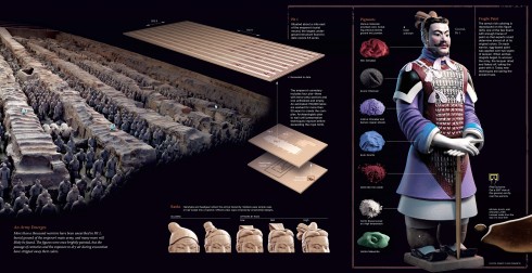
I worked on this one myself. Terracotta1.jpg is a double gatefold, which was followed by Terracotta2.jpg, a 3-page gatefold. When the double gartefold is closed, you see a panoramic photo of the pit as it stands today. As you open it, The graphic reveals an accurate reconstruction of the entire Army and their colors. I spent time in China working with the scientists and archeologists in the pit.
What makes this graphic unique?
The graphic is the first complete reconstruction on the main pit at the Terracotta Army site in Xi’an, China. Emperor Qin Shi Huang Di buried himself with a fabulous army of more than 6,000 terracotta figures. Each of them was different from the others and carried real weaponry. Elaborate chariots and horses were part of the army too. What was new? For the first time we had enough clues from pigment fragments to have a very accurate idea of the colors in the Army. Also, a whole new section of the pit was being excavated.
Juan’s experience in creating this masterpiece
I traveled to the site in China to research this project and to spend time with archaeologists and with the scientists working on the preservation of the color pigments in the warrior figures. Until now, any tiny fragments of paint would disappear in a few minutes after new figures were unearthed due to chemical reactions with the open air and changes in humidity. New preservation techniques are helping.
It all began with photos
Before traveling, the story photographer Lou Mazzatenta showed me some panoramic photos of the pit and we thought it would be amazing to compare a photo of the pit today with a full view of the Army in all its splendor. Once in China, the photographers at the site’s museum showed me a beautiful panoramic photo. When you come to the page you see that photo before you open this double gatefold revealing the whole full-color Army and the architectural structure of the pit, all in the same point of view.
In the following gatefold, we reconstructed the color of one figure in detail. For this particular figure (one the very few generals in the pit) and only a couple more we can make a nearly complete reconstruction.
It’s all in the details
We found the same antique pigments (azurite, malaquite, cinnabar, charcoal, charred bone, natural lacquer) that were used in the warriors in a specialty art store in New York, and photographed them to show them next to the figure.
The techniques
The entire Army was rendered in 3D in very good detail so we were able to show an animated video with a flyby around the pit in our iPad edition. In addition to the colors, the placement of the different ranks of soldiers, their armors and weapons, etc, are all accurate. We checked every detail back and forth with the experts multiple times.
The readers can also rotate the figure of the general with a finger to see the colors in the back, and overlay the panoramic picture on top of the illustration. They match perfectly.
The importance of research
Detailed research is essential for great information graphics and we are lucky to be able to travel to remote places to research and create pieces like this.
Oh, so beautiful, but where is the story?
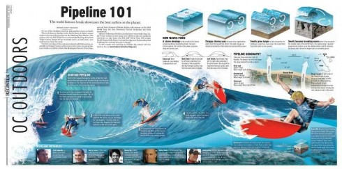
This Jeff Goertzen graphic did not win: it may represent the type of graphic the judges felt was big on illustration, short on storytelling
First, our respect and gratitude to the great infographic artist and visual journalist, Jeff Goertzen, of the Orange County Register, for his frankness and courage in dissecting his own beautiful graphic, and coming to terms with its shortcomings.
In our blog posts of the last two days, we have heard repeatedly from judges of the SND 34 competition who referred to graphics where the entry was long on design and making an image the protagonist, even when there was not much of a story to go with it.
This, as we all know, is the kiss of death for a graphic. Readers are smart, too, and do not buy the poster like, double page treatment that creates visual impact, while the journalistic element stays home. A measure of a good editor, art director and info graphic artist is the ability to recognize when a graphic should be one column, two columns or a double page spread. Failing to do that enters us into the category of overly designing—-visual exaggeration comes to mind.
Back to Jeff Goertzen, however. As soon as my first blog on the SND & Infographics appeared, Jeff wrote me to express his gratitude to us for writing about the subject, then presented the case study of his own non-winning graphic.
Jeff is definitely not apologetic about his own work here. Quite the contrary, he recognizes its shortcomings but still wonders the effectiveness of the graphic with readers and poses the decades-old controversial question: do we design for the readers or for the competition judges?
Create the best and don’t agonize over awards!
While I simply do not wish to go “there” (it requires an essay, not a blog post), I think that the best policy is to put all your passion into that piece you are designing, explore every corner, make sure that it is best of best in your own perception of what constitutes excellence, then publish it, and the awards may come. If they don’t, just don’t agonize about it. Give yourself 24 hours to get over it, and then march right on to creating your next best of best. This has worked for me for decades.
Here is Jeff’s story:
I felt compelled to use this as an example of an entry I submitted to the competition, which didn’t win. It falls right into the category of the type of graphic that the judges didn’t favor — heavy on illustration and light on information. And I would have to agree with the judges, if that be the case.
Where does this infographic fail?
Too much space, too little information?
The large wave with the surfer doesn’t explain much visually, but it was an important element in the page design and visual content. The most visually explanatory part of the graphic is at the top that illustrates how waves are formed. Honestly, this graphic could have been explained in half the space, but this was a stand-alone graphic on our Outdoors page. The purpose was to tell the story with a graphic and no story. I could have illustrated it with simple vector line work, but it would not have the same visual effect with all the rich textures.
Who are we designing for?
Jeff feels that while the judges may not have liked the graphic for not telling enough of a story, he still thinks that perhaps readers appreciated it.
I wouldn’t change a thing with the graphic. It was designed and presented this way for a purpose — to tell a story with a strongest visual impact possible. High priority on visual impact for the reader. Although I felt it had a shot at winning an award, that was not a priority on my list when I designed the graphic.
Jeff’s takeaways based on his experience with this graphic:
With each graphic you do, focus on what your readers will think, not what SND judges will think.
Make each graphic the best it can be, regardless of size.
Make sure the boss is happy with your work (Very important these days).
Be happy with your own work.
Be inspired by other work, but DON’T COPY. Be original.
At the end of the year, support SND and send in those entries.
Interesting points from Jeff, and I am sure likely to evoke plenty of reactions. We welcome your comments here.
Some more helpful suggestions to improve the SND infographics competition
Alex K. Fong, Deputy Design Director
Bay Area News Group (San Jose Mercury News, Contra Costa Times, Oakland Tribune), who was a judge in the SND 34 infographics competition, sends us some additional comments on his suggestions to improve the competition:
Infographics has expanded as a field, and the term now refers to a wide range of work that includes technical renderings and data crunching. Separating infographics into news and features categories feels antiquated — a relic of days in which design and visuals were verboten in news sections, and our techniques were limited by time and technology. It seems more appropriate to divide by the kinds of graphic to allow the judges to focus on the particular qualities and innovations of each “genre” on equal footing.
Possible sub categories for the competition
Two of these “genres” are obvious: data visualizations and explanatory graphics.
I’d like to propose a third I’m going to call “data illustrations,” or visualizations that are nominally derived from data but focus more on its aesthetic and tonal implications. Maybe this is crazy, but stay with me here as I think out loud (in email).
The National Post, I believe, won an award of excellence in the “Miscellaneous” category for a graphic that represented, if I recall correctly, a year’s worth of deaths in Afghanistan. Each fatality was depicted as a recognizably human pictogram.The choice in visualization obscures a reader’s ability to engage with the data numerically, but it humanizes the information and tells a powerful story. What we get is a haunting portrait of a continuing tragedy.
It’s a potent journalistic choice — perhaps one better served if given a different set of judging criteria.
The question is whether “data illustration” is a worthwhile distinction. I don’t think I am equipped to answer that.
Some words from the SND executive director
Courtesy of Adonis Durado/Times of Oman
Stephen Komives calls for greater participation in SND activities.
I want to thank you for leading the conversation about how SND can reflect, recognize and promote and infographics industry. I am hoping I might add the following to your third and final post, as a plea to all graphic artists working in news media: please join SND. Join our membership ranks. Join our committees, come to Syracuse as a facilitator, come to our workshops, help us organize a workshop where you live, come to our open committee meetings, join our board. We want and need your voice.
“Gain ownership of your craft”
When you join SND and share your voice you are taking ownership of your craft, not only for yourself but to honor those who created our discipline within journalism and to support the next generation who is striving to take the mantle. I do not know if 17 awards in the infographics category was a blip that will see regression to the mean next year, or part of a larger trend, if the entries were somehow weaker this year (I highly doubt it, and we have seen similar ‘blips’ if you will in previous years in news, photo, and among medal distribution – check out the no-Gold 27th edition sometime). I do know this: if we do not as visual journalists invest in our craft and futures through organizations such as SND, we will see our voice in the greater journalistic community erode to irrelevance.
“Join the conversation with us”
The journalists who are creating the best informational graphics the world will see are a treasure to the industry, are working in all corners of the globe, and there is a single organization, SND, founded by infographics artists, created explicitly to serve them, and not just through the annual Creative Competition or the amazing Malofiej Awards staged by our affiliate in Spain, but through continued service and sharing. Join us. If you believe 17 awards is simply not enough, join us. If you want to lead future conversations about the state of the industry, join us. If you have something to learn, or teach, join us. If you think SND could be doing more, join us. SND is just people, that’s all it is. It’s a relationship, and I hope everyone reading and taking away from this blog some very intelligent ideas about where we are today as visual journalists will join the conversation.
Nominate future judges here:
http://www.snd.org/competitions/print/judging/
Volunteer to be a facilitator here:
http://www.snd.org/competitions/print/facilitators/
Continue the dialog
Thanks to all of you who have given me of your time and talent as I put together these three blog posts. I have enjoyed the camaraderie, the healthy exchange of ideas, and I hope that, while this is the end of the series, it is the beginning of a dialog that will lead to a better infographics competition, and, ultimately to more newspapers and magazines including the best of the best infographics on their pages and digital platforms.
I also imagine a category in the competition for a graphic across the four platforms of the media quartet, and how the editors and designers created a distinct experience to tell the same story. And, this category is the present, not just the future, and should be present in SND 35.
Let’s reward the one column infographic and the media quartet infographic. Both can be winners.
Previous two entries for series SND & Infographics:
Part 1: SND & Infographics: Part 1
https://garciamedia.com/blog/articles/psnd_amp_infographics_is_it_tougher_to_win_today_p/
Part 2: What are solutions to improve competition?
https://www.garciamedia.com/blog/articles/psnd_amp_infographics_what_are_solutions_to_improve_competition_p
Of very special related interest:
A look at competitions and consequences
http://bit.ly/YBSUNB
Josh Crutchmer, who was a judge at SND34, the competition coordinator for SND33, and is a member of the competition committee responsible for the structure of the competition, discusses issues raised in our blog the past few days.
Highlight:
Let’s oversimplify the issue for the purpose of this discussion, and say this: The issue at hand is that SND34 judges awarded so few graphics and illustration entries that there is cause for concern over the viability and integrity of the competition. We know this based on public and private reaction to the announced results.
That’s our issue. Let’s take a look at all of the possibilities that arise in its wake.
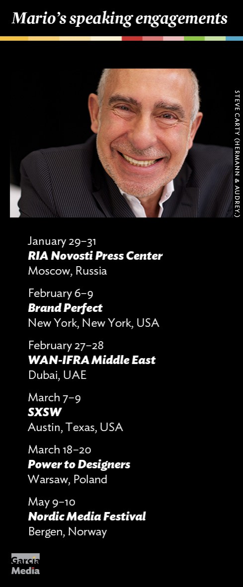
Where’s Mario until March 2, 2013?

Mario’s upcoming speaking engagements
Take advantage of our iPad Design/Ad Lab workshops

Do you want to take your brand to the next level by creating a tablet edition? Garcia Media can help. We now offer one- to two-day iPad Design Lab workshops on demand to jumpstart your presence on this exciting new platform. We also offer iPad Ad Lab workshops to develop engaging advertising models for your app. Contact us for more information.

Purchase the book on the iBookstore