TAKEAWAY: Another Project Pinstripe launch has taken place, this time the Cincinnati Business Courier. Unification and continuity for the American City Business Journals brand and storytelling continue.
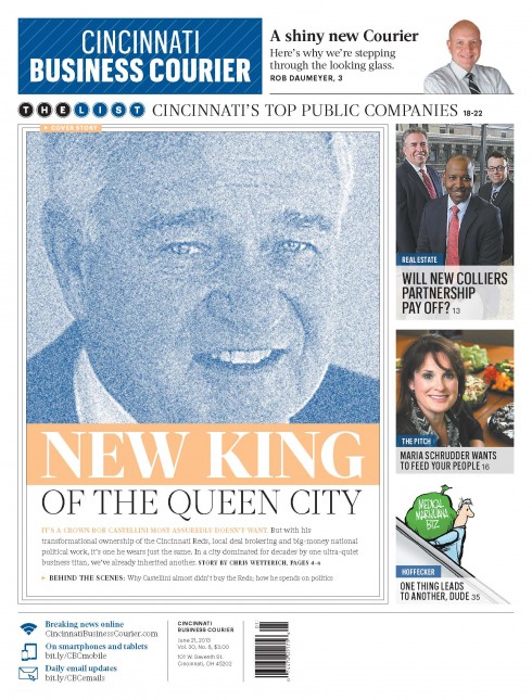
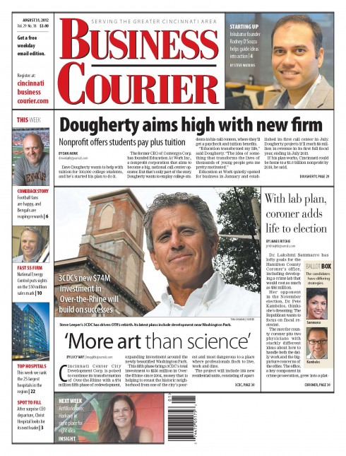
Front page of first issue after relaunch of Cincinnati Business Courier
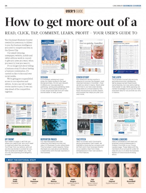
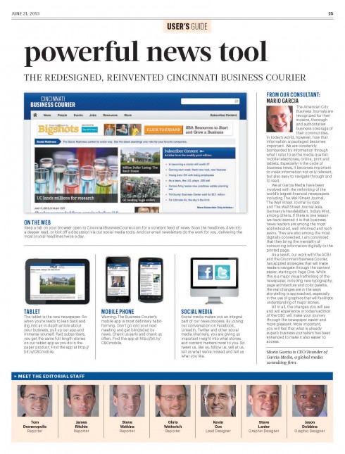
Double page guide to the new Cincinnati Business Courier

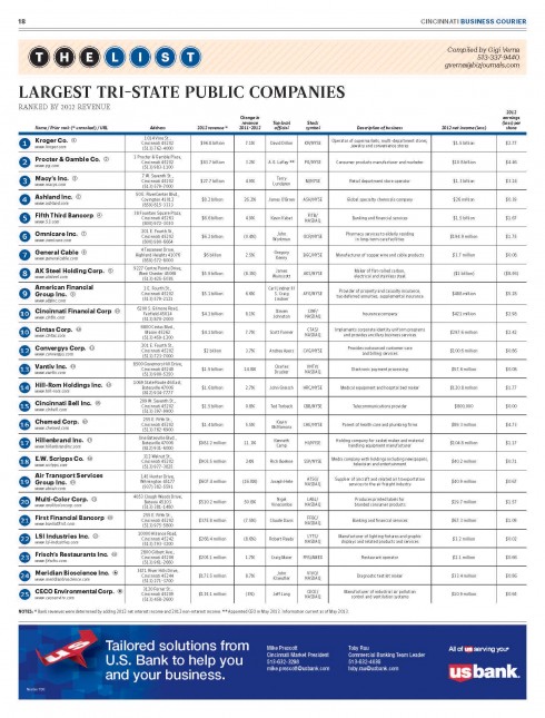
The List is an ACBJ exclusive and one of the best read sections of the newspapers
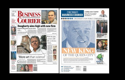
The front page before and after redesign/rethink for the Cincinnati Business Courier
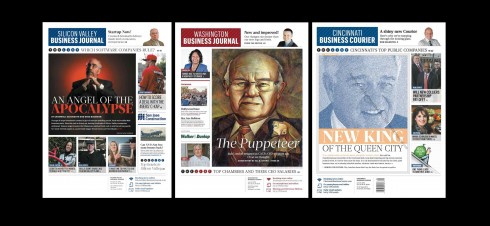
An aim of the ACBJ Project Pinstripe is to bring brand unity across all 40 titles of the firm: here the first three to launch, from left, Silicon Valley Business Journal, Washington Business Journal, Cincinnati Business Courier.
It was the Cincinnati Business Courier‘s turn to put those pinstripes on its logo (and its windows), complete with the centerpiece story on the cover, and a total rethinking and revamping of every page for this financial weekly.
It is part of the effort of American City Business Journals to unify its 40 weeklies, published across the USA, and to bring a common style of storytelling, story hierarchy and visual presentation.
Reed Reibstein and I at Garcia Media have worked closely with the ACBJ team, including Emory Thomas, chief content officer for American City Business Journals and creative director Jon Wile. Over the course of a year, and a half-dozen workshops, we have created a formula that is flexible enough to allow for the specific and unique features of each of the titles, while establishing a foundation that ensures a similar style for telling stories and for adapting to a digital first philosophy in the presentation of content.
What are the main changes in this rethink of the Cincinnati Business Courier?
Jon Wile, creative director for ACBJ, gives us a list of the most important things that readers will notice:
—Paper changed name to Cincinnati Business Courier (it was the ?Business Courier? with a tagline that said ?serving the Greater Cincinnati area?)
—Changed color to sapphire (formerly red)
—Full color in print product for first time
—Page 2 (Readers’ Guide) and Page 3 (UpFront) are new features that kick off reading experience.
—Sequencing of book changed dramatically
—InSight section is replaced by expanded List packages, anchored by a weekly Q&A feature. This week?‘s expanded List package, for example, was five pages.
Some reactions from the team
Here is how Jamie Smith, publisher, Cincinnati Business Courier, reacts to the changes made in his newspaper:
The new look and feel of the Cincinnati Business Courier has not only met every objective that we set in this process but it has re-energized my entire team. My editor, my managing editor and every single reporter immediately bought in to the new concepts. I truly feel that we have designed a product in print that is just what our readers want! Initial reactions from those who saw the launch issue have been nothing but praise.
A local CEO of an IT company praised the Courier and said that The Business Courier is the only print product that he reads, everything else I read online including the Wall Street Journal. After looking at the launch issue he commented, ?“The new look excites me, it makes me want to read it that much more!”? I couldn’?t be happier with this process. I truly feel like a trail-blazer in the media world.
Rob Daumeyer, Editor, Cincinnati Business Courier, worked to inspire his team to adopt the changes:
The design is just flat-out beautiful. But more importantly, it?s better organized, easier to read and provides far more entry points. I believe our print package is now exactly what it should be, circa 2013.
Reader reaction to new Cincinnati Business Courier
So far, positive reader reaction, as seen in the following quotes:
I love the new Business Courier! It has a cleaner look and, due to the new section layout, will be easier to use as a reference. I especially like the revamped “on the move” section and innovative advertising options. Congrats! “
Love it—dynamic and robust. Well done. Kudos to All
LOOKS FABULOUS!!! GREAT JOB.
Next to undergo Project Pinstripe
The Philadelphia Business Journal will be next to “earn its stripes” as it launches its new design this Friday.
Previously about American City Business Journals:
It’s a new Washington Business Journal
https://garciamedia.com/blog/articles/pits_a_new_washington_business_journal_p
The design of the Silicon Valley Business Journal, from prototype to reality
https://garciamedia.com/blog/articles/the_design_of_the_silicon_valley_business_journal_from_prototype_to_reality
Silicon Valley Business Journal: Creating the ultimate multi-platform operation
https://garciamedia.com/blog/articles/silicon_valley_business_journal—creating_the_ultimate_multi_platform_opera
Lessons learned from Silicon Valley, and a look at some details of SVBJ
https://garciamedia.com/blog/articles/lessons_learned_from_silicon_valley_and_a_look_at_some_details_of_svbj
And for those Mad Men TV series fans
Font experts weigh in on ‘Mad Men’s’ funky new logo
http://www.latimes.com/entertainment/tv/showtracker/la-et-st-mad-men-sterling-cooper-new-logo-design-experts-20130619,0,772189.story
First paragraph:
One of the quieter developments in Sunday’s “Mad Men” was the introduction of a funky new logo for Sterling Cooper & Partners, the hybrid agency formed earlier this season with the merger of Sterling Cooper Draper Pryce and Cutler Gleason Chaough.
And for fans of Pedro Almodóvar films
For Almodóvar, Comedy Needs Color
http://www.nytimes.com/2013/06/23/movies/for-almodovar-comedy-needs-color.html
All about the Spanish director’s choice of color for his latest film, I’m So Excited.
If you are into color choices and creating the right palette to suit content and mood, you will enjoy this Times piece.
First paragraph:
In the latest film from the Spanish director Pedro Almodóvar, “I’m So Excited!,” crisis equals opportunity. The problem that kick-starts the narrative — a serious technical failure on a commercial flight to Mexico City — lets him build comic moments out of chaos and revisit some of the outrageous humor he used in 1980s comedies like “Labyrinth of Passion” and “Women on the Verge of a Nervous Breakdown.” It also gives him the chance to use his signature vibrant, colorful sets to complement his broad comedy.