Thursday and Friday: Reporting from the WAN-IFRA World Newspaper Congress 2011 in Vienna
TAKEAWAY: It was an electrifying day of dissecting news websites, sampling one model after the other on the screen, and then retrieving to concentrate on what the new generation WirstshaftsBlatt online will look like. It was part of the Mobilista workshop in Vienna Tuesday. Highlights of the workshop here. PLUS: Two interesting Bild pop ups
Mobilistas movilize to create the next generation website
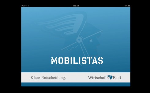
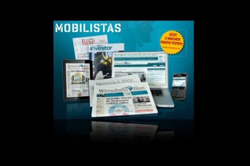
I was invited by Alexis Johann, director of digital publishing at WirtshaftsBlatt, the financial daily of Austria, to conduct a workshop for his team. Titled Mobilista, the workshop was to address how the WB continues to evolve its many digital offerings.
A media house with a successful digital component that already includes the mobile, online and tablet editions, in addition to the printed daily newspaper, is now preparing to develop its products further, with emphasis on the website, which was created in 2004 and now must adapt to be part of the media quartet.
As in many other newsrooms, a first part of our workshop was to discuss the role that each platform plays, and how the presence of a tablet edition forces editors to rethink their online offering.
Here are some highights of the workshop, which signaled the beginning of our work together, culminating in the launch of the new products by summer 2012.
Each platform doing what it can do best: While many in the industry see the tablet as posing tremendous threat to the printed editions of newspapers and magazines, I believe that it is the online edition that is likely to receive the greatest impact from the ever growing presence of tablet editions. Why? Both are digital, both are read on screens, and we know for a fact that a great number of readers are reading online news on their tablets (me included!). As a result, I see that online editions will probably develop into more news providers (consumed by most users during working hours, the lean forward motion); users will expect fewer amenities such as photo galleries and videos on their online editions. These, I believe, will move to tablet editions which are used primarily during evening hours, by a more relaxed user, in his/her down time, lying down and enjoying a more meditative kind of user experience. The online editions will become the day time “news workhorses”, their use diminishing in the evening, when the tablet takes over. The mobile phone will continue to provide our first encounter with a breaking news story, which we follow up online and then wait to get the full coverage in print or in the tablet. Such is the state of news consumption at the end of 2011. Our workshop addressed reading modes, lifestyle preferences of our audience, and the role of each platform.
Of related interest:
Night owls read news on tablets, as mobile overtakes computer for at-home browsing
http://www.poynter.org/latest-news/romenesko/149113/night-owls-read-news-on-tablets-as-mobile-overtakes-computer-for-at-home-browsing/
The aesthetics of the new website: It is less is best, and The Boston Globe and the Frankfurter Allgemeine are leading the way, showing us that it is not necessary to follow those Yahoo-inspired home pages that looked like the window of the hardware store——with more hammers and nails that the eye could capture. Instead, you want a home page that impresses with its presentation, relaxes the harried user with its clever use of typography and white space, and offers the type of information architecture with fewer categories to identify content. This look may be partly the result of what is called “responsive design,” in which templates adapt to suit all digital platforms. If so, then more power to responsive design. My response is that it is worth studying and cultivating. Note: While The Boston Globe is responsive, the FAZ is not.
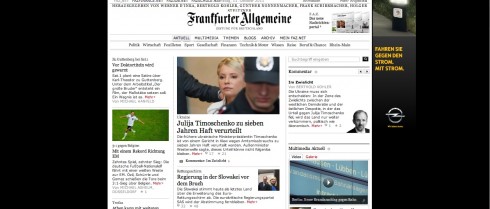
www.faz.net (Frankfurter Allgemeine Zeitung, Germany)
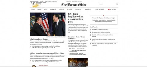
www.bostonglobe.com (The Boston Globe, USA)
Of related interest:
Introduction to responsive design
http://www.thestylesheet.com/featured-articles/2011/09/an-introduction-to-responsive-design/
The necessary presence of social media: About 45 minutes of our morning session during the Mobilista workshop was devoted to an ample discussion of the role of social media. Again, I emphasized the importance of coming to where the people are: that central square teeming with the crowds (destination: Facebook). Bring your ice cream to sell in the square, I encouraged the members of the WB digital team. Don’t let it melt away before you bring it to market, where the crowds are. Develop a Facebook presence, a la WSJ.Social, and as an increasing number of publications and media outlets are doing. For many members of the younger Facebook generation, who can dispense with news in the traditional form, it is imperative that the news come to them via the platforms they recognize and visit daily. For each day that a media house stays away from the central square, the price to pay is high, the removal of your brand and your product from those who will not come to you to get it. Whether it is vanilla or mango ice cream that you are selling, bring it to the big central square, where someone will sample it, and, who knows? Maybe they will like it enough to come back for seconds.
The importance of editing (don’t forget that sexy is important): By the end of the workshop our attention had turned to the more specifics of the websites discussed: editing and the presentation of content. The best websites provide typographic texture for stories: headline, summaries, secondary readings. When done properly, as with layering, each of these elements contributes to the storytelling process, and the user benefits. When we say that a website has to be sexy, we don’t mean a photo of a young woman wearing almost nothing. Not at all. Sexy translates into visuals that seduce, smart headlines that attract us, stories that engage, utility elements that remind us how valuable this website is for us to survive from day to day (think tips, guides, what to do tonight, etc.)
Did someone say photos are getting smaller? Well, maybe yes, and why not? If, as we mentioned earlier, the news website of now and the future is consumed during the day, during lean forward time, by people who know that websites are constantly updated, then they want good stories, good headlines, and, indeed, photos, but not necessarily a 25-image photo gallery. And also not very important that the photos be the 650 pixels across the screen. In fact, some of the best websites we reviewed today had just the perfect combinations of typography, white space and visuals. Come to think about it, not one of those elements took attention away from the other.
Responsive Design and the WB: Will the digital team of the WirtschaftsBlattattempt responsive design? Perhaps. IF so, my recommendation is to begin, not with the mobile phone, but with the wider platforms, as with the website, then adapt to mobile and tablet. If this is going to happen, my recommendation is that they start with a coded prototype soonest, to see how it may adapt to each platform.
Some we like
Some websites we reviewed in the Mobilista workshop. These samples which we looked at and commentaries came directly from Mario Garcia Jr., president of Garcia Media:
1. http://www.msnbc.msn.com/ Major flexibility in main story section, innovative navigation functionality where simply rolling over topics gives you a snapshot of the top stories for that section, simple labeling (I.e., top stories, explore, individual topic modules that you can customize, and great full-width article pages).
2. http://www.good.is/ Modern and beautiful design. Great navigation structure (elements as main nav, topics as secondary nav). Participation is obvious. Great content hook (Good Finder) to distinguish from other sites. Nice modular design as you get to the other stories on the site (much like we did with www ilsole24ore.com)
3. http://www2.ljworld.com/ Classic, simple design that also works well. Wonderful grid structure that makes the site look organized and offer flexibility depending on number of main stories and importance of main story.
4. http://www.indystar.com/ I really like the way this site looks modern, organizes content and elements (and this month I love the way they’ve worked the pink wallpaper into it!)
5. http://ihned.cz/ I’m very happy with the way ihned turned out (a Garcia Media project in Czech Republic). The nav structure is easier to use, the overall site more organized and the customization feature of the topic modules on the bottom has been very successful and saves users time (which they appreciate!).
6.http://atlanticrecords.com/ I love Atlantic Records site — has the responsive design that Boston Globe has plus it’s an interesting way to present the content in flexible modules that can be one column wide, or 2 or even 4. Easy to scan and I find I’ll read more stories just because I get to the headlines faster.
7. http://www.complex.com/ Also a great way to organize a large amount of content without overwhelming users. Middle of site lets me customize the experience to the topic I want. Homepage is shorter, easier to get through.
8. http://www.target.com/ This isn’t a news site, but I’ve been playing around with the idea of presenting news in a linear fashion like this. It’s a formula that has been used more for “sales landing” pages but they are successful there so wondering if it would work for a news site (writing a blog article about this idea for my site)
9. http://bleacherreport.com/ Not so much for the actual design, but another interesting way to present content that would transfer to the mobile devices as well — very visual where the photography is the link, but I think this site has grown in popularity so fast because of the way they present their content — lists, tons of lists that make it hard not read or scroll (examples: http://bleacherreport.com/articles/885679-week-five-report-card-for-all-32-head-coaches, http://bleacherreport.com/articles/882717-2011-mlb-playoffs-the-all-choke-team-position-by-position)
Today’s pop up
Bild surprises us again. This time, the German daily with some of the best pop ups in the iPad, takes up the story of the economic crisis facing Europe. It does it through a wheel of fortune that the user can spin to find out the highlights of the crisis.
And here Bild does its own take on a story that is captivating Germany: The German authorities have been accused of using Trojan malware to spy on private citizens.