New and old myths of newspaper design
5. Don’t mix color and black-and-white photos or graphics on the same page.
Never once have I heard a reader complain about this special cocktail of mixed black-and-white and color images. The designer’s task is to select the best possible images, regardless of color, and display them properly on the page following a hierarchy that indicates where the eye should go first, second, and third. The color versus black-and-white issue becomes quite secondary to the content of the images, their placement on the page, and the role of the images in the overall design.
6. Don’t interrupt the flow of text.
Magazines have been using quotes, highlights, and other text breakers for years. However, place one of these devices in the text of many newspapers and you will find a chorus of editors repeating the same verse: Any interruption of text causes the reader to stop reading.
I have found no evidence of this in the many focus groups I have observed or in The Poynter Institute’s own EYE-TRAC Research. (EYE-TRAC scientifically documented how color, text, graphics, and photos direct a reader’s eyes around a newspaper page.) Of course, interruptions can become obstacle courses if:
– One places a 24-line quote across 12 picas, forcing the reader to jump over text; or
– One places the breaker in such a strategic position that the reader will not jump over it, but assumes instead that he should move across to the adjacent column.
So length of the interruption and its placement determine legibility factors. Any interruption that requires more than a 2-1/2 inch jump should be reconsidered.
7. Readers prefer justified type over ragged-right type.
The myth is that ragged-right type implies “soft” or feature material, while justified type represents serious hard news. This, too, is only in the minds of editors and some designers. There is no evidence of the truth to this perception. If newspapers had always set all their text ragged right, readers would have accepted that style.
Ragged-right type can change the rhythm on the page, even when used for short texts or for columnists. Its use incorporates white space, which is always needed, and allows for more appropriate letter spacing within and between words. Some research has confirmed that the presence of ragged right speeds up reading.
8. Story count counts.
One must have, says this myth, a minimum of five stories on the front page. Well, it is seven in some newspapers, and 11 in others. Story count is a state of mind; it should not be a formula. No two days in the news are alike for the editor putting together Page One. On certain days, one big story may equal four, or even seven, small ones. Sometimes a photo may carry the weight of 10 stories, and so on. Individual elements are what count, not a systematic formula that forces elements to satisfy a quota on the page.
What do we know about story count and Page One?
Well, the front page is still the face of the newspaper and must display not only the day’s news but promote the best content inside. More is definitely better than less, and index items, promo boxes, and even standalone photos are all part of what makes the eye move. Readers in focus groups do not count stories.
Eye movement – activity on the canvas of the page – is what counts. How one makes the readers’ eyes move can be determined by factors that are not necessarily associated with the mythical story counts that editors are subjected to.
9. Leave things in the same place every day.
For many editors, a Page One or a section front with static elements (promos at the top, left-hand column of briefs, etc.) provides a sort of teddy bear to embrace when they come to work every day. So, in typical fashion, editors always ask for the teddy bears.
There is no truth to the myth that readers want these elements exactly in the same places every day. I prefer to experiment with “teddy bears on roller skates” – let the promo boxes appear differently from day to day. Some days use one promo only, some days use three promos. Surprise the reader with promos that run vertically on Tuesday, but horizontally on Wednesday.
10. The lead story must always appear on the right-hand side of the page.
Editors seem sure of this, but nobody bothered to tell the readers. To them, the lead story is the one with the biggest and boldest headline, whether it is to the right or the left. Of course, hierarchy is important. No myth here. One definitive lead must appear on the page to guide the reader, but its appearance, as long as it is above the fold, becomes inconsequential.
The new myths?
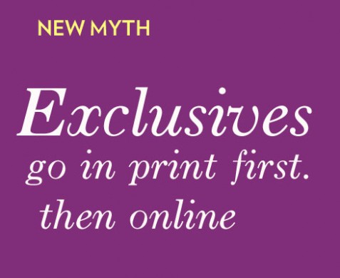
Save the exclusive for the printed edition: this is probably the most timely new myth. One still hears this in newsrooms across the world, the traditional print journalist who believes it is not really news until it appears printed on paper. Nonsense, I say. In a modern operation the path of the story is what is important. It is no surprise that a breaking news usually begins in an online edition (or mobile phone alert), then travels across the channel. Your brand carries the story, that is what is important, NOT where it originates.
Unlike some of the other myths listed here, which may be insignificant, this one, I believe, cuts right to the heart of success or failure, life or death, for a publication. Let the story move across the platforms, starting where it makes the most sense to get it to the consumer.
Broadsheets imply seriousness, compacts are downmarket: Does anyone out there still believe this? I hope not. Some of the most serious and well respected newspapers in the land have gone compact, i.e. The Times of London, The Wall Street Journal Europe and Asia, El Pais, La Vanguardia, Le Monde, Le Soir (Belgium), and the list goes on.
Why the myths?
Well, what would newspapers be without them? Meetings would be shorter, and less argumentative, especially if there was no “italics” myth. Who creates the myths? Like the games children play, nobody knows where these myths start. Children teach each other games in the schoolyard; professors pass on myths to their innocent charges in journalism school. Then those myths gain momentum when the rookie journalist hears the same myth glorified by his veteran editor, and so on.
What can one do about myths? Select the ones you really want to do battle over, then wrestle the myth promoter to the ground.
Sometimes you win.
![]()
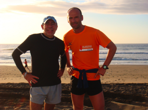
In the Canary Islands, resting a for a few days, doing good runs, enjoying the sun. Here Frank and I this Sunday morning, after running on the edge of the sea in Maspalomas’ Meloneras Beach.
TheMarioBlog posting #134