Update #3: Friday, July 30, 19:15 Paris time
TAKEAWAY: The summer’s indispensable companion, Monocle Mediterraneo,made its grand entrance at a Mediterranean beach near you yesterday. It is a must have. For us in this industry, a colorful, informative reminder of how much fun print can be. Here is the letter I wrote its editor and publisher, Tyler Brulé, after seeing my first copy. PLUS: Interview with Metropoli’s Rodrigo Sanchez AND: 40 Years/40 Lessons: Books.
“Scent” of a newspaper: people like the new MM
A happy editor/publisher/admiral of the fleet, Tyler Brulé updates us on early report following the launch of Monocle Mediterraneo July 29:
The headlines:
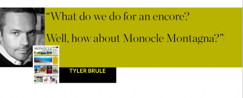
“Our tiny LA shop sold 77 copies the first day! Can you imagine how happy any traditional newspaper publisher would be to sell that many copies at a single outlet
we’ve been selling around 100 copies a day at £7 online .Everyone loves how it smells. I was in the store and I witnessed three customers crack it open and just smell the stock. I love that! People have been ordering two copies – one to get dirty with, the other to keep pristine. Our advertisers are all asking – what do you do for an encore?
The answer …
Monocle Montagna!
And Tyler dreams a little about his next seasonal newspaper:
Imagine a cosy edition to curl up to over the holidays? Imagine the advertising over the holidays!
Indeed, I can imagine it, Tyler. Print is eternal, we know, and with Monocle, print is seasonal and something to look forward to as summer leads to autumn and winter and spring.
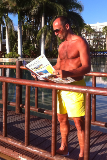
Frank Deville: probably Monocle Mediterraneo’s first reader, enjoying his copy at the beach in Maspalomas, Canary Islands. Frank is a model who resides in Luxembourg
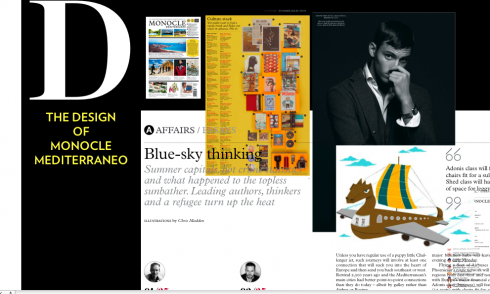
A front page with 15 enticing items to sample
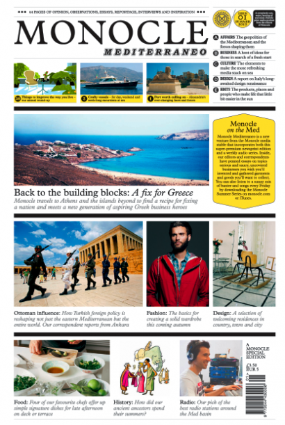
Here is the front page of the summer newspaper Monocle Mediterraneo, which appears July 29.
The contents page: navigation made fun and easy
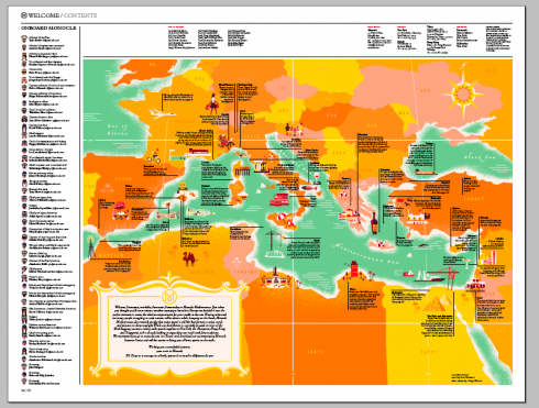
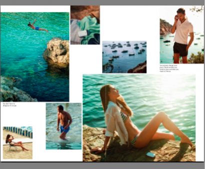
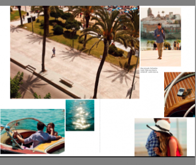
The contents’ page is a real map, pointing to locations of interest where Monocle Mediterraneo takes you in this premiere edition. But it is not just a navigator to the inside; it is also full of informative snippets about those sandy beaches of the Mediterranean. My favorites: In Bozcaada, go skinny dipping in the hidden coves on the south eastern tip of the forgotten Turkisn island; Liguria, Italy, if you must truly connect to your digital dependancies, the port of Genoa now has free wi-fi, although Tyler would probably prefer that you take a post-morning-run coffee and ensaymada at the Fibonacci bakery in the Portixol on Palma’s seafront.
Depth with optimism gives content rhythm a great start here
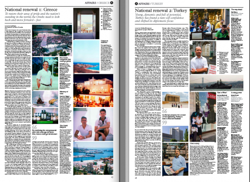
Opening with optimistic pieces about Greece and Turkey
Culture Stack: 36 tips to make you wiser, more interesting
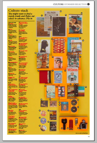
One of my favorite features, it encourages the reader to find a sturdy trunk and Fedex all these selections in advance. Among the top picks: El Pais of Spain, the must read while in the Mediterranean (I agree and always do); A Single Man the movie, directed by Tom Ford; Abba’s Voulez-Vous, those guys from Stockholm go well with the waves; and, Mario Vargas Llosa’s The Feast of the Goat.
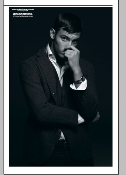
Even the late Steve McQueen comes alive here
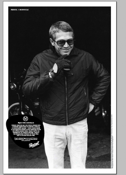
The ads with Steve McQueen, black and white splendor of a long gone movie idol, who seems to come alive here.
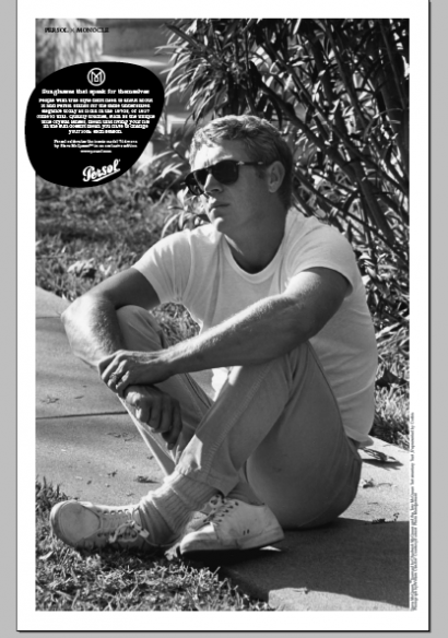
Ads as visually appealing as the rest of what we see here
Another one of those ads that blend so well with the rest of the MM’s editorial content.

BlackBerry ads were never so appealing. Notice that everyone here is at the beach, creating proximity between the product and the reader’s environment, something rare in newspapers as we know them today.
Dear Tyler, (or should I refer to you as Admiral of the Fleet, as you so aptly call yourself in the newspaper’s masthead?)
This is a love letter to you after seeing Monocle Mediterraneo. Please pardon me if I get too mushy here!
It is time to fan yourself with the 3Ms—-as in Magnificent Monocle Mediterraneo—-at the beaches of the Mediterranean starting tomorrow.
A quick review yields these impressions:
If anyone talks about a renaissance (did it ever go away?) of print doing what it can do best, this is it.
More than a summer newspaper, this is the tutti frutti sorbet that every publisher in the globe needs served to cool his palate, to make him believe in print again, and, most importantly,TO GET A TEXTBOOK, on what printed newspapers could do daily, yes, indeed, daily, to attract and to retain readers.
Sustainability for the newspaper is all about providing information, service and fun for readers. Monocle Mediterraneo does it splendidly well. I can see me kicking off my Prada sandals, putting a bottle of Veuve Clicquot in a bucket of ice, disconnecting (William Powers, I think of you here), while reading Monocle Mediterraneo in the Canaries, where I happen to be, starting tomorrow.
No need for anything with a screen on it.
You manage to use the old newspaper format and give it several injections of Botox for Angelina Jolie lips, grace the pages with those gorgeous photos of Steve McQueen (God, are you sure he is dead? That man looks like the guys from Persol just had him hiding in a closet somewhere and pulled him out just for your beach newspaper. Gorgeous, indeed, but, apparently someone was looking at beauty in connection with ads: the model from Pictet should be doing Dolce & Gabana ads as well, and the young lady from BlackBerry, has a smile that sells more than phones.
This is the thing, Tyler, that publishers need to learn, and your summer newspaper/textbook does it to a T: ads blend with the editorial content, and provide just as much delight. No, I will not put my turkey sandwich on top of the page with the ad. No, sir, not at all. But you had introduced the concept well in Monocle the magazine already, so here you are extending it, to show us that newspapers can be fun, and not just during summer in a cozy and dreamy Mediterranean beach.
That the model in all the ads appear to be at the beach, sitting right next to you, adds to the immediacy of the product. Yes, you do a double take to see if that guy or that girl are engaged in conversation in the chairs next to you.
And the content:
You begin with optimism—-don’t we all need it, along with sun and sand?
To mention Greece and Turkey these days, and the newspaper reports make you look the other way. So you open Monocle Mediterraneo with an optimistic piece about National Renewal in Greece.
And the short thinking under the sun snippets. Grand, and, of course, my favorite one: William Powers’ about postcards, which I still write, by the way. I thought I was the last soul sending someone a Wish You Were Here from Hong Kong or Kerala.
Photography: Marvelous that you give us so many smallish images. We are used to seeing things small on digital media, so why not here too. But when you go big, you do it so well (shades of LIFE).
The service guide to 50 ways to improve the way we live: absolutely necessary, and a good way to end this summer journey into a place where even sweat stops to look at that image on the page.
Congratulations for reminding all of us in this industry that it can be fun, it can be informative, it can be mesmerizingly good for the eyes behind the sun shades, and, most importantly, that it can be ink on paper.
PS: This should not just be for the summer, dear Tyler; Monocle on the Alps..……..?
If good design is functional, appealing, serves the content first and let the visual surprises interrupt the dance of continuity, then Monocle Mediterraneo has it.
Those looking for the next euphoric design moment of mid summer will not find it here.
Students of how design can establish an engaging pattern that identifies the publication’s purpose (here it is classy and friendly), engages you intellectually as well as visually (this is obvious on every page), and, yes, makes you feel good about yourself (the hidden, but so prevalent, objective of all that we do, right?), will be able to use Monocle Mediterraneo as a sort of inspirational text.
Headers at the top of pages are big enough to be seen and not so large that they become party hats at the top.
The typography, mostly serifs for headlines, plays a secondary role for headlines, but more of a primary role when it comes to differentiation of narratives (serif) and secondary readings and finger reading (sans).
Page architecture is identical to that of Monocle magazine. Wider columns carry the substantive texts, while narrow ones speed you into lists such as “before you dive in”, which abound in this, as in any, Monocle product. The perfect symphony of trombones, violins and the occasional drum is achieved here.
Photos and illustrations give us an immediate signal as to the content of the story, but none appear too intrusive. I was thinking that this is one of the few publications that one could not rate as a “writer’s newspaper”, or as “photographer’s paradise, ” and not at all a “designer’s showcasse”. Yet, the three disciplines coexist like it was another day at the beach.
If anyone needs a little review of how to use small photos advantageously, turn to any page of ModMed.
And, finally, color: Yes, the palettes are mixed, from the golden yellows in the cover, to the subdued sky blues for headers, and the gray for summaries under headlines. It is all there, along with some black and white to cleanse your palate between soup and salad, or between Inspiration and Fashion.
One of the most inspirational pieces in Monocle Mediterraneo plays with the “big idea” of changing lines of work.
“What’s the Big Idea?,” asks the headline on Page 21, then it answers it in the summary below: “Can’t face the thought of returning to work after your summer break? Maybe it’s time for a new gig.”
For those of us designers/journalists, the inspiration is NOT to find a new gig, but to reacquaint ourselves with that gig we love, hit the reset button and let Monocle Mediterraneo inspire our next project.
But, first, a dip in that Mediterranean beach—-usually too cold for a Floridian like me, but, refreshing nonetheless.
The Washington Post interviews Tyler Brulé
http://www.washingtonpost.com/wp-dyn/content/video/2010/07/28/VI2010072802062.html
Monocle Mediterraneo facts at a glance:
Multi-platforms: The Monocle newspaper will exist in both print and online formats.
Format/pagination: The 64-page colour tabloid will be accompanied by the weekly Monocle Summer Series audio programme on monocle.com, mixing live music, discussion and debate.
Price:The newspaper is priced at £3.50 or €5,
Previous blog interview with Tyler Brulé about his Monocle Mediterraneo project
https://garciamedia.com/blog/articles/exclusive_tyler_brule_discusses_the_monocle_newspaper
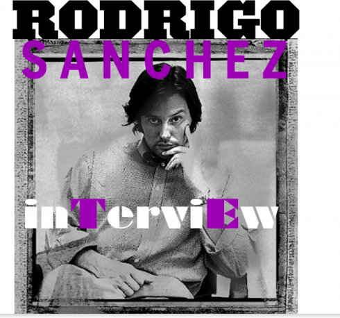
Two questions for Metrópolis’ Rodrigo Sánchez
Note: For those who would like to read Rodrigo’s interview in Spanish, please refer to our Garcia Media Latinoamerica website, where Rodrigo Fino picks up the story:
http://www.garcia-media.com.ar/blog/post/internet-en-beta-permanente/115
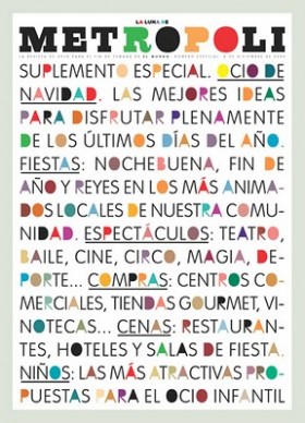
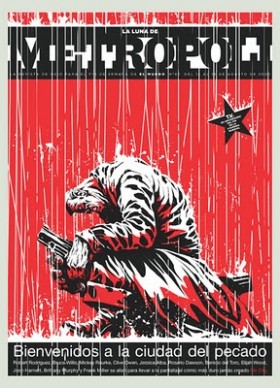
They are the covers that we all wish we had created, the ones we turn to for inspiration when the muse is taking a coffee break somewhere. An exhibit of the best of Metrópoli has opened in Madrid. The man behind so many of these magnificently conceptualized covers is the talented Rodrigo Sanchez, who for years has been art director of the supplements at El Mundo in Spain. He talks to us about what inspires him, and how he and Metrópoli face a new digital world

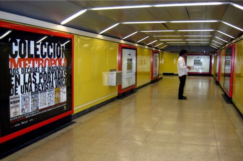
Rodrigo Sánchez stands by the sign announcing the Metrópol exhibition in the Madrid Metro. There are 10 different versions of this poster, shown at 124 stops of the Metro system

Two questions for Rodrigo Sánchez
Rodrigo Sánchez is Art Director for Magazines and Supplements (including Metrópoli), Unidad Editorial.
Mario: Metropoli has turned into a myth among designers worldwide who admire each of its covers, and have placed the publication in an altar. Now here we are in the middle of 2010, the era of iPhones, iPads and everything digital. How do you see Metropoli adapting to this digital scene?
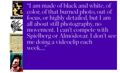
Rodrigo: Metropoli and all the other magazines in the guide genre have great ability to adapt to the digital media. Remember that we are talking information you can use 100% in Metropoli, and immediate access to this information gives it added value. iPod, iPhone or iPad will help develop greater links between Metropoli and its readers. I can foresee the day when Metropoli will be integrated into the navigators used in automobiles, or perhaps there will be podcasts created with tips about restaurants, movie, theaters or access to city highways. However, one thing is useful information and something very different the covers of the magazine. Here I do have my doubts. We are, or at least I am of a generation of journalists who have learned from the classics of the genre. From Cartier Bresson’s black and white photography, to Brodovitch’s majestic typography. From the subtleness and genius of George Luis at Esquire to the fashion in capital letters of Irving Penn for Vogue.
Me, I am made of black and white, and of color, of that burned photo, out of focus or hyperdetailed. But I am a still photo man, not in motion. I cannot compete with Spielberg or Almodovar, and I cannot see me trying to make a video clip each week. Perhaps in other magazines, such as our Sunday Magazine, but NOT in Metropoli. I continue to see those covers as capturing the emotion of a specific moment, Almost like a stolen kiss. It is not a sequence, it is an instant.
Mario: What is the difference between the Rodrigo Sánchez who has given us those wonderful Metrópoli covers and the artist Rodrigo Sánchez of today?
Rodrigo: I don’t know if what I am going to say is good or bad, but I am the same person.
The covers of Metrópoli cover such a vast span of my life that they have evolved side by side with me. They have reflected my happiness, my frustrations, my dreams, my doubts, my lethargic moments and my hurried ones. It has not been the work of a specific period; it has been—-and I know it sounds arrogant—-the work of a lifetime. Thank God that I have had the opportunity to develop my work with absolute freedom to create and to execute. And, if there is something that I have not done, it is simply because it has not occurred to me, and not because someone did not allow me to do it. My only limitations have been time and money. To balance those limitations, I had my imagination. The good thing about Metrópoli is that it has always been my escape, my way to free myself from my other work. Let’s put it this way, in other magazines I do what I HAVE to do. At Metrópoli I do what I WANT to do. i wish to recognize the attitude of my publishers and the editors of the newspaper who allow me to function this way. I don’t know if would be as generous as they are if part of the image of my brand, El Mundo, would depend on the whims of a crazy guy who is capable of sticking anything he wants on the cover of the magazine! I always like to remember that the merit is NOT just for he who does, but also for HE who allows for it to be done.
If you go
An exhibit of the best of Metropoli opens July 28 and runs through September 11 in Madrid at Instituto Europeo di Design, at Fundacion Diario Madrid,C/Larra 14.
A personal note from Rodrigo Sánchez….the day he stole my book!
Mario, I am embarrassed to tell you this: When I began my journalism studies at the Universidad Complutense de Madrid, I never thought I would design newspapers or magazines. It was in my second year at the university that I had a class on design and began to get interested in that world, which, by the way, has given me great satisfaction. Everytime I had to do an assignment for newspaper design class, I would run to your book, Diseño y Remodelación de Diarios, which was the best book on the subject at the library of journalism.
I have no idea the number of times that I would go down to study there and to copy your ideas and apply them to graphic solutions in my projects. I had such dependency on your book that, finally, I managed to sneak the book out of the library. Technically, I stole it. Now, as I write these lines, I am looking at the spine of the book. It is a book that has stayed more than 25 years with me, and that has followed me to every newspaper and magazine that I have passed through since i graduated. Your work has helped me since then, but I always have the bitter taste to think that, together with your book, I also stole the possibility that another student would learn from it. Not only did I stole the fish, but also the fishing rod. However, I hope to have given back to society and to our profession that which in that moment I took away.
Rodrigo
Mario says: Indeed, a fascinating story, Rodrigo, and one that makes me smile. And, while I don’t know how the librarians from the University reading this will react, I can guarantee you that you have given readers years of satisfaction through your work, not to mention that each week you have produced a sort of “textbook” for members of the profession.
That’s a lot of fish, as far as I am concerned, and a mile long fishing rod of inspiration.
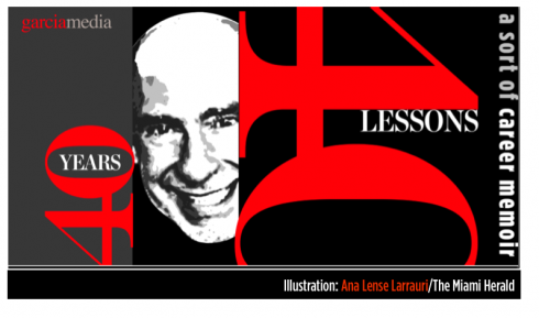
Illustration by Ana Lense Larrauri/The Miami Herald

TAKEAWAY:This is part 8 of my occasional series 40 Years/40 Lessons, which I call a “sort of career memoir” capturing highlights and reminiscing about what has been a spectacular journey for me, doing what I love most. Today’s segment: all about the books I have written and how a desire to share ideas fueled each of the titles.
The great American poet and novelist Sylvia Plath once said that “everything in life is writable about if you have the outgoing guts to do it, and the imagination to improvise.” Plath added that the worst enemy to creativity is self-doubt.
As I reminisce about writing the first page of what became my first book, The New Adviser: Learning the Craft (Columbia Scholastic Press, 1974), I realize just how right Plath was. I had no self-doubt, and, definitely tons of outgoing guts. I was also 27 years old and my third child and first daughter, Ana, had just been born.
I don’t think one is ever truly ready to write a book.
However, those who wait till they are, probably reach their end without ever writing it. Perhaps I should have waited a little longer to write each of my books. If so, some of the spontaneity that I now see in those texts would not be there. Perhaps we become more guarded with age.
The basis of book writing probably consists of a simple formula: one has a desire to share something (or, in the case of fiction writers, to tell a story) that one is passionate about , and, although there are always others who may know much more about it than you, they may not necessarily be interested in writing the definitive book on the subject, so you focus on getting your own views out there, writing as fast as you can and letting your writing start the dialog—-which usually happens quickly after the book is published.
About that first book
My intention was not to write a book. As the faculty adviser to the student newspaper at Miami-Dade College I was only four years older than my own students in the staff. I had replaced the legendary Barbara Garfunkel, who had been my own teacher and mentor. She left big shoes for me to fill, and nothing prepares you for the job of dealing with the day to day managing of how a student newspaper functions. The students attend classes and only work on the newspaper on a part time basis, between classes or after class. As the adviser, you are the full time person, the pole holding the flag, plus their teacher, managing editor, publisher, mentor, and, indeed, father confessor sometimes.
As I attended professional conferences with other college faculty advisers, it became obvious that we all shared similar problems and challenges. A day after returning home from one such conference, at the University of Minnesota, I sat at my Smith Corona typewriter, inserted a blank page, set the margins to 20 and 80 and started typing ideas on the page.
I remember the first line: So you are an adviser……
Those five words started my own chat with thousands of advisers who were not in the room with me. That was the spirit of the book, a chatty, informal, easy to read guide for the person suddenly pushed into the position of faculty adviser to a student newspaper. By the time I had two chapters completed, I drove across town to see Miss Garfunkel, my hands shaking a little as I put the pages on the table of her desk and told her what I was up to.
“I need an editor, Miss G,” I told her. She was looking down at the pages, her reading glasses perched perilously close to the edge of her nose, but with that chain that held them close to her chest in case they did fall. ” I have been writing for a few weeks and I think it is time you take a look, correct my English and give me some tips.”
The jovial and friendly Miss G signed up as my editor, a job she would hold for at least three more books. A few days later she returned the edited manuscript. Her neat handwriting appeared on the edges, between words, under paragraphs, and, in some cases, this meticulous woman had inserted full sentences that she had typed and glued to my manuscript.
I would learn much from Miss G for years to come, the ultimate mentor and friend. One of the lessons learned: everyone needs an editor, that extra set of eyes on the text. God knows I could use Miss G daily as I write this blog. Ironically, sometimes I feel as if she is right behind me, asking me to rearrange a sentence, or to choose a different word. She is missed.
Have manuscript, will travel
When the manuscript was finished, I remember tucking it into my briefcase without a clear idea of which publisher to refer it to. As it happened, I was attending a Columbia Scholastic Press Association gathering at Columbia University in New York City and did a presentation for journalism teachers. At the end, a gentleman named Benjamin Allnutt—-a member of the CSPA board at the time—-approached me and said:
“I liked your presentation a lot, and I think some of these ideas should be put together in a book for journalism teachers.”
“Thank you, sir,” I answered. “Matter of fact, I am already writing such a book and I can show you some pages if you wish.”
I will always remember that encounter as one of those lucky Mario moments, when you happen to be in the right place at the right time——with the right goods in your briefcase.
There will be many more moments such as that in my career. Each time, I felt luck was a constant companion, although hard work and perseverance probably had something to do with it as well.
The New Adviser went on to have two editions and it became a companion guide to faculty advisers to student publications across the United States.
The first big book
The incredibly long, frigid and white winters of Syracuse were conducive to taking the stairs of our two story home on Sheatree Lane and typing away in the spare guest room that served as my home office. I would type two or three pages, then pause to look outside the window, the white stuff descending from the sky in slow motion, the way I move at airports when I get there with plenty of time to kill, knowing you will eventually land, but not in a hurry to do so.
The book would become Contemporary Newspaper Design, first published in 1978, the last in 1993. I was that young professor of graphic arts at Syracuse University’s S.I. Newhouse School of Public Communications and I truly could not find a good book to use in my Newspaper Design class. What began as a series of lectures during my first year teaching the course, eventually developed into more of a book. I was blessed with many friends in the industry who contributed material. Like me, they were young and pioneering in a subject now referred to as newspaper design, but which was treated more like “newspaper make up or layout” in all of the literature of the time.
Robert Lockwood, Ed Miller, Nanette Bisher, Michael Keagan, Nigel Holmes, Randy Stano, Roger Fidler, Frank Ariss, Richard Curtis, and many others, freely provided me with copies of their best pages, and offered narratives of their struggles to push things through in an era in which newspaper art directors simply did not exist (at least by that title), and many newspaper editors considered design a word you simply did not use inside a newsroom.
Eventually, it was Prentice Hall which published the book, not that it was easy to get them to publish it.
When I first sent out a prospectus about my “potential book”, along with a table of contents, the reply was swift and direct and I will always remember the impact it had on me:
Dear Sir, thanks for sending us your book proposal, but there are only three colleges and universities in the country that offer a course for which your book might be adopted.
No, I was not surprised about this detail. But, not one to give up easily, I engaged the help of publisher friends in the industry, many of whom told me that their newsroom would by two to four copies of that textbook. I informed Prentice-Hall about that, and a contract arrived at my SU office. I am sure the guys at Prentice-Hall did not regret their decision, as the book went on to three different editions, including a Spanish one, published through the University of Navarra, in Pamplona, Spain, under the title, Diseño y Remodelacion de Diarios (1983).
These were not merely updates for each edition. In fact, I would almost rewrite the entire book, since things were happening quickly and the world of newspaper design probably had its fastest development and most far reaching impact during the 1980s and early 1990s. Design went from a whim that a rare publisher or editor pursued, to a necessary part of the storytelling process.
The busy 90s
The decade of the 90s was perhaps my busiest as an author, and I found myself writing almost every day, jotting down thoughts at the end of a meeting with editors and designers, or at the conclusion of a Poynter or American Press Institute seminar. Usually, critiques led to a list of topics that needed to be discussed further and I concentrated my efforts on those that I thought were important to a large segment of the people in our industry.
I never wanted to write books for designers, perhaps because I have no formal training as a designer, but also because I know that as a visual journalist, what we practice is not so much design per se, but design with a specific purpose: to communicate ideas quickly, and to translate the essence of the story before a reader reads that first word. With Contemporary Newspaper Design, my greatest satisfaction was to see the book adopted in editing classes at colleges and universities worldwide. I wanted editors and journalists to be exposed.
Not a week goes by that I don’t run into someone at a conference or a newsroom who will tell me that he/she read Contemporary Newspaper Design as a sophomore in college, and, some even in high school journalism classes.
It was in 1991 that I co-authored Eyes on the News with my colleague and friend, Dr. Pegie Stark Adam, as we both presented the results of the Poynter Institute’s Eye Track Research, followed by Newspaper Evolutions (1996) a case study book—-beautifully designed by Pegie Stark—- with highlights of some of my most interesting work of that period, the golden age of newspaper design. Newsrooms had acquired the maturity to accept design as an integral part of the storytelling process; art directors sat side by side with managing editors to make decisions, starting on Page One; infographics and illustrations soared and the beauty of typography was no longer the exclusive domain of glossy magazines.
If you wish to sample the golden age of newspaper design, just simply refer to any SND books with display images from the winners of its annual contest. I know I do from time to time and always emerge proud of the talent and genius of our designers.
Then came 9/11
I cannot separate the horrific events of September 11, 2001 from the writing of Pure Design. The two are linked in my mind because there would probably be no Pure Design if I had not stayed put in Santiago de Chile at the home of El Mercurio’s publisher, Agustin Edwards, when all flights were cancelled for a few days and nobody could go anywhere.
I tried to make the best of the situation, and my host was magnificent in the hospitality he presented me with, including daily trips to his personal library, complete with a collection of rare books among the finest in the world. It was there that I saw an edition of Aesop’s Fables, the little book that Mr. Edwards held in his hands with much care. When he started flipping through its pages, I was mesmerized by the illustrations, the handwritten letters, but, also, by how the master of the fables could tell a complete story in a mere few lines, sometimes 11, never more than 21.
The more I saw that book (which I revisited everyday), the more I came to the conclusion that I wanted to write a book with the briefness of the fables, and the visual simplicity that accompanied each of them.
I would not write chapters.
I would not have more than one illustration per topic.
I would try for a minimalist approach to both the writing and the visuals.
Pure Design appeared in 2002. Ironically, many college professors who liked the content would always ask me why I did not write longer chapters. My polite answer was consistent: It was not my intention to write a college textbook in the traditional sense.
I am currently in the early stages of talks to do Pure Design 2-—-which I would, again, do in a simple style, following the format of Pure Design , but moving more comprehensively through all the platforms. Who knows? In the era of Twitter-—with messages shorter than many of Aesop’s fables—-one could possible conceive a Pure Design version full of smart Tweets about our craft.
But I also toy with the idea of writing about storytelling in the era of the iPad and beyond.
One theme of all these books resonates with me today as it did when I wrote them: it is all about the story and how we, as designers, create a visual environment in which its contents are presented more clearly, with greater immediacy and, of course, attractively.
If you wish to download Pure Design, go here:
http://issuu.com/mariogarcia/docs/mario_garcia_pure_design.
Lesson:
Write that book you have inside of you now; don’t wait to have all the answers or to become “the expert”. Many of the experts I know started by sharing their experiences, which, in turn, helped them develop their expertise.
A special thanks to David Shedden, director of the Eugene Patterson Library at The Poynter Institute for Media Studies, for assisting me to gather the materials for this segment.
The New Adviser:Learning Craft. New York: Columbia Scholastic Press Advisers Association, 1978.
The New Adviser: Learning Craft. New York: Columbia Scholastic Press Advisers Association, 1981.
Contemporary Newspaper Design. ?Englewood Cliffs, NJ: Prentice-Hall, 1978, 1987, 1993.
Student Newspaper Designer. Norman, OK: Office of Scholastic Journalism Programs, University of Oklahoma, 1983.
Color in American Newspapers. St. Petersburg, FL: Poynter Institute, 1986.
Diseño y remodelación de periódicos. Pamplona: Universidad de Navarra.
Professional Video Graphic Design. (with Ben Blank). New York: Prentice Hall, 1986.
Newspaper Colour Design. Darmstadt, West Germany: The International Association for Newspaper and Media Technology, 1989. (published simultaneously in English, German, French and Spanish)
Eyes on the News. (with Dr. Pegie Stark). ?St. Petersburg, FL: Poynter Institute, 1991.
Newspaper Evolutions. ?St. Petersburg, FL: Poynter Institute, 1996.
Redesigning Print for the Web. ?Indianapolis, IN: Hayden Books, 1997.
Pure Design. ?St. Petersburg, FL: Miller Media, 2002. ?
1.Mirrors.
https://www.garciamedia.com/blog/articles/40_years_40_lessons_1—a_look_in_the_mirror
2.Refugee.
https://www.garciamedia.com/blog/articles/40_years_40_lessons_2—refugee
3.Teacher.
https://www.garciamedia.com/blog/articles/40_years_40_lessons_3—teacher/
4.Mentors.
https://www.garciamedia.com/blog/articles/40_years_40_lessons_4—mentors/
5.Consultant.
https://garciamedia.com/blog/articles/40_years_40_lessons_5—consultant/
6.Eagle.
https://garciamedia.com/blog/articles/40_years_40_lessons_6eagke
7.Abroad.
https://garciamedia.com/blog/articles/40_years_40_lessons_7._abroad
Comments
A cool paper indeed!
Posted by leroy on 07/28 at 5:04 AM