TAKEAWAY: It’s Monday and our thoughts turn to very interesting reading of the past two or three days: the future is storytelling across all the platforms; is it tablet versus web for the New York Post? And the Chicago Tribune launches a new design, with impressive masthead illustration (a visit to the past); Netherland’s AD thrives one week after launching new redesign. ALSO: We prepare for our participation in Zaman’s +1T seminar in Istanbul this week
Paper versus digital: keep that media quartet playing!
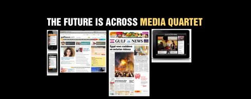
The present (and future) is storytelling across the media quartet of platforms: each doing what it can do best, not competing with each other. Here an example of the various platforms as
presented by the Gulf News (UAE)
We are happy with the validation that Gartner Inc.
study with the following information:
.
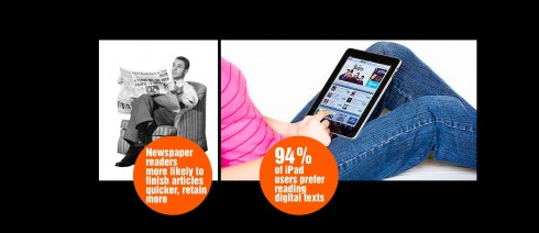
…. the time people spend reading on a digital screen is now almost equal to the time spent reading printed paper text.
The research director from Gartner Inc. is quoting as saying that “…the evidence from our research is that print and online are not generally regarded as direct substitutes by consumers,”
Of course, this is only one of several studies in the making, but it does point in the direction that tablets are very specific platforms, and we can explore a diverse number of storytelling options.
The next generation of news apps, the 2.5 and beyond, should take the information from this study as a foundation on which to build.
We are happy to be involved with an upcoming study at The Poynter Institute for Media Studies, part of the now well known Poynter EyeTrack series, this time devoted exclusively to how tablet readers read news on the new platform. Sara Quinn, of Poynter, is directing the study in which we hope to find out how tablet users consume news and information on iPads, for example.
This informative piece, authored by Mary Peskin, concludes with a statement that resonates here:
The future of content delivery is much more than the device or the medium. If we are trying to make richer connections with users, we should explore new design and storytelling techniques that move beyond traditional print-design thinking and traditional website-design thinking. The future is about delivering stories across all media and devices using all available technologies and storytelling forms
The NY Post: tablet versus web?
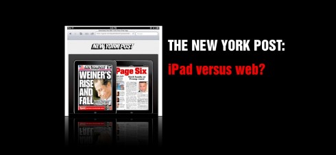
While on the subject of platforms competing with—-or, even worse, cannibalizing—-each other, here is a piece of great interest: Dave Winer
, writing on www.scripting.com, expresses his anger with the New York Post and how it is “breaking the web” by not allowing those who link to a piece on his website to read it, except on the Post’s own iPad app.
And Winer has a point when he writes: “The thing is this—the iPad has a perfectly functional web browser. It isn’t a “mobile” web browser. It has a full-size screen. It doesn’t need any accomodations to be readable, it is readable as-is. “
Again, these are issues that will be worked out as we emphasize storytelling across the platforms in a smooth, seamless manner, NOT as isolated islands. The time is right to implement this type of thinking right now, or as Winer concludes: “Stop the madness now! Please”.
A new look for the Chicago Tribune
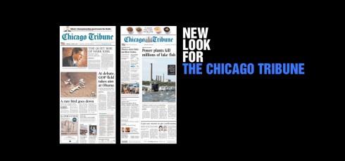
The old and new Chicago Tribune front pages (courtesy of the Charles Apple blog)
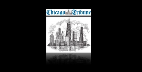
Bringing back the spirit of Chicago’s famous skyline on the Tribune’s masthead
It is redesign time—-again—-for The Chicago Tribune. My colleague Charles Apple analyzes the new look of the Tribune and offers his always interesting insights.
As I am travelling through Europe at the moment with no access to a printed version of the Tribune, I point you to Charles’ review. I agree with Charles that one of the most interesting features here is the work done on the newspaper’s nameplate. It will be a rotating illustration concept, as readers will see different Chicago skyline landmarks. Nice touch, reminiscent of how American newspapers used to reflect their communities on their mastheads——from skylines, to flags to eagles and mascots. They disappeared one after the other when designers in the 80s, including me, opted for the more minimalist approach. Remember my “killing” (should we say “streamlining”?) of the St. Cloud Daily Times’ eagle?
Now newspapers cling to their local DNA, the essence of what they have been and continue to be. We are likely to see more of these visual motifs on nameplates everywhere, sort of bringing those teddy bears in from the attic, to hold and to remind readers and the world that “we are still here”. This reminds me of that famous show stopper number from Sondheim’sFollies, in which a character named Carlotta, a veteran Broadway babe, shouts it best when she sings: I Am Still Here.
I am hopeful that this is not the only thing they pull out of that trunk in the attic. Start with what I call doing print happily, as if it has a future, which it does. Add a sense of local pride and transmit it to each page. Strut your stuff and appear each day, not as a moribund medium, but as one that will thrive and find its own space as part of the media quartet that we discuss above.
It is not just about skylines of the city, it is also about what happens way down below with the people who inhabit it. That has not changed!
Hear Elaine Stritch sing the showstopper from Follies for President Obama and First Lady Michelle Obama : I am Still Here (newspapers can learn from the song!)
The Netherland’s AD: one week after relaunch
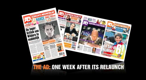
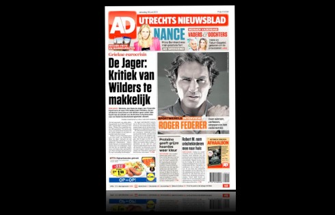
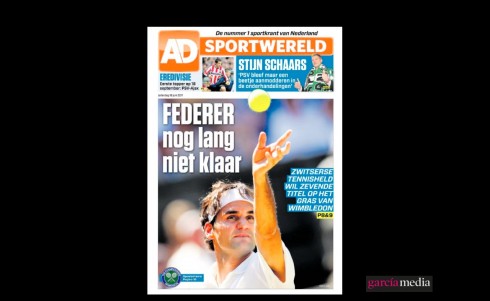
Front page of the AD’s weekend edition
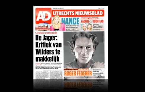
Close up of the upper portion of the AD’s front page
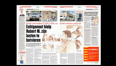
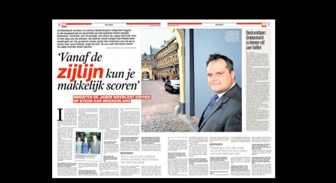
Pages 2-3 open up with the main theme of the day, coming from page one
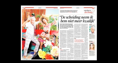
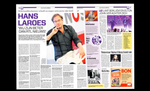
A main personality-oriented feature treated as double page spread
Treatment for news feature with dominance of photo
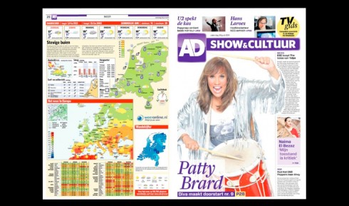
Right side: opening of the newspaper’s second book—Show and Culture
Inside double page spread of the Show and Culture section: color purple distinguishes this section
Opening of the sports section: orange
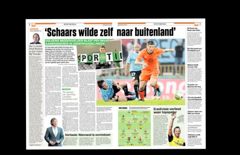
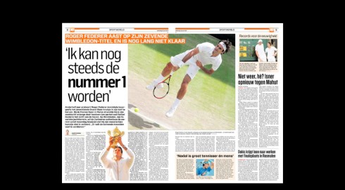
Inside spreads of sports
I am always proud when I review a recent redesign project and see the concept evolviing beyond the coldness of prototypes.
This is the case with the Netherland’s AD, published in Rotterdam. This weekend’s edition is a joy to review, page after page. I like how our idea of color use with type is finding a place on each page.
Take a look and tell us what you think.
It is color as punctuation, to use my colleague Pegie Stark Adam’s apt description. It is color as staircase, one color that starts at the top and moves the reader around the content of the page.
Here is one project where we have been more adventurous in the colorization of type.
The design team: For AD, I worked with our own Garcia Media art director, Christian Fortanet, and the AD’s design director, Jeroen De Haas
Number of US magazine apps grows
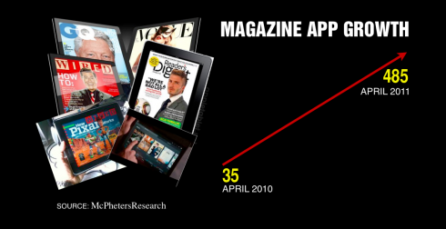
It is an impressive growth for the number of magazine titles in the US producing app editions for their products.
According to recent research from McPheters Research, there were 35 magazine apps available in April 2010, and one year later that number is 485.
For more information:
http://yfrog.com/kktoog
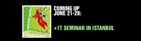
I am preparing my presentations as I participate, for the second consecutive year, in a well organized and interesting seminar in Istanbul.
The +1T Newspaper Design Days is sponsored by Turkey’s daily newspaper, Zaman. This will be the sixth edition of the +1T Newspaper Days program.
According to Fevzi Yazici, design director of Zaman, this program is especially designed for design students, to attract them to the world of visual journalism. However, professional journalists and designers also participate in the event.
“Our +1T Newspaper Days program is based on the idea that art (design) students and journalim students have to come together to get best newspaper design. So Zaman’s design staff organized this event to give future newspaper students an opportunity to accomplish this mission.”
This year program includes presentations by well known Turkish journalists. In addition: photographers Reza, George Georgiou, Vanessa Winship; Infographics artist ,Jeff Goertzen, of the Denver Post.
The seminar runs for 8 days June 21-
The seminar takes place at the Zaman’s hearquarters in Istanbul.
The title of my presentations are:
For print: Survival in the times of the iPad and Beyond
iPad :Creating that news app that is uniquely special
For more information: