This is our weekend edition of TheMarioBlog: to be updated throughout the day Friday at the WAN IFRA Conference in Vienna, and later during the weekend.
Update #6: Saturday, Oct. 15, Frankfurt, 17:17
TAKEAWAY: It is presentation day for me today at the WAN IFRA 63rd World Newspaper Congress. I moderate a panel on The Steps Towards a Successful Tablet Application PLUS: In touch with that printed magazine AND: The iPad as window dressing in Luxembourg
The ten lessons learned
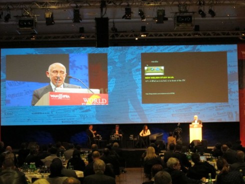
Photo during presentation at World Editors Forum 2011: courtesy of Andreas Emblem
For highlights of my presentation and a video go here:
http://blog.wan-ifra.org/2011/10/14/get-on-the-tablet-bandwagon-quickly-video
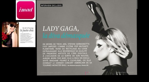
Here are samples of the Figaro’s i-mad magazine app: my fellow panelist, Stephanie Jolivot is publisher
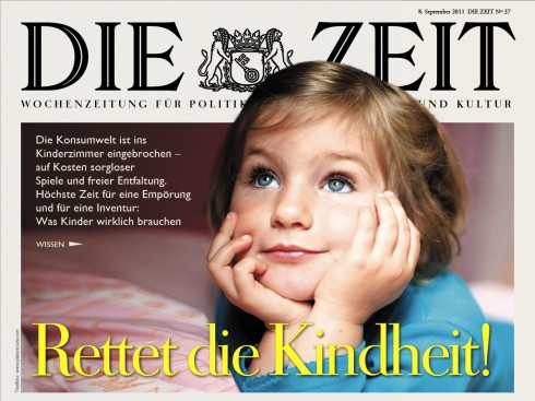
The Die Zeit app: my fellow panelist, Wolfgang Blau, is editor of Online for Die Zeit

Ringier Studiios produces a series of elegant, story driven apps; my fellow panelist Bela Papp, publishing director, Ringier Studios
I will moderate the panel this Friday at the WAN IFRA 63rd World Newspaper Congress, as part of the World Editors Forum series. The panel will include Wolfgang Blau, editor of online for Die Zeit (Germany), Stephanie Jolivot, publisher of Madame Figaro (France) and Béla Papp, , publishing director, Ringier Studios, Switzerland.
I am honored to be in this group, as the work produced by their teams is fantastic, and I look forward to the discussion that will follow.
Among the samples shown, I will share the work of my co panelists as well as the new Guardian (UK) app, introduced only this week. I find this to be a clean, easy to follow and practical app.
In my introductory remarks I will mention the Ten Lessons I have Learned while working with news apps:
1. Telling Stories Across Platforms: Lesson 1: we must think in terms of a media quartet
2. What the Tablet Is: Lesson 2: a platform that must be conceptualized to accommodate its uniqueness
3. The Lean Back Platform: Lesson 3: all available research shows a preference for evening use of the tablet
4. What the Tablet is Not: Lesson 4: It is not a replication of the print/online experience.It goes beyond to create an immersive experience (remember the finger)
5. Covering Three Tracks: Lesson 5: Users want their newspaper tablet apps to have the three main tracks of
curated edition, news updates and e-readers
6. The Tablet and Design: Lesson 6: Make it sophisticatedly simple
7. Create Those Pop Up Moments: Lesson 7: allow for a curiously impatient finger
8. Pay Attention to the Essentials: Lesson 8: start with a good sense of navigation, make sure user always knows how to go from point A to point C or Z
9. Make It Functional: Lesson 9: remember what the users are coming to your tablet for
10. Consider a Curated Edition: Lesson 10: At its best, a news app is especially edited and prepared
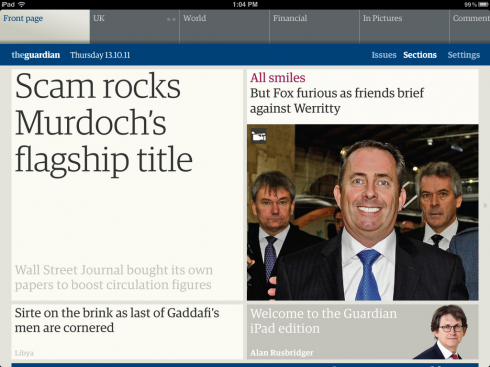
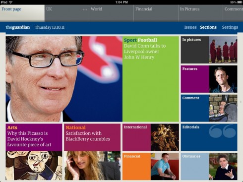
The Guardian’s new app
The Guardian surprises with an app that advances how news apps should be, showing us the way, capturing the best of the brand and spirit of the printed The Guardian, but extending it to this new platform, and doing so with a variety of extremely practical and appealing features, from the color blocks that constitute navigation, to the clean and easy to read article read page, to how photos and videos are displayed.
The Guardian’s new app
Of related interest
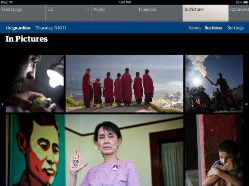
The Guardian iPad edition design evolution
http://www.guardian.co.uk/media/gallery/2011/oct/13/guardian-ipad-edition-design-evolution
Andy Brockie from the Guardian’s digital design team shares the key stages behind the design development of its new Guardian iPad app
The Guardian on iPad
http://magculture.com/blog/?p=12022
Highlights: “Thirdly, each section opener has a limited space to fill, meaning editorial decisions about hierarchy must be made in order to fit what is regarded as important. You can’t just extend the page as in other apps and digital environments. This is an intelligent way to bring editorial order to the content in a print-like way without copying print.”
“Instead of endless templates being filled with text from the newspaper, the primary navigation is a simple series of colour and image blocks, such as on this Front Page (top image). Each section opens with a similar page that can be scrolled to twice the screen height.”
Also of interest today
How the Newsweeklies Covered (and Designed) the Death of Steve Jobs
http://www.spd.org/2011/10/newsweeklies-and-steve-jobs.php
Interesting concept for a button-less app—direct interaction with the content.
Highlight: This is a demonstration of a fluid layout concept in an iPad app I did for fun. It is not affiliated with ikea. It’s a prototype, so please excuse that it’s not 100% super-beautiful. read more about it on momo.brauchtman.net oder follow me: @derwildemomo .
Interview in the Dutch daily NRC
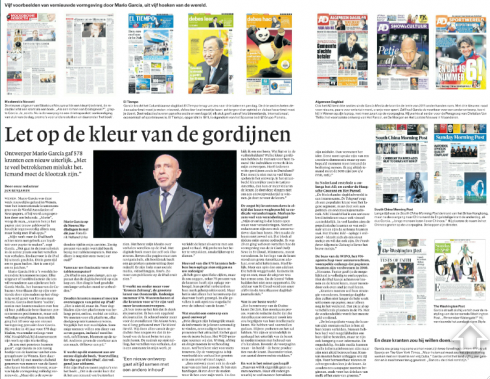
Pages from the Dutch daily, NRC, weekend edition
While in Vienna I was interviewed by Jan Benjamin, media reporter for the Dutch financial daily, NRC, for the weekend edition. That interview appears across two pages in the cultural supplement and those who read Dutch can access it here: www.nrc.nl
That is a big iPad on that window
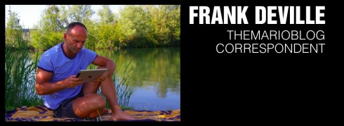
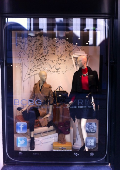
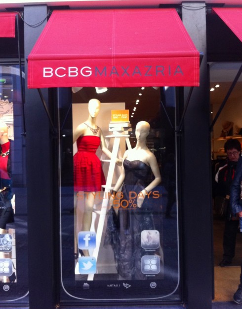
Frank Deville takes a stroll in the center of Luxembourg this Saturday morning and discovers that the windows of one of the chic stores displays huge iPad frames. So now we see the iPad as window dressing, a new twist for an ever popular gadget that does not stop to surprise.
When the magazine “does not” work like an iPad
Out of the fingertips of babes.
You will enjoy this video which shows how a one-year-old perceives the printed world.
And only last night I was telling my dining companions that I am glad there is NOT a YouTube video of me a few weeks ago when, standing in front of a screen of flight departures at the airline lounge in Frankfurt, and when the screens were taking too long to change from one alphabetical listing of cities to the next, I touched the screen as if I was going to swipe to the next page. The lounge waiter standing right behind me said: Sir, sorry, but this is not a touch screen.
I was a bit embarrassed and was very happy that nobody had made a video to post on YouTube of a this “mature” man so entrenched into the ways of the digital world that he was swiping the nonswipeable screen on the wall.
So, therefore, I am not at all surprised that a one year old tries to swipe the good old printed magazine.
Food for thought. How will the swipe generation approach life in general?