TAKEAWAY: It’s raining newspaper and magazine iPad apps and, truly, it is hard to keep up with all the new entries into tabletland. Here are a few of interest in case you would like to explore new ones.
It is 11 shopping days left till Christmas, or so the TV announcer reminds us this Monday morning. If you are like me, you are telling those who ask what you want to get you those handy iTunes gift cards so that we can stock up on new apps. They are, indeed, proliferating.
True, we have spent most of the weekend “playing” with Bild’s app: it is a fun one, and there is no room for lazy fingers in that one. If you are going to check out ONE newspaper app this week, please download Bild’s. The German daily is the king of pop up moments. Of course, not all of us can do those things Bild does so well in our first app version, but here is the shape of things to come. One reads. One looks. One touches photos that open up, reveal new surprises, or simply take us to a video.
Bild’s app is a must see.
Categories of iPad apps
But we are beginning to see newspaper apps developing styles, as did newspapers and magazines in print through the years.
So far, we see four prevailing models:
1.The e-reader-—-simply put pdfs of your pages there and the user flips through them. It works as a first step to get you into the iPad, but it should not be a sustainable, permanent app style. Of course, I am all for including the e-reader version in all newspaper/magazine apps, but as an option, not as the only way to read your product in an app. The Luxemburger Wort is an example among many.
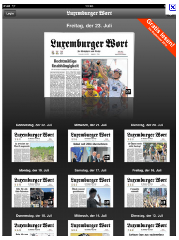
Read the entire printed edition of the Luxemburger Wort on your tablet
2. The newspaper look alike apps: these take the app one step beyond just becoming an e-reader, but the look and feel are purely that of the newspaper, one sees a miniature of a newspaper page on the screen; this is good for a start, to get app users get acquainted with the app edition while against the visual backdrop of the familiar printed newspaper or magazine. If some pop up moments are added, this can be a good way to introduce users to your tablet edition. USA Today and The Daily Oklahoman, Austria’s Wirtsshaft Blatt, among others, follow this style well.
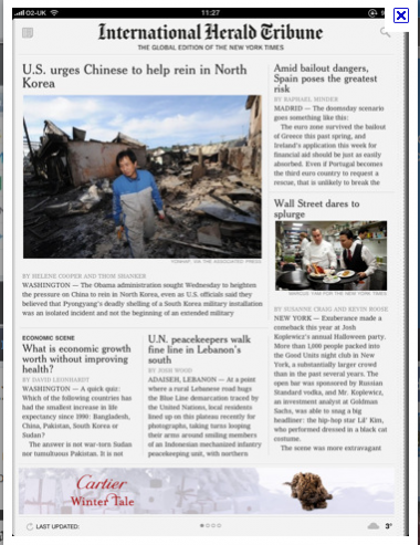
The newly introduced International Herald Tribune app: the newspaper look prevails here
3. The special tablet edition: here we have a dedicated editor putting together a distinct product that is exclusively for the iPad and that even goes back to the concept of editioning—-updating two or three times a day, while offering instant access to the online edition. See the newly introduced tablet editon of Colombia’s El Tiempo, perhaps the first app to introduce the concept of editioning. (Note: I sat with the El Tiempo team in the early workshops to conceptualize their app; it was just launched a few days ago, so be patient as it is tweaked).. Also, look at Sweden’s Dagens Nyheter, which combines magazine style visuals with a newsy presentation.
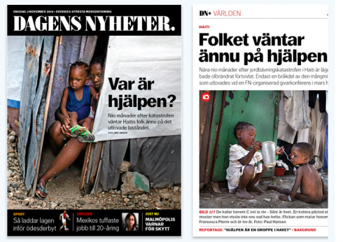
Sweden’s Dagen Nyheter: a distinct look, elegant screens, easy navigation
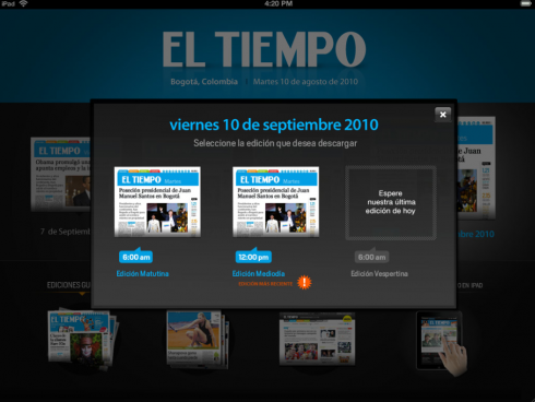
Colombia’s El Tiempo: introduces the concept of editioning to the app—-updating twice a day, and indicating so on landing page
4. The grand pop up app: Looking for one done extremely well
to accommodate newspaper content, see Bild’s. Here the app creators have taken the newspaper’s content and given it long fingers. Touching certain items is like opening presents: curiosity, surprise and excitement follow.
A great pop up moment in Germany’s Bild—THE must see app
New entries
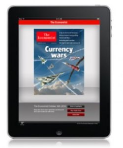
The Economist: new entry into the iPad app
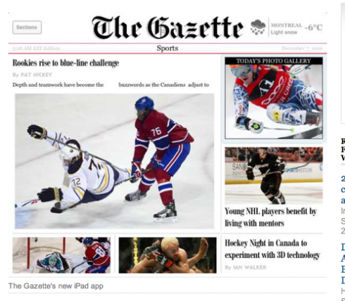
The Montreal Gazette just introduced its app