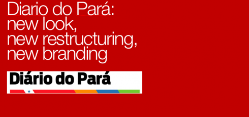
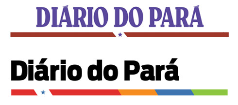
Big changes have taken place for Diario de Pará, including a change of its logo, which went from blue to black, with a different font. But the changes for Diario were not just visual, as the newspaper underwent a total rethinking of how it presents content,
Here is what the scope of the project was for Diario”
*To improve printing quality.
*To examine and to modify editorial processes
*To incorporate a new editorial system
*To introduce a new logo—-a change in the branding.
*To introduce a new design for the entire newspaper
*To reorganize and move content around in a more compact way, while introducing new content as well.
*To modify the editorial focus.
The new typography for Diario
The typographic scheme of Diario consists of three fonts: Antenna, Leviathan and Mercury.
[ ANTENNA ]
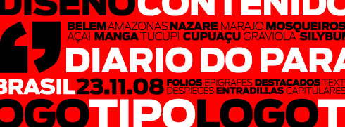
Used for headlines, subtitles and in a variety of weights and styles throughout the newspaper
===
[ LEVIATHAN ]

This font is used for page headers and for logos of specific sections and supplements.
===
[ MERCURY TEXT G2 ]

Mercury Text was found to be the best to provide legibility for texts.
===
New history is created for Diario do Para with the birth of this new logo, using Antenna. The line with color provides a sense of corporate branding to identify the newspaper and give it visual uniqueness. With a new logo, the management of Diario hopes to start a new era representing a product that is more modern, with a stronger presence in the market.
The new look
Some pages show the new design.
===
The design BEFORE the new redesign
===
New supplement page design
Supplement covers after the redesign
Supplement to present the new design
To read TheRodrigoFino blog, and see this case study in Spanish, go:
https://garciamedia.com/latinamerica/blog/articles/belem_do_para/
![]()
Spending this week at home in Tampa.
TheMarioBlog posting #142