It happens every week.
I sit with a group of newsroom managers and editors “rethinking” their product. Unlinke “rethinkings” of the past, where the emphasis was more on the aesthetic and storytelling, now the mood is a bit more somber, the conversation slower and in quieter tones, the topic can be summarized as : how can we, in the process of this change of formula, make deep cuts to save money?
The answers are not easy. The answers are not the same for every project. However, here are some areas where I think compromises can be reached. Four tips follow:
1. Consolidate content: This is the first thing to do. Go through the entire newspaper and be creative in how contents could be combined. True, the sports and business sections may not be the best fellow travellers, but it makes sense to combine these two in terms of advertising and readership. It has been done successfully now in various dailies worldwide, with no complaints from readers. Give each section a strong opener. Maybe Sports opens the section on Mondays, but takes the last page opener the rest. Or, maybe Business always opens. Difficult times will require creative approaches and hard decisions; go through the Lifestyle or features section—-perhaps a thematic approach is no longer feasible, so draw up a protocol of topics to be covered by the section (i.e.: fashion, books, fitness, relationships, advice), then provide readers a good navigation, but mix the topics. Readers enjoy it, if they can find the various topics. The message here: don’t become a victim to the dictatorship of fixed content positions.
2. Less is best This is a good reminder of the golden rule of design/content. Create a list of “sunrise and sunset” and go through every single edition of the newspaper to eliminate contents that are nothing more than what I call the luggage of legacy——a column or feature you still carry simply because it was there when you arrived as editor, and nobody has bothered to remove it.
Now it is that time. Clean the closets of each section. Go for the gold, get rid of the rest. Monday through Friday nobody wants a fatter newspaper. Do your readers a favor and play EDITOR by editing out that which is likely to be information readers can find online, or which has lost its relevancy today. Instead of three advice columns, maybe ONE will do. The message here: think like a reader, NOT like an editor. Create associations, dare to break the rules.
3. From glossy to newsprint If there is one area where editors and overanxious publishers need to be careful is in how they handle supplements. I believe strongly that the printed product of the future will be more weekend than daily. With that comes a weekend package that is sturdy, populated by various sections and supplements—-the combination book and magazine in one.
So, the last thing a publisher wants to do during these hard financial times is to get rid of that one entertainment supplement or special interest insert. However, one does not have to print them on high quality paper, and, here, too, the editor can sunrise and sunset features within the supplement. But DON”T KILL the supplements. Redesign them to be part of the newspaper package. Print them on newsprint even if only temporarily, but KEEP THEM. In my view, it makes more sense to look for Section A pages and contents that can be eliminated, than to eliminate the core of what the newspaper of the future will be, which is more featured, specialized content. The message here: cultivate the various special interest content supplements, rethink them, but don’t kill them.
4. It is all about navigation: Finally, when rethinking your newspaper, make sure that Page One is the best navigator possible to inside content, and that navigational strategies are not abandoned after Page One. When thinkiing navigation, also blend online/print contents, make the two work like a strong unit for content and information. The message here: today’s impatient readers give you little time, make everything easy to find. Guide me there
Thriftiness——advices Newsweek magazine in its current issue—is destined to become the new normal. Tight-fisted is back in style. For publishers, editors and designers, this will require a serious look at every bit of what they publish. The role of EDITOR was never more relevant or demanding.
To read TheRodrigoFino blog, in Spanish, go:
https://garciamedia.com/latinamerica/blog/
Today Rodrigo Fino writes about Movement in Typography
Thanks for smoking
An excellent presentation using cigarette brands, makes the point very directly.
Duration: 02:06
[+] see the video inyoutube.com
![]()
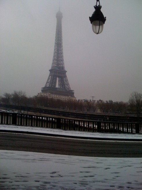
In Snowy Paris, where I took this picture while walking to work this morning. Forecast calls for more snow through Wednesday. Paris is always magnificent, regardless of weather.
Serendipity prevails here: I started early at Opera station, taking the Metro to connect at Invalides with the train that travels through the outskirts of Paris, the RER. Tricky train. If one takes the wrong one, and crosses to the other side of the River Seine , then forget getting to where you want to go on the left bank. That was my case today. But, by taking the wrong train, and having to walk almost 4k to get back, in the snow, with no taxis available, I was able to enjoy the sites and take this picture from under one of the 37 bridges over the River Seine, and here it is. Yes, my shoes were wet, but not my spirits
TheMarioBlog posting #182