This is the weekend edition of TheMarioBlog; the next blog post is scheduled for Monday, Aug. 27. We will update the weekend blog as needed
Keeping you informed about my new digital book
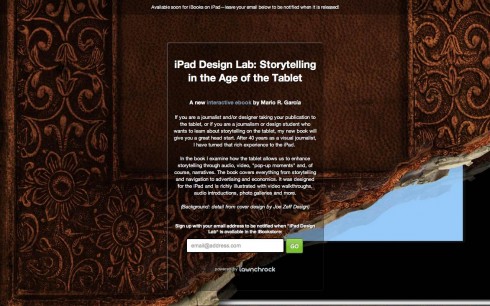
As we get closer to publication date for The iPad Lab: Storytelling in the Age of the Tablet, we are now set up so that you can give us your email address and you will automatically be informed when the book is ready for download.
Simply go here:
comingsoon.ipaddesignlab.com
TAKEAWAY: Who got the facts right and who did not following the shooting at a movie theater in Aurora, Colorado? That master infographic artist, Jeff Goertzen, relates his experience with the story.
Graphics and accuracy: always a hot topic, not always easy to achieve, even when artists, reporters and editors try with their best intentions.
My good friend and colleague Jeff Goertzen, a master infographics artist, is a newsroom veteran and conference speaker whose work has been singled out for awards globally. As I have shared seminars and workshops with Jeff, one thing that always impresses about him is the high level of respect for accuracy in how graphics are presented.
We all know the importance of accuracy at all times. However, when a graphics appears to tell a story, it is usually the first thing readers look at, before the dive into the text of the story. A wrong fact in the graphic definitely has a negative lasting effect, while misinforming and distorting the facts of the story.
A month after the Aurora, Colorado, shootings, Jeff stops to think about that day and how he was straddling to cover the event visually (and factually) for The New York Times and The Denver Post. He shows us who got it right—-and those who didn’t.
Here is Jeff’s own account:
Accuracy is still king—at least for some
Case study: The Aurora Shooting
By Jeff Goertzen / Graphics/design consultant and freelancer
DENVER, CO At 7 a.m., the morning of the Aurora shooting, I received a text message from The New York Times graphics department asking if I would be able to run out to the scene of the shooting to help them them create a graphic. “Absolutely.”
By 9:00 a.m. I arrived at the scene. By 10:30 a.m. I interviewed three witnesses and had a rough sketch of inside the theater with the sequence of events. By noon, I exchanged more than two dozen photos, videos sketches and text messages with The Times’ graphics department via my cell phone and laptop. And by 3 p.m. I was at The Denver Post helping their graphics department with their graphic.
In today’s age of trend-setting technology of global communication and social networking, one would expect that all news agencies would be able to gather accurate and credible information when it comes to breaking-news graphics. But, that’s not the case.
Both The New York Times and The Denver Post relied on graphics journalists at the scene to gather eye-witness accounts and visual facts necessary to create their graphics. This is what we’ve been doing for decades. However, network stations still haven’t discovered this. Here’s a comparison between the print graphics and television graphics:
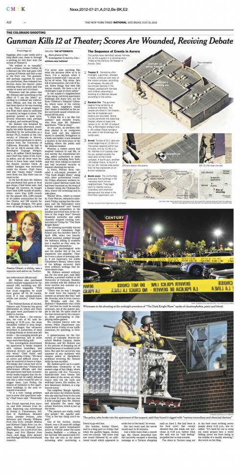
The New York Times graphic used aerial photography to show the location of the theater building, theater 9, the exit door and the location of the suspect, James Holmes’ car. I had obtained a diagram of a Century 16 theater floor plan from Denver Post graphics artist Severiano Galvan, who was also at the scene. However, the diagram was not used because the layout of the theater wasn’t confirmed by official sources. Nevertheless, the graphic was still very informative and gives an accurate account.
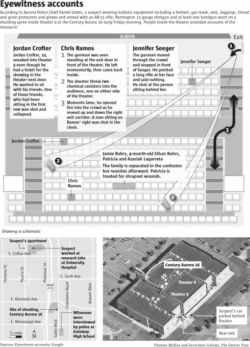
The Denver Post chose to use the floor plan locating where the witnesses were sitting, where the canisters were thrown, the location of Holmes and the exit door. Paired with the locator map and aerial photo, this graphic made for a robust visual presentation that tells the complete story.
Takeaway: If you’re going to base your graphic on eye-witness accounts, talk to more than one eye witness or source. There were at least three witnesses that verified the visual information in this diagram.
http://www.msnbc.msn.com/id/3032619/vp/48265059#48265059
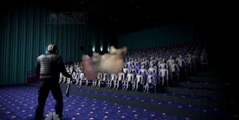
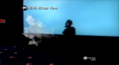
With news anchor Brian Williams, NBC aired this 3D video reenactment of the shooting. One inaccuracy with this video is that it shows Holmes entering the theater from the left side and moving along the left side of the theater. He entered from the right side and moved along the right side of the theater. There were no doors on the left side. The more serious issue is that this reenactment has no journalistic value. It gives the viewers no information.
http://www.youtube.com/watch?v=viFAIOzszQ8
Very similar to the style of what NBC aired, but it shows Holmes at the right side of the theater, which is correct.
http://www.youtube.com/watch?v=ul0i-8MgwMc
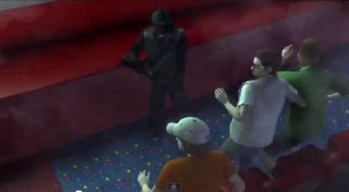
A Chinese news station aired this video of the shooting, created by an independent graphics studio in China. This reenactment is even more sensational. It illustrates the Holmes kicking in double doors as he enters the theater with people running screaming. Uninformative, purely speculative and sensational.
http://www.youtube.com/watch?v=j1_QwrYGbvc
On a more credible note, CNN’s Anderson Cooper aired this video reenactment created with ARAS 360Ëš CSI software. In his interview, it’s explained how investigators used this highly-sophisticated software to gather more than 30 million points of reference to create an exact replica of theater 9. With eye-witness testimonies and forensics investigations, they were able to locate where the shots were fired, where the victims were sitting and the exact path of the assailant. If only all graphics artists could have access to this
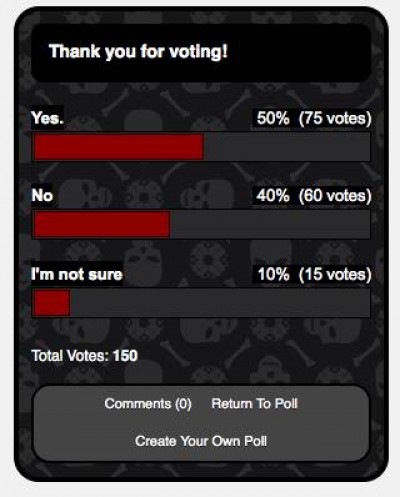
And don’t ever think that viewers don’t care what images we chose to publish. A blog site raised the question “Did TV News’ Aurora Massacre Animations Go Too Far?” Aside from questioning the credibility of such imagery, the blog published an informal poll by Polldaddy, which revealed that the majority felt that animations did go too far.
Although this poll doesn’t favor credibility by an overwhelming margin, the message is still there : readers and viewers expect better. Good journalism is about credibility. Keep it accurate, simple and informative. As one blogger said of the NBC video¦ “It’s massacre porn!”
Pop up of the day
Bild’s app offers a very interactive pop up: A picture of Harrison Ford as he looks today, but the headline suggests: Make him look like Indiana Jones. And, so you use your finger to get the actor look like again like his famous film character.
The iTypewriter?
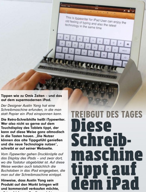
Also shown on the Bild app today, a photo of the iTypewriter, created by Edinburgh College of Art student, Austin Yang,
The iPad fits into a typewriter dock and with each key strike, hammers covered in rubber capacitive caps jump and tap the iPad’s on-screen keyboard.
For those who feel a little retro, this is the way to go. But, not available yet. According to Yange: It is a typewriter for the ipad. Users can enjoy the old feeling of typing and also the lastest technology.
Read more about it:
http://ereadercorral.com/tag/austin-yang/
Weekend reads:
Platforming books
http://craigmod.com/journal/platforming_books/
Craig Mod takes us through a thorough, fact and fun filled tour of how he has taken a book titled, Art space Tokyo, and carried its contents across platforms. One memorable highlight from this Mod case study—-and not just applicable to books, of course:
The future of books is built upon networked platforms, not islands. More than any surface advancement interface, navigational, typographic, or similar platforms define how we read going
SPD: Speaker Series Begins with “News You Can Use”
(Joe Zeff Design Illustration, courtesy of SPD)
Tickets are now available for the Society of Publication Designers’ first Speaker Series event of the fall, “News You Can Use,” scheduled Sept. 10.
For more information:
http://www.spd.org/2012/08/speaker-series-begins-with-new.php
SND Scandinavia Space 2012 conference
Still time to get a spot to attend the SNDS conference in Copenhagen, Sept. 27-29;
For more information:
SNDS workshop ever. Read all about SPACE 2012 here:
http://snds.org/get-your-own-space-guide/#more-1852
The iPad Design Lab: Storytelling in the Age of the Tablet
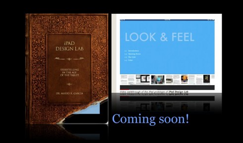
Video walkthrough of the iPad prototype of iPad Design Lab
Mario Garcia’s upcoming speaking engagements:
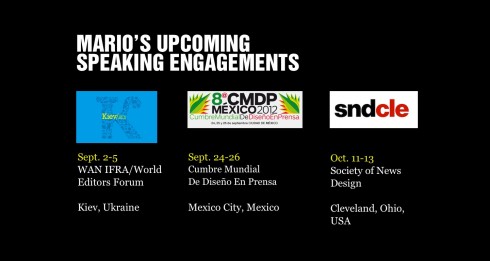
WAN-IFRA World Editors Forum, Kiev, Ukraine, Sept. 2-5
http://www.wan-ifra.org/events/64th-world-newspaper-congress-19th-world-editors-forum
Cumbre Mundial de Diseño en Prensa 2012: Mexico City; September 24-26
http://www.cmdprensa.com/mx2012/
SND (Society of News Design) Cleveland; Oct. 11-13
http://cle.snd.org/