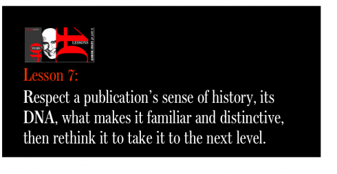
TAKEAWAY:This is part 7 of my occasional series 40 Years/40 Lessons, which I call a “sort of career memoir” capturing highlights and reminiscing about what has been a spectacular journey for me, doing what I love most. Today’s segment: A casual encounter at the end of my presentation takes me on my first journey for a project abroad: La Nueva Provincia , Bahia Blanca, Argentina. PLUS: Deadline approaching soon to apply for The Power of the Tablet conference at Poynter, June 14-15
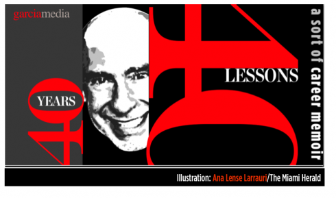
Illustration by Ana Lense Larrauri/The Miami Herald
The start of a long journey abroad
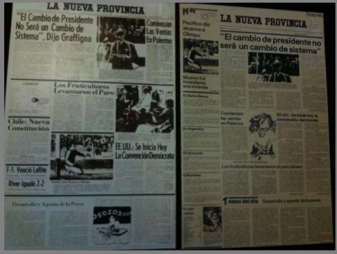
Front page of La Nueva Provincia before and after the 1981 redesign
I had made a collection of the dozens of styles used for headers before the redesign; at right, a more consistent pattern for headers after redesign
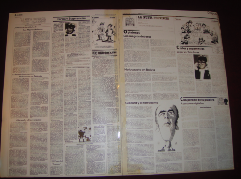
Editorial/opinion page before and after redesign
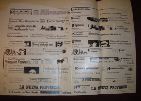
Inside pages were a bit chaotic and text heavy before redesign (left); more modular organization after redesign
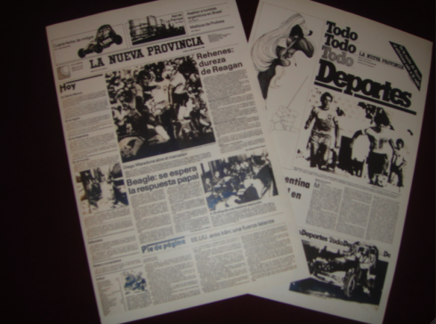
A Monday special for Sports: more features, more visual presentation, a new concept for the time
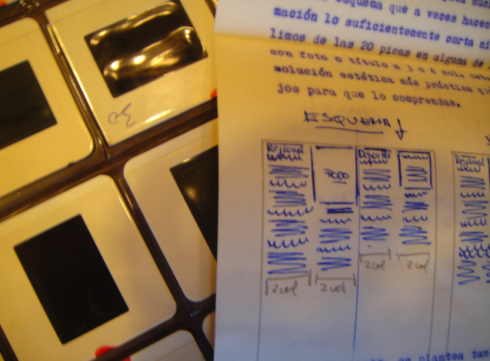
Sucho was the chief of layout and he sent me frequent and copious notes with small sketches to make his point during the course of the redesign. It was a world of slides then, and we kept that slide project plugged in at all times
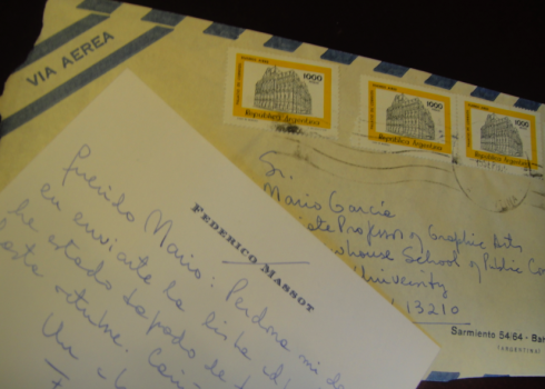
Oh, those handwritten notes, memories of another era when penmanship and slow mail made each message special. Here a note from Federico Massot to me
It was the end of my session on newspaper layout and design at the American Press Institute one day in May 1980. The young man approaching me was Federico Massot, whose family owned La Nueva Provincia
, of Latin American office (in Buenos Aires), and where I went on to do several other dailies.
Not to mention that, when I list my forever five favorite cities in the world, Buenos Aires, continues to rank as the third (the others: New York, Paris, Stockholm and Cape Town).
La Nueva Provincia was my first project outside of the United States, the start of an incredibly exciting career as a global consultant. It was here that I learned to respect culture, history, brand and all that is there long before any of us arrives to keep the publication’s “constant evolution” in motion.
Apply now for the Poynter conference
Roger Fidler
, considered by many as the pioneer who started working and experimenting with tablets for newspaper editions in the late 1970s, will join the Poynter conference, June 14-15.
Roger , who was a journalist and newspaper designer for 34 years, is program director for digital publishing at the Donald W. Reynolds Journalism Institute (RJI), he coordinates digital publishing research projects and the Digital Publishing Alliance (DPA). The subject of his presentation is still in the process of discussion, but we are happy to have him on board and will keep you posted as more details develop.
For application and more information:
http://www.poynter.org/seminar/seminar.asp?id=5515
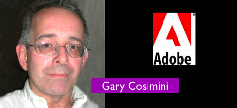
The Power of the Tablet conference will include the participation of Adobe’s Gary Cosimini . He joined Adobe as its first Business Development Manager in 1992, responsible for the introduction of Acrobat to the publishing industry, and then InDesign. He currently works on new digital publishing applications for newspapers, magazines and books, and continues to serve as a liaison to the publishing industry.
Gary’s participation is particularly interesting to all the editors, publishers and designers in the audience, as he worked for 16 years at The New York Times, where he was the original art director of Science Times. He guided the newspaper’s transition from traditional production of graphics and photography to digital formats. In 1985 he was a member of a team that won a Pulitzer Prize in explanatory journalism for coverage of “Star Wars”, the Strategic Defense Initiative.
Before joining the New York Times, Gary was an art director and deputy editor of the Detroit Free Press Sunday Magazine .
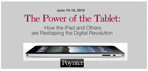
Thinking tablets? Poynter is the place June 14-15
With the addition of Jennifer Brook, an interaction designer who works at The New York Times, where she leads the user experience design of mobile applications and handcrafts information architectures for nytimes.com, our conference will now include presenters who are actively involved in how their titles commute from print to digital on a daily basis.
As many of you know, I have had a special and dear relationship with Poynter for over 25 years, as I came there from Syracuse University to create what is the Visual Journalism program today. Along the way, we have helped to train thousands of publishers, editors and designers. Each time, Poynter has been there to react to major changes in the industry, doing so quickly (with the speed that traditional academic institutions cannot practically do), and making sure that its classrooms served as platforms for the discussion and the hands-on approaches that would serve the industry best to take it to the next level. As such, we at Poynter have been first to do thorough training and research in color to maximize its effects; we also created the WED (Writing-Editing-Design) concept which still serves as the basis of how visual journalism/writing are taught at the Institute. When the first Macs arrived, we had the MacTracks, very specific seminars tailored to training designers and artists on the new equipment.
Why Poynter is THE place for a tablet conference
Today, Poynter moves to the forefront of what the industry is doing, and it is doing so in a major way. That is the reason that I am so honored to be back to direct this conference (I truly never left Poynter, having served as associate faculty and recently as a member of its National Advisory Board) .
I cannot imagine a better place anywhere than The Poynter Institute for Media Studies for a conference on tablets. In my view, the success of the tablets will depend on how we adapt traditional journalism ( storytelling) to make the jump from print and online to the more intuitive digital presentations that the tablet demands and allows.
However, the tablet itself is nothing but a gadget; it is the information that we craft to put in it that will determine its ultimate success. Poynter is a place where historically “the craft” has taken center stage. It is the foundation upon which all programs are based. While we embrace the tablet and see it as one platform that users will take to, we also know that we need to concentrate, as usual, on craft and how to enhance it and prepare it for this new medium. It is also important to note that our conferece is about tablets, all tablets, and not just one of the several that will be in the market. Our conference is NOT sponsored by any one brand, but inspired totally by the role of our craft in those tablets.
This is why I think that everyone who is seriously considering a tablet edition should make it a point to come join us at Poynter June 14-15 for this historic conference.
Why the emphasis on tablets
Like with color, WED and the arrival of Macs in the newsroom, we see that the tablets are going to be here to stay. In my view, it is not a matter of IF, but a matter of WHEN each newspaper and magazine travels the short or long road to incorporating a tablet edition as part of how it publishes and tells stories.
It is that thought that has inspired how we are crafting the one and a half day program at Poynter. We view this first introductory conference as a springboard to tablets, knowing that all we can do is introduce the various subjects that need to be discussed, and planning to continue with other more specific tablet seminars devoted to storytelling, advertising/revenue and technology, all of which are important components.
The speakers and their expertise
Jennifer Brook, The New York Times; will present case study of how the Times became the first newspaper to make its incursion into iPad
Gary Cosimini of Adobe: a frank discussion about Adobe’s role in the world of the tablets
William Couch, USA Today, designer for its app—a resource person who ushered his national newspaper into the iPad
Andrew De Vigal, The New York Times—will deal with storytelling thru photos and video
Steve Dorsey, vice president, research and development, Detroit Media Partnership: resource person to tell us how the Detroit Free Press is approaching tablets
Mario Garcia Jr., Garcia Media: issues of useability, from web to tablets.
Jennifer George-Palilonis of Ball State University: already teaches courses to prepare journalism students for the tablets
D.W. Pine, design director of Time Magazine: will present case study of how his magazine became the first to tabletize with iPad.
Erik Schut, president of WoodWing, the company that worked closely with TIME Magazine as it introduced its iPad edition this month, will be among the speakers.
Alfredo Triviño, Director of Creative Projects, News International (London). Al leads the process of visualizing and showcasing potential products for all News International titles—from print to mobile and tablet apps. Al has been working with tablets since 2007 when he invented the Newsbook, a platform where to read, view, listen to, share and store newspapers, books and magazines. Some of the ways of editing and delivering content that are central to the Newsbook will be tried out for the first time with The Times and Sunday Times iPad apps.
Joe Zeff of Joe Zeff Design: will talk about the importance of multimedia (animation) and about advertising opportunities
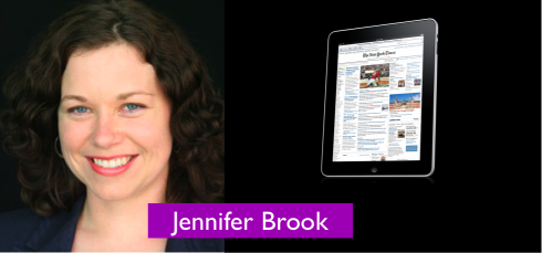
The New York Times’ Jennifer Brook will tell us all about how the Times got into iPad at The Power of the Tablet conference at Poynter
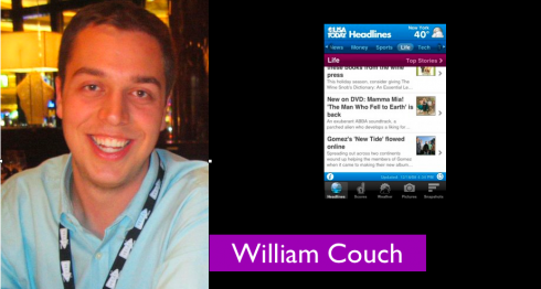
William Couch, USA TODAY, user experience and interface designer for the iPad app of the nation’s newspaper.

Andrew DeVigal (The New York Times), storytelling thru photo/video; Mario Garcia Jr. (Garcia Media) resource person on tablet usability

DW Piine (TIME Magazine) to present case study of Time; Joe Zeff (Joe Zeff Design) to discuss multimedia/advertising opportunities

The Power of the Tablet Conference at Poynter: Erik Schut (WoodWing), Alfredo Triviño (News Corp, London) among headliners presenting

Steve Dorsey (Detroit Free Press); Prof. Jennifer George Palilonis (Ball State University) at the Poynter conference
For application and more information:
http://www.poynter.org/seminar/seminar.asp?id=5515
Who should attend?
Who should attend?: I am happy to see that interest rates so high for this conference, as shown by the many phone calls and emails that I am receiving daily from across the world. One question frequently asked is “who is this conference for?”.
Well, it is for anyone in the industry who contemplates a tablet edition of his/her newspaper or magazine. This should be EVERYONE, in my book. The conference will be an introduction to what you need to know to get out of the gate, from storytelling and presentation modes in the new medium, to the technological solutions available to take you from your current editorial system and into a tablet, advertising opportunities, and, of course, the question that many in the industry ask daily: how can the tablet offer us revenue producing strategies.
Goal of the seminar: To introduce editors, publishers, managers and designers to what’s ahead and what they can expect when tabletizing their print products.
The conference will touch upon the four main themes involved in tablet planning: storytelling (presentation modes), advertising innovation, technology/usability and revenue producing strategies.
I will continue to update this information as speakers are firmed up.
We envision this introductory seminar as perhaps part of a trilogy of programs devoted to tablet publishing, with this one as the introductory one, then perhaps one on storytelling/presentation modes/technology, and one devoted to advertising/revenue producing.
I urge those interested to apply immediately as there will be a limited number of spots available.
Also at Poynter: the mobile seminar right after Tablet conference
You may wish to stay a little longer in sunny Florida and attend the Poynter Institute’s Going Mobile With Your News seminar, June 16-19, right after the Tablet conference. For those travelling long distances, this may be the perfect fit: a conference and a seminar. Bring home more information about digital publishing.
Here is a little information from the course description. For more and to apply, go here:
http://www.poynter.org/seminar/seminar.asp?id=5403&catid=149
Learn to create a mobile news delivery strategy, including building mobile apps and sorting through the options of creating apps vs. using the mobile web. We’ll help you unlock the journalistic power of mobile technology and show you how the public is consuming information on cell phones, tablets and other mobile devices. We’ll demonstrate the simple ways you can optimize your mobile site for smart phone users, and we’ll help you think through the issues you’ll face in design and implementation.