The Wall Street Journal in the Murdoch era has won a Pulitzer Prize, has reduced front page business coverage, has increased front page coverage of the U.S. government and, according to one expert on the subject, has shifted coverage from business to financial. “It's developed much more of a financial focus. There's very little of what used to be the meat and potatoes corporate coverage that made up the pages of the Wall Street Journal,” says Sarah Ellison, a former Journal reporter, and author of a highly regarded book, War At The Wall Street Journal.
The changes are not just in content and focus, however. Those of us who watch the design of publications have also noticed the transformation of the WSJ, subtle as it may be in some cases.
Four major changes stand out:
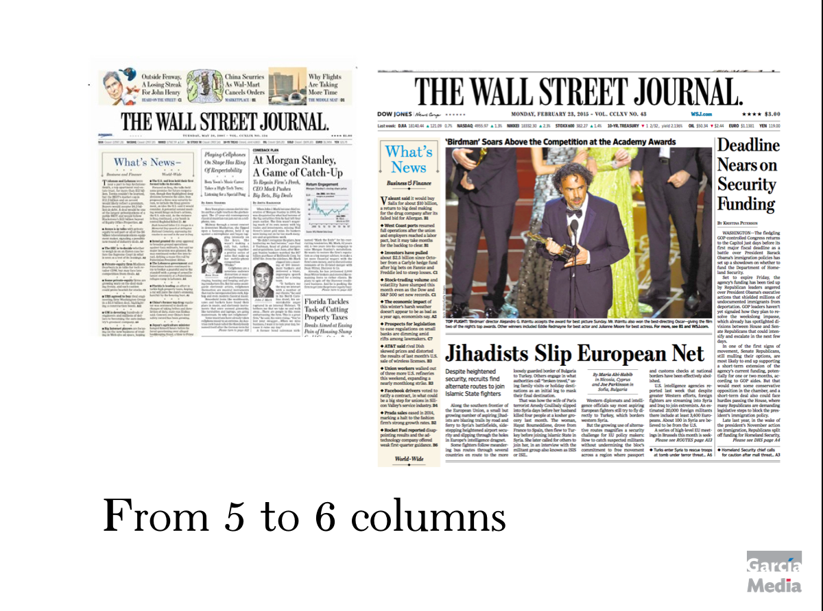
1. The front page architecture has gone from five to six columns.
2. The promos on Page One seem to be more colorful, much larger and sometimes more in line with what one would see in a more down market newspaper. However, it is difficult to describe the style of these promos, because they range from the elegant to the boring to the loud. Variety, obviously, is a trademark of the new WSJ under Rupert Murdoch.
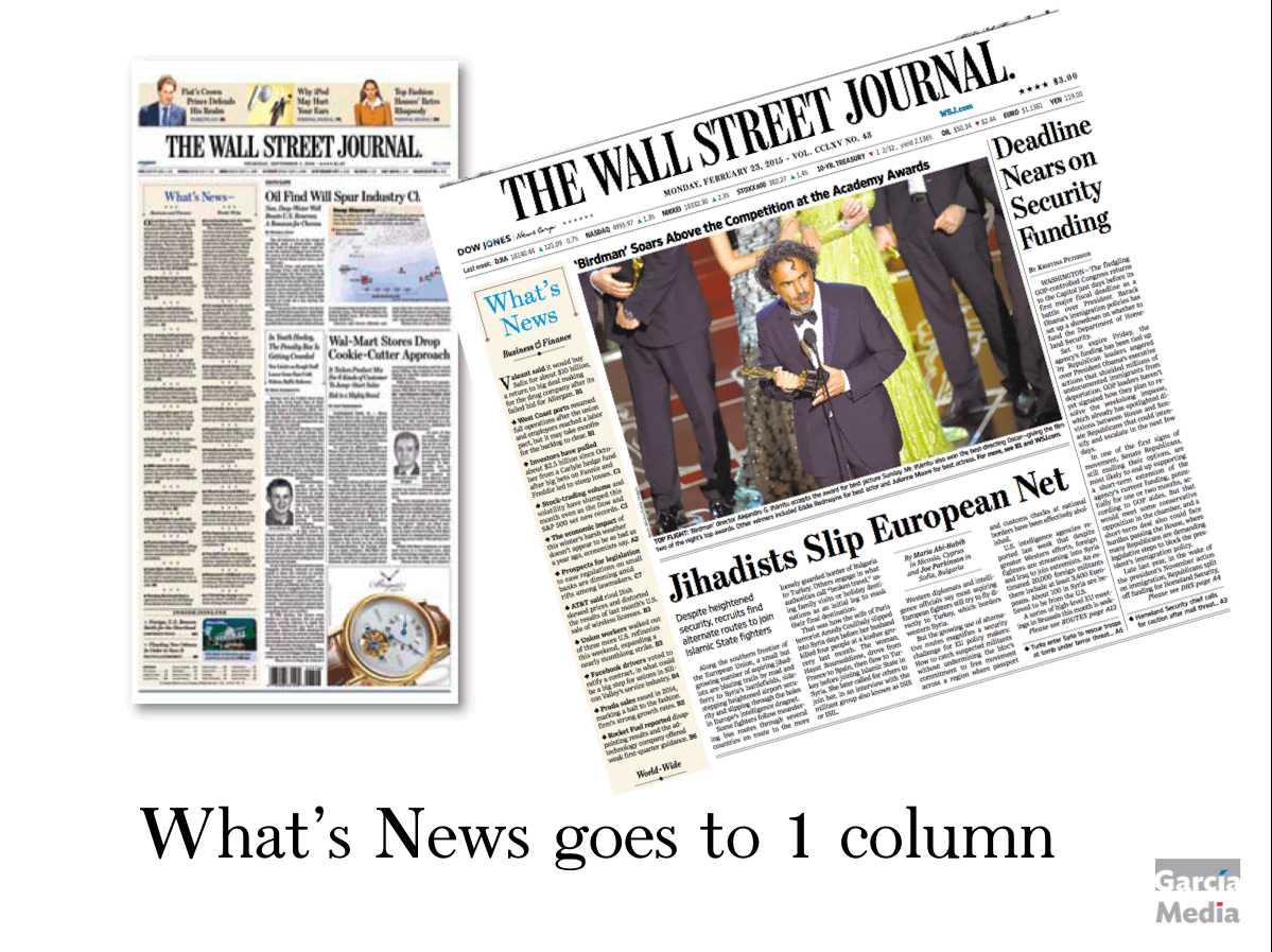
3. The What's News double column has turned to a single, skinny column on most editions, although the editors apparently reserve the right to revert to the two-column feature when needed. In The Asia and Europe editions, the Waht's News is often taken out of Page One and sent to Page 2. The What’s News column started appearing in the print version of The Wall Street Journal in 1934, an innovation of the 25-year-old Barney Kilgore, who later became managing editor.
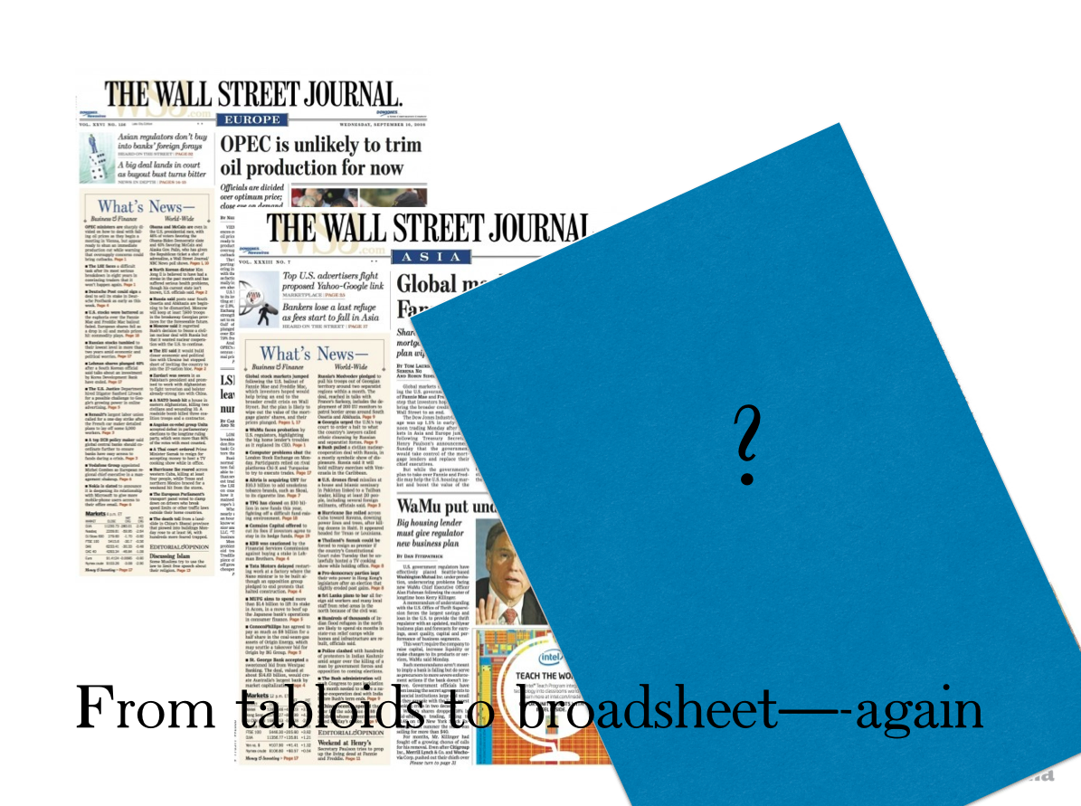
4. And soon to come: the reverting from tabloid to broadsheet format for the Europe and Asia editions of the WSJ.
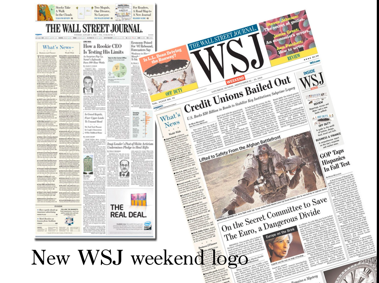
5. The weekend edition logo is simply WSJ.
We may add that in our daily observation of the print edition of The Wall Street Journal, it is obvious that the inside pages are not crafted as carefully as they were 8 years ago. Sometimes hierarchy of headline size and placement of elements seem to be more accidental than planned.
It is admirable, however, that The Wall Street Journal's DNA remains intact seven years after Murdoch took it over. There are many vibrant front pages and I like the editors' ability to use multi column photos on Page One, something that I remember was difficult to pull off when I redesigned the newspaper in 2001.
Take a look at main design changes under Murdoch


Four design changes of notice for The Wall Street Journal since the Murdoch acquisition

Prototypes for how Europe and Asian editions will be combined into one global edition in broadsheet format, with 3 sections
Of related interest
The Wall Street Journal: preparing for the next 125 years
https://garciamedia.com/blog/the_wall_street_journal_preparing_for_the_next_125_years
The Wall Street Journal: that was a great week
https://garciamedia.com/blog/the_wall_street_journal_that_was_a_great_week
The Wall Street Journal – compact
https://garciamedia.com/blog/the_wall_street_journal_compact
WSJ: Redesign case study
http://issuu.com/mariogarcia/docs/garcia_media_summer_report
Mario Garcia on WSJ Tabloid Design
https://www.newsu.org/courses/mario-garcia-wsj-tabloid-design-seminar-snapshot