
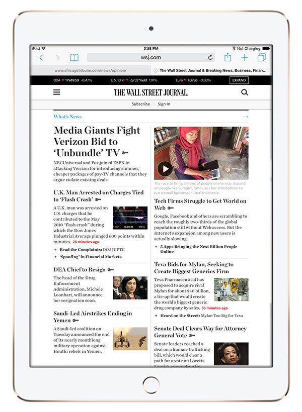
http://globenewswire.com/news-release/2015/04/21/726532/0/en/Wall-Street-Journal-Unveils-New-Mobile-Optimized-Fully-Responsive-Site.html
http://www.wsj.com/articles/wsj-new-york-times-win-pulitzers-1429557628
The Wall Street Journal won a Pulitzer Prize, journalism’s highest honor, for a series of articles exposing abuses in the Medicare system.
In their own words
It was double celebration time in the newsroom of The Wall Street Journal last week. The WSJ won a Pulitzer Prize, its first since 2010, and also unveiled the redesigned website.
The Pulitzer came as a result of a series of articles exposing abuses in the Medicare system. The coverage was led by Michael Siconolfi, investigations editor, and health-care bureau chief Stefanie Ilgenfritz, along with 7 other reporters which included John Carreyrou, Christopher Weaver,Christopher Stewart, Tom McGinty, Rob Barry, Anna Mathews and Janet Adamy.
I am delighted that Gerard Baker, editor of the WSJ, also mentioned the fantastic work of the Journal’s graphics team: Martin Burch, Chris Canipe, Madeline Farbman, Jon Keegan, Palani Kumanan and Stuart Thompson. Bravo to all.
A new responsive website

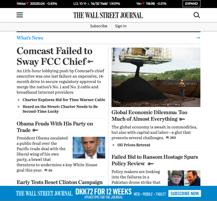
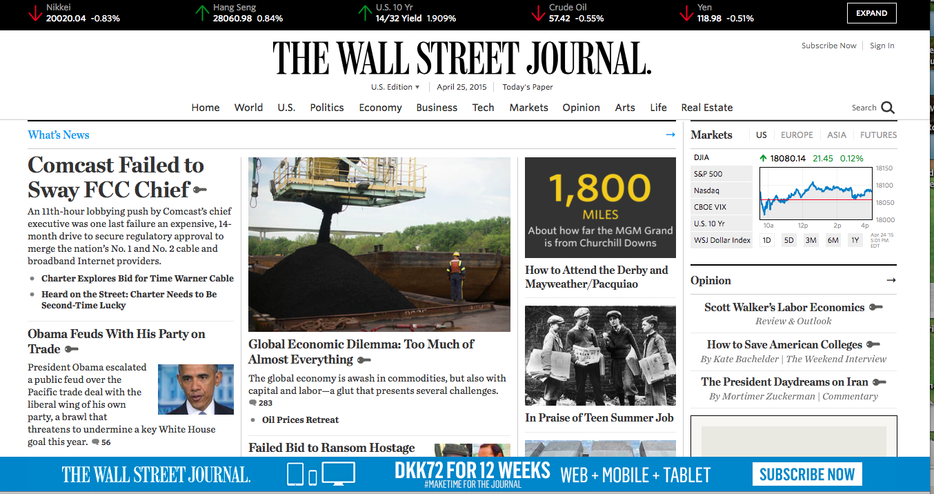
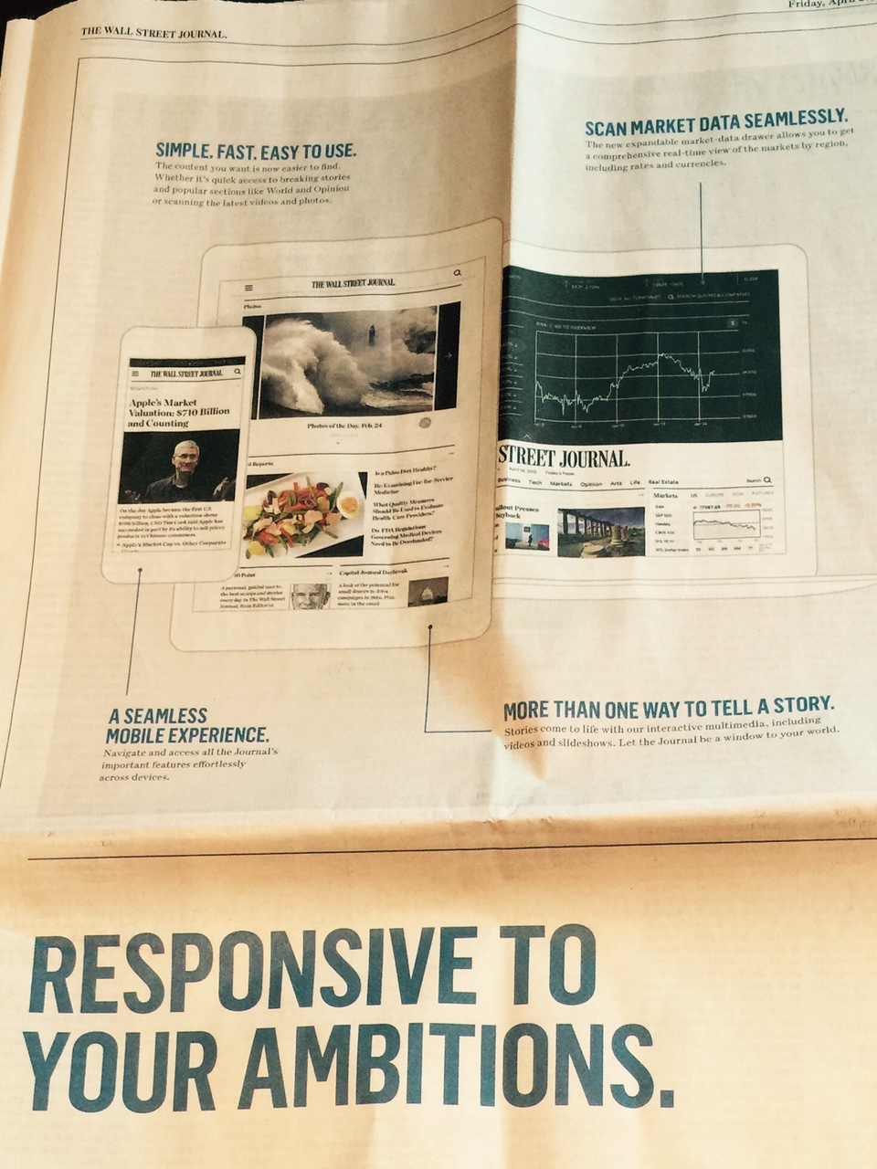
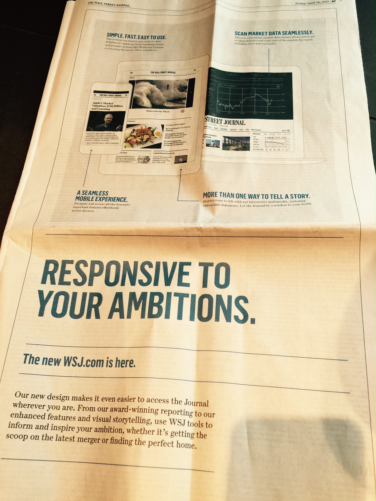
Full page advertising about the WSJ’s new responsive design website
Another reason for WSJ newsroom celebrations, the launch of a redesigned WSJ.com. Designed and built in-house, the fully responsive website allows for a digital experience with the WSJ”s content that is consistent across all screen sizes and devices.
While the new design is heralded as “uncluttered” , it is still a busy site, but this is understandable considering the nature of the fast changing business news that is the WSJ’s mainstay. There seems to be more graphics, photography and videos integrated into the home page and article pages.
That most important of website features, navigation, is also improved to better highlight the Journal’s core coverage areas, such as Business, Economy and Politics.
Video Tour of the new wsj.com
Publish Asia 2015: Master Class today

I am in Bangkok this Tuesday and ready to teach a 3-hour Master Class titled: Visual Storytelling in the Digital Age as part of the Publish Asia 2015 program .The objective of this class is to introduce the participants to the best practices in visual journalism, to broaden their understanding of design, visual communication and storytelling in the multimedia era.
I am happy to see that among the 24 participants registered are publishers, editors and v isual journalists from six countries.
Master Class Content Outline
Part 1—Two Tempos
—News Cycles
—Frequency
—Curated Content
—Role of Tablets
—Editing for Mobile Platforms
Part 2—Storytelling in the Age of the Media Quintet
—Lessons learned
—Accepting Change
—iWED (writing/editing/design)
—One Story/Four Platforms
—Unified Visual Brands
Part 3—Doing Print Happily
—The Role of Print
—Page One Surprises
—Case studies where print still has it!