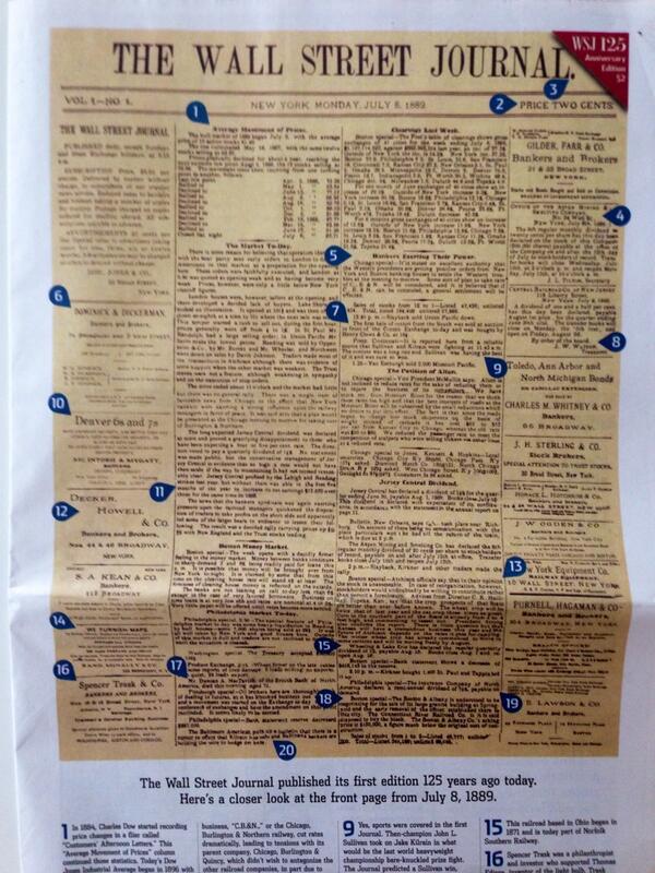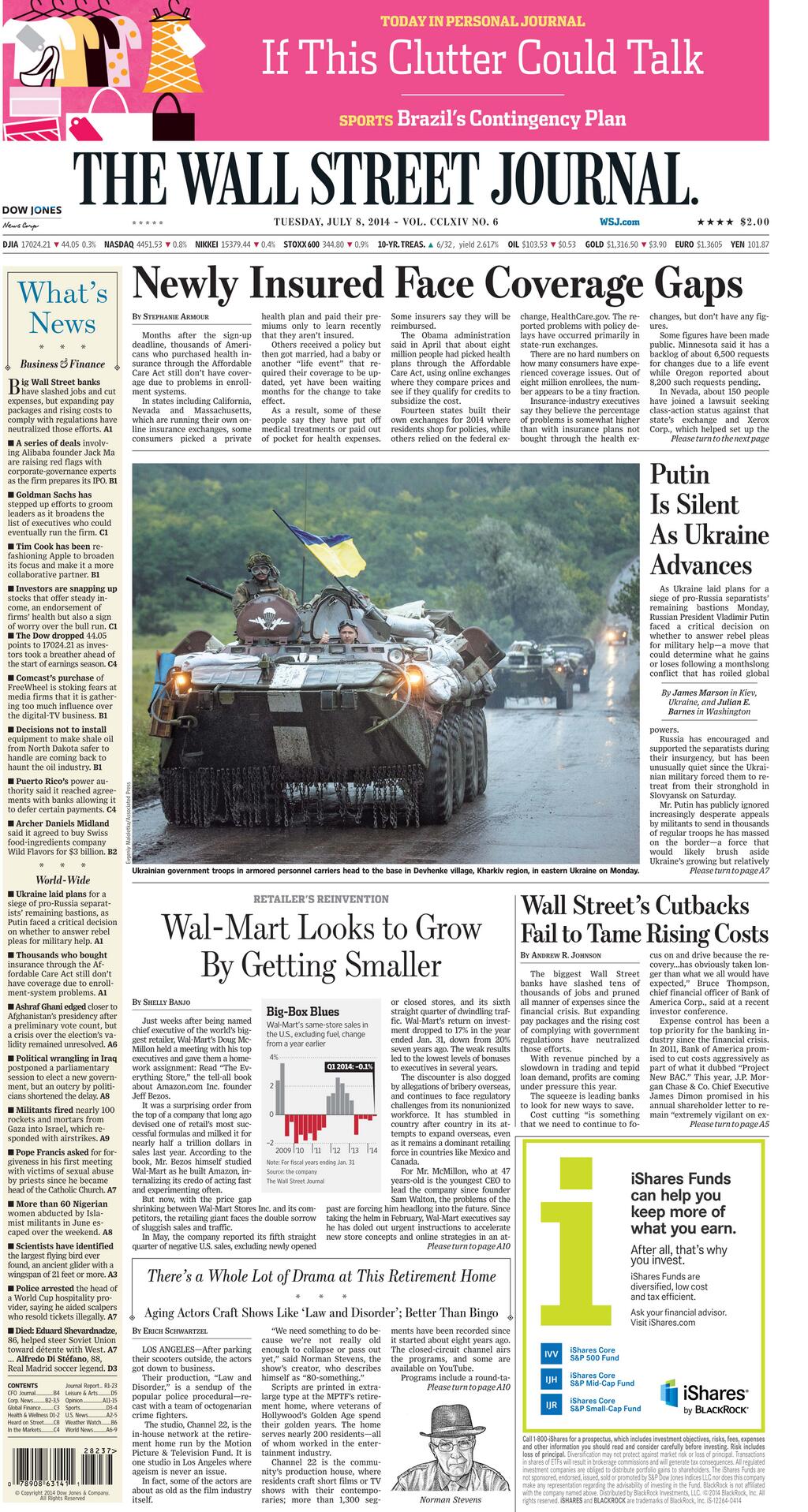


The front page of July 8, 1889 recreated in Tuesday’s edition; inside, the real front page for July 8, 2014. (Don’t miss the use of fuchsia for top promo)

Singer Taylor Swift among experts predicting the future: “Don’t write off the Album yet”
The Wall Street Journal has just turned 125 years old, and what an amazing celebration of itself it has prepared for its readers.
The champagne flows, as it should, all over the front page of Tuesday's edition. What a rich history of covering the world's financial story it has been for The Wall Street Journal since that first edition of July 8, 1889.
Today, The Wall Street Journal is still here. It's robust. It's healthy. It's the source of exclusive news in a digital world where almost nothing is ever deserving of the adjective. It's multi platform. It's the first of the newspapers to monetize its online edition. According to the Alliance for Audited Media, it has a circulation of about 2.4 million copies (including nearly 900,000 digital subscriptions), as of March 2013.
It's still the printed newspaper many men and women of a certain standing like to be seen carrying as they stroll through the world's capitals.
It's in the hands of new owner Rupert Murdoch, who purchased it in 2007, but it is still a more Wall Street Journal experience than a Murdochian escapade, although, under the reign of the Australian media baron, the newspaper has introduced changes such as the creation of a Greater New York section, switched the front page to six columns, introduced a new typographic palette to include Dispatch and Stainless (definitely not a crowd pleaser), and a color palette where fuchsia makes an occasional appearance (something I know would never have been an option for The Wall Street Journal team with which I worked–Joe Dizney are you listening?)
Ironically, as I woke up July 8 and headed for breakfast in Vancouver, British Columbia, my eyes turned to the splash of champagne color on the WSJ's front page, a remake of the original Volume 1, Number 1.
Ironic because it is the champagne color that we designed to use on the popular and most read What's News navigator that the newspaper has carried on its Page One for more than 8 decades.
(Today, of course, that navigator is only one column, a skinny, sort of anorexic version of what it once was. I, for one, think that it should still be two columns. In the digital age, we like to use navigational tools and that was the ultimate one, invented for print, but as if someone knew that there would be digital in the not so distant future).
Call The Wall Street Journal visionary:
From the start: a front page that always mirrored the best of the inside.
A sense of hierarchy via story structures: lead stories, secondary stories, compacts, briefs, opinion pieces.
Opinions & Analysis as close as possible to the stories of the day: help readers understand the news.
Most importantly, that dot at the end of The Wall Street Journal, as if someone knew, in 1889, that someday there would be wsj.com
Vision and beyond
In its 125th anniversary special edition–a must read for all–there is a Journal Report titled The Future of Everything, where leading thinkers (as in Lawrence Summers), innovators (like foodie Alice Waters) and artists (like Taylor Swift) share their visions of “where the world is heading”. Yes, there is also the beauty experts like Tyra Banks, predicting the vision of “loveliness” as in Take Two Pills and You'll Look Better in the Morning.
The headlines in this Special Report say it all:
Say Goodbye to Privacy
Everyone Will Be Online
In Banking the Big will get Bigger
Movie Theaters will Survive
Cash will be King? Not Even Close.
It's Too Soon to Write off the Album
I, of course, gravitated toward a story headlined
Older, Healthier and Happier (making the best of the last decades of our lives). Amen.
This special report is pure gold, like only The Wall Street Journal and a small handful of publications can pull it off. It is lean back reading at its best: inspirational, informational and rich.
The end of the Special Report is a back full page ad for Samsung that reads The Next Big Thing is Here.
My memories
I tweeted today that I was honored to have danced at least a dance or two with The Wall Street Journal. It was memorable in many ways, the type of project that touches you for a professional lifetime and beyond.
As I became a part of the various projects at the WSJ, I was keenly aware that this was not just another newspaper. I was touching history as it touched me.
The introduction of color, the switch from broadsheets to tabloid format for Europe and Asia, and eventually the narrowing of the page. All of these moments in the 125 year history of The Wall Street Journal became landmarks.
As memorable as it all was, there are those special moments that left an impression with me:
1. The day that the prototype of the front page with the champagne tone splashed over the What's News was approved, almost instantly.
2. The doing and redoing of the editorial page more than 50 times, and how I was collecting everyone of those trial and error pages, leaving them piled up on the edge of a window of the office where we worked, only to have them blown out into the streets and Ground Zero that fateful day of September 11, 2001.
3. Attention to detail-–if you have a chance to take a look at the Styleguide of The Wall Street Journal, do so. The Wall Street Journal is close to perfection published daily. It is attention to detail that guarantees that.
4. The best of the best–a highlight of my work with the WSJ was to work with some of the brightest minds in the business: Karen Elliott House, Peter Kahn, Paul Steiger, Jim Pensiero, Marcus Brauchli, Joanne Lipman, Bill Grueskin, Joe Dizney, David Pybas, James Reyman, to name a few. Lifelong friendships were formed. The same applies to our Garcia Media team, all of whom remember their time with the WSJ as special in their careers: Mario Garcia Jr., Jan Kny, Theresa Kral, Rodrigo Fino, Paula Ripoll.
Here is wishing The Wall Street Journal many more years. I would add one more headline to that Special Report titled The Future of Everything:
The WSJ will still be your indispensable daily financial guide.
Mario and The Wall Street Journal: further reading
The Wall Street Journal: preparing for the next 125 years
https://garciamedia.com/blog/the_wall_street_journal_preparing_for_the_next_125_years
The Wall Street Journal: An iconic front page element gets skinner, but why?https://garciamedia.com/blog/pthe_wall_street_journal_an_iconic_front_page_element_gets_skinner_but_why_
Behind the Redesign: WSJ
http://www.poynter.org/uncategorized/1547/behind-the-redesign-wsj/
Mario Garcia on WSJ Tabloid Design
http://www.newsu.org/tr/node/649
http://reymanstudio.com/rswebpages/RSWEBnewspapers01.html
Change Made A Difference in These Projects
https://garciamedia.com/blog/pchange_made_a_different_in_these_projects_p
Pure Design: WSJ redesign case study
http://issuu.com/mariogarcia/docs/garcia_media_summer_report/1
Pages We Like

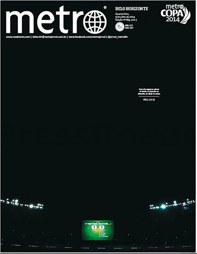
It was a severe loss for Brazil during the World Cup as Germany defeated the host nation's team 7-1. The front page of Brazil's Metro tells the story brilliantly well.
A digital navigator on Page One?

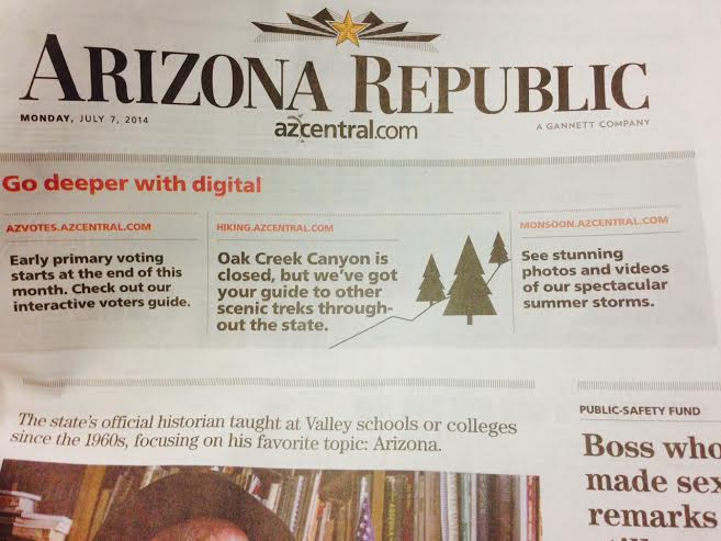
While passing through the Phoenix International Airport, I happened to come across a copy of the local newspaper, The Arizona Republic. What a surprise to see that the top promo unit is devoted to all digital content. Take a look at Go deeper with digital.
While we have seen an increase in the number of printed newspapers that make references to their digital content, we had not yet seen such promotions appear as the dominant promo box on Page One.
The promos to digital in the Arizona Republic lead to interactive voters guide, guide to scenic treks around the state and to photos and videos. The promo box itself is not very visually appealing, while the content it promotes may be.
My question is: is the top of the page the right place to promote content that is NOT necessarily within this specific platform I have in my hands? Will this navigator be better served elsewhere, but on Page One?
How many readers will be frustrated if they cannot easily access a digital platform to read the stories promoted in print?
I am sure that the Republic editors know the effectiveness of this digital promo in print. I'd love to hear what the reader reaction is.
Chime in, please.