TAKEAWAY: This is part 2 of our series on the importance of change in all we do. Today: how change has impacted some of our own projects.

If change was a tool, like an iPad, an iPhone, let’s say an iAnything.
And, if it would be as easy to acquire it as a trip to your neighborhood Apple store, then we all would be rushing to get it. Not one, but many. The iChange, the tool, is much needed—Apple folks, are you listening?.
If only was so easy.
In the blog yesterday I wrote about the need for change and how so many publishers and editors simply are afraid to face it.
As I reflected upon that blog post, I was thinking of my own career, and specific projects where the positive approach to change made all the difference.
Of course, by the time a media house contacts a consulting firm, such as Garcia Media, it has already taken that first important step towards change.
However, inviting a consultant does not mean that the door to change is open wide. It is an indication that the opening is there. As consultants we walk in knowing that we have an opportunity to effect change. The degree to which that change can be carried out varies from project to project.
Three projects that come to mind: The Wall Street Journal, Die Zeit (Germany), El Tiempo (Colombia).
In each of these there was a moment that defined how change would be approached. In each case, change made a cameo entrance, and, in a blink, the rest just happened.
The Wall Street Journal
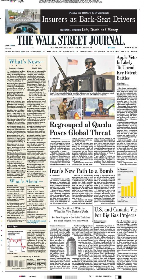
Change was defined by color on the What’s News column on the front page of The Wall Street Journal. (Special thanks to The Wall Street Journal Senior Art Director, David Pybas, for providing this recently published front page)
Grab a copy of The Wall Street Journal and the first thing you notice is that What’s News column with summaries of stories on page one. It is perhaps the most read item on the front page, and it has been for 90 years.
When we were charged to work with the WSJ team to introduce color to the iconic financial daily, it struck me that if this was the most popular feature, we had to put color. We proposed a “wallpaper” background effect with a soft touch of a champagne hue for What’s News. I am convinced that it was the approval of that one major change that set the stage for all the other many changes that followed.
The dynamics of change may be evolutionary, of course, if planned that way. In my view, however, big change often occurs in a blink of a moment. Such was the case at The Wall Street Journal.
The Wall Street Journal introduces narrower format
https://garciamedia.com/blog/articles/the_wall_street_journal_introduces_narrower_format
The Wall Street Journal goes compact
https://garciamedia.com/blog/articles/the_wall_street_journal_compact
The Wall Street Journal: new format, new content, more fusion for print online
https://garciamedia.com/blog/articles/the_wall_street_journal_new_format_new_content_more_fusion_for_print_online
Behind the redesign of the WSJ
http://www.poynter.org/uncategorized/1547/behind-the-redesign-wsj
DieZeit (Germany)
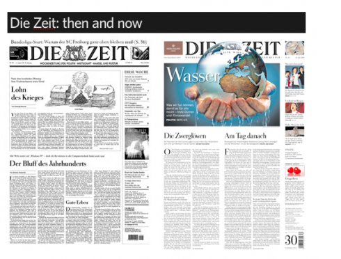
Die Zeit, then and after redesign
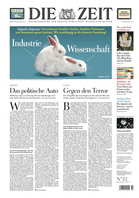
The front page of Die Zeit today reflects dramatic changes for a newspaper that did not carry color nor photos on its front page before. (Special thanks to Die Zeit deputy art director, Jan Kny, for providing this week’s cover page)
Change was not so swift here. It took 11 prototypes to get us to our destination, but, again, once the element of German elegance appeared in one of the designs, the rest was a matter of adapting the little details.
The new Die Zeit emerged with photography, color, shorter texts and perhaps one of the most dramatic changes in the design of a newspaper anywhere. Today, Die Zeit continues to evolve, to surprise and it is a thing of beauty. Rarely a week goes by when I don’t feel great pride upon seeing a copy of Die Zeit.
Behind each front page, what could be a documentary film to illustrate the painful evolution of change, but with a happy ending.
Indeed, change led to new (and more) readers for Die Zeit, as its circulation rose 12% since the redesign, making it Germany’s fastest growing newspaper.
How we did it: Pure Design case study of Die Zeit
https://garciamedia.com/blog/articles/how_we_did_it_pure_design_case_study_of_die_zeit
El Tiempo (Colombia)
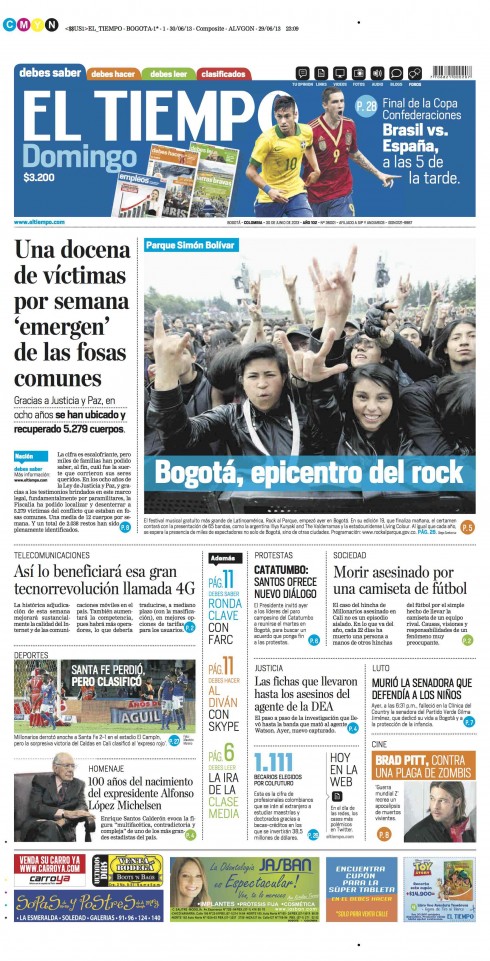
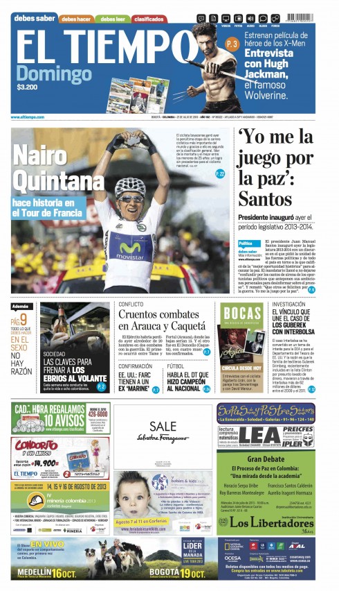
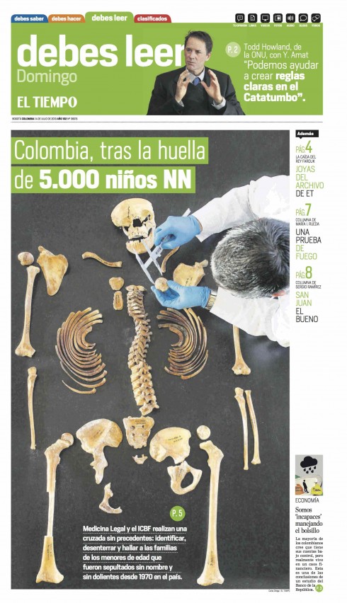
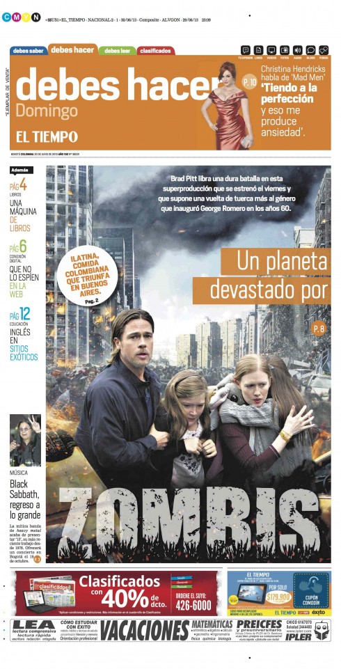
The iconic Colombian daily, El Tiempo, underwent a dramatic transformation based on true change: from six to three daily sections (Special thanks to El Tiempo design director, Beiman Pinilla, for providing these recently published pages)
As I start my project #673 (La Estrella de Panama), I cannot imagine a most resounding and profound example of change in any of my projects than that of El Tiempo, the most widely circulated newspaper of Colombia.
It was here that I first approached the initial workshop with the assumption that the existing product WAS NOT there. Not an easy thing to do, when you consider that El Tiempo is 100 years old and has a rich history as the newspaper of record.
But, by assuming that we were starting a new daily in Colombia in 2011, we were able to strip the process from the legacy syndrome. El Tiempo went from six sections to three: what you must know, what you must read, what you must do.
Today I am sure that many of El Tiempo’s readers don’t even remember their old six-section newspaper.
Change was at its best here, an effort that I have not been able duplicate anyplace else.
Happy ending here too, as the circulation increased by double digits for both the daily and Sunday editions following this dramatic change.
El Tiempo at 100: a fresh proposition journalistically, visually, digitally
https://www.garciamedia.com/blog/articles/el_tiempo_at_100_a_fresh_proposition_journalistically_visually_digitally
El Tiempo launches new concept today
https://garciamedia.com/blog/articles/el_tiempo_launches_new_concept_today/
El Tiempo: how rethinking evolves five weeks later
https://garciamedia.com/blog/articles/new_el_tiempo_pages_how_rethinking_evolves_five_weeks_later
Most recently: The Citizen of South Africa
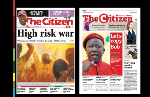
The Citizen changed dramatically: see the before and after front page design. (Special thanks to The Citizen’s design director, Seelan Pillay, for providing these recently published pages)
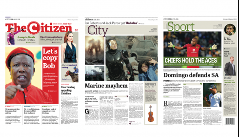
The new section fronts of South Africa’s The Citizen
I have to say that our most recently launched project, The Citizen of South Africa, is an example of swift and efficient change.
We at Garcia Media first met with the team of The Citizen in April 2013. It launched with a new rethinking across platforms August 1. From day one, publisher Eureka Zandberg, made it clear to me and the team that everything was up for grabs in this project.
“Nothing is sacred,” she said. “The logo, the front page, the content flow, feel free to propose what you would do.”
We did, and change made all the difference.
(We will have a regular case study for The Citizen in the weeks ahead).
As we never know when that moment of change is going to happen, keep the conversation open, ask the what if question, and, for visuals, show and tell. Change sometimes comes quicker when someone likes what he/she sees.
Don’t wait for Apple to come up with it. You are already in possession of that iChange tool. Use it
Of related interest
40 Years/40 Lessons: Change
https://garciamedia.com/blog/articles/p40_years_40_lessons_26_change._p
And talking about big change……
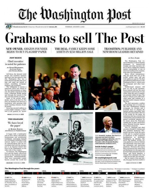
This front page of The Washington Post, reports big change.
In WaPo’s own words:
The Washington Post Co. agreed Monday to sell its flagship newspaper to Amazon.com founder and chief executive Jeffrey P. Bezos, ending the Graham family’s stewardship of one of America’s leading news organizations after four generations.
Definitely a rite of passage, and a new era for one of America’s most prestigious and influential dailies, and one that we are proud to have included among our clients.
We wish the WaPo team much luck and success under its new ownership.
Read all about it here:
http://www.washingtonpost.com/national/jeff-bezos-founder-of-amazon-to-buy-washington-post/2013/08/05/0e9bf196-fe2c-11e2-9711-3708310f6f4d_gallery.html
http://www.nytimes.com/2013/08/06/business/media/amazoncom-founder-to-buy-the-washington-post.html?nl=todaysheadlines&emc=edit_th_20130806&_r=0