This is the weekend edition of TheMarioBlog and will be updated as needed. The next blog post is Monday, June 26.
With Exchange, a font that was originated as a typeface for The Wall Street Journal around 2002 (but deployed in 2005), editors and designers can now add another font to lend text and headlines that sense of gravitas that is so important when we present news and information in the era of “fake news” and “alternative facts”.
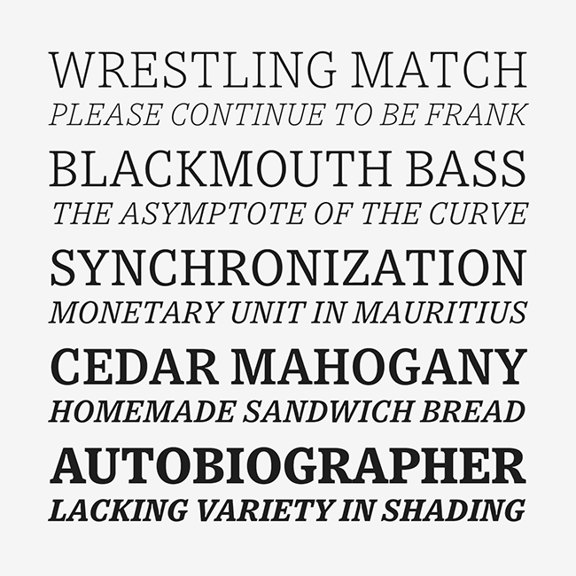
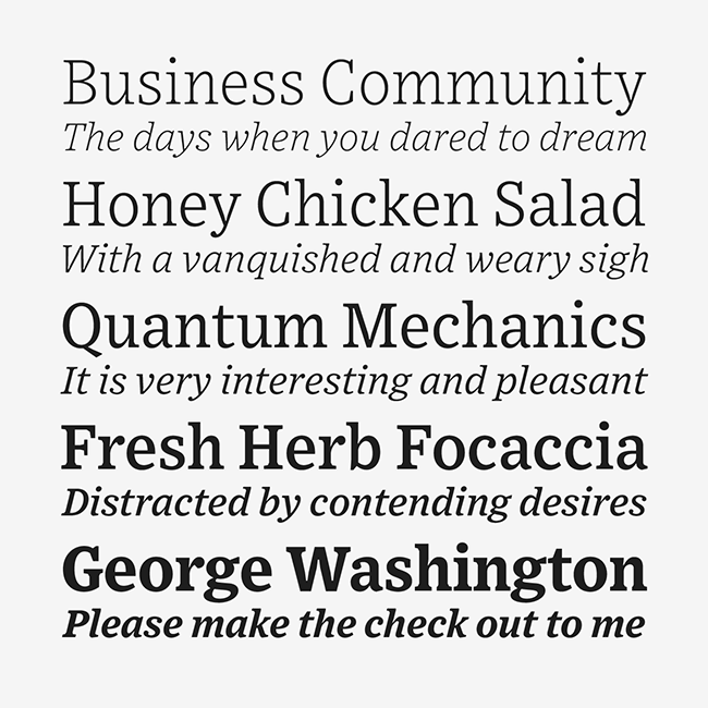
Tobias Frere-Jones has designed a font that is a marriage of the nineteenth century Ionic serif (“an early form of slab serif” according to Frere-Jones) and Bell Gothic.
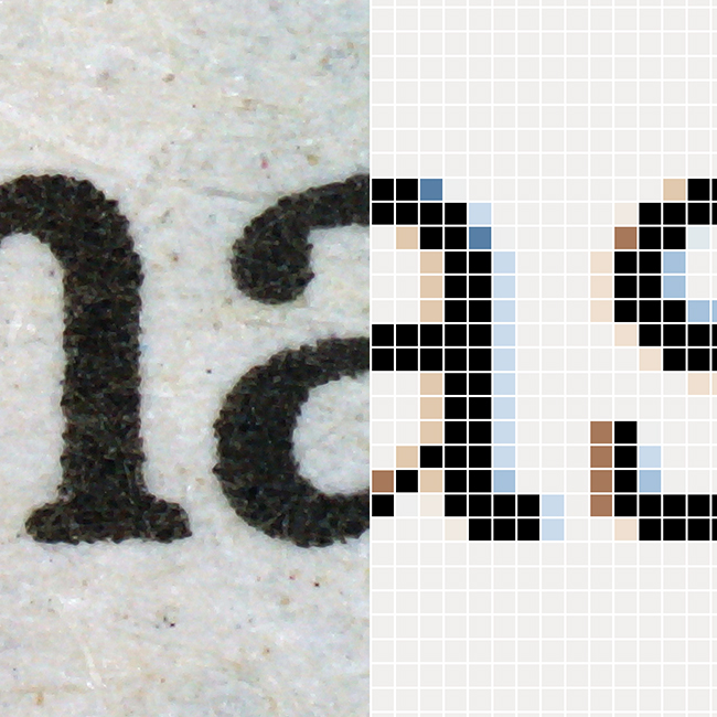
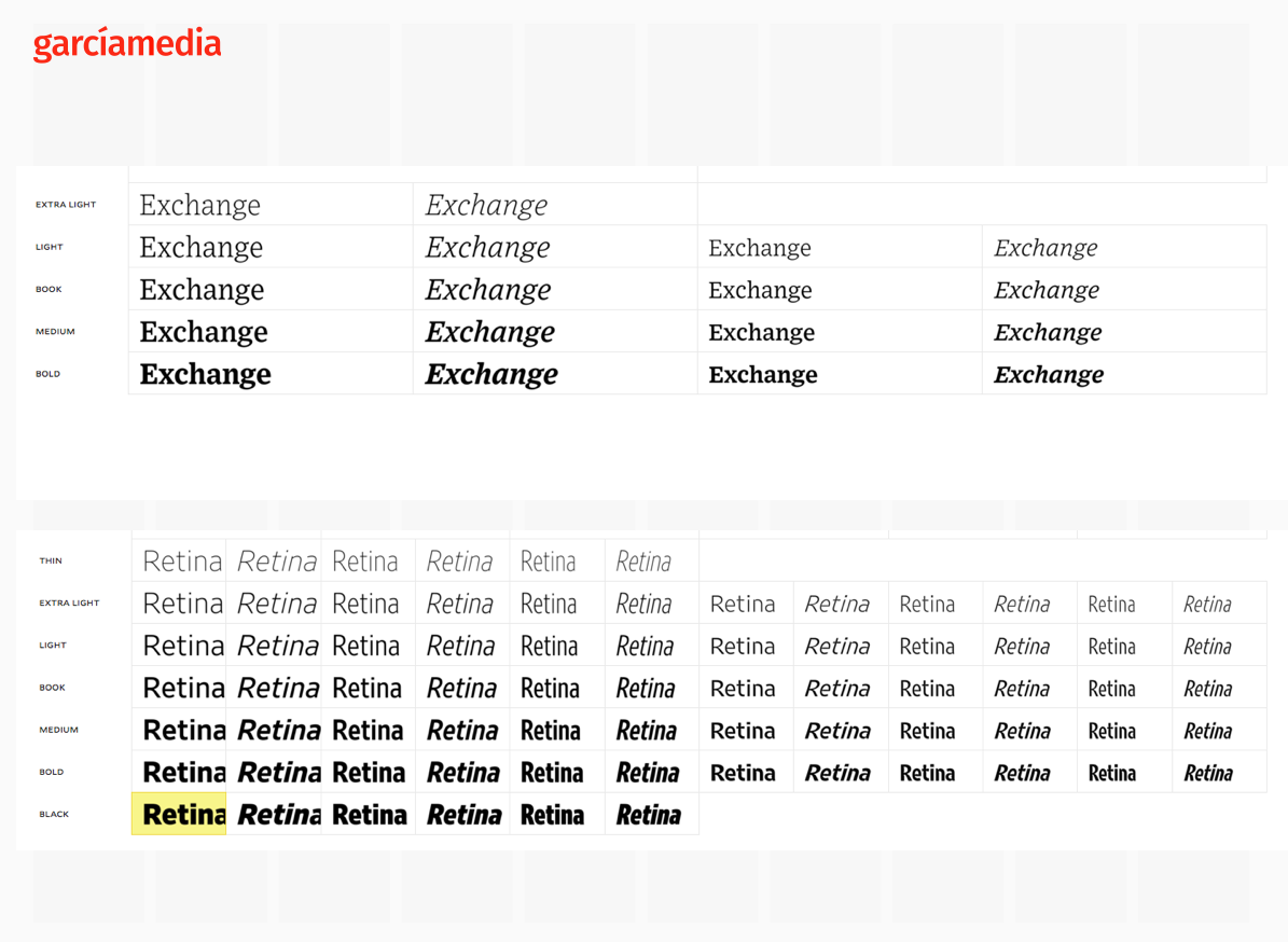
When we make type choices for news organizations today, one important concern is how well a font adapts for use on the screen, and for mobile devices specifically. Like he did with Retina, Tobias has designed Exchange so that it works well at small sizes. This is particularly important when reading text on mobile devices and small screens. Here we see Exchange and Retina, first cousins, and, in my view, a sans and a serif that work together well as part of a same type palette:
Tobias points out that this was much in his thoughts when he designed Exchange:
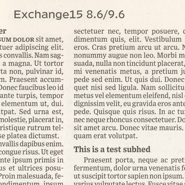
“Cross-environment use was an important part of Exchange’s update and expansion. The original print environment made some strong demands, and it shows in each letter of Exchange: deep lowercase arches, serifs strategically shortened and lengthened, and simplified italics. Those happen to be the same measures that will help our eyes in screen reading, so Exchange was well positioned to move between environments.”
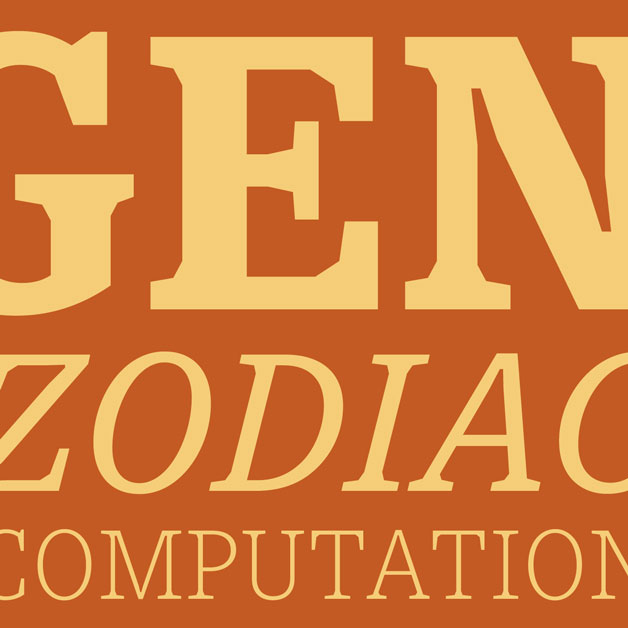
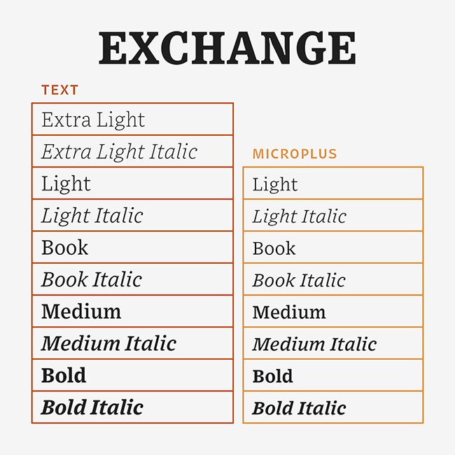
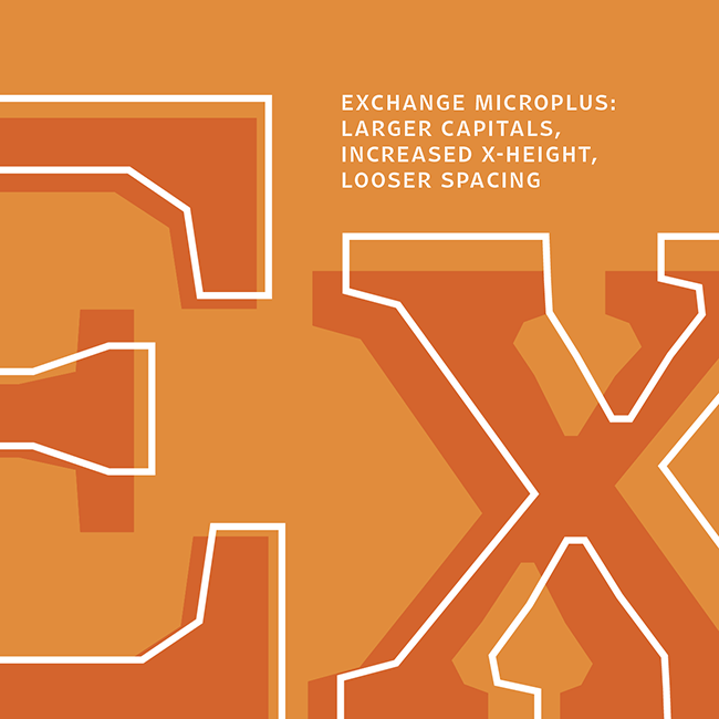
Designers always opt for fonts that offer variety. The new Exchange has 18 fonts, 10 standard styles and 8 MicroPlus styles–an important addition. The MicroPlus styles are capable of taking Exchange to becoming a favorite for use with websites and video.
Particularly with linear storytelling for mobile, where text appears in short bursts, followed by visual assets, I believe that Exchange will be a robust font for those combinations of narrative/visuals. Can’t wait to try it myself.
‘
“Exchange works hard at being stable, in multiple senses of the word: mechanically, to be clear and consistent between print and screen, but also psychologically, grounding shapes onto the baseline, signalling the gravity and seriousness that we need to see in the news. Exchange’s durability also comes into play for video, where the effects of underlying motion are pretty similar to ink blurring. (does that make a media sextet?)”
I like how Tobias refers to his new creation here:
“I like to think that all of this makes Exchange feel something like Edward R Murrow’s voice, presenting facts with calm, impartial authority.”
Calmness and impartiality have never been important. Exchange meets the challenge.”
See more:
https://frerejones.com/families/exchange