TAKEAWAY: It has been one of my most popular books, perhaps because it follows the storytelling techniques that readers prefer: short, “fable inspired” bits of information about our craft. So today we begin publishing Pure Design on the blog. In addition, we will update entries that were originally written in 2002 to add today’s updates and enhancements. ALSO: End of the vertical flag for the venerable Hartford Courant
Simplicity, precision and pure storytelling
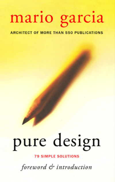
I am very happy to start publishing Pure Design in this blog starting today. The book is currently out of print, but I constantly receive requests from professionals, academics and students, to reprint. I have decided that it is probably more practical and economical to display each of the “fables” from the book here, with commentaries where appropriate to update materials and present the current view on a variety of subjects covered in the book. Hope you enjoy Pure Design, and that its publication here will be useful to you and your team.
About today’s entries:
In the introduction to Pure Design in 2002, I wrote: The segments that follow attempt to make clarity and simplicity foundations for all we do as designers.
Those words still ring true today, perhaps more than then.
If I were writing that sentence today, however, I would substitute “designers” for “storytellers”. As I go through my work day today, I see me as more of a storyteller than a designer.
Today, for example, while meeting with a group of editors, including the online team, it was a round table discussion of storytellers. The medium in which each person participated was not even mentioned. The stories were. The strategies to make those stories come alive was the core of our discussion.
That is as Pure as design or storytelling can get.
Perhaps a remake of the book could be Pure Storytelling.
The story behind the writing of Pure Design:
From time to time we hear about things that took place because of that fateful and unforgettable day, September 11, 2001. I was in Santiago, Chile, that morning when 19 Al-Qaeda terrorists hijacked four commercial passenger jet airliners, intentionally crashed two of the airliners into the Twin Towers of the World Trade Center in New York City, killing everyone on board and many others working in the buildings. We were preparing for the launch of the new look of El Mercurio and wondering, as we always do, what the news of the day would be as we put that first edition with the new design to bed. Little did we know that it would become such an iconic day in the news.
Of course, I could not travel (nobody could) for a few days, and so there I was in Santiago, worried about my family back home, with all the uncertainties that everyone felt, but accepting the circumstance that there was nothing I could do. El Mercurio’s publisher and patriarch, Señor Agustin Edwards, was, as usual, the perfect host, and he took me into his library of rare books one day, where I found me mesmerized by a copy of Aesop’s Fables (circa 1495), with its Gothic-style lettering , the hand drawn illustrations, and, most importantly, the short, succint little stories that said so much in so little space.
This was storytelling at its best. So, why not tell stories about our craft—-lessons, if you will, since fables are all about lessons of life——in a similar style. When I came out of that climate-controlled magnificent library in the Edwards’ residence, I went for a run against the backdrop of the imposing, snow covered Andes. The “fables” were dancing in my head as my Nike shoes pounded the pavement. Pure Design was born in the aftermath of September 11.
Each day, as I went through my work, I made notes of the one question someone asked, or the question I asked myself, which could make for an interesting Pure Design fable discussion.
In a sense, Pure Design was the precursor to this blog. What I did for the book then, I try to do on this blog daily.
For today’s Pure Design entry, go here:
Tomorrow on Pure Design:
Engines to Good Design
End of a vertical logo
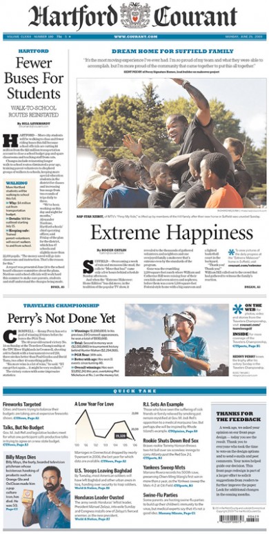
The new front page design for the Hartford Courant: no more vertical log, a more conventional look, and capital letters that are too big
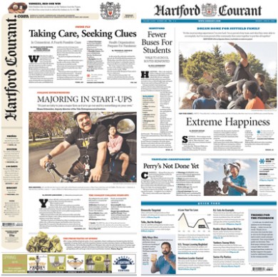
Before and after: the Hartford Courant’s “old” front page was a design not more than a year old; the new concept, right
The Hartford Courant surprised us when it switched this week to what appears to be a more conservative front page, and the abandonment of that vertical nameplate which had turned heads—-in the real sense of the word.
Well, there goes one perennial question in most of the seminars and conferences I hold in the US. Inevitably, someone will ask: what do you think of the
vertical nameplate?
It did not bother me. Why? Because the magnificent art director/layout staff of the Courant managed to make that front page so vibrant, fresh and innovative that the positioning of the flag seemed to be quite secondary to the rest. In the hands of someone with less spatial control, then it could spell vertical disaster.
I am sorry that the Courant has decided to return to a front page that is more like we have seen since 1990, or before. But the bottom navigator is interesting, and, I bet, quite popular with readers.
I do question why those capital letters are so huge on page one.
What’s in a name? Or a logo?
You can take the “week” out of the name, but please don’t take the “news” away
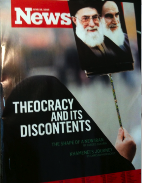
There I was, on board the Lufthansa flight from Berlin to Dusseldorf, so when the flight attendant asked me if I wanted a magazine to read. I said: “Give me TIME or Newsweek, please.”
She looked through the stack on her arm and said: “I don’t think we have Newsweek this week”
However, as she flipped thru the magazines, I could tell that she did have it, except that, on this edition (European) this week a photo covers most of the logo, leaving only the word News as a logo.
Of course, she was confused, and as I examined the cover, I realized that one has to be careful when covering a logo. Sometimes you can cover one or two letters, and you still recognize the brand. Sometimes it does not work so well.
Remember, Newsweek changed its design/format about six weeks ago, and the table of contents page does a “cover up” as well, with the letter “s”. Instead of Newsweek, it reads New week. Easier to do those cover ups inside than on your cover.
The flight attendant probably now knows that designers sometimes play games and don’t inform the readers.
TheMarioBlog posting #294