Updated Sunday at 15:20 in Lagos, Nigeria
TAKEAWAY: We visit the studio of contemporary Nigerian artist Victor Ehikhamenor, who is also Creative Director, Timbuktu Media, the company that publishes Next on Sunday and soon Next the daily. How “newspapering” has transformed the artist. ALSO :We review Next on Sunday’s Arts & Culture section PLUS: Pure Design download is about alignment of type: centered versus flush left. AND: Could Saturday be the new Sunday for US newspapers? UPDATE SUNDAY: Pages we like: today’s Bild Am Sonntag and sports, etc.
Bild Am Sonntag today
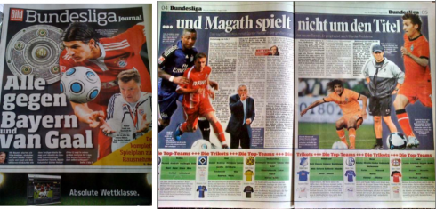
Special sports section previews the upcoming Bundesliga season
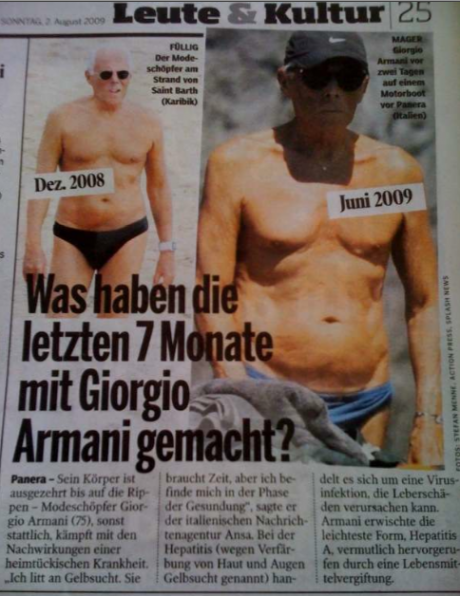
One of Bild am Sonntag’s specialties: the before and after photo story treatments. Today’s victim: Giorgio Armani
and the headline: What have the last 7 months done to Giorgio Armani?

Just to show you how popular Bild Am Sonntag is with all types of “readers”, here is Jacky, Frank Deville’s dog, to prove it: “A regular reader of Bild Am Sonntag, that Jacky is,” says proud owner Frank. It is sort of “Bild Am Jacky”
Frank Deville, of Luxembourg, knows that I enjoy looking at the surprises usually found in Germany’s Bild Am Sonntag, so as he read his Sunday paper at home, and knowing I am in Nigeria, he sends me some pages of interest: A special sports devoted to the next Bundesliga season. In addition, we have a tidbit “before and after” but not related to page design. It is fashion designer, Giorgio Armani, however; the photo story shows how the last 7 months have been particularly difficult for the icon of fashion, and he seems to have aged a bit.
For Victor Ehikamenor: a year of transition, discovery

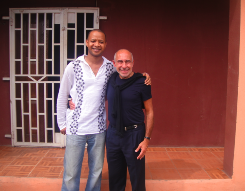
Victor welcomes me at the entrance of his studio in Lagos
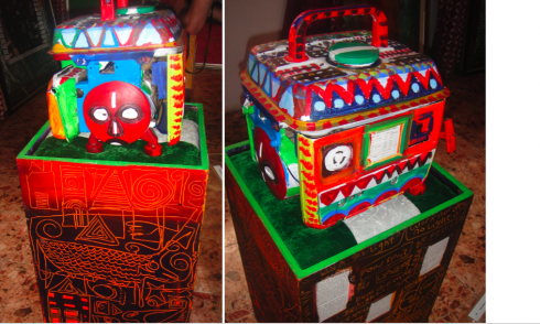
The Generator—power play, I better pass my neighbor
Victor explains what inspired him for this piece:
As you can see, there are frequent power outages in Lagos. It is a disgrace. We pay for service we don’t get, but the people are used to malfunctions, so they don’t complain strongly enough, and the chaos continues. So we all buy generators to get our own electricity when there is a failure. Picture me going to a shop in the street asking for a broken generator. Here it is.
Klakitiklak of ineffective policies
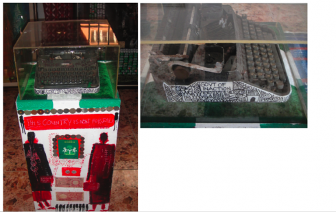
Here, Victor uses the old typewriter as a symbol of the government’s bureaucracy. Papers are filled out, no action is taken.
If you read the sides of the piece, I have included notations that are real, decrees that have never come into action, projects that have been abandoned, it is all a part of what we live with in Nigeria everyday.
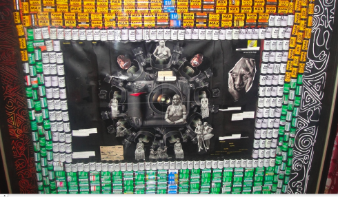
In this piece, Their Point of View, Victor uses rolls of film to frame images as captured by photographers.
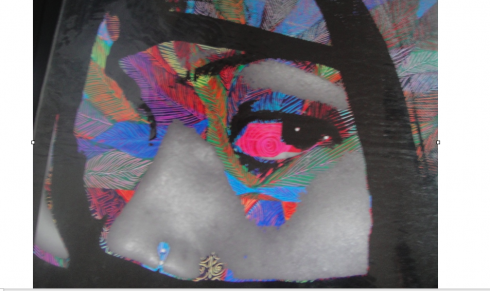
A digital collage
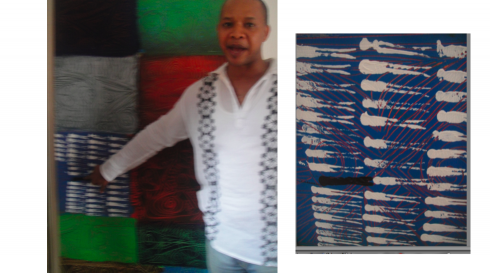
Victor points to part of the texture of one of his paintings, which he created when he arrived in the United States: “For the first time in my life, I was a minority—-a black man in a white society”
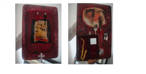
A prayer of the faithful (left), A Superstar’s Paraphernalia
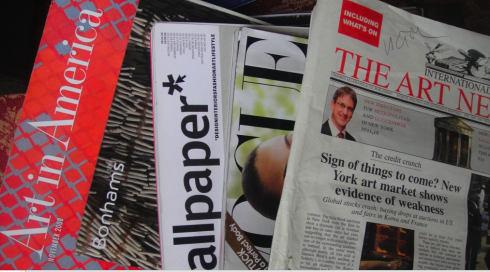
What the artist reads
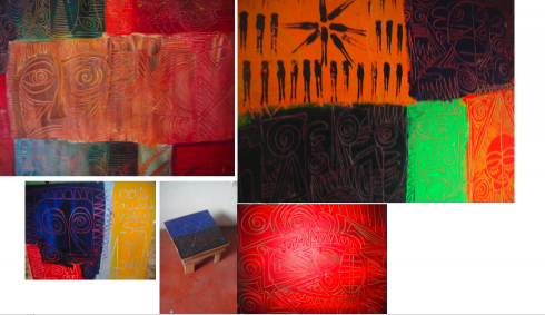
I focus my eyes—-and camera—-on details of Victor’s work: he creates squares, each of which includes a story, so I have Victor explain them to me. The texture of his paintings is a combination of these little stories that provide an overall distinctive style.
It has been exactly one year today, August 1, since Victor Ehikhamenor made his homecoming back to Nigeria—-trading the life of college professor in Baltimore, for a bit of the unknown in his homeland. When we met here in Lagos, soon after his arrival, I was about to start the early design stages of two new products: Next (daily) and Next on Sunday. One afternoon, visiting a gallery, I discovered the talent of Victor the aritst. I became a collector of his works, which I hang proudly at home in Florida, but, more importantly, we became friends.
Next needed a creative director, preferably one with an intimate knowledge of Nigeria. Victor’s works had already communicated tons of visual information about the place for which I was to develop a newspaper, but I thought it would be ideal to have him join the team.
“I have never worked in a newspaper,” he said.
“That makes it even better,” I responded.
So, with the enthusiastic help of publisher Dele Olojede, who thought it was a brilliant idea as well, Victor became creative director. A crash course in newspapering followed. One year later, he still talks to me, I am happy to say. He talks more like a newspaper person, and he knows about daily deadlines and long 12-hour days. His artistic background has brought glorious touches to Next, and this is only the beginning.
Newspaper influence on the art
During this visit, Victor and I have had many chances to speak about what has transpired this year. Not all has been easy, of course. It is a new product. It is a young team with little experience. There are details, technology to learn, editors to deal with. Victor seems to sail through it all gingerly, with a smile. The artist, I believe, saves the day.
Today, at lunch, Victor told me something that has stayed with me:
I am now a different kind of artist because of my one year with the newspaper. I try to bring social causes to my work which perhaps were not so relevant before. I am back in Nigeria, and I see things that need change, and I know that I can effect a little of that change through my work. Newspapers, the contact with journalists has tranformed some of the nature of my work.”
It was at that point that we decided to take a tour of Victor’s studio, a 30-minute drive from where the newspaper office is in Victoria Island, including crossing a bridge . We travelled through congested streets, bumpy dirt roads, and witnessed the colorful parade of one of the world’s most peripatetic street markets. The enterprising Nigerians—-of all ages—-sell it all in the street. Just roll down the window, call the vendor and get those peanuts, razor blades, books, tomatoes, eggs, sandals or silk pajamas.
Suddenly, we were at Victor’s studio—-an oasis in the midst of the chaos, an old home that he is restructuring and redesigning as his studio, with big rooms, high celings, and explosions of Victor Ehikhamenor magic everywhere. We took a fascinating tour, and I have chosen some of the most intriguing pieces (above), and at least two that reflect the new Victor: with a social message for this new Nigeria.
As he re-enters Nigeria, Victor is cautious to point out what is obvious to a visitor here: “We are a society that lives between suffering and laughter,” he tells me, and, in, fact, that is the title of one of the pieces resting against the wall of his studio.
Through his art, Victor Ehikhamenor is aiming to decrease the suffering and increase the laughter, a goal worth coming home for.
Arts & Culture supplement for Next On Sunday
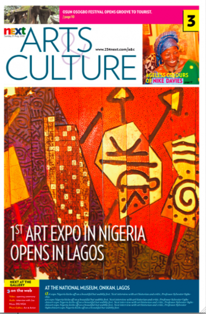
Cover of Next on Sunday’s Arts & Culture supplement
Every Sunday, readers of Next on Sunday get their pull out, tab format Arts & Culture section. It is rich in content and celebrates the enormous artistic and literary resources of Nigeria. As we review that supplement this week, our main complaint is one that can be echoed in many places around the world: the editor’s desire to make it so elite and full of “gravitas” (I have come to hate that word, simply because when it is mentioned, right behind comes a boring page with a 3000-word article that could be cut in half) that the supplement becomes difficult to navigate, and impossible to penetrate.
Part of our job is to guide these culture/literature editors and remind them that the purpose of their supplement is to be read—-by as many as possible.
To do that, cultural supplements must be accessible.
What does this mean?
Accessible headline: One word headlines do not cut it. When you say “Metamorphosis” you, the editor, may be the only person in the room who knows what it refers to. It would be better to write:
“Author’s metamorphosis led to his new trilogy of fiction and verse”, for example.
Summary/highlight of story: The headline is the primary hook to grab our attention, but a well written and short summary can expand on what the story or review is about. We are all scanners, regardless of which educational level we fit in. Scanning applies to all reader groups. Perhaps the more educated the more impatient.
Subheads and breakers: Since the cultural texts tend to be long, please use subheads to advance the story.
For more information about Next, go here:
The official website:
www.234next.com
Previous blogs dealing with Next:
https://www.garciamedia.com/admin/index.php?S=3d288590d403189c70a2b177e20a8bb8577a3b25&C=edit&M=edit_entry&weblog_id=6&entry_id=685
https://www.garciamedia.com/admin/index.php?S=6bed83f06c1beac7b1d0578a3c490f80481ba6b1&C=edit&M=edit_entry&weblog_id=6&entry_id=684
https://www.garciamedia.com/blog/articles/nigerias_next_on_sunday_changing_journalism_one_sunday_at_a_time/
https://garciamedia.com/blog/articles/next_on_sunday_the_new_newspaper_that_raises_journalistic_bar_in_nigeria/
Guillermo Kahlo photo exhibit in Cuba opens August 1
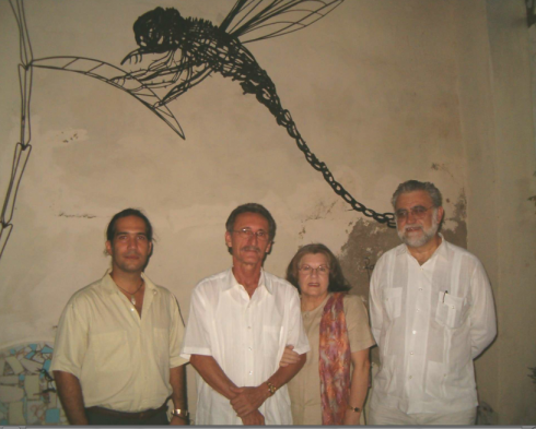
At the opening of the Guillermo Kahlo exhibit: From left, Pavel Alejandro Barrios (curator of the expo), Orestes Larios Zaak, Mary Granela de Larios Zaak and Iván Trujillo
Although we all know about Frida Kahlo, the renowned Mexican painter with the unique style and colorful self portraits, we know less about her father, German-born Guillermo Kahlo, a photographer who started his career with newspapers in Mexico, working wtih El Mundo Ilustrado and Semanario Ilustrado. He was commissioned by the government to do architectural photographs, probably his best work. He also took photographs of churches with other photographers for a six-volume survey in the 1920s.
My cousin Mary Granela de Larios, who lives in Camaguey, Cuba, and is married to the well known artist, Orestes Larios Zaak, informs me that her husband’s gallery,has had the distinct honor of being commissioned to do a Guillermo Kahlo exhibit, tomorrow, August 1, at 8 pm, at Galerias Taller Larios. The exhibit is titled: Guillermo Kahlo—Photographer of the Centennial.
Says Orestes Larios Zaak:
“It was Porfirio Diaz, then President of Mexico, who commissioned Guillermo Kahlo to do a photographic documentary of the architectural treasures that Mexico had at the time in celebration of the country’s centennial. Kahlo, who specialized and promoted himself as specialist in landscapes, buildings, interiors and factories, did not disappoint.”
But, Larios reminds us, in the process he also took many pictures of his favorite daughter, Frida, a radical departure from his usual photography, which did not include humans. Some of the Frida photos will be included in this exhibit.
Any of our readers who are in Cuba, or visiting there, here is a rare chance to see the Kahlo photos.
It is mostly flushed left type these days
This is not a topic that will help us make newspapers or magazines more profitable for sure: should headlines be centered or flushed left?
However, it is one that designers deal with continuously. Either way is fine in terms of legibility, as far as I am concerned. If you ask me: I usually go flushed left for headlines, but it is a matter of seeking a more perfect alignment on the left hand side of a page or screen, and also allowing for some built in white space to be engaged on the page. It is nothing academic for sure.
US newspapers eye Saturday weekend publication
It is a sign of progress that American newspaper editors are willing to engage in at least a start up conversation concerning frequency of publication—-especially as it affects their Sunday readership, which continues to be the most revenue producing drivers for an industry in tremendous trouble.
Bill Mitchell, of The Poynter Institute for Media Studies, writes a piece about a possibility some publishers are studying: to produce a weekend newspaper that appears on Saturdays.
It already happens in many newspapers in Europe. It is now a matter of studying how the lifestyle habit of American newspaper readers would affect such a move. I gave Bill some of my own comments. Interesting and timely topic. We have not heard the last of this.
In my view, this is the right discussion, as I maintain the Monday-Friday publication for print is likely to disappear, but a robust weekend edition, preferably on Saturday, is the answer.
Read on.
For complete article:
http://www.poynter.org/column.asp?id=131&aid=167636
Download entire first section of Pure Design: Words
Now that I have fully presented the first of six sections of Pure Design on TheMarioBlog, I am offering the entire initial section, “Words,” available for download—all 33 pages of it. This may be useful for those of you saving or printing out Pure Design and will be done following each of the remaining sections. At the end of our journey through words, type, layout, color, pictures, and process, I will publish the entirety of Pure Design in one file.
Follow me at www.twitter.com/tweetsbydesign
Follow the Marios

Two Marios. Two Views.
Follow Mario Jr. and his blog about media analysis, web design and assorted topics related to the current state of our industry.
http://garciainteractive.com/
Visit Mario Sr. daily here, or through TweetsByDesign (www.twitter.com/tweetsbydesign)
In Spanish daily: The Rodrigo Fino blog
:
To read TheRodrigoFino blog, in Spanish, go:
https://garciamedia.com/latinamerica/blog/
TheMarioBlog posting #321