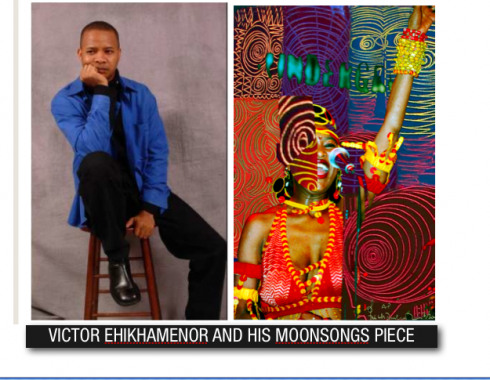
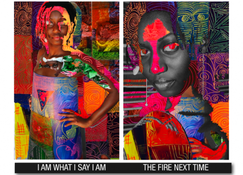
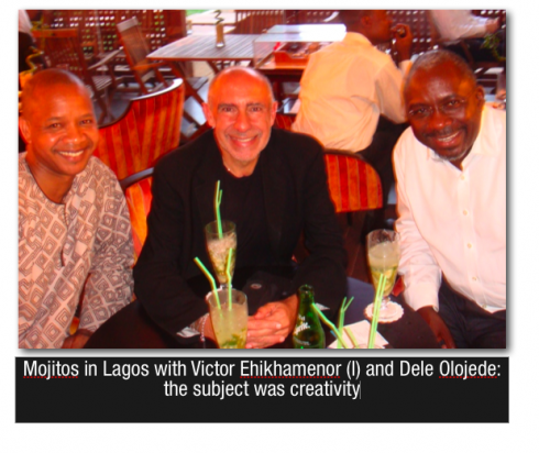
Victor Ehikhamenor, one of Nigeria’s most renowned contemporary artists, has been named Creative Director of NEXT, the new newspaper to be published in Lagos, Nigeria. Victor, who has most recently lived in the United States, where he painted and taught at the university level, is happy to come back to his native country:
“This is great that I can come back to my homeland and to find a new means of expression, and to be part of this historical moment, the creation of a new newspaper,” he told me during our week-long workshop in Lagos.
“For me to take this giant step from the world of fine arts, to a totally new medium—-print and web, and the business of news—-is right on target as far as my professional development is concerned. I am learning much already, and the learning curve is quite high, but I am up to the challenge,” he said.
For Dele Olojede, , CEO , Timbuktu Media and Publisher, NEXT, this is a one of a kind opportunity for both his new news operation and for Victor:
“Victor is an accomplished painter, photographer and creative thinker. Our decision to ask him to join the team really was a no-brainer, and it demonstrates our very high ambitions to create a world-class newspaper in a difficult environment. He is as good as it gets.”
Personally, as I see Victor create page designs during our workshop, I am mesmerized by the combination of creativity and that certain freshness brought on by someone who has never worked in a newspaper and who obviously has no baggage in terms of “newspaper design” rules. Victor lets his imagination go, then asks me: Is this possible to do in a newspaper? In most cases I find myself telling him: Not really, but you show that it can be done, so let us try it.”
Victor will head NEXT’s creative team, working closely with Design Director Isiaka (Eazy) Gbodiyan, whose background is in advertising design.

Our previous interview with Victor:
https://garciamedia.com/blog/articles/the_artist_looks_at_newspaper_design_in_nigeria_a_three_minute_interview_wi/
![]()
Victor’s world–
MY ART @ http://picasaweb.google.com/sozaboy/ARTWORKS
http://www.sozaboy.com ?http://www.newweb.net/~victor/artist.htm ?http://www.nigeriansinamerica.com/authors/18/Victor-Ehikhamenor ? http://www.sentinelpoetry.org.uk/0306/index_files/page0026.htm ?http://www.flickr.com/photos/withinreason/sets/72157605273663384/ (displays Victor’s works, as well as that of other artists)

MESSAGE TO THE FINANCIAL TIMES: PLEASE MAKE TYPE BIGGER
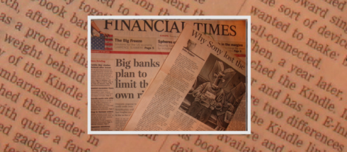
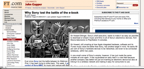
One way to experience frustration is to try to read a story set in text type too small. Such is the case for me with the Financial Times, one of my favorite daily reads.
It happened again Thursday night. My Lufthansa flight 565 had barely taken off from Lagos on the way to Frankfurt,the cabin was well lit and I took off my shoes and settled down to read about four newspapers I had carried with me on board.
No trouble at all reading USA Today, Wall Street Journal Europe or the International Herald Tribune—-all part of my daily newspaper fare. But then came the Financial Times (Thursday, August 7 Europe edition) and I had trouble reading every story, but especially the one that grabbed my interest: “Why SONY lost the e-book battle”. I strugged with what seems to be type not bigger than 8 points and gave up after the third paragraph, deciding that it was not worth the effort on my 61-year-old eyes, and that I would read the story upon landing in Frankfurt in the online edition of the FT (www.ft.com). I went the rest of the flight not knowing why SONY lost the e-book batlle!
Not everyone has the choice to read a story online. Not yet, anyway, and the Financial Times, which I am sure has a vast audience of readers in my age group and beyond, would be wise to reconsider its choice of text type size. Try 9 points, minimum. As for me, I usually recommend 10 points, with a good interline line spacing, as I am aware that readers are living longer, and this is one issue where newspapers can make efforts to retain their older readers.
Finally in Frankfurt, I connected and read the story online. Yes, the type for the online edition is crisp and legible. Thank God for online editions, I said to myself.
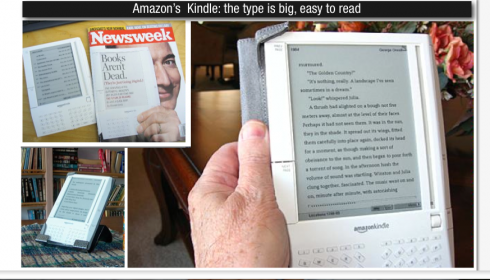
Yes, SONY lost the e-book battle to Amazon, which has become its main rival in the e-book business through the creation of the Kindle, its e-book reader. One major advantage for Kindle users: it links to Amazon’s online store, where users find more than 145000 titles to download. The Kindle sells for US$359.
And, indeed, the type is big, easy to read. With the popularity of e-books and e-papers on the rise, there are lessons for editors of printed products to learn, and they start with making type bigger.
I am sure the FT does not want to “lose the battle” with its print readers.
NOTE: I am planning to devote future postings to the e-paper phenomenon and how it is possible that we will begin to design print products with an eye on how the pages will perform on the screen.
For more information:
http://www.amazon.com/Kindle-Amazons-Wireless-Reading-Device/dp/B000FI73MA
FROM THE IFRA EXECUTIVE NEWS SERVICE TODAY:
English
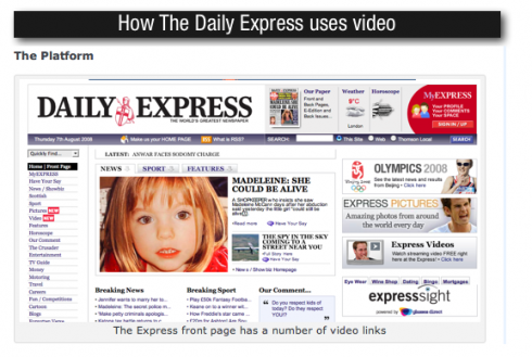
– UK: How theTabloids use video: The Express
http://www.andydickinson.net/2008/08/07/how-the-uk-tabloids-use-video-the-express/
Español:
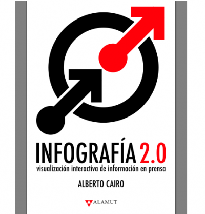
– Infografía 2.0: visualización interactiva de información en prensa
http://www.albertocairo.com/imagenes/capitulomuestra.pdf

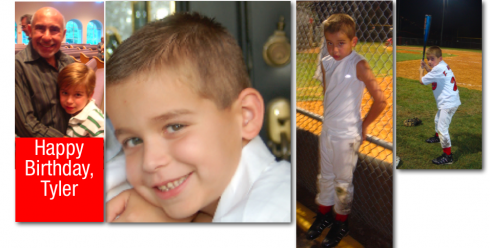
GRANDSON TYLER GARCIA TURNS 7 YODAY
Happy birthday, Ty. Abo sends you big hug from Nigeria, and hopes it will be special one.
Ty, whom we in the family call Ty Ty since he was a baby, is witty, handsome and smart.
His teacher this year told his parents—-my son Mario and his wife Tammy—-that “Ty sets the mood for the class; depending on how he acts, the rest of the class acts.”
He also sets the mood for Garcia family gatherings providing instant comedy wherever he is and making sure he is noticed, in spite of the other eight grandchildren clamoring for attention.
We think Ty is your rock star in the making!
Happy Birthday, Ty.