TAKEAWAY: Today we turn our attention to that web screen. See some “historic” home pages from The New York Times’ website. AND: Check out these web fonts—-not just for the lonely.
Recent history made visual
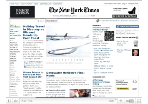
This is a fun link for you, if you wish to see 12,000 screenshots of the front page of the nytimes.com passing very fast before your eyes.
Phillip Mendonça-Vieira writes that an errant cron task ran twice an hour from September 2010 to July 2011, and he accidentally collected all the screenshots.
Indeed, an interesting way to look at the news of each day and how the editors presented.
My first observation: as someone who has collected newspaper front pages through the years (yes, many of them are folded, yellowed, brittle but still in the appropriate folders), I also agree with Phillip that nobody truly collects the “home pages’ of special days in the news——or not that we are aware of.
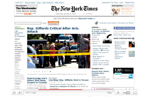
My second observation: in this collection we see a “template” at work. (I call it Template One) For the 12000 screenshots here, the Times changed the home page template ONLY for the 2008 US Presidential Elections, or for the attack in Arizona in early 2011 where Rep. Gabrielle Giffords was injured, in which the small photo image in the middle of the screen, extended to about three columns. (I call it Template 2)

Template One: the most used

Template 2: for when the Times considers the news to be of greater magnitude
Fun with web fonts

I truly like the name of this website: Web Typography for the Lonely
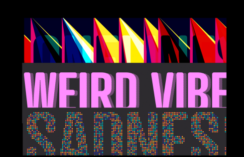
But what I like even more is some of the fonts they have developed for web use, with names that say it all.
My illustration above shows (in the order in which they are stacked):
Triangulate—-“Lighten and darken transparency effects with compositing.”
Coolinate—-“Creating graphic shadows using Html5 Canvas”
Cluster—“Reconstructing typography using getImageData”
Check them out, plus others like Illuminate and Punchout