This is the weekend edition of TheMarioBlog and will be updated as needed. The next blog post is Monday, September 21
Update #4: Saturday, September 19, Amsterdam, Netherlands, 14:13
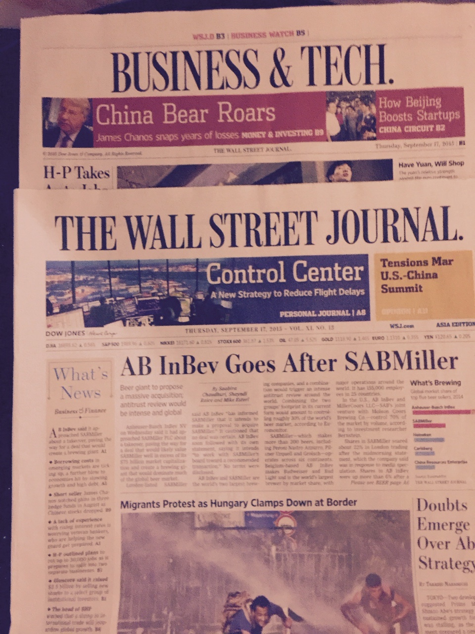
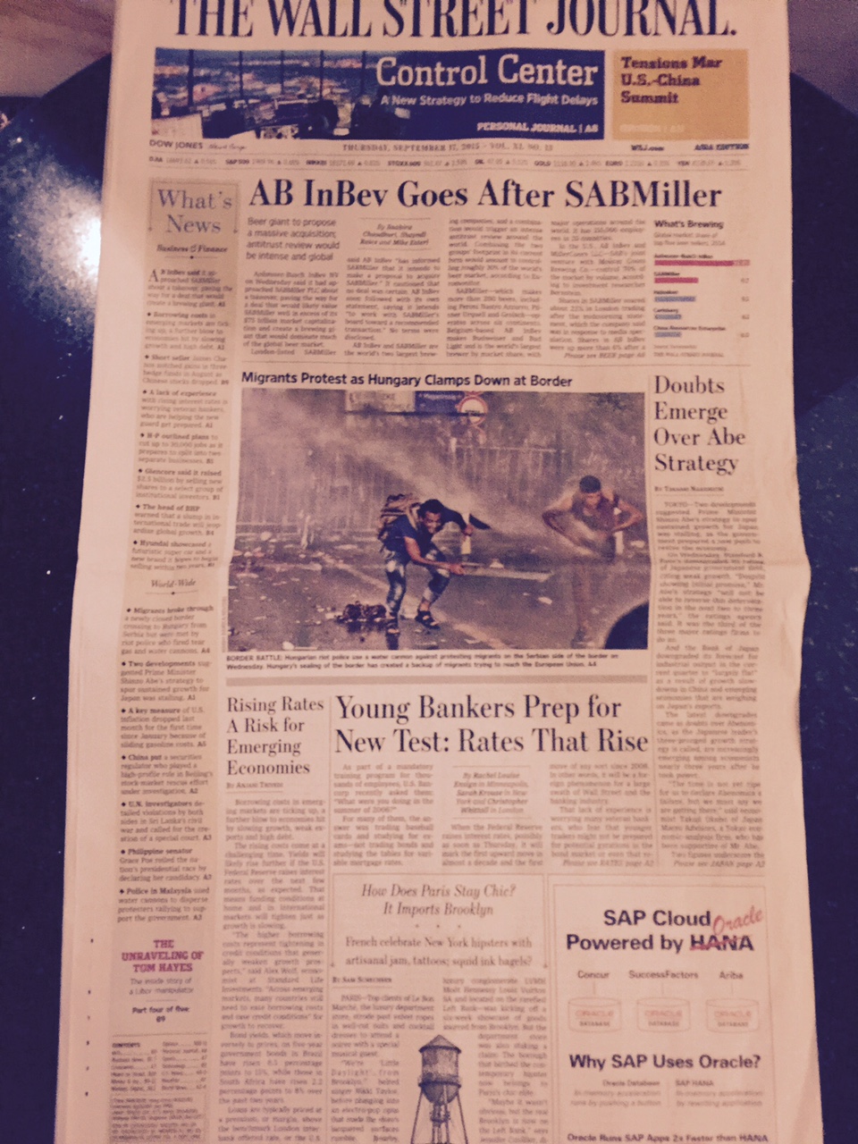
New global edition of The Wall Street Journal is back to broadsheet format
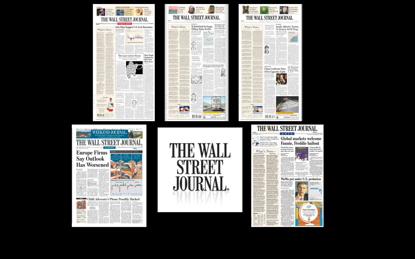
Here is the before and after when we converted the WSJ Europe and Asia from broadsheet to tabloid in 2005
I am looking at this new larger edition of The Wall Street Journal aboard a Singapore Airlines flight from Manila to Singapore. For a moment, I think that I have the US edition in my hands, which is, of course, broadsheet. I do a double take, look at the folio lines, then remember that this is the new WSJ for its global editions.
I am quite familiarized with the WSJ and, in fact, have been honored to have been a consultant with its team at various junctions, including the conversion of the Europe and Asia editions from broadsheet to tabloids in 2005.
This is what I wrote about that groundbreaking conversion for the WSJ Europe and Asia:
“In a wireless world that is always “on”, readers want the portability and convenience of a small format, as well as the online ability to access important information whenever, wherever. Advertisers want new formats, such as are available in compact newspapers, and more efficient ways to reach readers.
“The Wall Street Journal’s conversion to “compact” will offer both readers and advertisers the best of the print and online worlds. Of the hundreds of newspapers I have designed over the last four decades, these international editions are the most groundbreaking: they are truly integrated print/online publications designed to provide unsurpassed news and insight, 24 hours a day, 7 days a week.
I must say that I was quite surprised to hear that one of my favorite newspapers was going from small to large. We at Garcia Media have participated in the conversion of 23 newspaper titles from broadsheet to tabloid. I admit that this is the firs time that one of those has reverted to the larger size.
But, heck, it is all about change, and the WSJ execs must have very good reasons to make this move. After all, this is better than killing the print edition entirely.
And after seeing this Friday's weekend edition of the larger WSJ, I do agree with the editor that it does seem to contain more information.
The new marketing for a bigger (and better?) edition of the WSJ
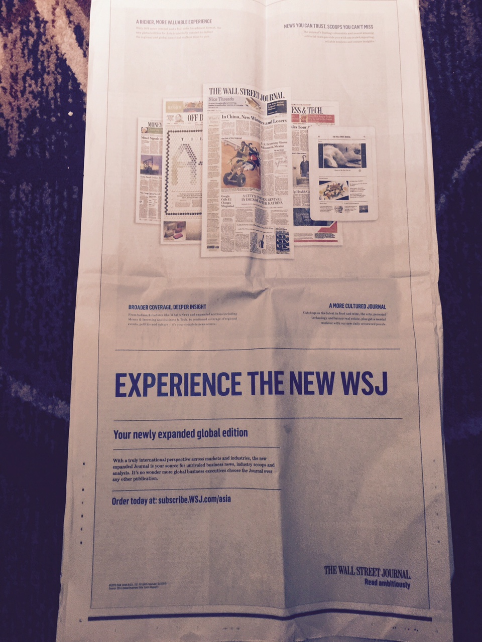
Full page ad inside the new WSJ to promote the new and bigger product
Now the larger WSJ has hit the market as the international edition. In its own house ads, the WSJ promotes this edition with an invitation to readers to “experience the new WSJ: your newly expanded global edition.”
The promotion highlights “news you can trust, scoops you can’t miss,” and “a richer, more valuable experience”. More is better, so to speak.
There is “broader coverage, deeper insight”, and, finally “a more cultured Journal.”
The add emphasizes print, a way of highlighting the new, larger format. That, too, surprised me, as we don't see too many marketing campaigns with big print newspaper pages as the main event.
This revamp will also include new iPad and Android editions for subscribers.
Gerard Baker, editor-in-chief of the WSJ, said that the move to a single global broadsheet edition will mean about 50% more news content.
“The single global edition will be based around the US edition but will be adapted for the two separate regional readerships,” said Baker in a note to the staff, quoted in The Guardian.
Once inside this edition, it is a replica of the design used by the US edition. It will appear as a two-section daily from Monday to Thursday, and include a third section each Friday featuring the Journal’s ‘Off Duty’ lifestyle content about food, travel, and fashion – as well as its ‘Mansion’ section about global luxury real estate. WSJ. magazine, its luxury lifestyle publication, will also be distributed with the newspaper once a month.
The WSJ Europe and Asia had a great run as a tabloid for a decade, and, as a person close to the WSJ operations told me:
“I don’t think those editions would have survived if they had not moved to a tabloid format at that particular time.”
More about our work with the WSJ
https://garciamedia.com/blog/the_wall_street_journal_compact
https://www.newsu.org/courses/mario-garcia-wsj-tabloid-design-seminar-snapshot
https://garciamedia.com/blog/the_wall_street_journal_preparing_for_the_next_125_years
http://www.international.ucla.edu/southasia/article/25231
Of related interest
Rupert Murdoch proves his faith in print with WSJ’s broadsheet relaunch
I still believe in The Impact of the Compact
I said it here in 2009, and I still maintain it, compact, smaller formats are ideal for printed newspapers (and the readers agree, by the way!)
http://issuu.com/mariogarcia/docs/the_impact_of_the_compact
My review of the new Washington Post website
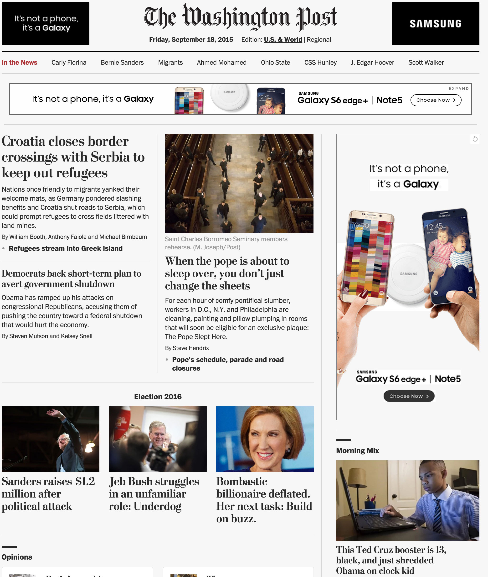
Here is the link to my Poynter column for this month:
A highlight:
I have taken a look at the new WashingtonPost.com and two things stand out: its clean, minimalist approach and the important and greater role that hierarchy plays. It is as if the WaPo digital team has been inspired by how news are presented in print and decided to salute it through their online edition.
The Post’s classy font, Postoni, helps to situate us in familiar territory from the get go.
My discussion of Indian newspaper design
Indian newspapers tend to be busy:Mario Garcia
http://newspaperdesign.in/forum/topic/show?id=2134745%3ATopic%3A69362&xgs=1&xg_source=msg_share_topic
Highlight:
Like everywhere else, there are well designed newspapers in India and others that could be improved. In general, Indian newspapers tend to be busy, a bit congested and trying to do too much which may cause a bit of chaos on a page.