
Third update, Sunday, Jan. 23, 13:06 Hong Kong time
TAKEAWAY: This Sunday readers of The Washington Post will see a revamped edition of their newspaper, including the introduction of a new, slick Sunday Style section in tabloid format, rethought Arts section, Kids Post and newly redesigned navigation units on A1. We describe our involvement in the process.
A new Sunday Post starting January 23
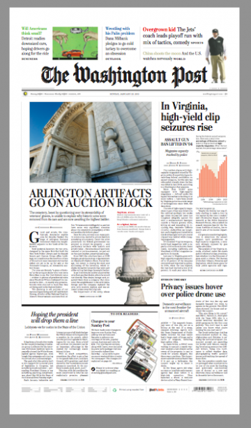
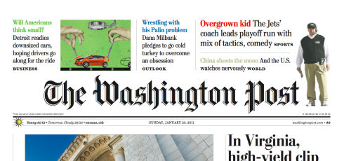
Here is the front page of Sunday’s The Washington Post, with new A1 promos at top; page designed by Jon A. Wile, Senior News Designer
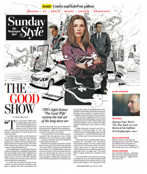
First cover of the new Sunday Style section as it will appear Sunday
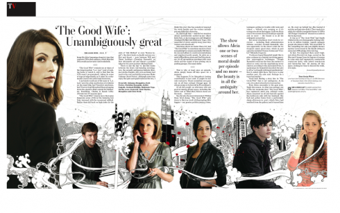
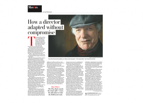
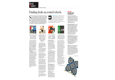
Inside pages of the new Sunday Style section

Our concept for headers for inside pagers borrows the “pill box” rectangle used on the front page logo for the section. The one letter of the logo in red erupts from the black background of the box.
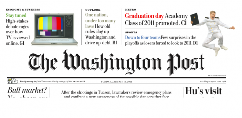
Here’s prototype of how the new front page promos for Page One will appear at The Washington Post starting Sunday: a combination of free form units with soft pastel colors
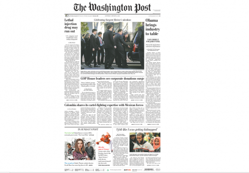
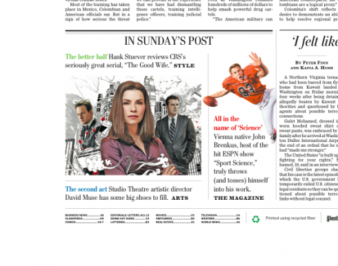
Here is a “mosaic” approach to the navigation, as it appears on the The Washington Post Saturday, calling attention to all the special content coming in the Sunday Post; many of the new offerings will already be inserted in the Saturday editions, allowing readers more time to go through them leisurely
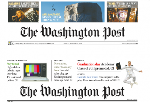
This image shows how Sunday Post front page promos looked until last Sunday (top), and the new approach, more open, less boxy and with softer use of colors.
Don’t know why, but everytime I am working on a project anywhere in the planet, I always imagine a couple of people who would be consuming that product: newspaper, magazine, app, or whatever platform. It helps me with a sense of “localness” and allows me to focus on making the product suitable to a specific audience. We all know that the product that is for everyone ends up being for no one.
And so, when Marcus Brauchli, executive editor of The Washington Post, and Raju Narisetti, managing editor, invited me to come to DC and work with them and their team on the creation of a new Sunday Style section for the Post, my immediate reaction was one that included a cozy Sunday morning somewhere in a corner of the living quarters of the White House, with The Obamas enjoying their Sunday Post, including the new Style section.
Who knows? Maybe this will really happen and we will hear their reactions. There is something in the new Sunday Post for every member of the Obama family, including their young daughters as well as their in-residence maternal grandmother!
What will they see?
First, the Sunday Style, in tabloid format, is part of a major series of great changes
and offerings coming to readers of The Washington Post Sunday, January 23.
Among the changes coming to the Post this Sunday:
*Expanded coverage of arts and popular culture creating separate Arts and Sunday Style sections, adding new features and columns and delivering feature sections on Saturday to give busy readers more time to enjoy their Sunday paper.
*Sunday Style will be a new tabloid-size section focused on popular culture, featuring coverage of movie, television and music by Hank Stuever, Ann Hornaday and other award-winning Post journalists. The new section will also have stories on fashion, shopping deals, the latest trends on the Internet and the week’s most interesting photos from the Washington-area social scene. The popular Style Invitational and Celebritology will move from Saturday to Sunday Style, where they will appear with pop-culture book reviews, weddings coverage in On Love and well-read advice columns by Carolyn Hax and Amy Dickinson.
*The expanded Arts section will showcase The Post’s world-class coverage of theater, opera, art, dance, classical music, architecture and museums with stories by renowned critics Sarah Kaufman, Philip Kennicott, Anne Midgette and Peter Marks. The Arts section will range from internationally significant openings and exhibits to the latest goings-on in Washington-area institutions, creating an expanded community for art-lovers in a city that treasures the arts.
*Sunday will also include a brand-new KidsPost tabloid, extending a popular feature of the daily paper to the Sunday Post as well. The new section will offer stories, games, puzzles and jokes for children and give young readers a separate, pull-out section of their own. KidsPost will come wrapped around the Sunday color comics.
The visual concept for Sunday Style
As soon as I arrived at The Washington Post, my task was to work closely with the talented design director, Janet Michaud, testing various ideas for Sunday Style.
First stop: the creation of a logo. It should say Sunday Style, but it must also carry Post somewhere in there. From the start, we decided that the logo should follow a “pill box” format, as to make it more economical. After all, this is a tabloid format, so the size of every element on that precious cover counts.
Second stop, secure the services of Jim Parkinson to help us with the final logo concept for Sunday Style. Parkinson did his usual magic and the logo for Sunday Style is crisp, attractive, elegant and, although new, has the familiarity that makes it a first cousin of everything else that is already in the Post.
Third: Janet and I spent hours conceptualizing the cover. We knew that we had to have text on the cover, and not just a headline and a summary, but a big chunk of the story there. The task here was to make text, photos, logos and navigational units come together as ONE. To that effect, no column rules, no boxes. My recent work in Europe has showed me that a free form style of design brings cohesiveness to a page, especially the small canvas of a tabloid, while incorporating areas of white space. Readers do not require boxes and rules to create separations. The storytelling process flows more naturally in an open environment.
In addition, we tried the use of columns of text touching or protruding into photos sometimes, a way of creating associations.
Fourth, we tackled the inside pages, creating a simple square “pill box” unit for the top of the page headers. Simple and small, allowing for air at the top of every page.
The rest was in the hands of Kevin Sullivan, Post’s features editor, and his team, creating stories to populate the canvas Janet and I had created.
“At a time when there is a lot more talk of apps and there are many more digital versions of newspapers, the Sunday changes are also a strong signal to our readers that the Post will continue to invest in its print offerings, which have a large, loyal readership,” says Post Managing Editor Narisetti. “For this investment—in new pages, new content—to pay off, we really needed a fresh design that engages our busy readers within the overall Post look and feel that they have come to love. And that is where your ideas and work was invaluable, Mario.”
New navigation at the top of Page One
Working with news designer Greg Manifold, we designed a new set of Page One navigations, incorporating subtle pastel colors, getting rid of boxes and opening the area at the top of the page, above The Washington Post logo, the same way that we had done for the cover of Style.
A similar style of navigation, but more in mosaic style, appears on the Saturday edition of the Post to promote the Sunday content.
Part of our work has been to standardize navigation throughout the Post.
It should all make the readers’ journey through their Sunday Post all the more enjoyable. Now, will we ever know what those first citizens of Washington, The Obamas, think about these great Post offerings on Sunday?
TheMarioBlog post #696