This is the weekend edition of TheMarioBlog and will be updated as needed. The next blog post is Monday, Nov. 7.

This is how the graphic appeared in the print edition of The New York Times
My students at Columbia love it when I have the privilege of bringing in Gabriel Dance to speak. Gabriel is that talented man who can make storytelling via numbers seem easy and even fun. He’s done it at The Guardian (the Pulitzer-winning NSA Files Decoded story), The Marshall Project, and now at the Times.
His work is all about breaking up the story into digestible segments, and adding animation that makes it all come together in an easy to understand manner.
This time we have an exclusive story about GOP presidential candidate Donald Trump’s finances. While the narrative offers a lot of valuable and new information, the graphic, especially the digital version makes it all clearer.
I was surprised to see that the graphic also appeared in print.
Look at the graphic here
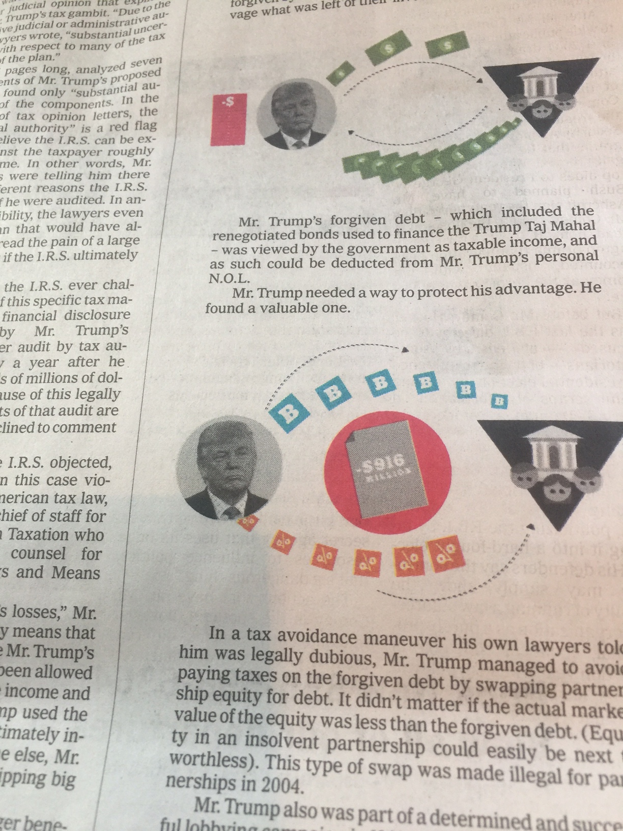
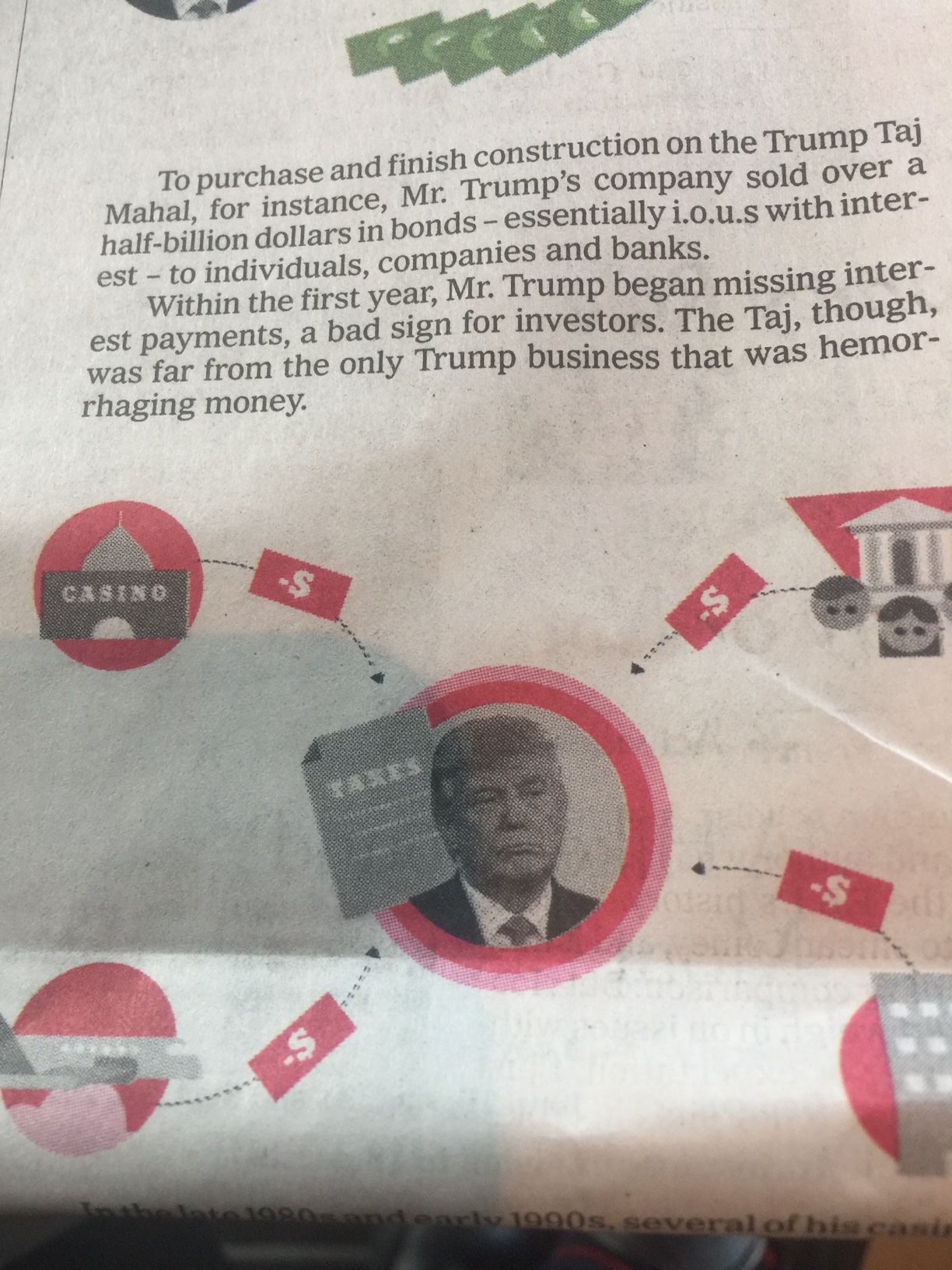
“The story of how Mr. Trump sidestepped a potentially ruinous tax bill emerged from documents recently discovered by The Times during a search of casino bankruptcy filings.”
Best of Columbia J School students’ writing
Take a look:
https://medium.com/columbiajourn