Update #2: Tuesday, April 26, Miami, Florida, 08:54
TAKEAWAY: Here is an app that takes storytelling to the next level, a sort of documentary app, complete and rich in details, but also fun to experiment with. A pop up a second is one way to describe veteran video game journalist Geoff Keighley’s app, The Final Hours of Portal 2, created by the team of Joe Zeff Design.
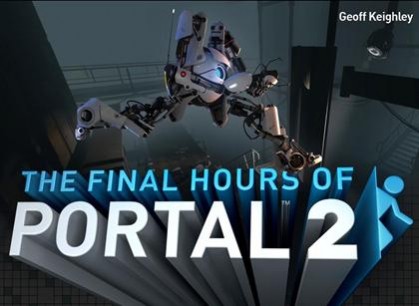
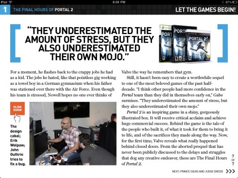
The app provides for the reading experience
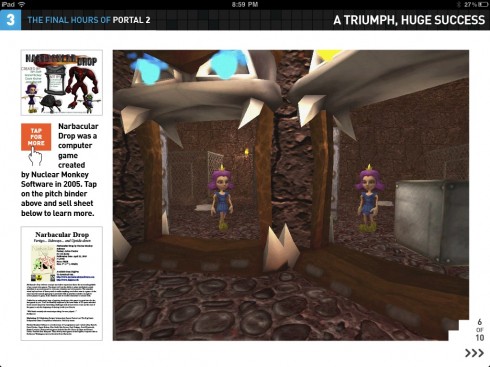
….also for photo galleries
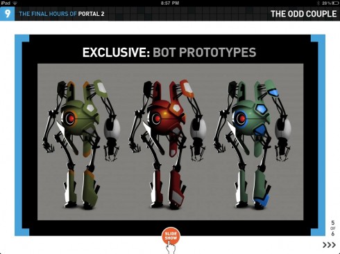
...and for experiencing what the story attempts to tell
Usually in this blog, we analyze typical news apps. However, as I often mention, those of us engaged in the business of creating and developing those apps have an obligation to look at apps of all kinds.
This one , particularly, is a textbook case study of how one can tell stories in the tablet platform. There is a certain richness in the way The Final Hours of Portal 2 has been assembled that could apply to a variety of stories, regardless of topics: here we see a combination of ‘user experiences” all in harmony with each other, each enhancing the storyline and holding our interest. The navigation is simplistic (chapter format) but effective. One is never lost and one is often amazed.
What struck me as interesting and worth writing about with The Final Hours of Portal 2 is that app’s sense of “interrupted storytelling”, keeping the interest of the user at all times. Like a well written symphony, this app takes us from explanatory storytelling, to the long form narrative, to a full screen panorama where we explore a situation, then go back to reading, but a common thread exists. I can imagine that news apps of the future, when we have abandoned the old newspaper paradigms all together, will follow such a style. But those willing to experiment can look at this app and learn about content flow, tempo, rhythm and could apply those to the storytelling that we now do for traditional newspaper and magazine stories.
Interactivity is an important component of the app, with polls appearing at the end of chapters, engaging the user.
But so is how the designers, under the direction of my good friend and colleague Joe Zeff, have created an app that consists of 13 chapters, but they all open differently. I will not reveal the excitement you may find in some of those openings, but suffice it to say that pop up is spelled in capital letters here, especially the opening of Chapter 2. But the chapters don’t all explode in your face. This app plays violins with plain text reading, then it changes to a full photo gallery, then come the pop ups, or the interactivity. It is perhaps, the one app that shows that we are beginning to graduate from the flip the pages style of the past 12 months, but not engaging in Wired style three ring circuses of excitement. The Final Hours of Portal 2 is worth studying for what it does, and how it does it.
I believe that we are seeing an early example of the app as documentary, a genre for which this platform appears absolutely and perfectly created.
Storytellers, photographers, designers and animation graphic artists rejoice. As someone who has centered my work for many years around the WED (Writing-Editing-Design) concept—-the marriage of words and visual images—-I believe that, with this app, we are seeing a vivid representation of the WED concept in the era of the tablet.
I have asked Joe to offer his insights, and, to tell us, as a pioneer of app design and development, what he has learned the past 12 months.
Here are some of Joe’s thoughts:
“What the iPad has meant to me and my work”
“The iPad has been a lightning rod, attracting the most intelligent, most creative, most visionary group of people I’ve ever known. People like yourself, Geoff Keighley, Erik Schut, Roger Black, D.W. Pine, Scott Dadich, Jochem Wijnands and Michel Elings, Josh Klenert, Jeremy LaCroix, the list goes on and on. In some ways the experience has completely transformed my studio, yet in many ways we’re still doing the same things we’ve done for the past decade: telling stories visually.”
“Where the right formula for success with apps appears to be”
“We’re learning as we go, and one of the takeaways from “The Final Hours of Portal 2” is that consumers will pay for apps that are built from scratch to address their particular interests. As I watch Conde Nast abruptly backpedalling from the App Store, I find myself wondering if we’ve entered a world where independent publishers have the advantage over the establishment. We’re not burdened with the task of making old content new. While Conde and Time inc. focus on building bridges between yesterday and today, we’re entirely focused on tomorrow.”
“Our experience with this specific app for The Final Hours of Portal 2”
“We loaded this app with opportunities for the user to engage with the app rather than simply consume it. The audience has responded so enthusiastically. We included a feedback page at the end of the app where users could post comments. After the first weekend in the iTunes Store there were 27 pages of comments. Not 27 comments, 27 pages of comments. This is the most valuable resource a publisher can have — a dialogue with its audience. At this moment, the most recent feedback reads as follows, and I’m not making this up: ‘I have never played a Valve game but could not put this down. Good storytelling and excellent execution of an iPad digital magazine by Joe Zeff.’ ”
“We are reinventing ourselves”
“It takes a team to do this type of work — it’s not just me but Ed Gabel and Katie Orzeck and so many of our partners, all of whom are working harder than ever to reinvent this medium. As we do so, we’re also reinventing ourselves — into 21st century storytellers with the skill sets to engage audiences rather than simply delivering content that may or may not be absorbed.”
What next?
“This is only the beginning. We are submitting another app to the ITunes Store this week that delivers on the same model — creating an experience that is custom-built to tell one incredible story incredibly well. I can’t wait to share it with you and your readers.”
For a USAToday story about The Final Hours of Portal2:
http://content.usatoday.com/communities/gamehunters/post/2011/04/gametrailers-tvs-geoff-keighley-gets-interactive-with-new-portal-2-ipad-app/1
For more about Joe Zeff’s work:
www.joezeffdesign.com
www.joezeffdesign.com/blog
www.twitter.com/joezeffdesign
Today’s pop ups

Bild app offers interesting coverage of the Royal Wedding coming up this week, complete with countdown and tour of Westminster Abbey. Take a look at the star guests, and see where they will be seated for the ceremony!
Of interest:
Motorola Xoom Sales Are Even More Pitiful Than Previously Thought (MMI)
http://pulsene.ws/1pMHs
Android tablets don’t impress, gap widens – survey
http://www.reuters.com/article/2011/04/26/mobile-developers-idUSN2520374820110426?feedType=RSS&feedName=technology-media-telco-SP&rpc=43

I am honored to be one of three keynote speakers at the upcoming WoodWing Xperience seminar in Amsterdam May 24-25
I did a previous keynote for a WoodWing Tour function in London in 2010.
For those interested in attending, here is more information:
May 24-25, 2011, Amsterdam, Netherlands
http://xperience.woodwing.com