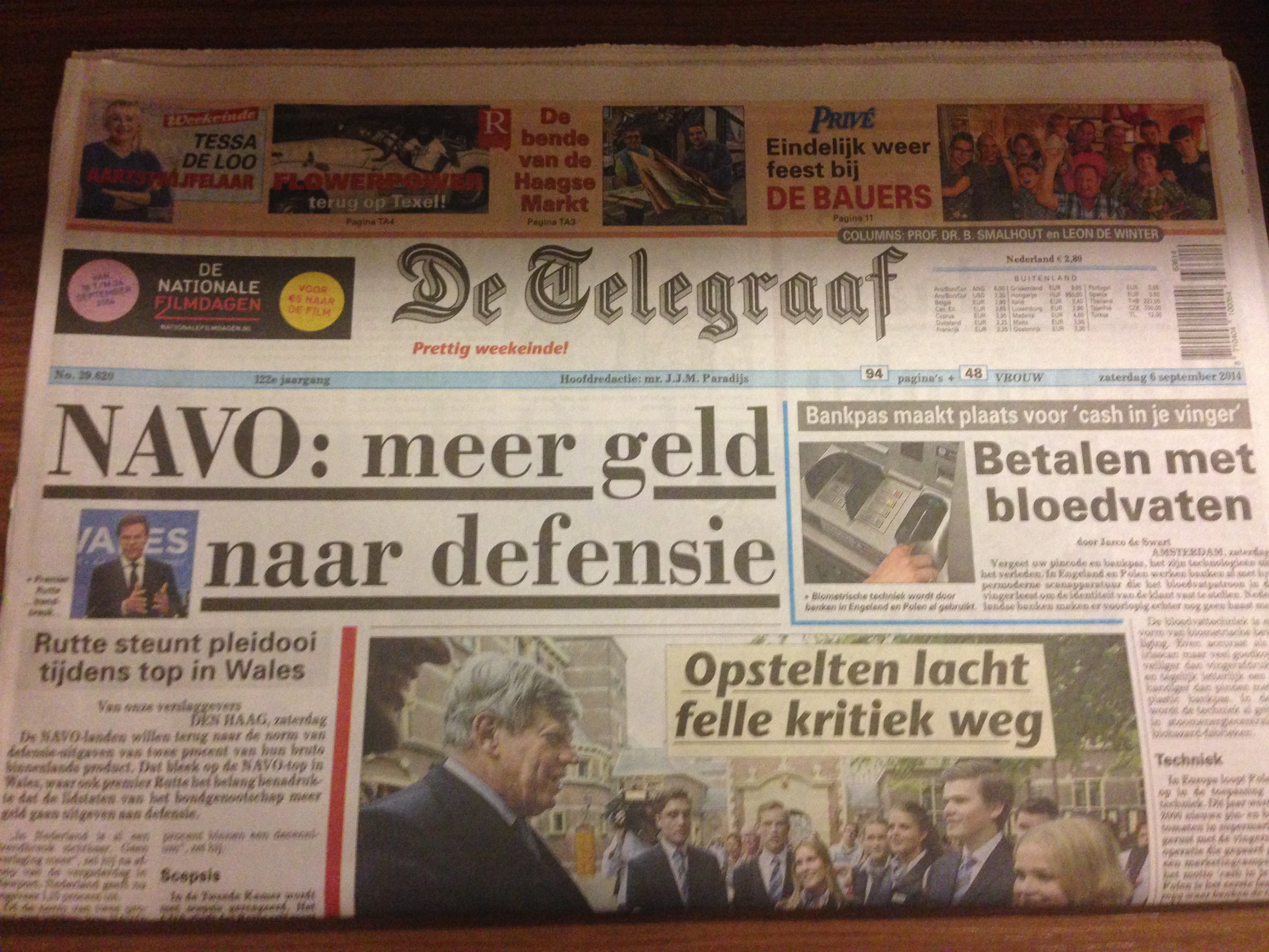
Front page of De Telegraaf in all its sweetly chaotic splendor: layout has not changed for decades, emphasis is on a little bit of visual chaos


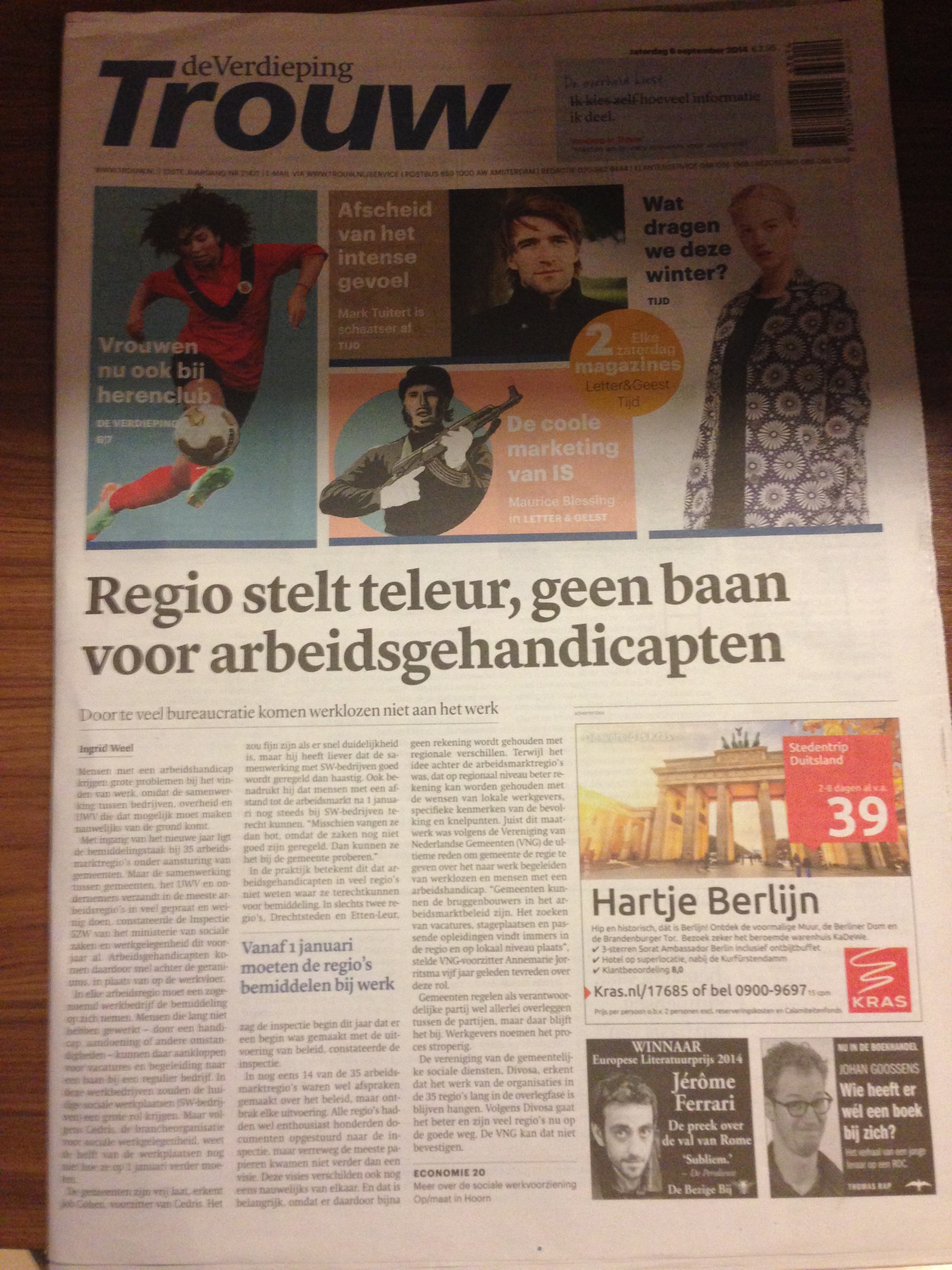
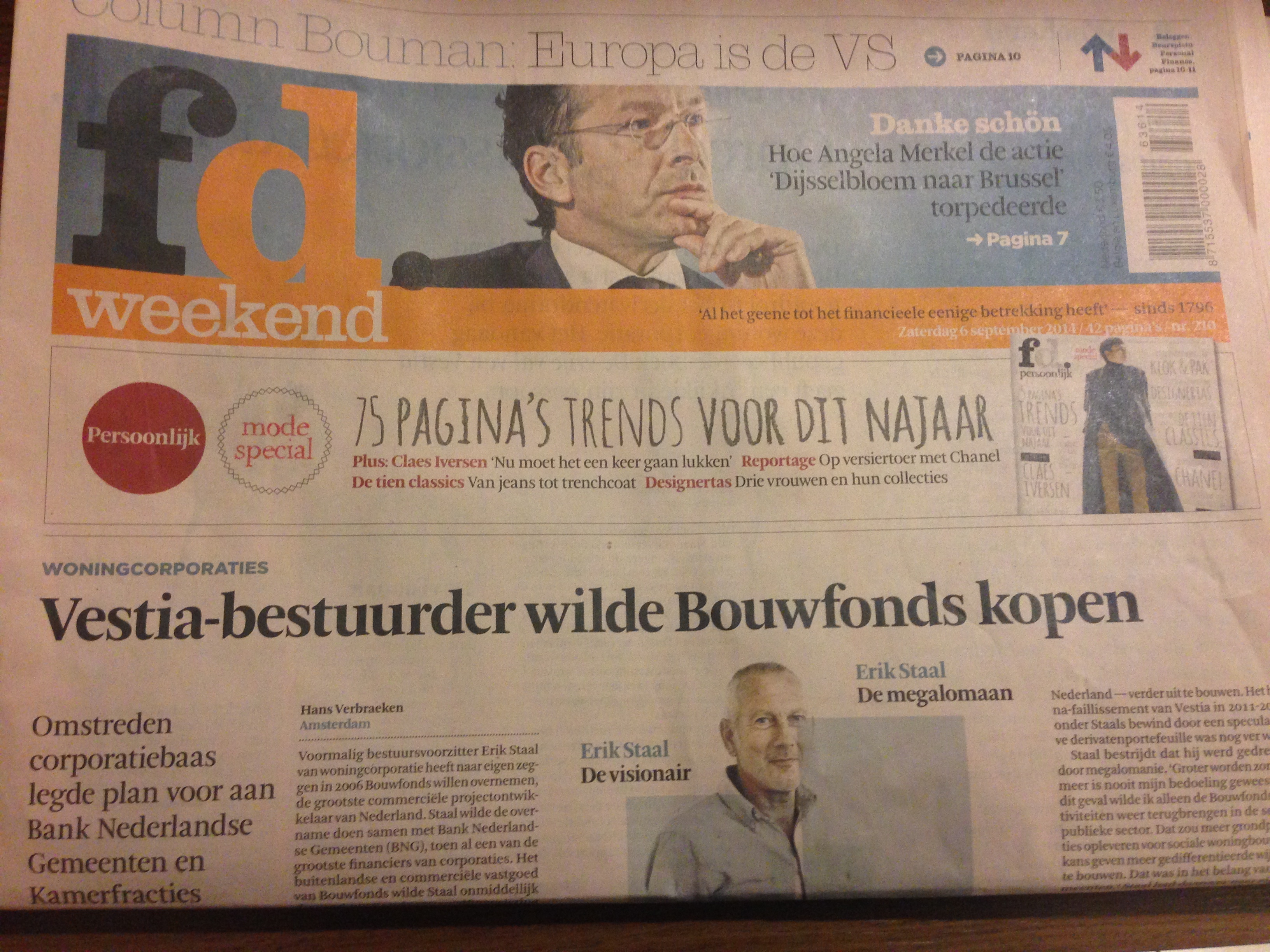
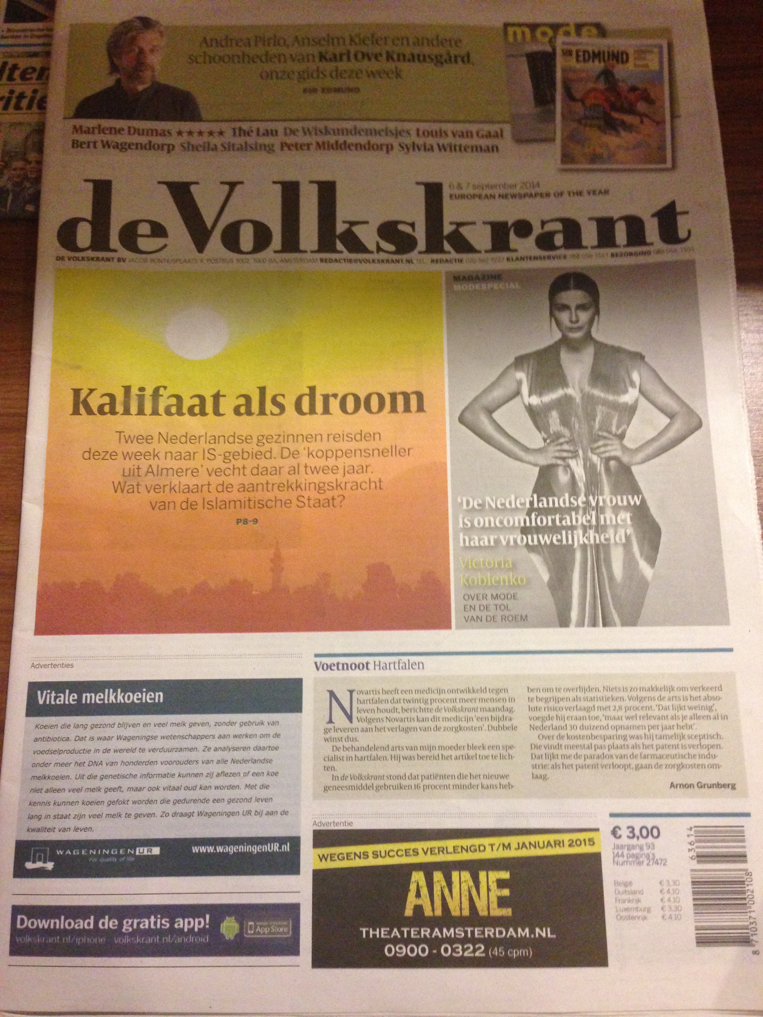
Here are front pages of De Telegraaf”s competitors: order and aesthetically pleasing design prevails in these titles
De Telegraaf against the competition: here design chaos may be a virtue?
Designers may spend the span of an entire career NOT having to wrestle with the issue of chaos versus order. Order is what comes naturally, of course. Chaos is to be avoided, as we learn in the first week of design training—whether we are studying to be furniture or brand designers.
It is an interesting question to ponder, anyway, and one that I have been thinking about everyday last week as I visited the legendary and iconic Dutch newspaper, De Telegraaf, as we put final finishing touches on the prototype for its conversion from broadsheet to tabloid (it happens October 10).
At the core of this project is making sure that the visual DNA of De Telegraaf——perhaps the most visually chaotic newspaper design in public view today——is maintained. Wrestling on the mat with that idea is the fact that today’s readers live in a busier, more complicated and, indeed, chaotic world. They get a lot of information via digital platforms—online, phone, tablets.
Chaotic design is more difficult to navigate than a more orderly canvas of a page.
Yet, editors and designers at De Telegraaf know that too much order, too many hints of elegance, may rub the conservative, die hard core of De Telegraaf readers as not the thing to do.
“Our readers like our chaos,” editors tell me. “They would not want it any other way.”
So, for months, we have made sure that some level of chaos prevails. When Elegance with a capital E rears its decaffeinated head, we eliminate it in two seconds. In fact, we make an effort to make sure that Chaos, with a big, bold, capital letter appears triumphantly.
And, as we now have a prototype that we all seem to like, it is a great combination of systematic chaos with touches of elegance (in lower case letters), and we are all surprised that we have been able to pull this off.
That is why, as I left the Netherlands Sunday, I could not help but look at all the Dutch papers on display at the airport lounge. One front page jumps at you, grabs you by the throat and says: Look at me. I may be the ugliest and messiest, but, I bet you could not resist me.
Can’t wait for October 10 and the launch of the smaller, and slightly less chaotic De Telegraaf, to hit the stands. Stay tuned, readers of TheMarioBlog, this is work in progress.