Update #1: Hong Kong, 11:02. This is the weekend edition of TheMarioBlog and it will be updated as needed. The next new post will be Monday, January 23
TAKEAWAY: We conclude our reports from the Asia-Pacific region with this profile of the Sydney Morning Herald, an organization where stories come first, and each platform shines based on its own strengths. AND: A new design for Money magazine
When storytelling, design work across platforms
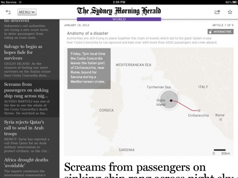
See this interactive graphic of the Costa Concordia disaster on your iPad here: http://dl.dropbox.com/u/5538738/boat/index.html
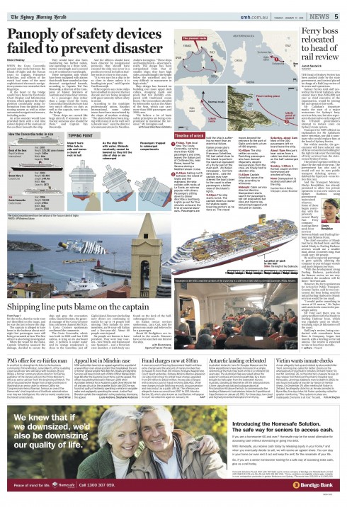
Here is how the print edition of the Sydney Morning Herald covered the Costa Concordia cruiseliner accident
Here is the iPad edition of the SMH
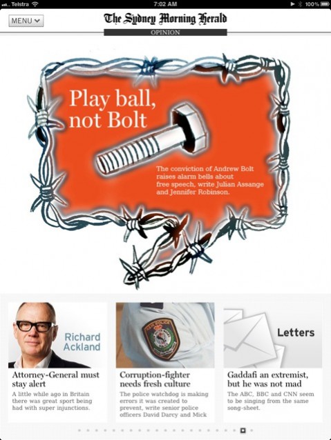
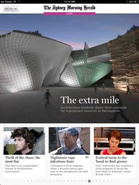
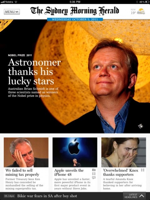
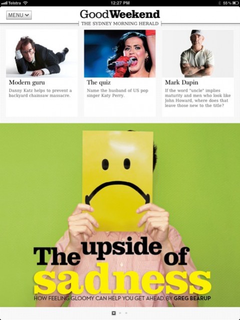
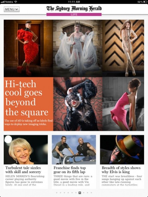
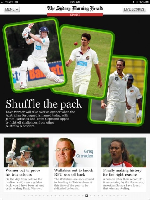
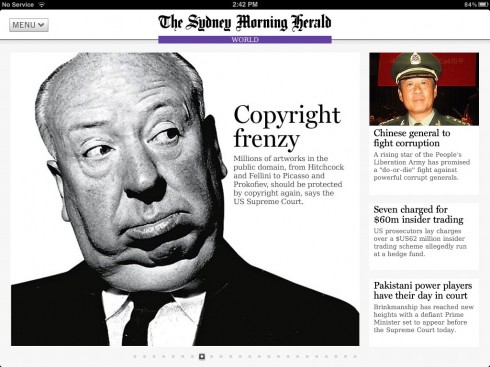
I made a visit to the Sydney Morning Herald in Australia in October, and was impressed by how the newsroom seems to approach stories first, then deal with the platform in which they will be presented.
This week I have been in touch with Matt Martel, managing editor for presentation, and one who works across platforms himself (the reason I make this disclaimer is because I know occasions where the person with a title like this is very print oriented, has marked time in the organization, and is NOT truly involved with the digital side of the operation). Matt called my attention to the interactive graphic the SMH ran in its tablet edition, about the Costa Concordia, the cruiseliner that ran aground off the coast of Italy last Friday.
Matt has put together a dedicated iPad graphics team (good move). The graphic was done by two of iPad artists– Rodolfo Pazos (Argentina) and Francisca Sallato (Chile), working with help from the Morning Herald’s graphics editor, Remi Bianchi.Also in the iPad graphics team is Colin Hamilton. The SMH iPad app is edited by Stephen Hutcheon with help from Andrew Forbes and Conrad Walters.
“Our aim is to do two or three unique interactive graphics each day and we’ve done some fantastic ones. Most of the time, we are using the same Adobe Illustrator files for print and iPad. Because of the techniques we have developed, we can turn them around in only four or five hours, rather than a couple of days,” says Matt.
And Matt adds that users of the iPad seem to like those animated graphics a lot:
We have stats that show readers stay two or three times longer on the pages with graphics, and we put a huge amount of effort into them each and every day. We are really proud of what the editorial art department has achieved, particularly because we are all traditionally print graphic artists and designers, and we have fewer staff than we once did.
I invite you to take a look. In fact, when you click on this link you will get a good promotion for the tablet edition, one of the best I have seen.
In the process of looking at this graphic and chatting further with Matt, I have rediscovered all the exciting things they are doing across platforms, but, particularly with their app. In fact, I have admired this app since I visited with the team, and much of their success is that this is a curated edition with a team dedicated to its daily production. One cannot overemphasize the importance of such approach.
One of the highlights of this app is the Editor’s Choice—-a table of contents styled to offer the user a quick overall view of what is in the app that day. It affords a bit of serendipity, since the plugs for selected stories here are interesting and very visual. I highly recommend this approach. The Editor’s Choice comes right after the start page. It is a good way to secure that even habitual users who know where they want to go may sample stories they were not originally seeking to read. I know I did.
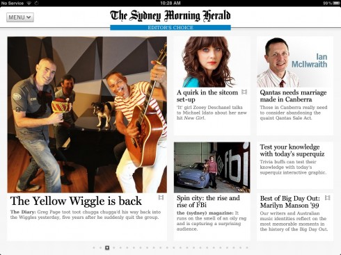
Here is the Editor’s Choice screen (one of several) that are an integral part of the SMH’s iPad app edition
Obviously, enough users like it too. According to Matt, it has been “phenomenally successful”. The combined download figure for the SMH and The Age’s app is now more than 400,000.
The central idea behind the design of the app is that it reflects the design language of the newspaper (rather than our websites). That’s why heads are Miller, etc. It is templated, but we use a lot of video, photo galleries and interactive graphics (our pop-up moments).
For other dynamic iPad graphics from the Sydney Morning Herald:
http://udenplan.carbonmade.com/projects/3435556
You can get the Sydney Morning Herald app here:
http://www.smh.com.au/interactive/ipad-app-landing/
An interesting redesign to follow
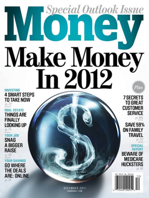
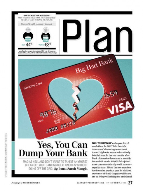
Cover and inside page of the new look for Money.
It is a new look for Money magazine, and you may wish to access the well illustrated case study in the Society of Professional Designers website:
http://www.spd.org/2012/01/how-to-re-make-money-part-1-pr.php
The magazine celebrates its 40th anniversary this year. In addition to the print edition redesign, there will also be a “bold” new tablet app.
My take: Design Director Neil Jamieson has a dynamic writing style and tells us the insight into how he and his team created the look of the personal finance magazine in print. But be on the lookout for his description of how the magazine will introduce its new app edition (next week in the SPD website). I like the pages shown very much. The cover shown includes navigation to 8 inside stories, diverting from the trend of the past two years for fewer elements on those covers. I think readers want to have the cover as a main navigator and this new Money cover does it splendidly well. Typographically, Jamieson writes that he and his team fell in love with by the Swiss Foundry Lineto called Brauer. It also, he says, paired really nicely with their serif face kept from the old design, Benton Modern. I like the combination. Benton is always sturdy, but elegant. Lineto adds a clean, elegantly round look that goes well with the contents of a financial magazine. I notice that black (borders), gray (backgrounds) and ample white, are an integral part of the color palette here. This new Money manages to use space economically, but without looking in any way busy.
The new Reuters magazine: numbers go classic
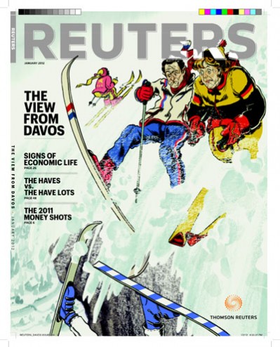
Cover of the new Reuters magazine
Speaking of magazines, Reuters, the 160-year-old news agency, is putting out a magazine of its own and it looks slick. The new issue will be rolled out later this month in Davos, Switzerland, when the World Economic Forum meets there. I have not seen the entire issue, only this cover. But it looks as if the audience the new Reuters mag is going for is very Davos-like: elite financial movers and shakers globally.
Here is what bloggers Joe Pompeo and Tom McGeveran, who examined an issue of the new magazine,
And here is that most irreverent of the irreverent newspapers, New York Post, and how it handled the story of the captain of the ill fated cruiseliner, Costa Concordia, who allegedly abandoned ship before all his passengers had evacuated.
No comments.