This is the weekend edition of TheMarioBlog and will be updated as needed. The next blog post is Monday, Nov. 2
Update #2: Frankfurt, Germany, 08:49
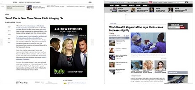
Brain finds the layout left more friendly.
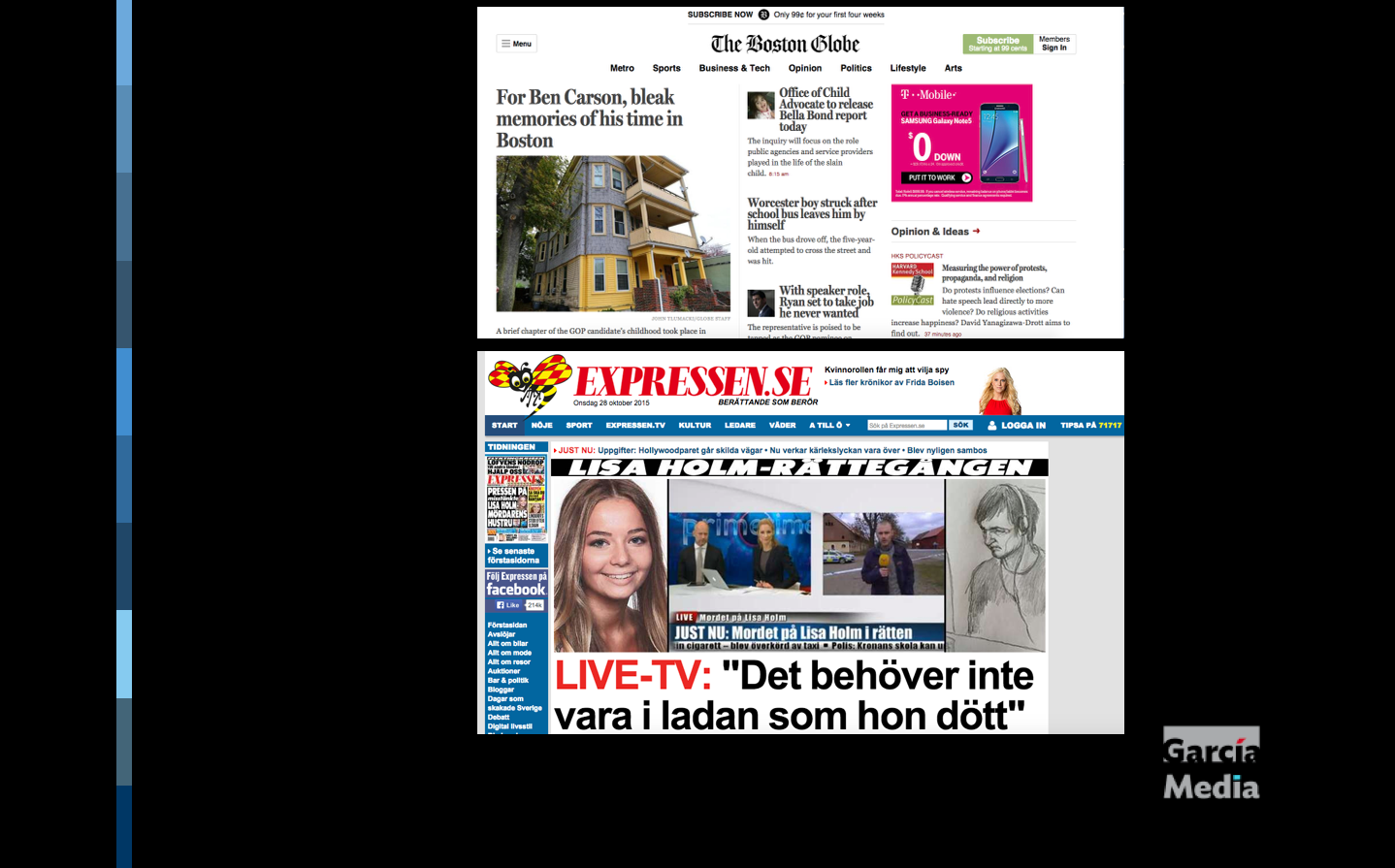
Based on this study, the top website for The Boston Globe here would be more stimulating than the one below for Expressen of Sweden
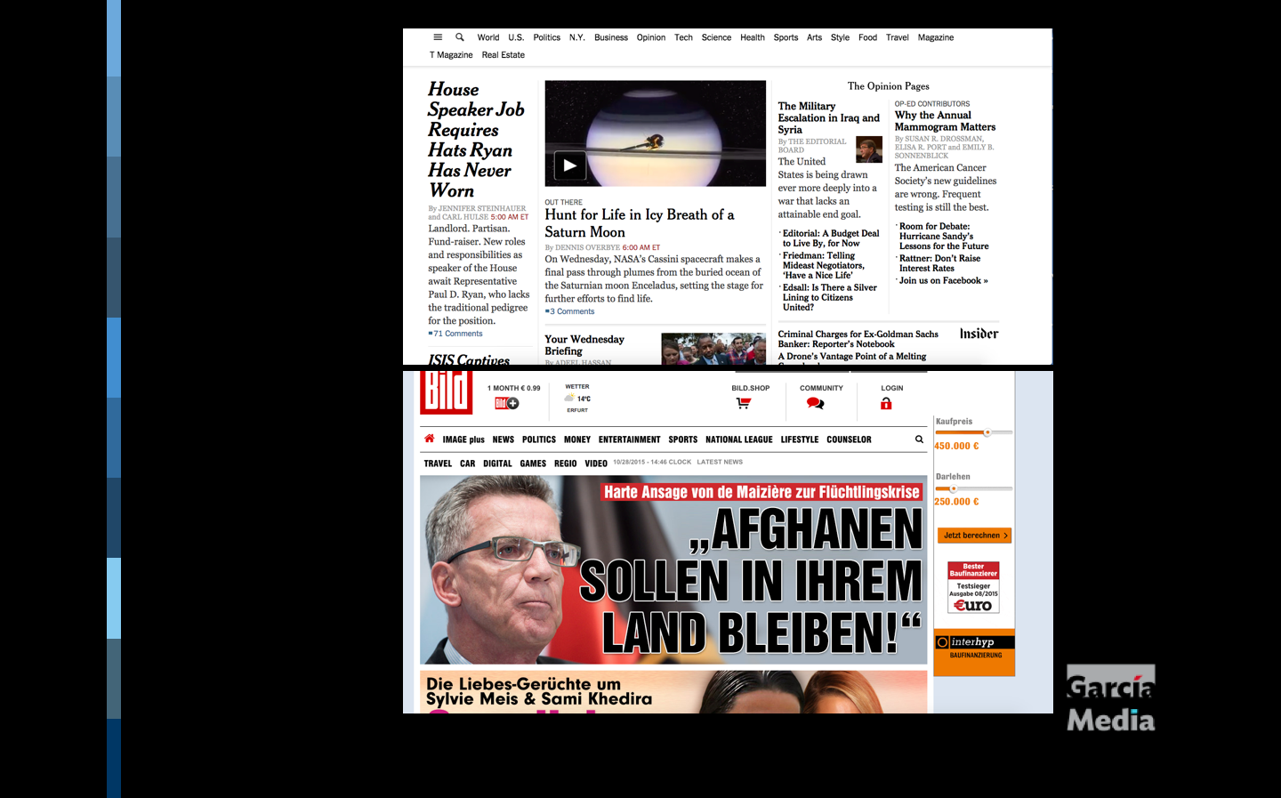
The New York Times’ website would rate much better than the extremely popular one for Bild (Germany). Both of these have a loyal following of users that fall within two very distinct segments of the audience, which begs the question: does our brain get used to the type of design that we are exposed to?
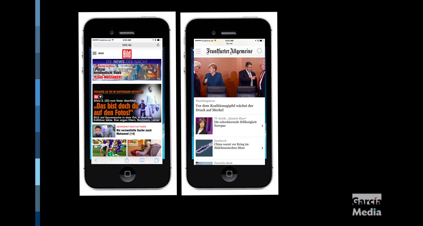
A study in contrast: These German newspapers stimulate the brain in different ways! Participants in the study cited here would definitely choose the Frankfurter Allegemeine (right), but millions gravitate to the more chaotic Bild daily.
There is new research that connects good, clean design with better brain stimulation. Why am I not surprised?
Great news for designers everywhere. And, very especially for those who favor, clean not over the top design.
A new study by Alex Remington, engineering product manager at The Washington Post, in a research sponsored by the Reynolds Journalism Institute University of Missouri, tells us that better page design does cause the brain to pay more attention.
The study’s key findings:
By statistically significant margins, readers agreed that better-designed stories were:
• More interesting
• Easier to read
• More enjoyable
• Made them want to find out more about the topic
• Helped them learn more about the topic
I am delighted to have this information validating what I have seen via focus groups around the world, and through our own Poynter Eye Track studies, in which the less cluttered, more minimalist design always appeared to have greater impact with readers and users. This, of course, regardless of platform.
Especially with the way we consume news today, in this era of the journalism of interruptions and at a glance journalism, clean design is essential to a better user experience. With mobile and small screens becoming the canvas of preference, this is more true today than ever.
How about chaotic design?
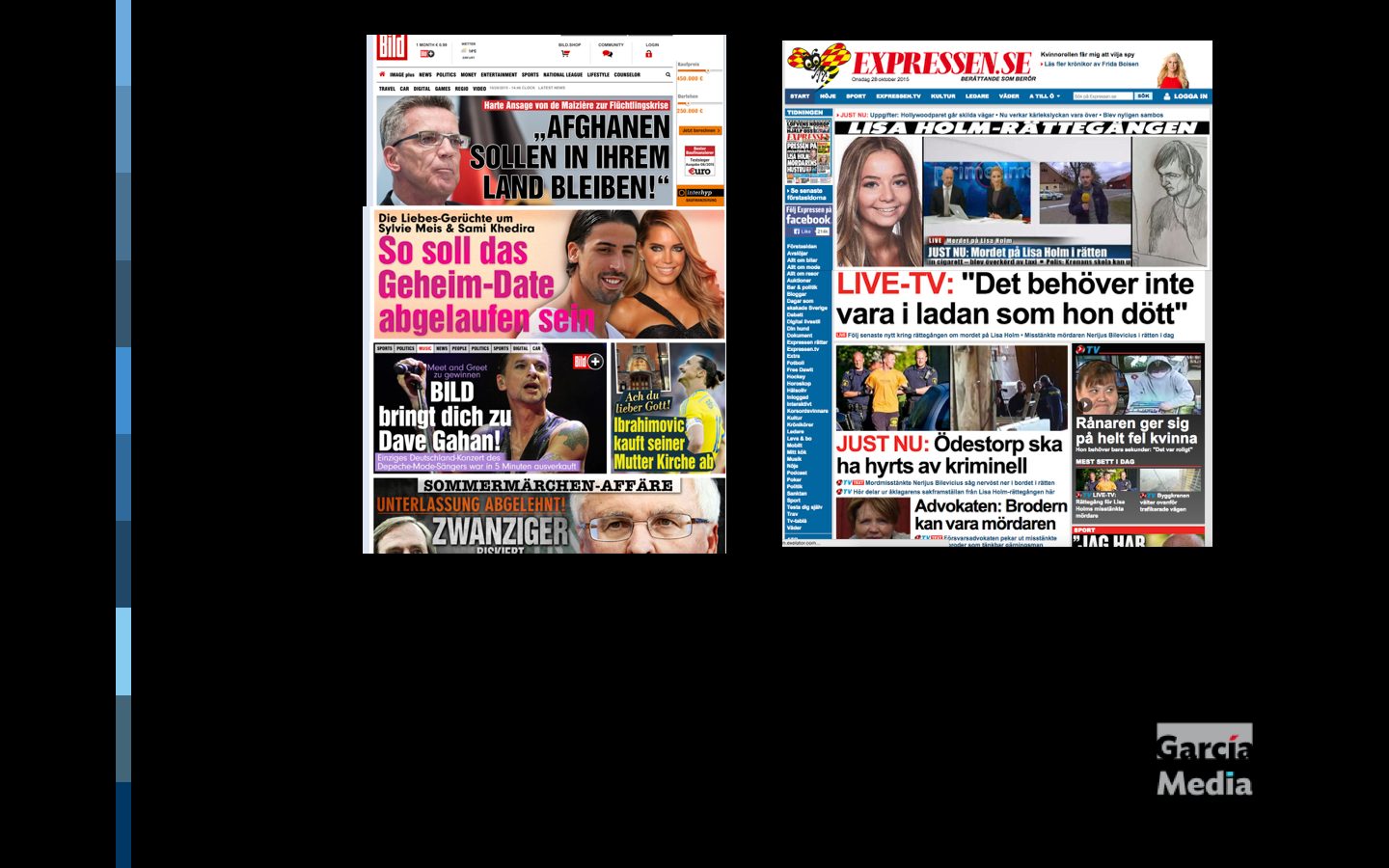
These are two quite successful newspapers: Bild (Germany), Expressen (Sweden), yet their design is quite chaotic. It would be interesting to test how the brain reacts to this style of design
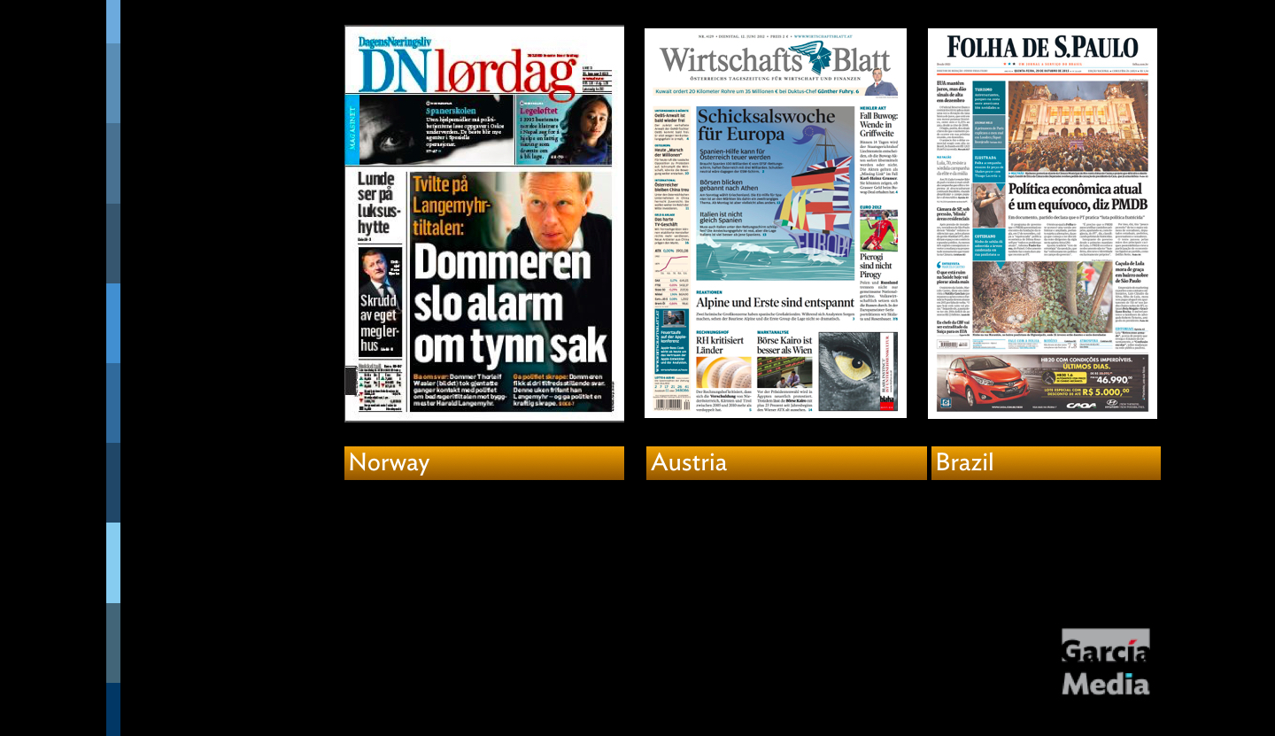
Front pages of three newspapers whose content is highly regarded, while the design is contemporary and expressive (make that bold).
It, too, has its followers. There are publications, both in print and digital, where chaos is the goal. There are many down market publications that wish to carry the banner of design chaos as a symbol of pride.
I wonder how the subjects in this study would have reacted to the Bild (Germany) website (or its printed front page). Is this too much stimulation for the brain?
Are there times when culture affects how a user reacts to design?
If the test was to be conducted in markets where even the most elite titles go for the chaotic, would the readers still react better to a cleaner design?
How much effect does habit and what we are used to seeing have on our perceptions and reactions?
In my extensive work in more than 120 countries and six continents, one thing I have learned: when it comes to the design of newspapers (and I imagine this will apply to the various platforms on which we receive information), culture plays a key role. I know of many serious newspapers, some which would be considered the newspaper of record in their respective countries, where the headlines shout and the photos are big. Readers of those publications react to that type of design as something familiar with which they come in contact daily. Yet, readers of a similar newspaper, let's say The New York Times, might not react the same way.
I can immediately think of Norway's DN (financial daily), Wirtshafts Blatt (Austria) and Folha de Sao Paulo (Brazil) as newspapers where the display to be big and even boisterous, but the content is solid and highly regarded. It begs the question: should these publications turn to quieter, more discreet presentation, the cleaner type of page (and screen design) that the study mentioned here says stimulates the brain in a positive manner?
These and other questions provide plenty of material for a follow up study. I hope it happens.
MediaShift: The future of tablet editions
Tune in to this interesting and timely discussion about the future of tablets following the discontinuation of three of the Postmedia evening tablet editions for The Ottawa Citizen, The Montreal Gazette and The Calgary Herald.
This podcast considers such topics as:
—To what do we attribute the success of tablet editions for two Canadian papers, The Toronto Star and La Presse?
–Has smartphone adoption, especially the bigger screens on recent phones, affected the use of tablets?
—Let’s not count tablet editions dead yet: There’s also the announcement that Next Issue, the “Netflix of magazines,” would relaunch as a magazine app called Texture.
— Other experiments: A joint venture by Conde Nast, Hearst, Meredith, News Corp. and Time Inc., Next Issue was an attempt by magazines to band together to prop up digital subscriptions. Founded in 2009, Next Issue was intended to be an electronic newsstand. The rebranded app, Texture, will allow users to search for more content and share via social media. It will also allow users the ability browse by article instead of by publication. Its closest competitors would have to be Apple News and Flipboard. But truthfully, it’s fighting for your attention with other social platforms such as Facebook, Twitter and Snapchat. Of course, it remains to be seen whether Texture’s subscription model will ever gain widespread adoption.
PARTICIPANTS
Moderator:
MediaShift’s Mark Glaser will host
Special guests:
Mario Garcia, founder at Garcia Media
Anthony Ha, writer at TechCrunch
Douglas Hebbard, publisher at Talking New Media
Regular guest:
Andrew Lih at American University, with Jefferson Yen producing.
At Columbia University: Journalism + Silicon Valley
![]()
I am honored to be part of a panel during this upcoming day-long seminar Nov. 12 at Columbia University.
It is free to attend and here are additional details for those interested.
About the program:
Journalism is increasingly dependent on + influenced by the companies that dominate the social web. Social networks + search companies like Facebook, Twitter & Google are no longer “just platforms” or conduits and are now actively shaping how journalism is practiced + funded.
The new paradigm that puts together the culture, technologies + business models of Silicon Valley with the practice of independent journalism is creating opportunities + challenges for both fields.
The Tow Center is committed to researching + explaining this critical new landscape with the aim of identifying and teaching best practices to a new generation of journalists + fostering wider understanding of how the public is influenced in the 21st Century.
For an up-to-date schedule and speaker roster for the day, visit: http://bit.ly/TOWCONF
Topics will include:
The relationship between news organizations and social networks
The rights and responsibilities of platforms and publishers
Improving quality and depth in the technology journalism beat
How newsrooms have adapted to storytelling through platforms to reach new audiences
The benefits and drawbacks of news organizations tackling their own platforms and distribution mechanisms
Lessons for news organizations as they diversify their revenue streams
A reception will follow at the Brown Institute for Media Innovation
This conference is supported by the John S. and James L. Knight Foundation.
Essentials:
NOVEMBER 12 @ 10:00 AM – 5:30 PM
LOCATION: COLUMBIA JOURNALISM SCHOOL + GOOGLE MAP
PHONE: 2128541951
Journalism + Silicon Valley
Columbia Journalism School
Pulitzer Hall
Eventbrite: https://www.eventbrite.com/e/journalism-silicon-valley-tickets-18699009240
Website: http://towcenter.org/event/journalism-silicon-valley/
Hashtag: #TowJSV
Tow Twitter Handle: http://@TowCenter