

No way, said I. How can that be?
Well, it is. Accept it. This is 2015 on the way to 2016 and things happen rapidly, including testing, experimenting and discarding (the normal process of how disruption works!).
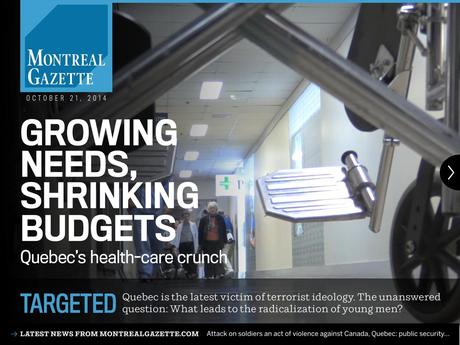
My first reaction was to get in touch with Lou Clancy, of Postmedia in Toronto, who organized the project in which Garcia Media was involved for 17 months as we rethought how news is presented across platform, a project, which remains very much intact for all practical purposes.
“Well, Mario, the surgery was great, but the patient died,” was the typical Lou reaction. As I was one of the surgeons, I was not laughing, but I got the point. We did it right, I thought, but did we?
What if we had done this……
Here are some of the what ifs……
Time of day: Could we have suggested a different time frame for the tablet edition? Not really, all the facts that we had available at the time told us that tablet use went up in the evening, after 7 pm, a pure lean back reading experience.
Content: Could we have suggested a newsier tablet edition? A recap of the news of the day? Not really, we thought. There is plenty of that going on all day long, during the lean forward moments. We felt that in the evening we want some features, more magazinish fare and maybe some longer reads. But, news, not really.
Look & Feel: Could we have aimed for a more “newspaper looking” product? Let’s differentiate, I told the team. Let’s create a mood that is more meditative and relaxing. Heck, it is the end of a long day, you are taking off your shoes and lying on the couch, the TV is on, and you are ready for the long read, for the “fun” part of your information consumption.
And so, the three Postmedia tablet editions went out there looking like a million bucks (although they did not bring any figures resembling that to Postmedia). I praised the work that all those dedicated editors.
The tablet: some historical moments
It’s been four years since I wrote my digital book iPad Design Lab: Storytelling in the Age of the Tablet. It might as well be 15 years, considering how rapidly the landscape of tablets and news has evolved.
In 2011, the tablet was perceived by some as the greatest invention since Johannes Gutenberg invented a new printing method. Others saw the many features of the tablet that are so intuitive to traditional print newspaper and magazine readers as the salvation for these publications to make money. And so, perhaps too much hope was placed on the tablet, and, specifically on Apple’s iPad, the new, sleek today that everyone had to have in 2010, regardless of age.
We witnessed those great pioneers of the tablet magazine editions, such as Sports Illustrated (in December 2009) and Wired (February 2010), which released slick concept videos showing digital magazines with rich graphics, multimedia, interactivity, social sharing, updated content, dynamic advertising, and tons of what I came to call as “finger happy moments.”
Yet, there were some telling moments too: In 2011, while tablet ownership and reader acceptance of digital magazines accelerated,such magazines as Popular Mechanics and The New Yorker found that their readers resisted excessive interactivity, so they became far more selective in choosing what elements to enhance. In other words, it was good to give the finger something to do, but not too much!
By 2013, publishers had arrived at a more measured and realistic understanding of mobile and were still seeking a sound, focused strategy – for advertising, circulation, and editorial – that would make their investment in mobile worthwhile. I would say that this is where many publishers still are, finding their way, trying to adapt to how their specific publications fit into their audiences expectations for a tablet edition. Stories such as the Postmedia experiment give some a cause for pause. Others, such as those Canadian folks at La Presse + (Montreal) and The Toronto Star (Star Touch), are experimenting and banking on those try outs for their tablet editions.
Today, with digital revenue still small for most magazines and tablet revenue insignificant, publishers wrestled with a dilemma: whether to design one stellar, enhanced app for one device and fewer readers, or to design for multiple devices, reaching more people but with a lesser-quality product.
A study by two Drake University professors, Jeff Inman and Jill Van Wyke, suggests that there is a “move away from richly enhanced tablet editions”. I am sure the Postmedia execs agree.
However, the authors of the study did not suggest giving up on the tablets:
“The results suggest that tablets have not transformed the industry—yet. However, publishers should continue to experiment, even as they wrestle with the proliferation of devices and operating systems; audience adoption; advertiser acceptance; and standardization.”
Meanwhile in Denmark

Before anyone decides to bury tablet editions as superfluous flights of fancy among editors and designers, we must understand that tablet editions do well in many markets.
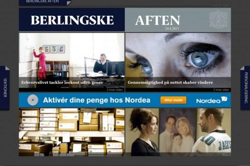
In Denmark, for example, the daily Berlingske, has two daily tablet editions, both distinct in content and look and feel. I asked Jens Jørgen Madsen, an editor, about the success of their product:
“It’s all about relevance. It’s about meeting the readers where they are – to help them navigate in the world and their everyday life – to give them an overview. What hasn’t changed is, that we still believe that we don’t need to give them a lot. There is still a lot of news and info out there. It’s actually more and more important to give them the compact easy read edition of what’s important now……and, yes, there is less dingling and whistling….”
But, an important point needs to be made about Berlingske, as well as other Scandinavian newspaper tablet editions in the evening: they all include an e paper, or pdf of the next day’s printed paper, and this is a favorite with readers. Jens agrees:
“The PDF is still a big hit. One of the simple reasons is that there is a beginning and an ending. You let the user know where to start and take control of all the content. They might not read it all. Or maybe just a fraction. But they don’t get lost.”
A chat with Ottawa Citizen managing editor Carl Neustaedter
Carl Neustaedter, now manging editor of the Ottawa Citizen, has been a part of the Citizen's evening tablet edition since its inception. He participated in all of our workshops leading to the creation of the concept both for storytelling and design. That is why I sought his take on the demise of the tablet edition.
Mario: What do you think went wrong?
Carl:
We are really proud of the editorial product we created, and it seemed people who saw it were impressed — yet it was clear not nearly enough of our potential readership was aware of it. There was also confusion of perhaps too many products: every time a reader called pr emailed I would have to figure out if they were reading the e-paper on their tablet, the original robot-fed tablet app, or our evening interactive magazine. These interactions showed me there was lack of awareness.
Mario: What lessons have you and your team learned?
We learned a lot about digital storytelling on the tablet though, and as you probably heard from Catherine, there is an attempt in ottawa, Calgary and Montreal to try and translate this expertise to other platforms … Web and mobile.
However, it does make me wonder, though ,if the convenience, share ability and immediacy of stories in the smartphone trump the interactivity of the tablet . My personal habits certainly bear this out — I’ve never had a problem reading long stories or watching video on my phone. The barriers to sharing and commenting on our tablet app I think were a disincentive to full engagement — it was more of a one way conversation (although a beautiful one!)
Mario: Many wonder why the tablet edition of La Presse, for example, has been such a resounding success, while the Postmedia tablet editons did not make it?
Two big differences exist between the Lapresse / Toronto Star Model: one is time of delivery (‘morning vs evening) and comprehensiveness (theirs is a replacement for the paper, ours was an evening newsmagazine that could not claim to be comprehensive).
We’ll see how the Star does with its version — will that model work outside the unique Quebec market?
I still believe in the tablet

I still believe in the tablet
The tablet has a place (so does print, by the way) and it is the process of assigning value and potential utilization to each platform that constitutes one of the industry’s most puzzling and challenging tasks.
I see smartphones as the platform of choice. Nothing can beat it. No other platform compares with it. We have a smartphone in our hand every waking hour. Smartphones don’t sleep, and they barely let us sleep. Smartphones are active participants in our news and information consumption routine. Tablets, PCs and printed newspapers are NOT. Yet, at least the tablets and the printed newspaper must strive for new roles.
Tablet editions in the morning? Tablet editions in the evening? Printed newspapers for the weekend? Tablet edition for the weekend? All of these are options that need to be analyzed and then applied to each specific market.
But if I were doing it all over again with a client, I would suggest a tablet edition that is a combination of the best features of the day, constant link to news and, definitely, an e paper with tomorrow’s printed newspaper.
I am glad that my friends at Postmedia have not given up on the tablet.
Lucinda Chodan, vice president for editorial and editor of The Montreal Gazette, wrote me:
“The possibilities remain dazzling. We will be very curious to see how the Toronto Star “Touch” experience works out; that will give us a sense of whether the La Presse Plus phenomenon is sui generis.”
Catherine Wallace, executive producer of The Montreal Gazette’s tablet edition wrote me:
“It (the tablet edition) allowed us to think in terms of movement and pacing and sound and stills, within the intimate atmosphere that the iPad creates. The audience feedback we got focused on some of the elements that we liked the best too — the “living still”, for example, where a short video is taken from one position, giving the effect of a still photo evolving before your eyes. It pulls you in and really connects you to the subject — the city, in our tablet.
“But it takes a lot in the current state of the industry for a new product to succeed — a lot of focus, a lot of marketing. It takes flexibility too, I think, to tweak your approach. The Postmedia edition was experimental in several ways: it was weekday only, it was published at 6 p.m., it was labelled a newsmagazine rather than a newspaper, it worked only on iPads and not on other tablets. It would have been interesting to be able to tweak these elements to try to bring in a bigger audience.
We hope that Postmedia will continue to experiment in the same courageous and enthusiastic way in which they did those evening tablet editions.
Catherine Wallace agrees:
“I personally think there were other places to take this app, more experimenting to be done, and that we could afford to devote a small number of people to this. I think it would have been worth it for two reasons:
First, it might have worked. It wasn’t bringing in a huge audience, but it was an engaged one, and an engaged niche audience is valuable.“Second, even though tablet sales are stalling and the tablet might not be one of the big salvations of the industry, we could have continued to learn different storytelling approaches.”
It is only the end of 2015, folks, and who knows what we will be experimenting with only a year from now.
That is the challenge, that is the risk, and that is also what makes these the best times to be a storyteller.
Of related interest: My Poynter piece on the Postmedia tablets
3 Canadian newspapers gave up on the tablet edition
http://www.poynter.org/news/mediawire/380744/why-3-canadian-newspapers-gave-up-on-the-tablet-edition/