This is the weekend edition of TheMarioBlog. Next blog post is Monday, March 5
Update #1: Friday, March 2, Tampa, Florida, 15:13 EST

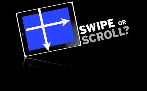
TAKEAWAY: The question that lingers and that every developer of a news app wants to get the answer for: do users reading news on the iPad prefer scrolling or swiping? We think the answer is “swiping”, but there is research coming up to provide a more scientific answer.

It is Friday, the end of another week, and it has been a productive one, with one issue taking front and center in discussions I have had during the course of my trip of the last two weeks, from Dubai to Malaysia to Holland.
It is the question of swiping versus scrolling when reading news on the iPad.
Not that we have the scientific answers right now, but we do know that people in the industry wish to know. So do I, and so do my colleagues at The Poynter Institute for Media Studies where we are busily engaged on the next EyeTrack, centering entirely on how users behave when reading news on the iPad.
We are quite hopeful that the Poynter EyeTrack will provide us with substantial information about all the “gesturing” that is involved when users engage with news content on their iPads.
Until then, and as I consult various designers and practitioners who are actually creatign news apps at the moment, I get mixed reactions to the scrolling versus swiping debate.
Here are some of the most interesting ones.
?I would love to hear your views on this, and, if you have conducted focus groups with users of your own news apps, please let me know what their reactions have been on this topic.
Let’s hear it for scrolling
Oliver Reichenstein, of Information Architects
http://www.informationarchitects.jp/en/
“Basically, user interface design is about the relation between hand and head, not eye and screen.
In user interface design you try to limit the amount of physical and mental action.
Scrolling is literally a no brainer in terms of orientation and has a slight advantage as a blind action over the conscious action of pointing-and-tabbing. It also gives you better orientation, as long as the scroll area is not all too long. So for medium length articles, scrolling definitely works better. For long texts (more than let’s say 10 vertical lengths) it doesn’t make sense.”
Let’s hear it for swiping
Joe Zeff, of Joe Zeff Design
www.joezeffdesign.com
“The best iPad experiences put the user in control of his or her experience, and swiping instills greater confidence than scrolling. The swiping gesture is like opening a door, and revealing some new place behind it. The payoff: an entirely new screen containing entirely new content. The scrolling gesture is like opening a window, where you see more of the same. You typically enter a vertical well with no discernible bottom, forcing you to scroll and scroll until you can scroll no more. The payoff is much more incremental, and thereby less satisfying. I strongly prefer the swipe to the scroll, as it keeps the user on a linear path from start to finish rather than imposing a detour that requires unnecessary gestures.”
Claus Enevoldsen of Next Issue Media
www.nextissuemedia.com
“For publishers attempting to create an “edition based” experience similar to print, swiping from page to page gives the user a sense of familiarity. Readers get comfortable right away. They’ve done this before. They’re progressing from one page to another, using a gesture very similar to what they would have used in the good old days with print. And because of that they know there’s a start and an end. I believe a big group of users are looking for that familiarity and experience. Even apps not founded in legacy newspapers/magazines are attempting to create that sense of familiarity: The Daily, Project Magazine, and all the aggregator apps as I mentioned before, such as Flipboard, Zite and Editions by AOL. “
See more of Claus’ opinion on the subject here:
http://cenevoldsen.com/2011/11/04/content-design-for-tablets-swipe-versus-scroll/
Justin Makler
http://www.justinmakler.com/
“Swiping for me is when its design driven and the written word is just part of the overall experience. Its about taunting me and teasing me to explore and be part of something that may not always be linear. – “drink me” – Alice in Wonderland analogy. On a tablet I feel cheated if I can’t swipe. On a desktop swiping would only confuse me and its about the lean forward (desktop) or kick off your shoes and enjoy the ride (tablet)”
My take
In my own current work, I am experimenting with news apps that only require swiping and never scrolling.
I believe that swiping is more intuitive, allowing us the turning of the pages, but also allowing for less confusion as we navigate the content of an app. If the navigational intentions of the designer are not clearly stated, one finds many frustrated users trying to move down or horizontally. If simplicity and sophistication are the trademarks of good design, then a less complicated—swiping mode—-allows for easier use.
Weekend reads of interest
Review of the Lytro camera
http://www.theverge.com/2012/2/29/2821763/lytro-review
Learn all about this camera that is likely to change how we do things.If you like to keep your pulse on the future and the gadgets that are likely to seduce us, you will be interested in the Lytro camera.
Highlight:
“We got to see a few of the company’s next developments, like a 3D view and a view that lets you pan inside an image and slightly change the perspective. Both are absolutely wild — as you pan around an image, people’s reflections on a glass of water shift to match your new perspective, as if you were moving your head slightly — and both will be rolled out to Lytro owners without any new hardware required.”
– If you think Twitter doesn’t break news, you’re living in a dream world
http://gigaom.com/2012/02/29/if-you-think-twitter-doesnt-break-news-youre-living-in-a-dream-world/